1.About Global Tuning Tool
The Global Tuning Tool (GTT) is a software tool developed by Harman International, a leading audio and electronics company. The tool is designed to help audio engineers to create audio post-processing pipelines and tune audio the systems to get the best audio performance.
This is a windows-based tool that is part of the Harman AudioworX product suite. The Global Tuning Tool includes a comprehensive set of core audio functions, a powerful signal flow designer, tuning tool, and the framework for processing the entire audio signal path, enabling easy integration of both HARMAN and 3rd party technologies.

Key Features of Global Tuning Tool
- Real-Time Analysis: The software provides real-time analysis of audio system performance, allowing engineers to quickly tune the system as per requirement.
- System Optimization: The Global Tuning Tool uses advanced algorithms to optimize the audio system performance, based on the specific acoustics of the venue and the desired sound quality.
- Intuitive User Interface: The Global Tuning Tool features an intuitive user interface, with easy-to-use tools and visualizations, making it easier for engineers to make adjustments and optimize the sound system performance.
- Preset Management: The software includes a library of preset configurations for different types of venues and events, making it easier for engineers to get started and save time during the tuning process.
- Signal Flow Designer: The software allows users to drag and drop audio processing modules such as volume, limiter, filters, and mixers onto a virtual canvas, and then connect the input/output pins of modules to create a signal flow diagram. The signal flow diagram provides a visual representation of the path that an audio signal takes through a system, including where it is processed, amplified, and mixed with other signals.
1.1.System Requirements
Your computer must meet the minimum technical specifications outlined below to run and use Global Tuning Tool.
Table 1: Global Tuning Tool System Requirements
| Component | Minimum Requirement | Recommended Requirement |
| Processor | Intel® Core – i3 processor (4.3GHz) | Intel® Core -i5 processor (1.7GHz or above) |
| Operating System | Windows 10 (64-bit support) | |
| Memory | 4 GB RAM | 8 GB RAM or above |
| Hard disk | 20 GB of available hard-disk space; additional space is required for installation | 50 GB or above |
| Display Resolution | 800 x 600 display | 1920 x 1080 display |
| Graphics |
|
|
| Browser |
The current version of Microsoft Edge, Internet Explorer, Chrome, or Firefox. Internet connection is necessary for GTT registration, license activation, membership validation, and access to online services. |
|
Currently, the Global Tuning Tool is not supported on macOS systems.
1.2.Global Tuning Tool Workflow
The below figure explains the workflow of the Global Tuning Tool.

2.Exploring GTT Workspace
The GTT workspace consists of several tabs, including the Home screen, Device Designer, Panel Designer, and Parameter Sets. Additionally, there are specialized tabs for tasks such as IR Measurements, IVP RTA, Central Viewer, Auto EQ, and AI Module. This guide focuses on providing information about the Home screen, Device Designer, Panel Designer, and Parameter Sets tabs.
2.1.Home Screen
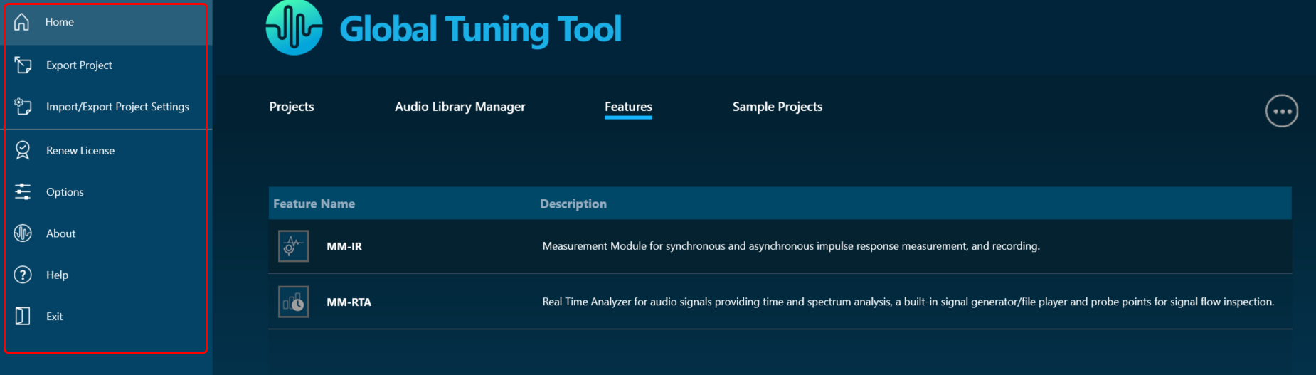
The Global Tuning Tool Home screen allows you to perform various operations like creating, importing projects, opening pre-configured templates, and launching default features.
When you launch GTT, the home screen appears, which includes the following tabs:
- Projects
- Audio Library Manager
- Features
- Sample Project
Also, Global Tuning Tool Home screen contains various options like export/import, renew license, configuring GTT settings, refer to Home Screen Options.

Projects
On the Project tab, you can create new projects, edit existing projects, import and delete projects.

On the Project tab, you can perform the following operations:
|
Create Project
|
Use this option to create a new project. Once you click on the Create Project option, a Create Project window will be displayed. You can choose Empty Template or One Core Template option to create a project. Project name will be automatically filled when selecting any template, you can manually change the project name by editing the default project name. By default, empty projects do not contain a description, you have to enter the details manually.
|
|
Import Project
|
Use this option to import existing GTT project. Click on Import Project and navigate to the folder, select the existing project, and click Open. This imports the GTT project on the project tab.
If there is a version mismatch between the current audio library version and version saved in each device, of the imported file, then a warning message will be popped up. Import Project with Measurement sessionsWhen a Project is imported and an associated Measurement Raw data file ({projectname}.mmdata exists, then the Measurement sessions will also be imported along with the project. |
|
Delete Projects
|
Use this option to delete a project. You can delete multiple projects as well as single project.
|
|
Edit Project
|
Use this option to edit project name and description. On the Project tab, navigate to the respective project, and click the Edit option. Modify the name and description as required and click Update. |


Audio Library Manager
The GTT interacts with the audio library service, which is a Windows service. This service hosts the C++ dynamic linked library xAFVirtualAmp.dll. This DLL exposes a number of methods that GTT calls from the managed environment, in order to determine what audio algorithms and memory layouts are available in the DLL.
Every audio library has a version, and GTT stores this information alongside the data received from the xAF service.

GTT requires an audio library to perform operations required for tuning amplifiers. It obtains audio objects, their properties, memory layout, and so on from the audio library. This library is hosted in a Windows service and communicates with it via IPC. The Windows service is called Harman audio library. The block diagram below shows high-level communication between GTT and an audio library service.

| Column | Description |
| Default | This column shows which DLL has been set as the default. |
| Audio Library Version | This column displays the version of the DLL. |
| Audio Library Name | This column displays Audio Library file name (DLL name). |
| Description | This column displays description of the DLL . By default description will be taken from file description property of the DLL meta data. |
| Audio Library Path (DLL Path) | This column displays the source path of the DLL. |
You can perform the following actions on the Audio Library Manager tab.
- Select the checkbox in the default column to set the audio library as default.
- Click on edit icon to edit the audio library description.
- Click on the Delete option to delete the audio library.
Load Audio Library
On the Audio Library Manager tab, click on Load Audio Library icon. You can load multiple xAF libraries.

If the same xAF library version is already present in GTT, a prompt will appear before overwriting the DLL.
When a new audio library is loaded, it will not set to default automatically; instead, you need to select the checkbox to make it default.
After extending support for multiple libraries, each version of xAF libraries will be separately stored for simultaneous use in GTT. Prior to this, existing xAF dlls were overwritten when another DLL file was loaded, and GTT could only work with one xAF dll version at a time.
Set Default Audio Library
Installed audio library will be set to default when first time launch of the GTT application. User can change the default audio library by checking the checkbox in Default column and the same will be updated and notified to the user.

The default audio library version set from this screen would be used for basic GTT operations – Add Device/ Discover Device/Project import (if last saved audio library is not loaded in GTT).
- Set the default audio library version by selecting the checkbox.
- Only one audio library version can be set as default.
- Settings shall be saved once check the selected audio library.
On GTT installation, the latest audio library will be loaded automatically and set as default.
Edit Audio Library Description
You can modify the description of audio library DLL by clicking on Edit Description option. After changing the description, click on Update to save the changes.

By default, Description is taken from the file description of DLL meta data until the user manually updates it by clicking the Edit icon.

Delete Audio Library
Click on Delete icon to delete an audio library.

To delete the Audio Library, you should run GTT with the “run as administrator” option.
Audio libraries can be deleted only when associated device and compound audio objects are deleted.
Audio library which is set as default cannot be deleted.
Any unsaved settings should be saved before audio library delete.
Feature
The Feature tab allows you to directly access the MM-IR (Measurement Module for synchronous and asynchronous impulse response measurement, and recording) and MM-RTA (Measurement Module for Real Time Analyzer) features without having to go through the entire process of creating a regular GTT project.
If a project is in the open state and you double-click on the MM-IR or MM-RTA features, a feature window will open, and the relevant data will be updated and stored in the project.
If you double-click on the MM-IR or MM-RTA features from the home screen, a dummy project will be created in the background and you will be directed to the feature window. However, it is not possible to export the dummy project

MM-IR
The MM-IR defines the Measurement Module for synchronous and asynchronous impulse response measurement, and recording. A device is not necessary for the Measurement Module to function in the project. The Measurement Module enables direct sound card measurements without an intermediate device, whereas tests controlled by gain channels can be carried out via a device.
To open the Measurement Module dashboard, double-click on MM-IR.
For more information, refer to GTT Measurement Module 2.0 User Guide.
MM-RTA
The MM-RTA defines the Measurement Module for multi-channel Real-Time analyzers for audio signals.
It provides time and frequency domain analysis tools for measuring RMS/peak levels, frequencies, THD, delays, magnitude, and phase responses. In addition, a built-in signal generator provides sine tones, sweeps, pulses, and various noise signals. Analyzing recorded signals is possible with a file player.
To open the Measurement Module dashboard, double-click on MM-RTA.

For more information, refer to the Real Time Analyzer User Guide.
Sample Projects
The Sample Projects tab allows you to get access to the example project. This will help you to understand how various audio objects are configured in the Signal Flow Designer.

Double-click on the example project, this will create a copy of the example project. You can modify the newly created example project. Similarly, you can create any number of copies of an example project.
More Options
On the right side of the GTT home screen, you will find an ellipsis menu that contains additional options.
Additionally, there is the “Current Project” option, which allows you easy navigation to the existing project window. You must have a project open in order to use the ” Current Project” option; otherwise, the feature will be inactive.

- About Global Tuning Tool: Displays software version of Global Tuning Tool, release type, and license status.

- Thumbnail View: To display all items on the home page in thumbnails. The Thumbnail option is only available in Feature and Sample Projects tab.

- List View: To display all items on the home page in the list.

- AudioworX Documentation: To open the AudioworX documentation page.
- Know your GTT license status: Displays GTT license status. Also, you can renew your GTT license.
2.1.1.Home screen Options
The home screen contains following options:
- Export Project: To export a project, for more details refer to Export Project.
- Import/Export Project Settings: To export and import project settings of RTA, Central Viewer and Measurement Module, or more details refer to Import and Export project settings.
- Renew License: To renew a global tuning tool license, for more details refer to Renew License.
- Options: To configure global tuning tool settings, for more details refer to Application Options.
- About: To know Global Tuning Tool version, release type, and license status.
- Help: To open AudioworX documentation.
2.1.1.1.Export Project
Once you complete the signal flow design you can export the project.
Follow the below steps to export the project:
- Click on the File menu and select Export Project option.
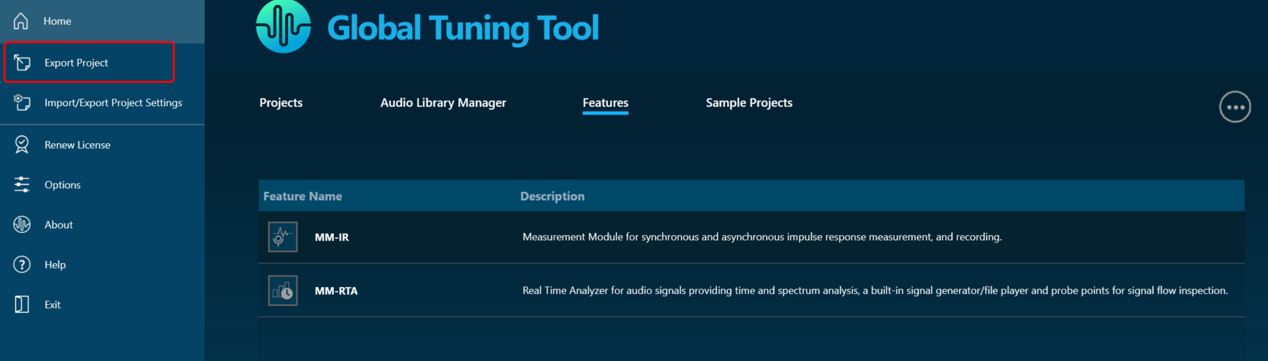
- In the Export dialog box, choose the desired destination where you would like to save the project file, and then click the Save button.
The project file is stored with file extension *.gttd.
Export Project with Measurement Sessions
When a project is exported, by default the project will be exported with measurement sessions and session associated raw data will be stored in the {projectname}.mmdata file in the same destination folder.
If you want to exclude measurement session data from the project export, make sure to configure the project settings prior to initiating the export process.
Follow the below steps to exclude measurement session from project export:
- Click on the File menu and select Options.
- In the Application Options dialog box, click on Project Settings, and uncheck Include Measurement Session in the Project export options.

- Click OK to save the change.
2.1.1.2.Import and Export project settings
The Export and Import project settings allows you to share project settings of certain components like RTA, Central Viewer, Auto EQ, and Measurement Module etc to other team or to a end user.
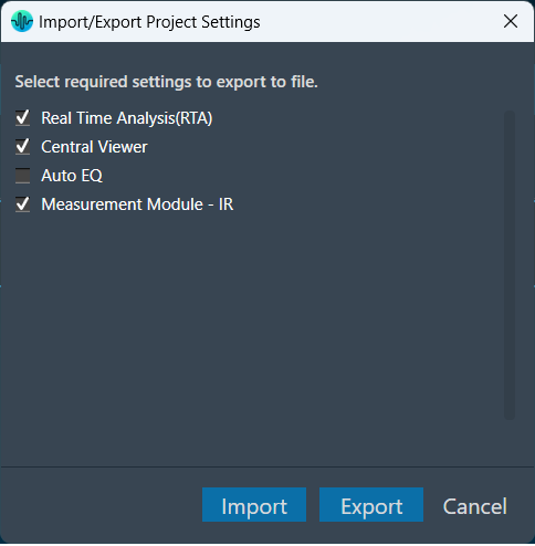
Export Settings: Allows you to export RTA, Central Viewer, and Measurement Module settings of a project. The settings will be exported as a *.gttdSettings file.
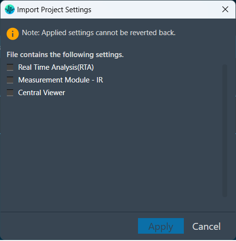
Import Settings: You can import the previously exported project settings (*.gttdSettings file) after creating a project and wants to replicate the same project environment with the same settings.
During the import process, you can optionally choose to import component-wise settings.
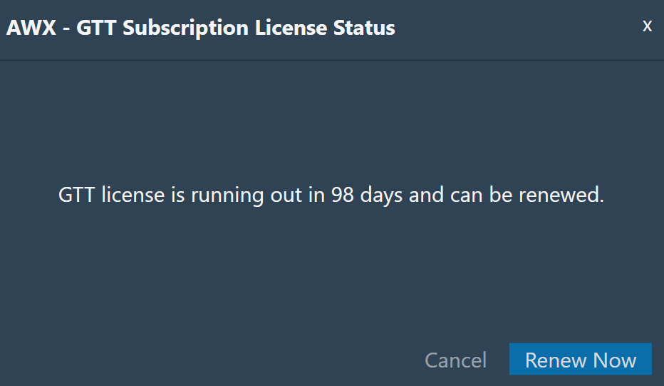
2.1.1.3.Renew License
You might see the “Renew GTT license” message on your GTT platform home page or dashboard. This happens due to an upcoming expiration date of the GTT license.
The “Renew license” operation enables you to extend the validity of your GTT license, and you may also request new features as part of the renewal process.
Follow the below steps to renew the GTT license:
- Click on the File menu and select Renew License.

The system will start downloading the latest license. The GTT platform notifies you after a successful license renewal.

2.1.1.4.Application Options
The option menu allows you to configure various settings in GTT, such as the general settings, project settings, custom panel grid settings, and event log settings.

General Settings
In the general settings dialogue box, you have the option to customize measurement settings, venue menu settings, explorer settings, and system conversion settings.

| Measurement Settings |
Measurement Session Raw Data Folder: Specify a desired location where you would like to store the raw data for the measurement session. Predefined Stimulus Signals Folder: Specify a desired location where you would like to store the predefined stimulus signals. |
| Venu View Settings |
– Show Warnings: If enabled, all device alerts will be displayed in the venue. – Show Incompatible HiQnet App Warning: If enabled, a warning dialog will appear upon startup if another HiQnet application is already running. – Load Previous File On Startup:
|
| Explorer Settings | If enabled a drop-down arrow appears next to discovered devices in the venue explorer. When the arrow is clicked, the complete device information is displayed. |
| Address Settings | – Display Addresses in Hex.
– Display Object Addresses as Octals.
|
| System Conversions | This option makes all instances of parametric EQ displayed either as bandwidth in Octaves or as bandwidth as Q at the user’s discretion. Switching from one option to the other will be on a global basis for the entire application. |
| Advanced |
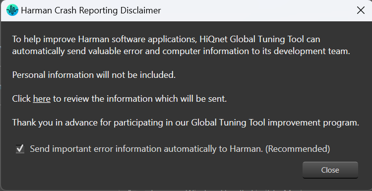
– Increase Window Handle Limit to Maximum: This option allows you to set the handle limit to it s maximum value (checking the checkbox), this will increase the maximum number of controls/planes allowed by the operating system. By default, this option is unchecked. If GTT exhausts its handle resources and is unable to launch a panel, it will notify you of the issue and prompt you to close any unused panels in order to free up resources. – Select wiring controls in real-time when using lasso selecting: When using the lasso to select objects, having this box checked allows the selection of wiring contThis option makes all instances of parametric EQ displayed either as bandwidth in Octaves or as bandwidth as Q at the user’s discretion. Switching from one option to the other will be on a global basis for the entire application.rols. – Error Reporting: This option enables GTT to send important error information automatically to Harman. On Harman Crash Reporting Disclaimer dialogue box, check the “Send important error information automatically to Harman” option. This feature will send application and computer information to the Harman GTT team in the event of an application crash. Uncheck the checkbox if you do not want any information sent.
|
Project Settings
| Project |
In the project settings, you have the option to designate a folder where you would like to store the project file. If you want to exclude Measurement Session data from the project export, uncheck the “Include Measurement Sessions in Project Export” options.
|
| Decimal Separator for Exported files | You can select between a dot or comma to specify the separator of any quantity for the files you export in GTT.
Currently this option is only supported for traces exported in .txt and .txtrclist in the RTA module.
|

Make sure to configure the project settings prior to initiating the export process.
Custom Panel Designer Settings
In GTT, you can modify the settings for the custom control panel design view, such as the grid, snap lines, and control transparency configuration.
However, it is important to note that once you make changes to these settings, you must close any open custom control panel designer and reopen it for the changes to take effect.

| Grid Layout | The design grid allows you to arrange controls relative to specific marks on the design view of the Custom Panel.
|
| Advanced |
Enable Control Transparency Control transparency gives the controls on Custom Panels transparent backgrounds. While this option makes the control panel designer more attractive, it may slow the computer system performance significantly to process all the graphics. If you are having problems with the graphics building too slowly on the screen, uncheck the box “Enable Control Transparency.” While they will show up as overlapped on the Custom Panel designer, they will show up as transparent on the Custom Panel if the background is transparent (defined in Control Properties). |
User Interface Settings

| Font Size | Choose the desired font size:
Currently font size change will impact only in the Central Viewer Browsing and Permanent curve name font sizes. |
| Windows Setting |
– Show all sub windows on top: Check this option to ensure all sub windows are always visible above the main window. |
Tuning Data Settings

| Retain Tuning Data |
By default, tuning data of the Audio object will be lost when the Mode, Additional Parameter, or Number of Elements property changes in the signal flow. To retain tuning data in the above cases, please check the appropriate option based on your needs. |
Event Log Settings

| Event Log View |
The Event Log window tab shows events that have occurred on HiQnet devices. The log may be utilized by individual devices to perform certain operations. You can also use the logs for troubleshooting. The Event Log Indicator will notify you in real time as events occur.
You can also group information by heading. Click and hold on the heading and drag it to the top just below the log file to the “Group(s)” option. The screen will now display by the heading you selected.
To remove the grouping, click and hold on the heading and drag it off the “Group(s)” option. The Event Log Archive is a store of the Event Log from when the application was opened. |
| Miscellaneous |
|


2.2.Device Designer Overview
The Device Designer comprises of various tools and interfaces that are used to create and run audio processing systems on hardware. The Device Designer contains the canvas and modules needed to create the signal processing template, while the SFD interface handles most of the target and audio object interactions.

When you launch a project in GTT, the Device Designer screen appears, which includes the following elements:
- Ribbon and Group: The ribbon is composed of six groups, each of which represents a subset of program functionality. In addition to these programs, there are also additional contextual programs that automatically appear depending on what is currently selected.
- Devices List: This section displays the list of projects. In addition, you can add and delete a device.
- Toolbox: This section display core levels of processing, such as block length conversion, merger/splitter, and sample rate conversion within the audio processing pipeline.
- Device Operations: This section contains several functions related to physical/virtual devices like Load Device Config, Edit Device, Send Device Config, Send Signal Flow, Export SFD, and Control Ids.
- Properties Panel: A Device Template is a combination of three layers – Physical Layer, Virtual Core, and Core Object. When you select one of the cores, the properties of the core are displayed on the right side. If required you can modify the core properties.
- Device View: The workspace is used to add devices and program the device core. You can use the magnifier function to adjust and change the size of the design workspace.
2.2.1.Device Designer Ribbon
The GTT ribbon comprises six groups: Tools, Connection, File, Tuning, Device Panels, and External Endpoints. Each group has specific tools of related functions. It gives you quick access to the tools and functions you need to complete a task.

- Tools: This group includes three tools: Services Monitor, Event Log, and xTP Log. The event log and xTP log in GTT can both be checked and monitored using all these tools.
- Connection: This group includes tools to set up the connection between the physical or virtual device, such as configuring socket connections and port settings. Additionally, it facilitates you to establish the connection once it has been configured.
- Import/Export: This group allows you to import and export device files, tuning data files, device description data files, and corporate pin data.
- Tuning: This group includes Tuning Data and Virtual Tuning. Using Tuning Data, you can open and tune the audio files. Virtual Tuning enables the measurement of impulse responses of an acoustic environment using the AudioworX measurement Module.
- Device Panels: This group includes the following tools: State Variables, Default Control-Ids, Present Controller, Controller, Linking Window, Mips, Memory, Memory Latency, Streaming, and File Controller. Each of these tools is equipped with a unique set of functions.
- External Endpoints: This feature allows external tuning to communicate with the device. The GTT will receive the requests from external tuning tools and send them to the device via GTT. This is made possible by a WCF service endpoint that third-party tools can access.
2.2.1.1.Tools
The Tools group allows you to monitor the all services running on GTT, view the event and xTP logs, and perform the sound card configuration.

2.2.1.1.1.Service Monitor
Global Tuning Tool provides a comprehensive set of tools for monitoring following services:
- SQL Server Service
- Measurement Service
- Harman Audio Library 32
- Harman Audio Library 64
- AI Module
The choice of tool depends on the type of monitoring or tuning to be done and the events to be monitored.

2.2.1.1.2.Event Log Viewer
The Event Log window tab shows events that have occurred within Global Tuning Tool and on connected devices. The log may be utilized by individual devices to perform certain operations. You can also use the logs for troubleshooting.
The Event Log Indicator will notify you in real-time as events occur.

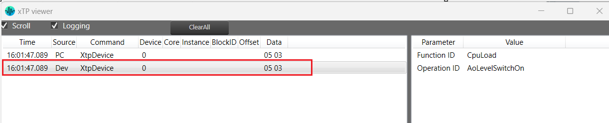
2.2.1.1.3.xTP Log Viewer
Any error on the device is displayed in GTT in the XTP viewer and Event log.


The xTP-Viewer has two sections:
- Left side section: Display message flow view and show raw data of several messages.
- Right side section: Detailed view of a selected message on the right side (is empty, if message interpretation is not implemented up to now for the specific message).
2.2.1.1.4.Sound Card Configuration
The Sound Card Setting allows you to configure the host API (audio driver), device, sample rate, block length, and the master output for the audio processing. Based on device selection, input and output channels are available for configuration.
Using “Master Output” you can set master and device output modes for speaker configuration in Measurement Module.
The configured sound card configuration is used throughout the RTA and Measurement Acquisition features.
Before you start Measurement wizard or set the “Sound In” and “Sound Out” devices in the RTA, make sure you have configured sound card settings like Host API (Driver Protocol), Device, Sample Rate and Block length of the sound card.
On the “Streams” section list of available channels for input and outputs is displayed .

GTT supports two host API “MME” and “ASIO”.
- MME: This is the standard windows audio driver. It allows operation of multiple audio devices at the same time. Sample rates are handled by the operating system. Can be set to any sample rate. If the sample rate of the physical audio device is different, then OS takes care of the sample rate conversion. This mode is recommended if multiple devices are running at the same time, e.g. measuring with an USB microphone while playing back generator signals with an internal sound card.
It is recommended to keep the block length at the maximum value of 4096 and the sample rate at 44.1 kHz or 48 kHz.
- ASIO: This driver is used with multi-channel sound cards. It enables low latencies and ensures that all input and output channels are in sync. Depending on the latency requirements of the audio signal processing provided by a loaded plugin (future feature) the block length can be reduced down to 64 samples. The RTA sample rate setting has to be equal to the audio device driver sample rate.
It is recommended to use an ASIO sound card instead of Windows drivers. When using Windows drivers, it is advised to use a block length greater than 1024 in order to avoid the noise distortion effect, which is a known limitation of the Windows driver (as observed even in audio mulch).
The setting for sample rate does not change the actual setting in the sound card driver. The alignment of the sample rate setting has to be ensured by the user.
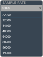
Supported sample rate
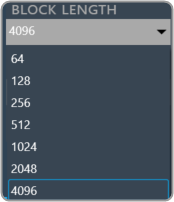
Supported block length
2.2.1.2.Connection
You must connect the device instance containing the tuning data to the physical/virtual device to send tuning data to the physical device.

Connect Device
To connect a device, select the device from the device list, and then click Connect Device.
If there is no instance of AmpSrv2 running with the required port, then a new instance of AmpSrv2 will start. Otherwise, it will use the current AmpSrv2 instance.
The communication port between GTT and AmpSrv2 is calculated automatically on GTT side: 24575 + HiQnet node address of the device instance.
If AmpSrv2 is started by GTT, then AmpSrv2 settings will not be stored.
If AmpSrv2 settings change permanently, then a manual start of AmpSrv2 is required.
Automatic startup of AmpSrv2 only works for single device instances. If you want to connect to multiple device instances in parallel, you will need to manually start multiple AmpSrv2 instances (running on the requested port addresses).
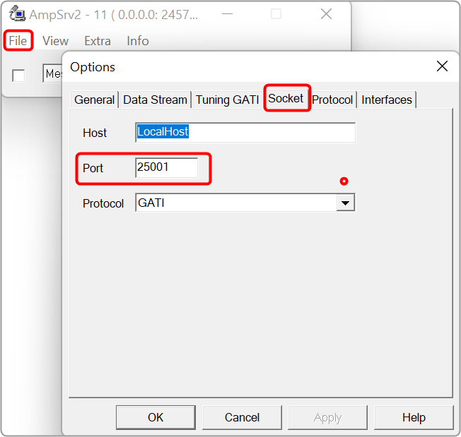
From Herbie Hancock release onward, the default port of the virtual device has changed. The default port is now 25001 (before it was 8080).
If an old audio library is used, the settings should be adapted manually. In AmpSrv2 > File > Options > click Socket.
Disconnect Device: Click the Disconnect Device button in the ribbon bar.

If AmpSrv2 was launched by GTT, AmpSrv2 will be closed. Otherwise, AmpSrv2 will keep on running.
AmpSrv2 Settings
AmpSrv2 is software to connect the tuning tool to either a physical target device or a virtual amplifier.

The AmpSrv2 shows the following menus:
- File: Click on the File menu to open the Options window or close the AmpSrv2.
- View: Click on the View menu to open dialogues and protocols functionalities.
- Extra: Click on the Extra menu to import CAN SID, OS-Msg Description, GATI/xTP Description, and Protocol file.

- Info: To get the AmpSrv2 version and license details.
AmpSrv2 License
The AmpSrv2 dialogues and protocols functionalities are licensed-based. If any dialog or protocol is grayed out or not available, this means you have a limited license.
The AmpSrv2 is shipped with a limited license (Customer.lic).

To check AmpSrv2 license:
- On the AmpSrv2 window, click Info, and then click About. This displays the AmpSrv2 info screen. Verify the license information.

To activate the new AmpSrv2 license:
- Navigate to the C:\Program Files\Harman\HarmanAudioworX\tools\AmpSrv2.
- Locate Customer.lic file (license file) and delete the existing license file.
- Copy and paste the new license file (xxx.lic) into the same AmpSrv2 directory.
To changing AmpSrv2 Settings:
- On the AmpSrv2 window, click File, and then click the option. This opens the Options window.
- On Socket tab, set the protocol to GATI.

If you experience network conflicts, choose a different port above 50000 because port 8080 is very popular. Your selection must appear in the VST client (probably AudioMulch).
- On the Tuning GATI tab, set the Databytes per to 192, and click Ok.
- On the AmpSrv2 window, check the checkbox
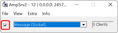
When you start GTT and connect to AmpSrv2, the AmpSrv2 window will show the number of connected clients.
Once you have completed the necessary Ampsrv2 modifications, go to AmpSrv2 Settings and save the Ampsrv2 modifications.
This saved configuration will now be used for this specific device on Connect Device. The saved configuration will also be exported/imported using the GTT project Export/Import functionality.
If no AmpSrv2 settings are connected with a device, the default settings will be used. You can modify the GTT default AmpSrv2 settings. Follow the steps mentioned in the above topic “To changing AmpSrv2 Settings”.
The AmpSrv2 window will appear, and the user can modify the settings, which will be considered the Default Settings for GTT.
In the case of a Discover device, you should first open AmpSrv2 Settings, modify settings as needed, and then click on Discover Device. This modified configuration will be used to discover the device.
In the AmpSrv2 window, the port number of the server is not saved in the General tab.

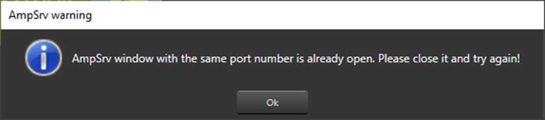
Two AmpSrv2 windows with the same port number cannot be opened or an error message will be displayed.
2.2.1.3.Import and Export

Import

- Tuning Data: Use this option to import an existing tuning file (*.set or *.setr).
Users can use the following hints to see if the “imported tuning file” has made any changes to the device:
- Check the State Variable Explorer to see if the values of the corresponding state variables have changed.
- If the device and GTT are in sync, sending tuning data should cause the frequency response to change.
- The user can manually create a set column to obtain the current state of the state variables after importing the tuning data file on the device.
- The user can use the set column that is already present after importing the tuning data file on the device and pressing the “store” button. If the set column in the set file contains state variables, the user can view the modifications.
Export

- Tuning Data: Use this option to export a tuning file (*.set or *.setr).
This method creates a .set file which contains all the object tuning data, that includes all of the device’s state variables. For example, if certain objects are not tuned, their default tuning values will be exported to the set file.
- Export DDF Data: Use this option to export a device description data file (*.ddf ).
- Export Control Pin Data: Use this option to export Control Pin Data (*.csv).
If no configured control pin data is available its shows the message “Control pin not configured for device”.
- Device Template: Use this option to save device template file (*.flash).
|
Important The Device File option is hidden by default. Steps to make Device File option visible under in Import/Export option: 1. Go to GTT installation path and locate GlobalTuningTool.exe.Config file. Location: C:\Program Files\Harman\HarmanAudioworX\tools\GTT\ 2. Open the file in any text editor (notepad) and update “AudioObjectDeveloperMode” attribute under “appSettings” node as shown below. 3. Set Value = true to enable Device File option. Similarly, set Value = false to disable Device File option. Restart the GTT to take effect of updated setting. |

2.2.1.4.Tuning
Tuning Data
You need to connect a device to GTT to send/receive tuning or state data.

When the device is connected you will get the following options.
- Send Tuning Data
- Receive Tuning Data
- Receive State Data
Virtual Tuning
This feature will be removed in the future Global Tuning Tool release.
Virtual Tuning allows you to measure impulse responses of an acoustic environment using the AudioworX Measurement Module. Based on these measurements, a production signal flow can be virtually tuned.
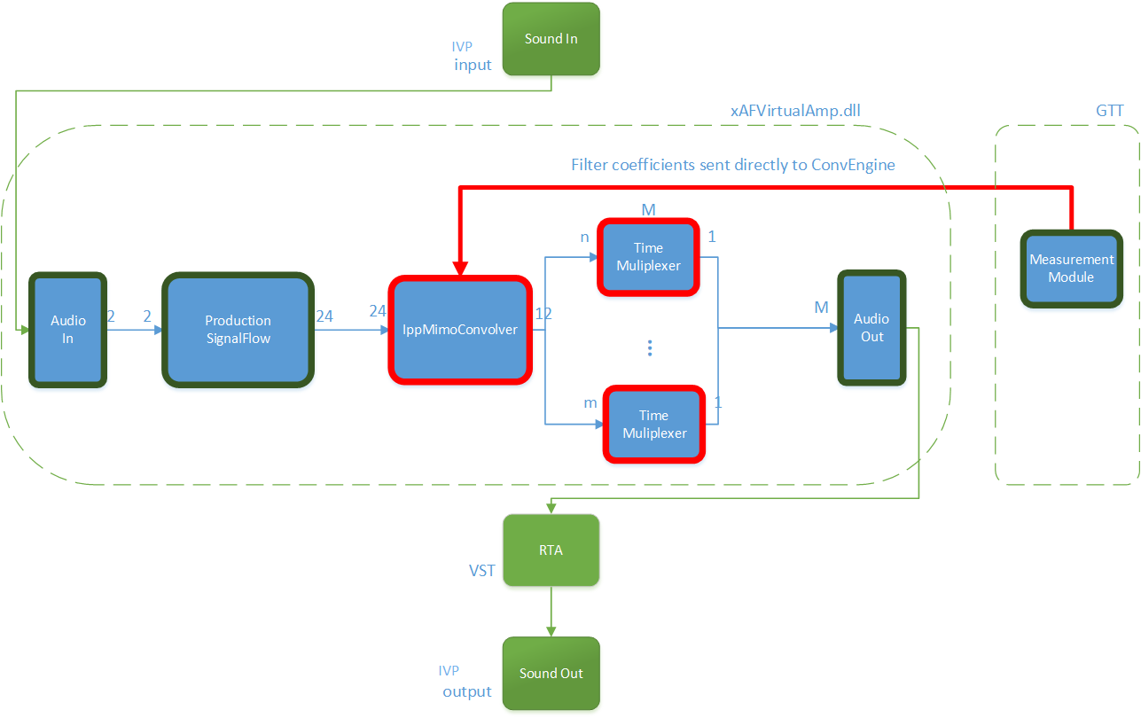
For this purpose, two new audio objects are implemented in AudioworX:
- IppMimoConvolver
- Time Multiplexer
IppMimoConvolver: The IppMimoConvolver audio object provides MIMO convolution with FIR filters using the Intel Integrated Performance Primitives (IPP) library, a multi-threaded software library of multimedia and data processing applications. It is highly optimized for various Intel® architectures and is a comprehensive library of out-of-the-box, domain-specific functions. The library is available for the Linux, MacOS, Windows and Android operating systems.
In the SFD, you can select the following object parameters at design time:
- Number of input channels
- Number of output channels
- Number of taps of filters
Tuning: For each filter combination in IppMimoConvolver, this object exposes these one tuning parameters set to the GTT
- Coefficients: The coefficients of the filters can be imported from .csv files. The filter taps that are set in the GTT must match the taps of the filter that is imported from the .csv file.
Filter coefficients can also be loaded directly from a Measurement Module session that has been pre-measured in AudioworX.
Time Multiplexer: The Time Multiplexer combines multiple input audio signals into a single audio signal by dividing the input channels into equal fixed length time slots and mixing them into a common output channel with fading between channels.
The length of the time slots and the fading characteristics can be configured at runtime.
The output signal is the signal of one input channel at a time. The next input channel becomes the first input channel again when the last input channel is reached. Depending on the fading mode, there might be a block length of fading between 2 channels.
In the SFD, you can select the following object parameters at design time:
- Number of input channels
Tuning: This audio object exposes four tuning parameters to the GTT.
- Mode: The mode can be set to:
- Normal Mode: Performing multiplexing
- Active Channel Mode: Single channel passed to the output
- Off: No output
- Multiplex number of blocks : Only evaluated in “Normal mode”. It presents a number of blocks (block length) after which to switch to the next input.
- Fading mode: Only evaluated in “Normal mode”. It sets a type of fading method:
- Cosine square fading
- Linear fading
- No fading (hard switch)
- Active channel
- If in mode “Active channel mode” – The channel number of the input channel that will be routed to the output channel.
- If in mode “Normal mode” – Set the selected channel as current input and continue with the next channel in normal/multiplex mode after the configured number of blocks.
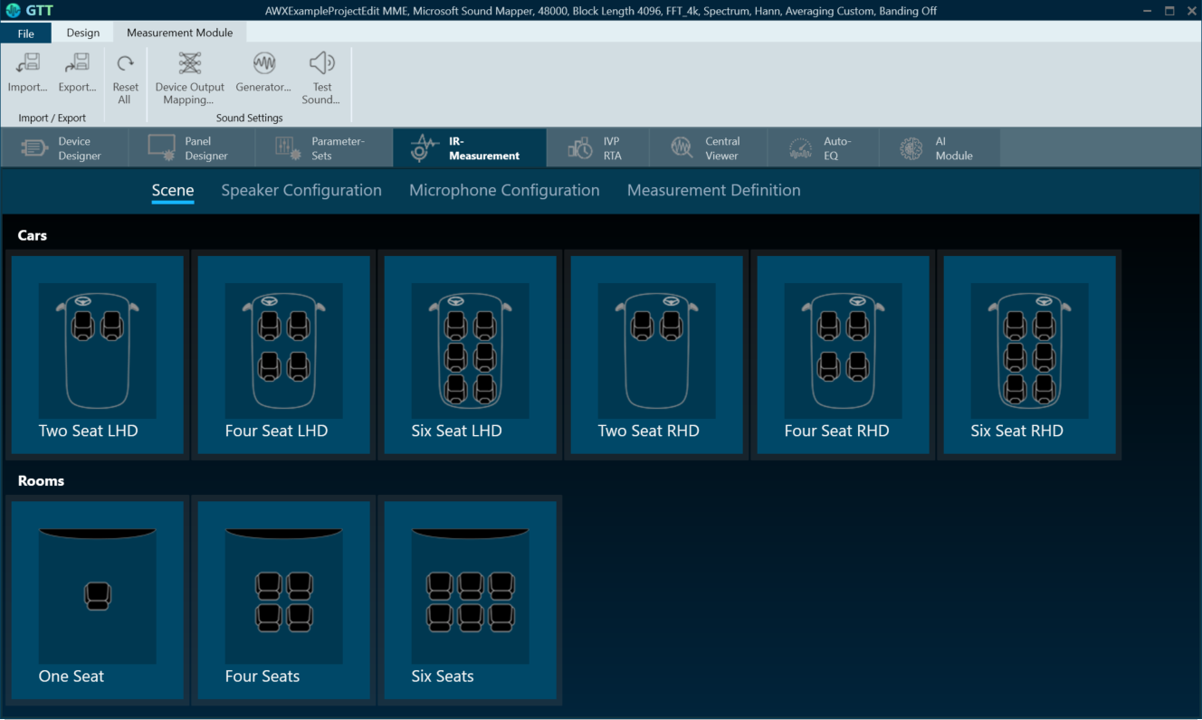
Virtual Tuning Configuration Prerequisites
The steps listed below describe how to configure an IppMimoConvolver object using GTT.
- Create a signal flow with the IppMimoConvolver object with m inputs, n outputs, and j number of taps for filters.
- Create a measurement with n mics and m speakers.
- Adjust measurement length, sample rate, etc to get exactly the required amount of coefficients (ir data points) before starting measurement.
Once the above steps are done, select the device (which contains a mimo object) from the device list to activate the device tab.
Steps to launch Virtual Tuning:
- Select a device, and click Virtual Tuning. This opens the Virtual tuning configuration screen.

Apply Coefficients to Virtual Tuning
Steps to apply coefficients to Virtual Tuning:
- Open Virtual Tuning and select suitable Measurement Session.
- Select Convolution Object to which the Coefficients to be applied.
- Click Apply.
The selected measurement’s IRData is retrieved and applied to the convolver object. A toast message appears, stating that the coefficients were successfully applied.

Virtual Tuning Panel: The IppMimoConvolver panel is used to view the coefficients assigned to the object. This panel provides the following functions.
- Flat
- Import
- Export
- Import All

2.2.1.5.Device Panels
The Device Panel group offers a set of tools that lets you perform various functions on a device.

The following tools are available on the Device panel.
2.2.1.5.1.State Variable
The State Variable Explorer window allows you to view the memory layout of each device instance. It can also be used to send and receive tuning data.

To copy values of FloatArraySV type state variable to the Windows clipboard, press CTRL+ C in the table . The float values are located in the clipboard. The same can be achieved by using the context menu (Copy All) of the table.
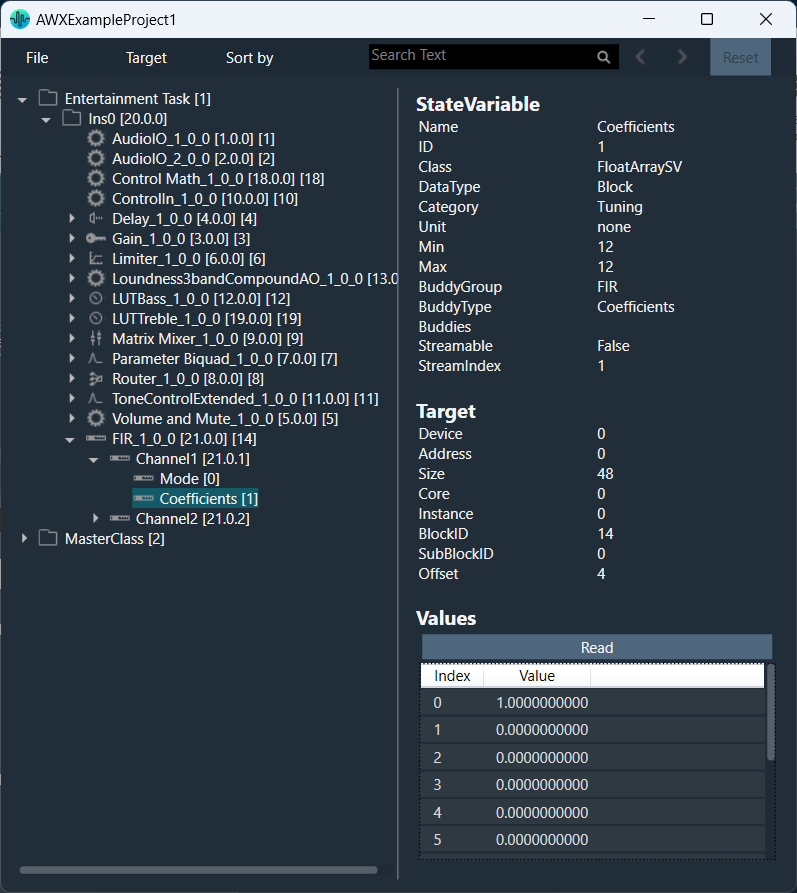
File: Using the file options you can load and save the set file.
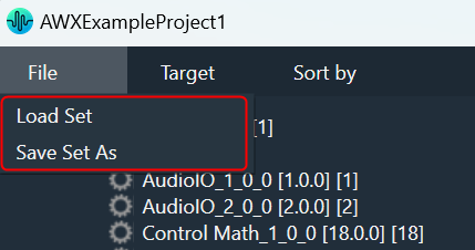
- Load Set: To load a set file, click on “Load Set”. Browse the location of .set or .setr file and click “Open”. This loads the set or .setr file in State Variables explorer.
- Save Set As: To save a set file, click on “Save Set As”. A dialog box will appear, where you can choose the folder to store the files (.set/.setr). Enter a file name and click on the “Save” button.
Target: Using target options you can send or receive tuning data from the connected device. When the device is connected you will get the following options.
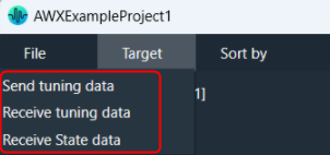
- Send Tuning Data
- Receive Tuning Data
- Receive State Data
Sort by: Using sort options you can sort the state variables and audio objects in the state variable explorer.

- Name: To sort the audio objects or state variables based on their names
- Block Id: To sort the audio objects or state variables based on audio objects block Id.
- Object Type: To sort the audio objects or state variables based on audio object types.
- HiQnet Id: To sort the audio objects or state variables based on audio object HiQNetIds.
When you click it the first time, it will sort in ascending order; the next time, it will sort in descending order, and so on.

Search: Using the search option, you can locate and highlight a matching record and move on to the next or previous matching data set.
It will search audio objects and state variables based on Name, Block Id and HiQnet Id.
Reset: The Reset option will clear all search and sort data and reset state variable explorer to default state.
2.2.1.5.2.Default Control-Ids
The Configure Default Controls option allows you to specify which default control ids should appear in the “Control In” control list.

To Configure the Configure Default Controls:
- Click on Default Control-Ids. This opens the Configure Default Controls window.
If no configuration is defined, all Control IDs are selected in the Configure Default Controls window.
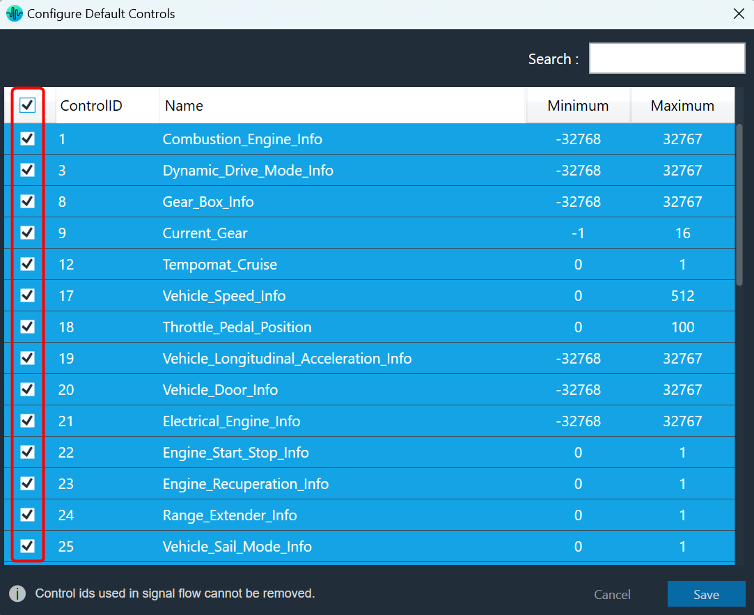
In the Configure Default Controls window, you can select or unselect control IDs.You cannot deselect the Control ID used in the Signal Flow Designer.
- Select or deselect the required control Ids and click Save to update the configuration.
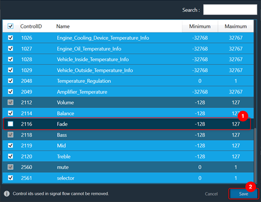
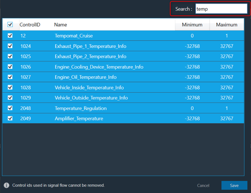
Use the search text box to search and filter the control Ids.
Once you have modified the Configure Default Controls data, you can verify the changes.
Go to the Signal flow designer window and open the Control In property window to verify the configured default control IDs along with custom control IDs.

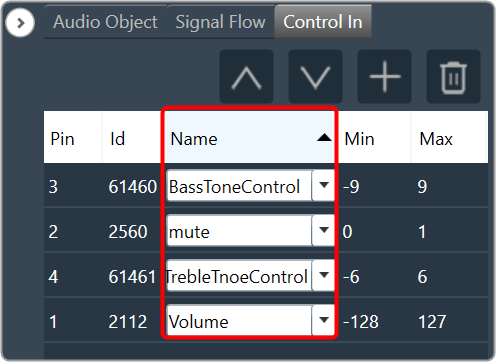
Sort Control In Pin Data
The Control In panel shows all user-configured control pins data.
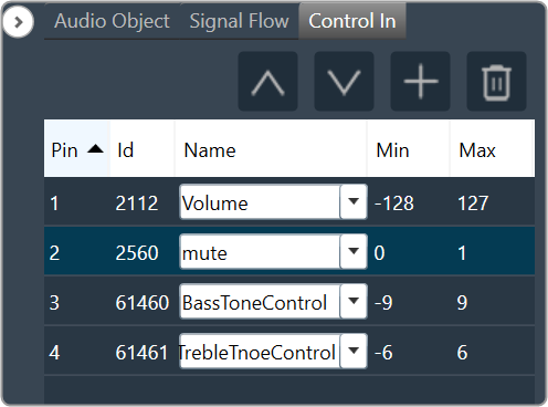
You can click on any of the column headings to sort the data. Clicking alternately will change the sorting direction from ascending to descending or vice-versa.

The ascending order of the Pin column is the default sort order for the Control In panel.
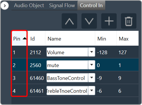
Click on any column header to sort the respective data on the Control In panel.
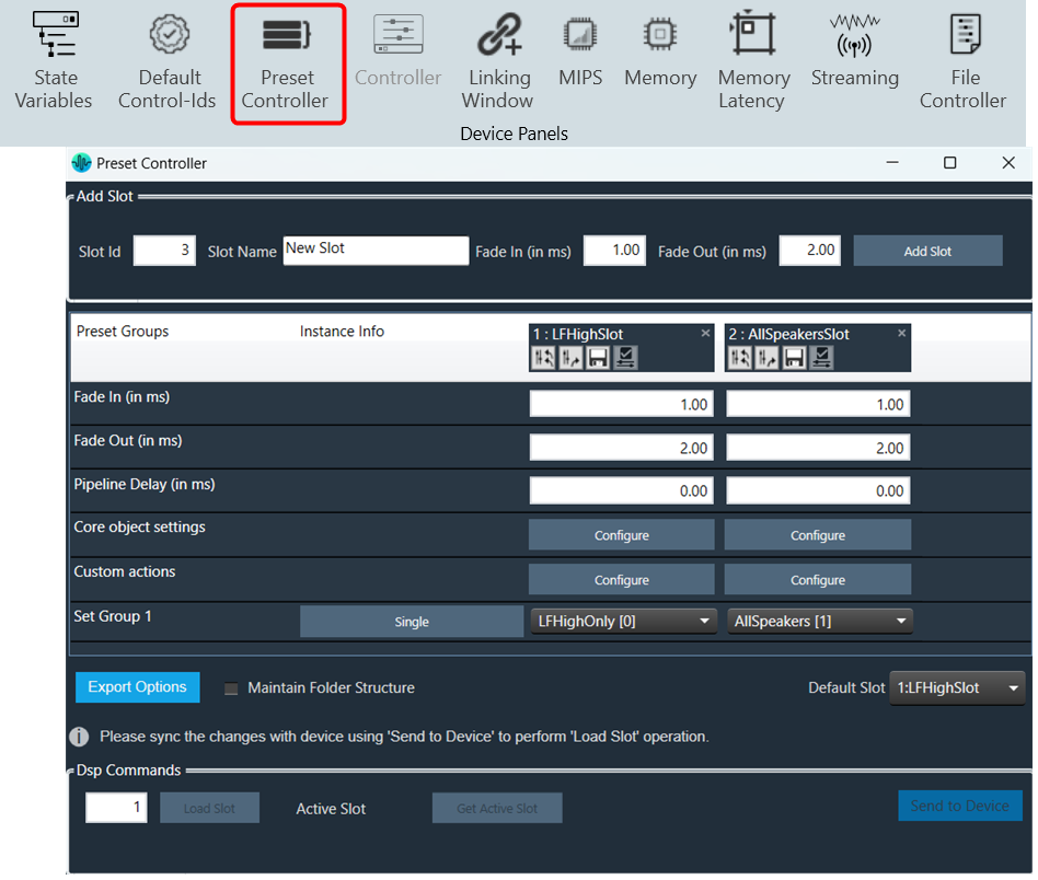
2.2.1.5.3.Preset Controller
The preset controller is the central place for managing and organizing how you will load presets in your signal flow. It also contains other related features such as creating .set files, storing sets, and recalling sets of parameter sets available.
A “Slot” is a group of parameters set one level above. You can create multiple such slots and do any actions like create set files, store , recall etc.
In addition to GTT functionalities, it is also possible to send Xtp commands to device. There are XTP commands to send slot map and Load the slot on to device. You need to export all .set files and manually flash on to the amp.
For more details Preset Controller, refer to Configuring Preset Controller.
2.2.1.5.4.Controller

The controller window is used to send instance commands.
The controller feature is enabled only when the device xAF dll version is lower than 18.x.x.xxx.
Steps to setup controller:
- Enter a valid Core Id and Instance Id and click on Get Status to get the current available slot of the device. The response from the device will be displayed in the Response section.
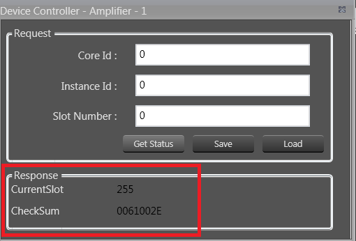
- Click Save to save the current instance data on the device to the memory slot entered.
- Click Load to load the data from the memory slot to the device RAM.
If there is any error in the device connection or if any invalid Core Id and/or Instance Id were entered, the error message “Request failed!!!! Please make sure […]” will be displayed.
2.2.1.5.5.Link Window
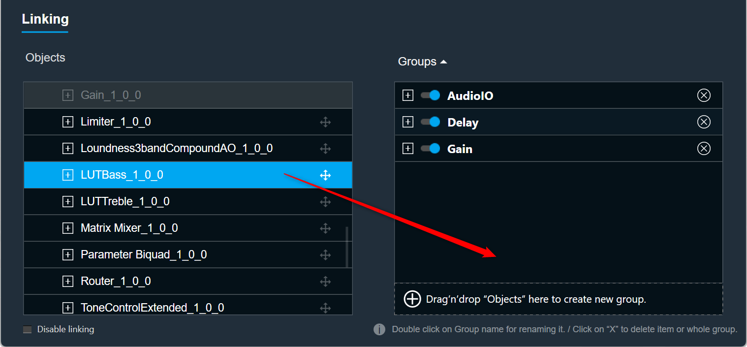
The Linking Window is designed to assist you by reducing the number of audio parameter configurations. It enables you to organize the filters and channels. When you set one item in a group, the remaining items in the group will have the same value.

By default, all the groups link are enabled. If you want to disable the specific group link, click on the toggle button to disable it. GTT will store the group linking status in project file.
If you want to disable all the groups link, select the Disable Linking checkbox.
Create a New Group
Steps to create a new group:
- Open Linking Window, expand the task, and drag-drop the object to the right-side section under Groups. A new group is created, expand the new group. Under the new group, you can view the added object.
Renaming Groups: Double-click on a group name to rename it.
Only groups can be renamed; Audio objects cannot be renamed.
Removing Objects: Click on the remove icon to remove the object. This will also delete all child objects.
Removing Groups: Click the remove icon to the right of the group. This will also delete all child objects.
Add Object to Existing Group
Steps to add object to an existing group:
- Open Linking Window, expand the task, and drag-drop the object to the right-side section under target group. A new group is created, expand the new group. Under the new group, you can view the added object.

If an object cannot be added to a specific group, the color of that group will change to grey.
If the object is added to the group, the color of the group will change to blue.
Linking Rules
- Each of the audio objects can be part of only one group.
- If a child audio object is part of a group, the parent element cannot be part of that group.
- Groups can contain only one type of audio object. For example, you cannot link a Biquad with a Delay. Each group can contain more than one AO.
- Objects in groups are linked according to their order. For example, if you link two EQ channels, the first Biquad from the first channel will be linked with the first Biquad from the second channel.
- Changing links is done live. You do not need to close the window for the changes to be working.
2.2.1.5.6.MIPS
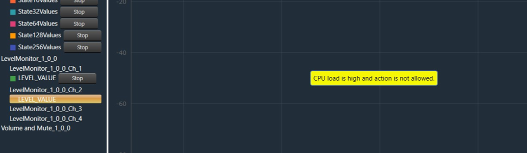
The MIPS window presents the CPU load of cores, instances, and audio objects of the connected device.

MIPS profiling data is fetched from the device (hardware) using xTP Commands and the user can optimize signal flow based on this information.
MIPS window is enabled only when the device xAF dll version is 18.x.x.xxx or higher.
Signal flow should be flashed before launching MIPS.
Launch MIPS Profiling
Steps to launch MIPS profiling:
- Select the device node and click MIPS. This opens the MIPS window for the selected device.
MIPS measurement on (0x64<deviceID>0501) and Audio Object level MIPS measurement off command (0x64<deviceID>0504) will be sent while opening MIPS window and a progress window will be seen as per below screenshot.

Below command will be seen in Xtp Log viewer.

Summary Tab
- Present virtual core and instance MIPS data (Average MIPS and Maximum MIPS) retrieved from the virtual device using the xTP Command.
- MIPS data displayed on the physical core are the aggregated value of its virtual cores.
- Audio Object level MIPS measurement off command (0x64<deviceID>0504) will be sent while switching to Summary tab from Instance tab and a progress window will be seen as per below screenshot.


Below command will be seen in Xtp Log Viewer.

Instance Tabs
- A new tab corresponding to the selected instance will be loaded, displaying audio-object MIPS data retrieved via the xTP Command.
- Inner audio objects will be displayed alongside compound audio objects for compound audio objects.
- Audio Object level MIPS measurement on command (0x64<deviceID>0503) will be sent while opening new Instance tab or switching to Instance tab from Summary tab and a progress window will be seen as per below screenshot.


Below command will be seen in Xtp Log Viewer.
Reset
When you click the Reset option, the MIPS number for the device will get reset for the selected tab and Reset command (0x64<deviceID>0500) will be sent and a progress window will be displayed as per below screenshot.
Below command will be seen in Xtp Log Viewer.

Refresh MIPS: When you click the Refresh Mips option, the MIPS data for the current tab will be refreshed.
Export to CSV: When you select the Export option, the Mips data for the current tab will be exported to a CSV file.
Closing MIPS Window: When you click on cross (x) to close the MIPS window, MIPS measurement off command (0x64<deviceID>0502) will be sent and a progress window will be displayed as per below screenshot.

Below command will be seen in Xtp Log Viewer.

2.2.1.5.7.Memory
The Memory window presents the CPU memory of cores, instances, and audio objects of the device in a single multi-level grid.

Memory profiling data of cores and instances is fetched from the device (hardware) using xTP Commands, and the memory of the audio object is fetched based on its memory latency configurations.
Overhead Memory consumed by core and instance is calculated and displayed as ‘Framework Memory’. You can optimize signal flow or adjust latency based on this information.
Memory window is only enabled if the device xAF dll version is 18.x.x.xxx or higher.
Before starting the Memory window, the signal flow should be flashed.
If the memory latency configuration is updated, the signal flow should be flashed again and the memory window should be restarted.
Launch MIPS Profiling
Steps to launch MIPS profiling:
- Select the device node and click Memory. This opens the Memory window for the selected device.
When the Memory window is launched, a multi-level collapsible grid with core, instance, and audio objects will be displayed.
- The physical core memory values displayed are the sum of its virtual cores.
- xTP Commands are used to retrieve virtual core and instance memory from the device.
- Memory latency configurations are used to fetch audio-objects memory.
- Overhead Memory consumed by the core and instance is calculated and displayed as ‘Framework Memory’.

- Expand All: Expands all rows of the collapsible grid.
- Collapse All: Collapses all rows of the collapsible grid.
- Export to CSV: Click on the Export option to export the memory data of the device in a CSV file.
2.2.1.5.8.Memory Latency
Memory latency shows the amount of time taken by the CPU from initiating a request for assessing memory to actual reading or writing data at the requested memory.

In AudioworX, the latency of the memory request is abstracted and only measured in relative levels.
- Level 1 – fastest memory available in the platform.
- Level 16 – slowest.
The Memory Latency Editor provides a way to configure latency levels for individual audio object memory records from GTT.

During design time, GTT retrieves memory records for audio objects from the audio library in the following cases:
- While adding an audio object.
- Modifying audio object i.e changing the number of inputs, outputs, number of elements, or selected mode.
- Modifying additional parameter value.
- Upgrading audio object.
- Import of project which defaults to a different dll other than the created one.
- Upgrading device framework to version 17 dll or above.
- The changing target type of Core.
- Changing Sample Rate or Block Length of instance.
GTT supports Memory Latency feature only if the xAF dll version is 17.x.x.xxx or above.
Editing Memory Latency
Memory records will have default latency selected by the Audio Object developer. GTT provides the option to set the latency for every memory record of the audio object in the Memory Latency Editor.
- Select the device node and click Memory Latency. This opens the Memory Latency window for the selected device. When the Memory window is launched, a multi-level collapsible grid with core, instance, and audio objects will be displayed.

1 – Header, 2 – Column Filter, 3 – Header, 4 – Latency Sector
- Multiple memory latency record selection: You can select multiple records in the memory latency window.
- To select the specific rows – Hold Ctrl and click on the required rows. This method is useful when you want to preform action on specifics rows.
- To select a set of row – Click on the first row of the set, hold Shift, and then select last row of the set. This method is most useful when selecting a large number of rows in a range.
Sum of all the selected memory latency record size will be shown as “Total size of the selected records in bytes” in the memory latency window.
“Total size of the selected records in bytes” will be visible only on selecting any memory latency record in the window.

- Reset to default latency level: You can reset the selected records to its default latency level. Right click on selected records or anywhere on latency grid. A context menu “Reset to default” option will be displayed. Click on the “Reset to default” option, all the selected records of the latency level will be set to default value which is “LEVEL5”. Click on “Save” button and it will be saved into database.
- To reset records to default latency level for the specific rows – Hold Ctrl, select on the required rows, and then right-click on selected records. A context menu “Reset to default” option will be displayed. Click on the “Reset to default” option.
- To reset records to default latency level for a set of row – Click on the first row of the set, hold Shift, select last row of the set, and then right-click on selected records. A context menu “Reset to default” option will be displayed. Click on the “Reset to default” option.

- Saving Latency memory: Only Latency can be selected. Other attributes of memory records are read-only. When you click on Save, the Latency for the memory record will be saved.
The Save Button is disabled until a change in latency is detected.
- Send Memory Records to Device: Send Signal Flow will handle sending Memory records to the Device with a specified latency. When the signal flow send is successful, the device will boot up with the memory latency specified.
- Import Export of Project having Memory Record: Memory latency is preserved if the export and import occur on the same xAF dll by version.
If the dll version changes, Import will generate a new memory record based on the new target xAF dll version. - Copy Paste of Audio Object or Core Object Containing Memory Latency: If the properties of the source and targets are the same, memory latency is retained in the pasted object.
- CSV Import/Export: You can export and import of memory map to CSV files. The primary operation of this feature is to export memory latency to CSV, adjust memory levels, and then import the updated memory levels back into the GTT. When the memory map form file does not match the one in GTT, GTT will request permission to import only the items that match.
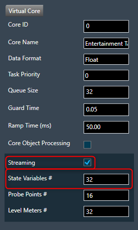
2.2.1.5.9.Streaming
You can stream live data from the device. The state variables which support streaming and polling are displayed in the state variable explorer tree with “Category” other than “Tuning”.

This feature needs a license to unlock. Please talk to the license administrator to get the license.
Configure Streaming
If you want to stream streamable state variable, then you can enable Streaming option.
To enable Streaming per core:
- Open the Device View and select the Virtual core layer of the device.
- Go the Virtual core properties, select the Streaming checkbox, and set a number of State Variables per core.
Maximum 32 state variables can be configured for streaming.
If you want to perform the operation using non-streamable state variables, then there is no need to enable these options
For more details about Streaming, refer to Streaming and Polling.
2.2.1.5.10.File Controller
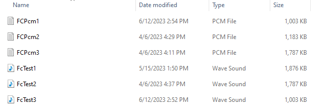
The File Controller allows you to send audio files from GTT to device. The file controller suports .wav and .pcm formats audio files.

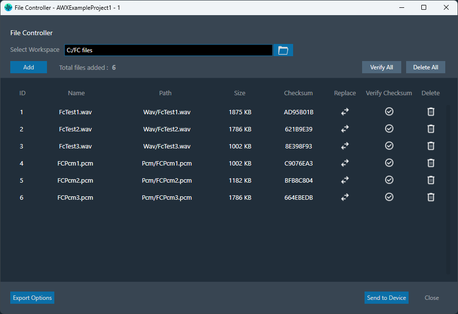
Following are the options available in file controller.
- Select Workspace
- Add Files
- Delete File
- Replace File
- Send to Device
- Verify Checksum
- Export Options
The file controller feature is available from W release onwards.
Select Workspace
The Select Workspace option allows you to browse and select workspace or root folder from the local directory. Once the folder is selected you can add the respective audio files.

Also, you can also copy & paste the path of your workspace folder in the “Workspace” field.

Add Files
Once workspace folder is selected, click on the “Add” to launch file browser. You can navigate to the respective folder and add audio files (.pcm/.wav) in file controller from the workspace folder.
The file browser will open the workspace folder by default.
After adding the files, following details of the files will be displayed in file controller.
- File ID: This ID is generated from GTT, it’s range from 1 to 254.
- File Name: If the file name is exceeding length of 15 characters (including file extension), GTT will trim it to 15 characters.
- Path: Relative path of file, based on workspace folder selected.
- Size: Size of the file in KB. If the file size is less than 1KB, the size will be displayed in bytes.
- Checksum: Checksum calculated using file content.

In case if you add any file from non-workspace folder, following prompt will appear.
- Copy: To create a duplicate copy of the file within your workspace folder.
- Move: To relocate the selected file to your workspace folder, removing it from their original location.
- Cancel: To stop the ongoing operation.

This facilitates the sharing of project files and files added to the file controller by ensuring that all files added to the file controller are present in the workspace folder.
The number of files added will be displayed in File Controller.
Maximum 254 files can be added in file controller.
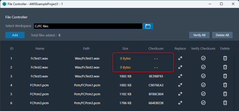
Once after adding files to file controller, on relaunching file controller if any file not found to load, the error is indicated by showing “0 Bytes” size and invalid checksum as below,
Delete Files
The file controller offers two ways to manage your files:
- Click “Delete All” to remove all files at once.
- Use the “Delete” button for each file to remove them individually.

The delete operation will delete file entry from file controller, not the file from file system.
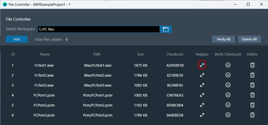
Replace File
You can replace file in the file controller. Click on the “Replace” button, this will open the file browser, allowing you to select the new file you wish to use.
Also, allows you to reuse file id for different file easily.
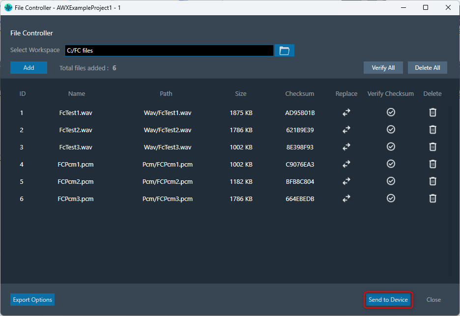
Send to Device
The “Send to Device” allows to send the loaded files in file controller to the device.
While sending files to device, file map will be sent to device first. File map contains metadata about the files being sent.
If it fails to send file map, the audio files will not be transferred to device.
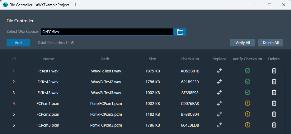
Verify Checksum
The “Verify Checksum” feature helps ensure you’re working with the correct files. The Verify Checksum option uses the file content checksum to confirm that a file with the same file ID is present on the device.
Use the “Verify All” button to check all files at once or the individual “Verify” button in each row for specific files.

Export Options
To export files from file controller, following options are available.
- Export File Map
- Export Audio Files
- Export All Files
These options will be displayed on clicking “Export Options” button.

Upon selecting any of these options, a folder browser will open allowing you to select the destination folder.
Export File Map: This option is to export filemap file and human readable filemap.

Export Audio Files: This option is to export audio files added in file controller.
Export All Files: This option is to export all files including filemap and human readable filemap.

Export & Import File Controller Data
The selected workspace and metadata of loaded files in file controller can be exported through project file (.gttd). This metadata includes file id, name and relative path of file. After importing the gttd file with file controller data, if the workspace folder is not found, files will be displayed with “0 bytes” Size and invalid checksum as shown below.

You can select workspace folder with same sub folder structure to automatically reload files loaded in file controller. The files should be present in same hierarchy and name.
2.2.1.6.External Endpoints
GTT allows external tools to interact with devices. The tuning of 3rd party audio objects can be done directly in GTT, or it can also be done from an external tool.

The requests from external tuning tools will come to GTT and GTT will forward these requests to the device. This is enabled through a WCF service endpoint that external tools can tap into.
To help external tools integrate with GTT, the GTT process hosts a WCF endpoint; external tools can connect to that endpoint and use the exposed APIs.
Refer the contact information mentioned in the latest release notes to get more details on “External third party tool” documentation and package.

Before proceeding with the following sections, it is understood that you have received 3 compressed zip files. It is recommended that you use these for integration purposes.
- HarmanReferenceTool.zip: This compressed folder contains an executable sample tool that you can run and verify the endpoint functionality. Unzip the HarmanReferenceTool.zip file, go to the HarmanReferenceTool\Release\net6.0-windows folder, and locate the ExternalTuningTool.exe. Run the exe to open Harman Reference Tool.

- ExternalToolCode.zip: This compressed folder contains visual studio solution for the sample tool. One can refer to this code to understand how the endpoint is accessed. Unzip the ExternalToolCode.zip file and locate the file under ExternalToolCode\ExternalTool.
- WcfServiceProxyLib.zip: This compressed folder contains a proxy library dll that should be referenced for integration with the GTT endpoint.
The “WcfServiceProxy.dll” is a .net dll which has the implementation of the client code for the endpoint hosted in the GTT.
Setup
GTT needs a minimum setup for external endpoints to function.
- Right-click on GTT launcher and click on the “Run as administrator” option.
For the external endpoint feature to work correctly, it is necessary to run GTT as an administrator.
- GTT should have an open project. Only external audio objects can be accessed from external tools.
Accordingly, the project must contain at least one external audio object within the signal flow. An external audio object is defined as an object with Class ID between 9000 and 9999. - GTT should be connected to the device. The device can be a virtual device or a physical board.
- Click on the Start/Stop button to start the External Endpoint. The same button works as a toggle switch to start and stop the endpoint.
A license is required to use this feature. Contact the solution management team to enable the feature.
- Once the endpoint is hosted, the 3rd party applications can use the proxy dll or write their own proxy to access the WCF endpoint. For more details about WCF proxy, refer to “About WcfServiceProxy.dll in the GTT Third Party Tool Integration User Guide.
Supported Features
Sending and Receiving Tuning Data
To support sending and receiving tuning data, the following methods are exposed.
- GetExternalAudioObjects: This method will return all the 3rd party audio objects in the device.
- SendTuningDataAsync: This method is used to send tuning data to audio object.
- ReceiveTuningDataAsync: This method is used for receiving tuning data from an audio object.
Sending and Receiving Control Data
To support sending and receiving control data, the following methods are exposed.
- SendControlDataAsync: This method should be used to send control data by mentioning the control id and control data.
The control data supports 16.16 format.
- ReceiveControlDataAsync: This method can be used for retrieving control data by providing the control id to the control elements to be read back.
Streaming Methods
GTT also supports streaming with the following methods.
- EstablishSocketConnection: This method must be called first in order for streaming to work. The third-party tool should first establish a socket connection and then make a call to the port number where it is listening. GTT will connect to that port. This is a socket connection.
- DisconnectSocketConnection: This method is used to unsubscribe all the subscriptions and close the socket connection.
- SubscribeForStreamDataAsync: This method is used to subscribe for stream data for an audio object.
- UnSubscribeForStreamData: This method is used to stop or unsubscribes the stream data.
To know more about all the API methods described above, refer to the API Reference section in the GTT Third Party Tool Integration User Guide.
External Tool Interaction
The following are the steps to integrate with GTT.
GTT will host the WCF endpoint at the following URI (http://localhost:8080/XtpHandlerService).
Steps to get started with the WCF service.
- Discover the service using this URL. Use the known tools like visual studio service reference tool or any 3rd party tools.
- Create a service reference for the same.
- Then using the service reference call the APIs for different operations.
Otherwise, developers can follow the “Third Party Tool Tuning Sequence Workflow” and “Third Party Tool Streaming Sequence Workflow” to write code to consume the endpoint hosted by GTT using the proxy library (WcfServiceProxy.dll) shared and explained in the GTT Third Party Tool Integration User Guide.
API References
GTT endpoint APIs definition and parameter details are provided in the GTT Third Party Tool Integration User Guide.
|
API: ExternalAudioObject API Function:
Description: This function will return all the audio objects that are used in the currently open signal flow in GTT. It returns only those audio objects which have Class ID between 9000 and 9999. Also, any audio objects that are listed in external category. |
|
API: SendTuningDataAsync API Function:
Description: This function will apply the data payload to the ExternalAudioObject passed into the function. |
|
API: ReceiveTuningDataAsync API Function:
Description: This function will retrieve tuning data from the ExternalAudioObject. |
|
API: SendControlDataAsync API Function:
Description: This function will send control data to the control id mentioned in the function. |
|
API: ReceiveControlDataAsync API Function:
Description: This function will get the control data from the control id that is passed into the function. |
|
API: EstablishSocketConnection API Function:
Description: This function will instruct GTT to connect to the socket connection listening at the port passed as parameter. The integrating application will create a socket connection and listen at a port and send this port id to GTT, so GTT can establish a connection and send stream data through the socket. |
|
API: DisconnectSocketConnection API Function:
Description: This function will instruct GTT to disconnect the previously established connection. The integrating application will close the socket connection. |
|
API: SubscribeForStreamDataAsync API Function:
Description: This function will create a subscription for data streaming of a particular state variable of the audio object mentioned at subblock/offset. This function can be used to subscribe for streaming of a particular data from audio object. Parameters include audio object, its subblock. There is an option to send the number of messages to be streamed per second and if the streaming data is to be retrieved before calc or after calc. All this needs to be supported by the audio object. Once the subscription is complete, the subscription id and status are returned to the object. |
|
API: UnSubscribeForStreamData API Function:
Description: This function will terminate the subscription that is currently running. GTT will stop the subscription that is started with the subscritionId passed as parameter. |
2.2.2.Devices List
The Devices section allows you to perform the following actions:
- Add a new device to the project.
- The Discover Device option allows you to discover connected physical or virtual devices and GTT will interact with the target device to obtain the device information available on the device.
- Display lists all the devices in a project.
- Provides options to remove the device from the project.

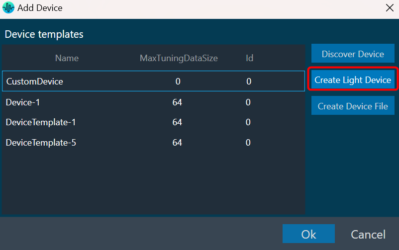
On the Device Designer tab, click on the (+) icon to add the device. This opens the Add Device dialog box.

On the Add Device, you can perform the following operations.
- The Add Device dialog box lists existing device templates available in GTT.
- You can add new device templates using any of the methods; Discover Device, Create Light Device, or Create Device File options.
- You can delete existing device templates if they are not used in a project.
- Custom Device is also listed in the Device template list as the first template. You can select a custom device and add it to the project like other templates.
GTT supports 1 custom device at a time as per the current design.
You can use any of the options to add a device template to the project.
- Discover Device: Click on Discover Device, if you have the preconfigured device template available and connected to the physical or virtual device.
- Create Light Device: Click on Create Light Device, if you want to create a new template.
- Create Device File: Click on the Device file, if you want to create a device file.
2.2.2.1.Discover Device
The Discover Device feature allows you to read and write the device configuration from or to the device.
This function allows you to read information from a device that is connected to the Global Tuning Tool. This information is used to create a device template that reflects the internal layout structure of the device, which includs its physical cores, virtual cores, and routing information from device input to virtual cores between virtual cores and core objects.
You can also write (download) your own configuration to the device using this feature.
Below are the few details which GTT will get from the device to construct the inner layout.
- Physical cores information.
- Core information.
- Core objects information.
- Device and Virtual Core Routing (For more details refers to Device Routing)
Below are the prerequisites to start a Discover a Device.
- Copy the flash file (device.flash) and the audio library xAFVirtualAmp.dll file available in AWXInstalledLocation/HarmanAudioworX/AudioFrameworkDLLs to your working folder.
- Launch IVP, open to “Advanced” settings, go to “Plugins” tab, and select the correct path to the xAFVirtualAmp64.dll.

Before using this feature, delete all the *.flash files from the working folder. IVP may crash, if it has the old tuning flash files.
Follow the below steps to discover a device:
- On Add Device window, click on Discover Device. The GTT will start to communicate with the target device, gather the device information, and add the device to the Devices templates.

The device identification feature is enabled for audio libraries version 13 and higher.
Only after you have completed the prerequisites the Discover Device feature function will work properly.
2.2.2.2.Create Light Device
Using the Create Light Device option, you can create a new template.
Follow the below steps to create a device template:
- On Add Device window, click Create Light Device. This opens the Add Device dialog box.
- Enter the details in the following fields and configure the device core type.

- Reference ID: Enter the reference ID of the template.
- Device ID: Enter the initial value of the Device ID field for the first device instance created out of that template Device template name.
- Device Name: Enter the device name.
- Brand: Enter the brand name required for legacy AA infrastructure.
- Family: Enter the family name required for legacy AA infrastructure.
- Number of Channels: Enter the number of channels supported by the device.
- Max Tuning Data Size: Enter the maximum count of bytes included in a single tuning data message.
- Communication Type: Select ID-based tuning or address-based tuning.
- IdBasedTuning –
- AddressBasedTuning –
- Core(s): Each device template exposes one or more physical cores.
For the xAF library before the O release: multiple cores from the given list can be selected.

For the xAF library from O release: Cores can be added/removed. Core types and Data-formats supported by xAF will be listed for configuring the core.

- Click Add Core, select core type and date format from the drop-down list, and then click Ok.
When the default xAF library version is < 15 (O dll), GTT displays a static set of core types with corresponding data formats.
Based on the default xAF library selected, you can add multiple cores, and two modes of core selections (Core Type and Date Formate) are available. Below is the example showing the available core type supported by respective xAF dll versions.


While configuring the core type of the device, if you want to remove any core, select the core, and click Remove Core.

- Click OK. The new template is added to the device templates list.
2.2.2.3.Create Device File
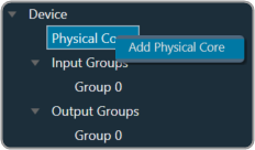
The GTT allows you to create a device flash file using Device File Editor (DFE) in a project. The device file is a combination of Physical Cores, Input Groups, and Output Groups.
Follow the below steps to create a device file:
- On Add Device window, click Create Device File.

This opens the Device File Editor window. The editor interface uses a tree-like structure to display items at each level and this structure is defined in the xTP specification. Furthermore, a Virtual Core will have Input and Output Groups as defined by the xTP specification. Each Input Group and Output Group have one group added by default.
By right-clicking on each item, a context menu will appear that will allow you to add or remove subtree items.

- Select Physical Cores and enter the hardware and software version.
There could be one or more Physical cores under a Device and each Physical core can have more than one virtual core inside it.

- Right-click Physical Cores and select Add Physical Core.
- Select Physical Cores 0You must specify the Core Type of Physical Core. When the default xAF library is set to O release or above, the supported xAF core-types will be listed or set the default value to ‘0’.

- Right-click on Physical Cores 0 and select Add Virtual Core.
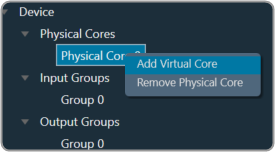
- Select Virtual Core 0, enter the Task Priority, and select the Date Format.
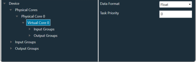
A Virtual Core is made up of Input and Output Groups. You can add one or more Physical Cores, and each Physical Core can have many Virtual Cores.It is important that you should specify the Core-type of the Physical Core, Data Format of Virtual Core, Device Input, or Output Group.
When the selected default xAF library is “O” release or above, the xAF supported data formats will be listed or the default value set to ‘2’.
- Expand Input Groups, select Group 0, and configure the respective properties. Similarly, expand Output Groups, and configure the Group 0. In order to allow routing from Device Input/Virtual Core to other Virtual Cores or Device Output Groups, select Connectable Cores and Connectable Device Output groups.
You can add multiple Group inside an Input Group.

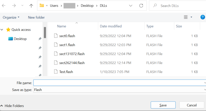
- Once all the configuration is done, click Save Device File. A save file dialog box appears, enabling you to save the flash file.
The flash file contain the information related to structure of the device like Device Id, hardware version, software version, input groups count (No. of input pins), output groups count (No. of output pins), physical cores count,
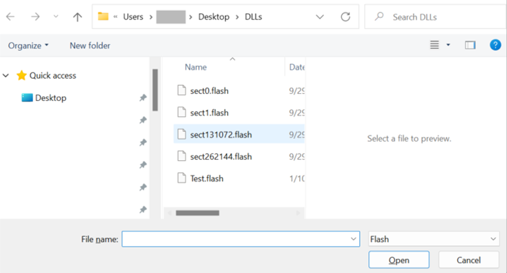
To view or modify an existing flash file, click Load Device File. The Device File Editor displays an Open file dialog box, selects the flash file, and clicks Open.
2.2.3.Core Objects Toolbox
The Toolbox contains the core objects that were retrieved from the xAF dll. The objects that can be used within the core to create the device signal flow are called core objects. Each core object has its own purpose and solves parametric issues which block routing within the core.
Core Objects are classes that are part of the Audio Core (virtual core) class and operate at a higher level than audio objects. The audio processing class itself is a core object. The relationship between core objects and Audio core is similar to that of audio objects and the Audio Processing class.
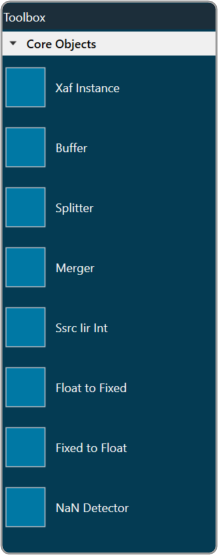
The execution order (or index) of the core object is displayed by Core Object Id. Routing determines the order in which core objects are executed within a core. The core objects that are connected to the core input will be executed first, and the core objects that are connected to the root object after that will be given the next execution order.
The device identification feature is enabled for audio libraries version 13 and higher.
2.2.3.1.Xaf Instance
The Xaf Instance is the core object inside which the signal flow for that instance can be created.

- Core Object Id (execution order of core-object with-in core) and Instance Id (index of xAF instance with-in core, based on execution order) will be displayed as read-only fields.
- The sample rate and block length of the instance will control signal flow within the instance. You can change the sample rate and block length of the instance in the properties section.
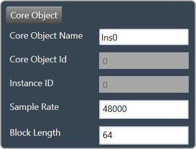
Further information on signal flow creation is available in the GTT Signal Flow Designer guide.
2.2.3.2.Buffer
Buffer core object is used to convert the input block length into the required output block length. The buffer core object has an equal number of input and output channels. It can be used as a pass through core object OR it can be used to, as its name suggests, buffer samples from the input to the output. The object does not change the sample rate (it is the same at the input and the output).

If you want to connect two core objects with different block lengths, you can use a buffer core object. As a result, the input block length will be the Block Length of the first core object, and the output block length should be the Block Length of the other core object.

It can be configured as follows:
- If the input block length is equal to the output block length, then it behaves as a pass through object (so you could have an audio core with a buffer object to connect the core input to the output)
- Input and output block lengths must be integer multiple of each other
- When input and output block lengths are not equal, the object handles taking in input at a lower block length and outputting it at a higher one and vice versa. For example, it facilitates the connection of an object at block length 32 to an object at block length 64
Introducing this object into your signal flow for any case but pass through WILL result in latency at the output.
2.2.3.3.Splitter
Splitter core object is used to convert one input to multiple outputs of the same sample rate and block length.

- This core object always has a single input.
- In order to make routing from any core object to the splitter both the source core object and splitter core objects sample rate and block length should match.
- Number of output channels for the splitter is configurable.

It is not to be confused with the Splitter audio object.
This object operates in parallel to an xAF instance NOT within it.
2.2.3.4.Merger
Merger core object is used to merge multiple inputs into a single output of the same block length and sample rate.

- This core object always has a single output.
- In order to make routing from any core object to merger both the source core object and merger core objects sample rate and block length should match.
- Number of input channels for the merger is configurable.

It is not to be confused with the Merger audio object.
This object operates in parallel to an xAF instance NOT within it.
2.2.3.5.Ssrc lir Int
Synchronous Sample Rate Converter (SSRCs) is used to convert the input sample rate to the required output sample rate.
SSRCs are core objects that can operate within an audio core. Currently there is one implementation of SRCs in Awx.

Two options are provided to convert the sample rate. Both these options are mutually exclusive.
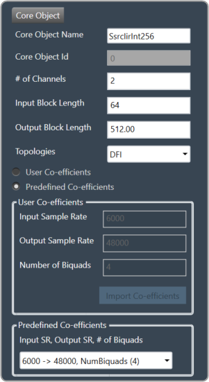
IIR Integer Multiple SSRC
This core object implements a synchronous sample rate converter whose input sample rate / input block length and output sample rate / output block length are integer multiple of each others. This is also an infinite impulse response implementation (IIR).
The object operates in one of 2 modes:
- User Coefficients mode
- Predefined Coefficients mode
Before we get into the details, there are some common configuration parameters between the two.
- The input block length needs to be set by the user.
- The Biquad filter topology. Currently 2 topologies are exposed.
- Direct Form I
- Direct Form II
User Coefficients mode: In this mode, the user has to provide the input and output sample rate. Input and output sample rates should not be equal. The Number of Biquads field is read-only.
User has to import the coefficients by clicking on the button “Import Co-efficients”. Based on the number of coefficients in the file, the Number of Biquads is updated.
Validations for User Coefficients mode: The Input and Output sample rates cannot be the same. Validation is shown when the same values are entered.
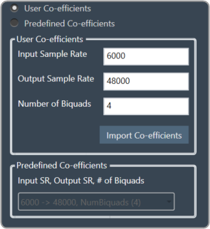
After adding a new “Ssrc lir Int” object and selecting “User Coefficients Mode”, if the coefficients are not imported, the following message will be displayed on various operations such as “Save”, “Edit Device”, “Copy Core Objects” and “Paste Core Objects”. After importing coefficients, the user can perform the required operation.

Predefined Coefficients mode: In this mode, the xAF dll is used to read the input sample rate, output sample rate, and the number of biquads. When a value in the combo box is selected, the xAF dll is also used to fetch the corresponding coefficients.
Biquad Co-efficient has to be re-imported whenever the mode is switched between Predefined Co- efficient mode to User Co-efficient mode.
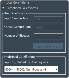
For these pre-defined coefficients, the quality measures are as follows:
- Signal to noise ratio: 80 dB
- Total harmonic distortion: 2e-3f
- Spurious free dynamic Range: 59 dB
- Total harmonic distortion plus noise: -60 dB
- Frequency response flatness: 3 dB
Output block length (Displayed as a read-only field) = (Output sample rate /Input sample rate) * Input block length.
2.2.3.6.Float to Fixed
Float to Fixed core object accepts audio buffers that are in floating point format and outputs buffers that are in fixed point format (16-bit, 24-bit, 32-bit etc).

- # of Channels is configurable. No of Input channels = No of Output channels
- The user can configure the scalar value to indicate what fixed point format is required. This scalar value is multiplied by the floating point input samples to convert them to fixed point.
For example, to convert from float to 32 bit fixed point, this scalar value must be:
(1 << (32-1) – 1) = 2,147,483,647 - In order to make routing from any core object to Float2Fixed object both the source core object and Float2Fixed core objects sample rate and block length should match.
Float To Fixed core object is enabled for audio libraries version 16 and greater.

2.2.3.7.Fixed to Float
Fixed to Float core object accepts audio buffers that are in fixed point format (16-bit, 24-bit, 32-bit, etc) and outputs buffers that are in floating point format.

- # of Channels is configurable. No of Input channels = No of Output channels.
- The user can configure the scalar value to suit the fixed point format of the input samples. The reciprocal of this scalar value is multiplied by the fixed point input samples to convert them to floating point.
For example, to convert from 32 bit fixed point to float, this scalar value must be:
(1 << (32-1) – 1) = 2,147,483,647 - In order to make routing from any core object to Fixed2Float object both the source core object and Fixed2Float core objects sample rate and block length should match.
Fixed To Float core object is enabled for audio libraries version 16 and greater.

2.2.3.8.Nan Detector
The NaN (Not a Number) detector core object detects NaN from input samples and informs the platform using an xTP command if NaN is found. The xTP command will inform about the core id, core object instance id and channel index, so that platform can react accordingly by muting or resetting states. The input samples are copied to the output without doing any other processing. The number of output channel(s) is always same as the number of input channel(s).

- # of Channels is configurable. No of Input channels = No of Output channels.
- Block length and Sample rate are configurable.
- The number of input channels is user configurable and ranges from 1 to 255.
- This core objects’ block length and sampling rate are the same at both input and output side.
- Block length is configurable in the range of 4 to 4096 samples.
- Sample rate is configurable in the range of 8 kHz to 192kHz.
In order to make routing from any core object to NaN Detector, both the source core object and NaN Detector core objects sample rate and block length should match.
NaN Detector core object is enabled for audio libraries version 19 and greater.
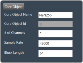
2.2.3.9.Core Objects Validation
When the GTT is loaded with a version of the xAF library lower than 13. If a user tries to open a device view that contains core objects other than a XAF instance, they will see the following error message.
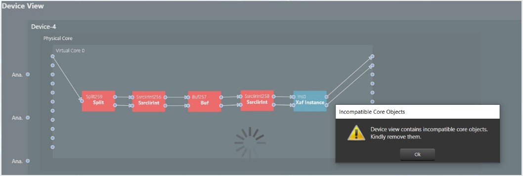
Aside from the Xaf instance, every other core object will be red.
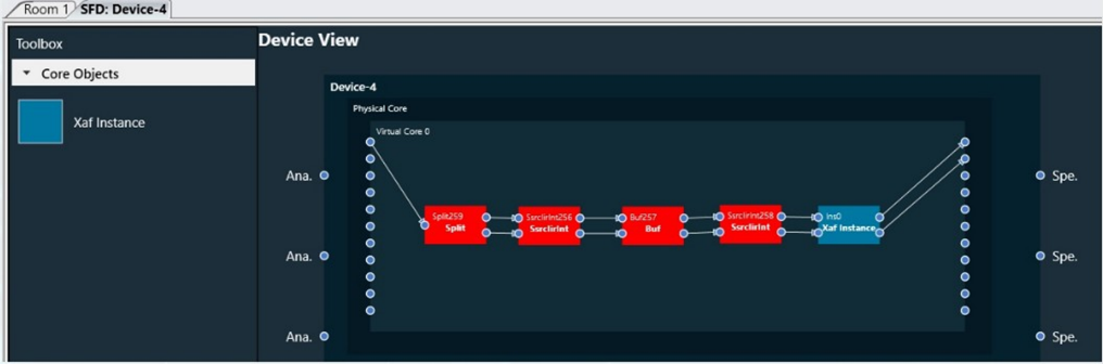
2.2.4.Device Operations
This section explains the device operation features available at the bottom of the Device Designer workspace.

2.2.4.1.Load Device Config
When there are no core objects in the cores, the Load Device Config option is enabled. The Physical Cores and Virtual Cores (available within a Physical Core) as well as their connection points that were fetched from the target during device discovery are visible after the device has been loaded. Since they are read from the device, the number of virtual cores and their connection points cannot be changed.
You can connect core objects by dragging them onto the virtual cores. Alternatively, you can select the “Load Device Config” option, which will read the target’s device routing information as well as the layout and routing between core objects and display it on the GUI.
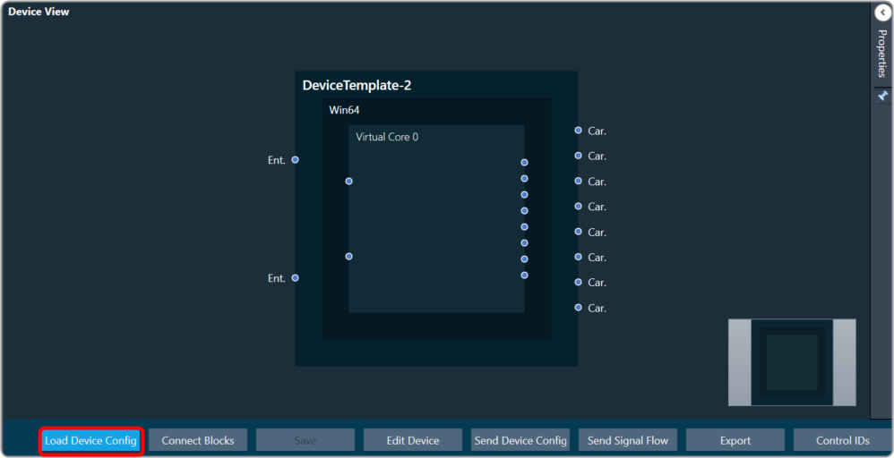
In the device view, a property section has been added to display and change the properties of chosen Core or Core Objects. When the virtual core or core object is selected, their respective properties are shown on the screen.
If you don’t clear the device view first, you won’t be able to save or access SFD.
The device identification feature is enabled for audio libraries version 13 and higher.
2.2.4.2.Connect Blocks
You can auto-connect selected devices, cores, and core objects using Connect Blocks.
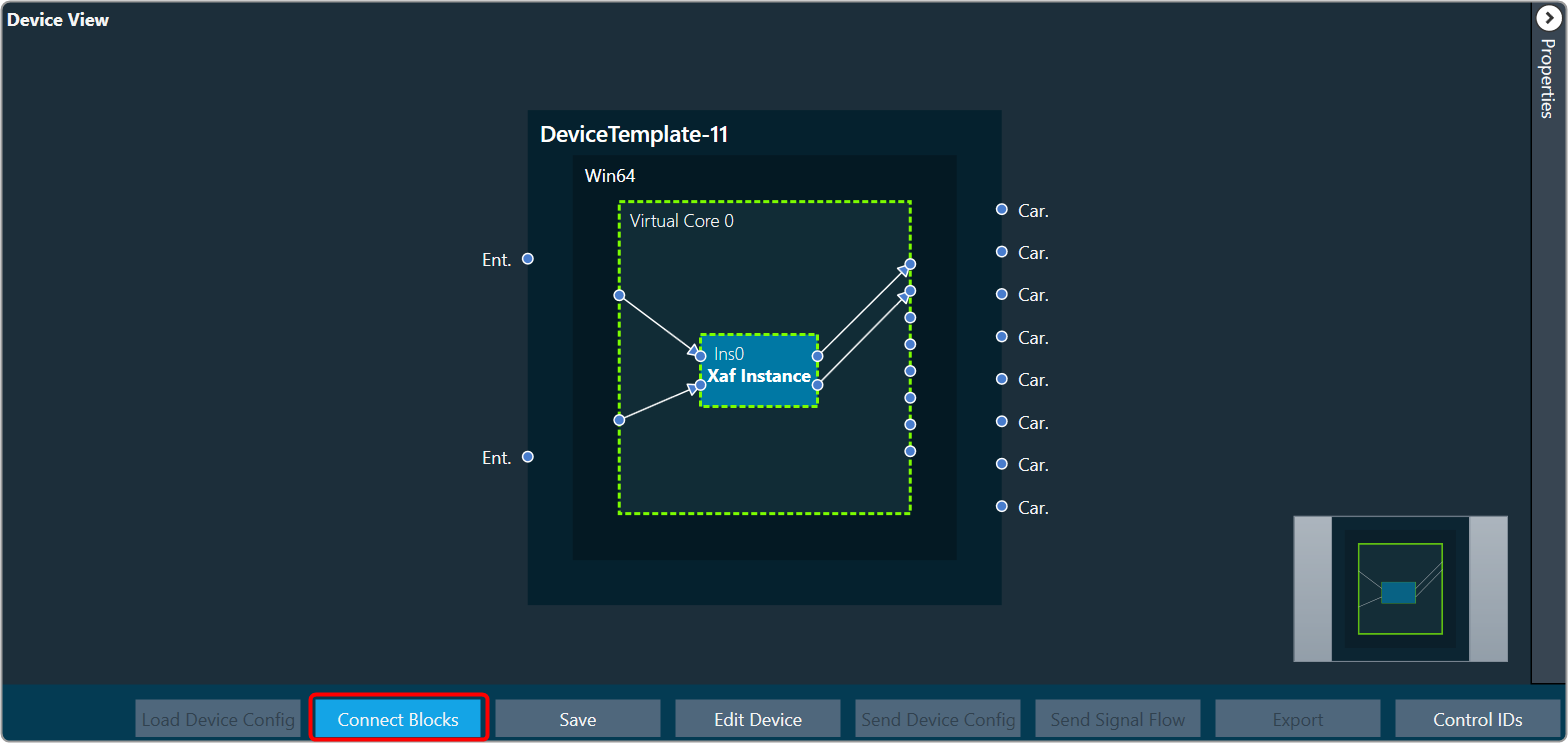
Choose at least two cores and click Connect Blocks.
You can auto-connect the following components.
- Device – Virtual Core(s)
- Virtual Core(s) – Virtual Core(s)
- Virtual Core – Core Objects (within selected Virtual Core)
- Core Object(s) (within same Virtual Core)
2.2.4.3.Edit Device
In Device File Editor you can modify the device configuration, then perform “Save Device Template” or “Update Device” operation.

2.2.4.4.Send Device Config
You can create your own configuration and write this configuration to the target device. The Send Device Config option sends the device configuration (Core Objects, Device Routing, and Virtual Core routing) to the target device.
Before sending the device configuration, all the input and output connection points of the core objects must be connected. If any of the pins are not connected, an error message is displayed.

The Device view (number of Cores, Physical Cores, Connection points, Sample Rate, and Block Length) inside GTT and the data inside the Device. The flash file on the target should match before Sending the Device configuration. If the data doesn’t match then the below transmission error is seen
The data in the device view (number of cores, physical cores, connection points, sample rate, and block length) and the data in the device. The flash file on the target device should match before the device configuration is sent. If the data doesn’t match, you will see the transmission error.

If any changes are made to the configuration, the send device config must be completed before sending the signal flow.
The device identification feature is enabled for audio libraries version 13 and higher.
Feedback Loop
In the device view, feedback connections are allowed. You can connect the output of any core object as input to any other core object.
Core object Id defines the order of execution of core objects. Execution order of any core object depends on the IO dependency. IO side dependency is not considered when there are feedback loops.
Self-loop is not supported as feedback.
In the image, connection highlighted in green color is a feedback connection.
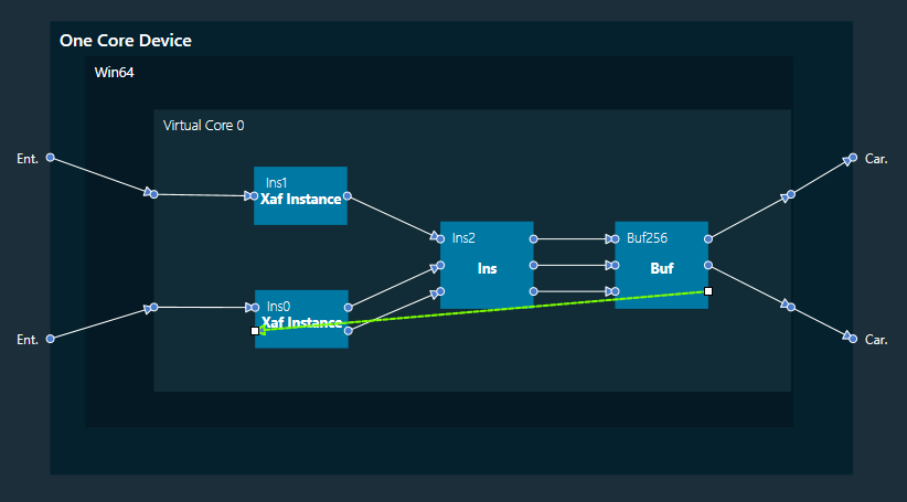
2.2.4.5.Send Signal Flow
The Send Signal Flow option sends the configuration of the signal flow design to the target device. You can also use this to test how the target device responds to specific test signals. In a test scenario, you can configure specific test signals and send them to the amplifier.

2.2.4.6.Export
Using the Export option in the device view, you can export the device configuration data and the signal flow design details.
*.Core files would be created for each Virtual Core available in the device. One *.route file will be created for Device routing data. One .mcd file will be generated for master control data and one .SFD file will be generated per instance per core.
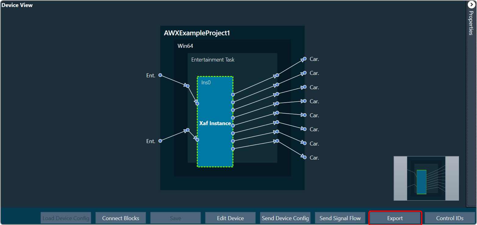
- One core file per virtual core in the signal flow.
- The core objects within the virtual core.
- The routing within those objects.
- The destination of the output pins of the virtual core.
- One signal flow file per xAF instance.
- This is the same legacy file.
- One input device routing file.
- This basically describes how the device input buffers are connected to the virtual cores and/or the device outputs.
2.2.4.7.Control IDS
The Control IDs are used to configure Custom Control IDs. Users can add, edit, export, and import Custom Control IDs data.
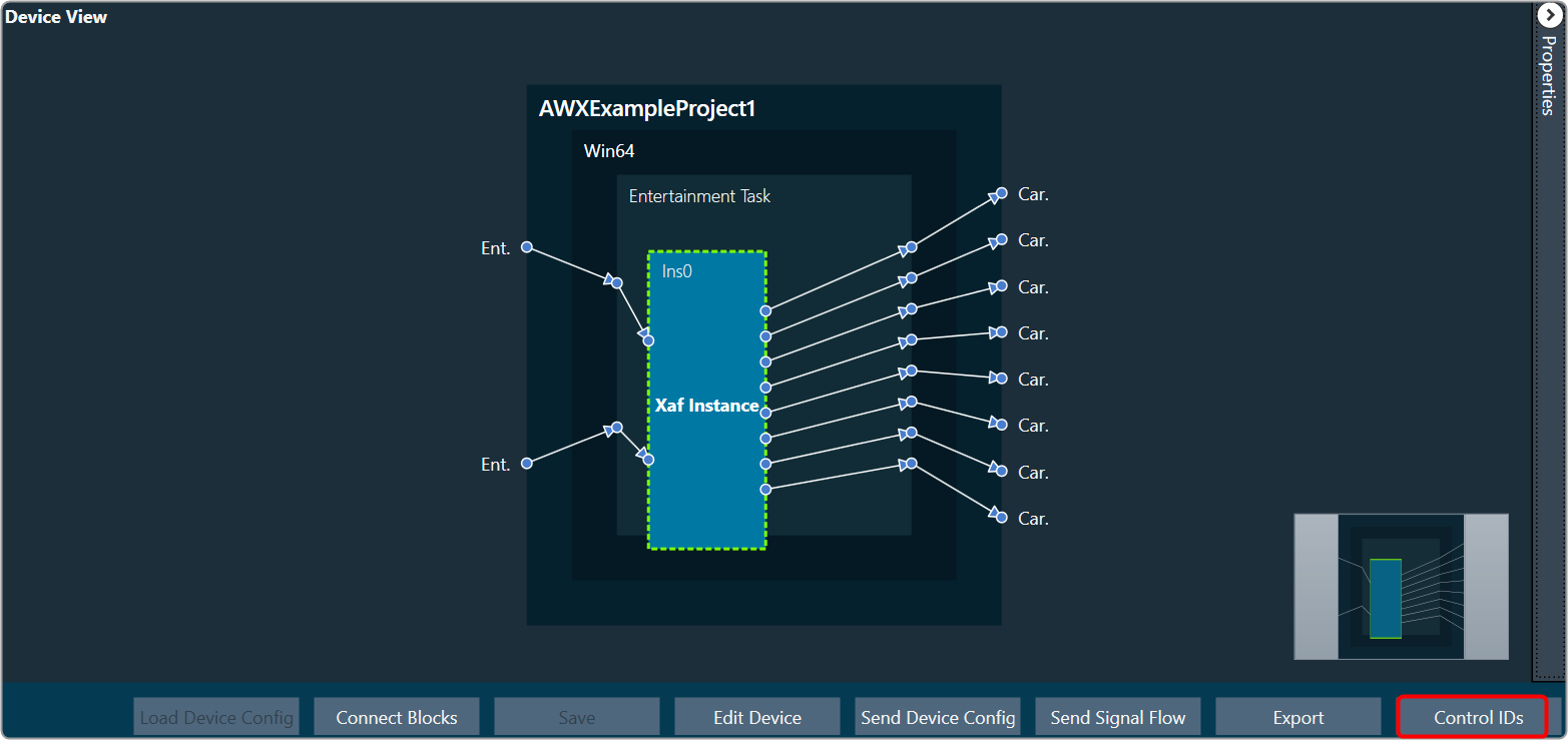
To open the Control IDs
- On the Device View, click on the Control IDs. This opens the Custom Control IDs configuration window.
The Custom Control IDs window shows all the custom control ID details.

To add the custom control ID
- On the Custom Control IDs panel, click on Add. This opens the Add Control Signal window, where the user can enter the details of the new custom control.
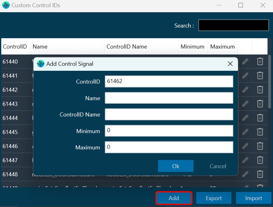
You need to enter details in all fields. The maximum value of control should be greater than the minimum value. The Control ID range should be between 61440 to 65535. - Click OK to save the custom control id details.
To edit the custom control ID
- On the Custom Control IDs panel, click on the Edit icon. This opens the Edit Control Signal window, where the you can update or change the custom control details.

- Click OK to update the custom control id details.
To delete the custom control ID
- On the Custom Control IDs panel, click on the Delete icon. This deletes custom control and also removes its associated data.
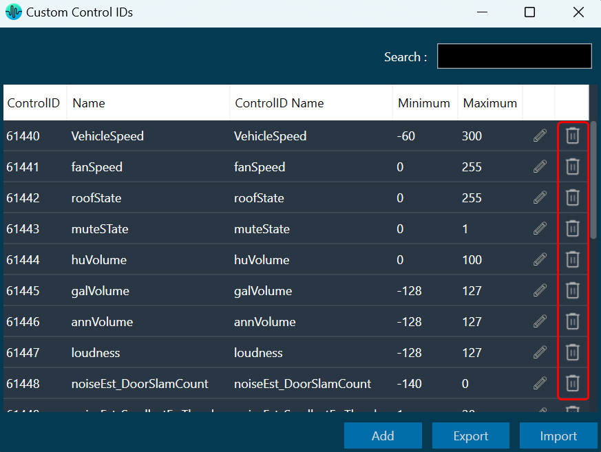
To export the custom control ID
Using the export option, all custom control data can be exported in the provided destination directory with the file extension *.csv.
- On the Custom Control IDs panel, click on Export. This opens the file directory.

- Navigate to the desired location and click Save to export the file.
To import the custom control ID
Using the import option, all the custom control data can be imported to GTT.
- On the Custom Control IDs panel, click on Import. This action opens the file directory.

- Navigate to the file location and click Open to import the file.
This action will import all the custom control pins from the file (with *.csv extension) in the custom control list.
A message will appear if the file is invalid or does not contain the required data.

If GTT contains custom control IDs, it will ask for confirmation whether the user wants to overwrite them.
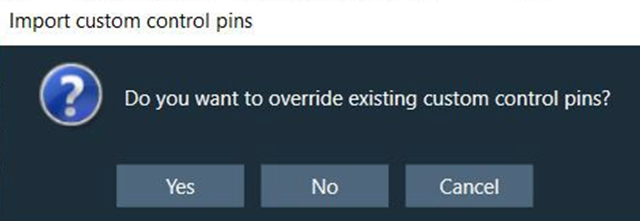
An error message will be displayed if the import file contains duplicate control IDs.

2.2.5.Properties Panel

- Class Name: Display type of device and this property is read-only,
- Audio Library Version: Display the audio library version used in the selected device. You can change the audio library version. On the property panel, click on the audio library version, select the desired audio library version, and click save.

If a device has a signal flow with audio objects created in an older version, compatible audio objects will upgrade automatically. Non-compatible audio objects in Signal Flow Designer will be highlighted in blue or displayed as a warning in the compiler; these audio objects can be upgraded using the audio object context menu.In the following cases device association with a dll cannot be changed.- If a device’s signal flow is open.
- If you have a monitoring window open, such as a streaming or profiler window.
A change in dll association for one device has no effect on other device instances.
- Device Id: Enter the ID of the selected device. Make sure the device ID should be unique.
- Node Address: The Node address of the selected device. Each device has a unique node address assigned to it.
- Name: Name of the device.
- MaxTuningDataSize: Maximum tuning data.
- System Context: Set the system context Init or Runtime.
2.2.6.Device View
The Device View is used to view and modify detailed information and settings for a specific device. Double-click on the desired device from the list to open a device template in the Device View.

Device Object Properties
A device is a combination of four layers: Device Layer, Physical Layer, Virtual Core Layer, and Core Object Layer. When you select any of the layer, you will see the properties of the selected layer on the right side.
Device Layer: Device layer properties include Device Name, Hardware, and Software version.
Device layer properties are not editable.

Physical Core Layer: Physical Core layer properties include Physical Core Name, Physical Core Type and MIPS.
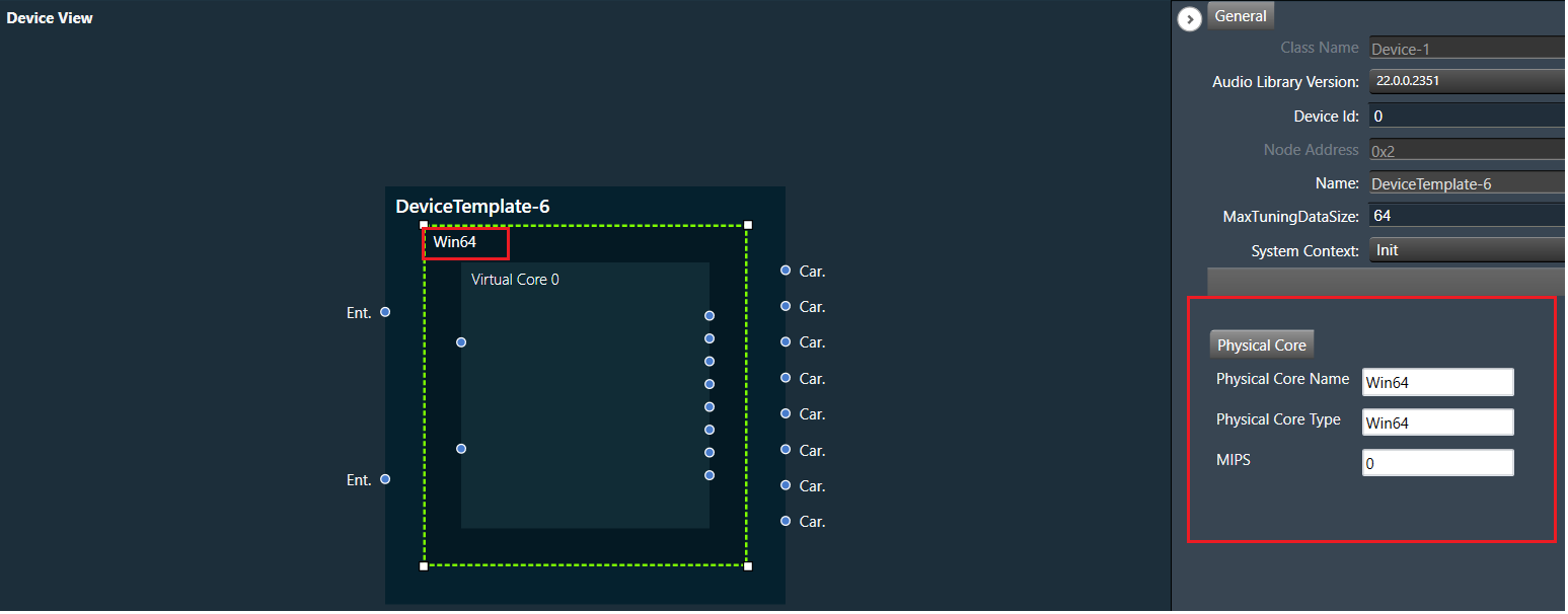
The “Physical Core Name” property in the Physical Core layer properties can be changed, but the “Physical Core Type” and “MIPS” properties are non editable.
By default, the “Physical Core Name” property value is same as the “Physical Core Type”. If you want to change the physical core name, enter the value for “Physical Core Name”, the updated in the Physical Core layer value will be reflected in the device view, then click on save button to save the changes.
Only from the Device File editor window, you can update Physical Core Type.
If you keep the Physical Core Name field empty, GTT will ask you enter the valid name for “Physical Core Name”.

Virtual Core Layer: Virtual Core layer includes the following properties:
- Core Id: Display the core id.
- Core Name: Display the core name.
- Data Format: Display the date format type.
- Task Priority: Display the date priority value.
- Queue Size: Size of message queue
- Guard Time: Time to avoid message processing as percent of interrupt time.
- Ramp Time (ms): Duration between two processing state (in ms), when Core Object processing state is enabled.
- Core Object Processing State: Enable or disable processing state for Core objects in core.
- Streaming: Enable or disable streaming. Enabling steraming option allows you to set “Set Variables”, “Probe Points “, and “Level Meters”.

Queue Size and Guard Time will be supported only for Devices with audio library version “O” release and above or “M+2” release and above.
Enable Core Object Processing State and Ramp Time will be supported only for Devices with audio library version “O” release and above.
Processing state for Core objects will be applied only if Enable Core Object Processing State was enabled before Send Device Configuration.
Enable Probe Points and the Number of Probe Points will be supported only for Devices with audio library version S release and above.
Core Object Layer: Each core object has different properties. For more details refer to the ToolBox.

Magnifier options

- Fit to Window: Click on this button will change the current view to the size of your device view window.
- Zoom to 100%: Click on this button will return the view to 100% zoom.
- Zoom In: Click on this button (+) to zoom in for gradual increments.
- Zoom Slider: Slide to the desired percentage zoom setting.
- Zoom Out: Click on this button (-) to zoom out for gradual decrement.
2.3.Panel Designer Overview
The Panel Designer comprises of various features, that offer you a thoughtfully designed, clean, and easy-to-use workspace. Using Panel Designer, you can quickly create a custom panel with all the elements you need and link the panel with a desired audio object. Let us have a look at some of the components of the Panel Designer workspace.
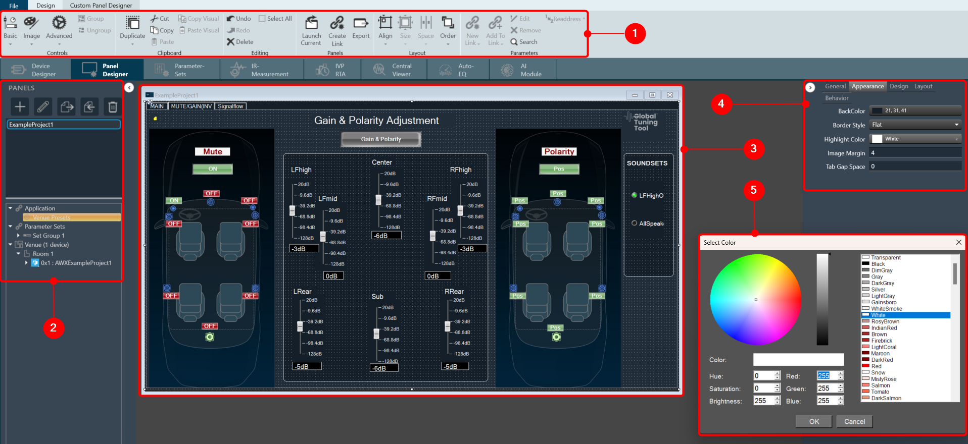
- Panel Designer Ribbon: The Panel Designer ribbon contains tools for designing and editing the custom panel. The ribbon is divided into the following groups: Tools, Current Panel, Controls, Clipboard, Editing, Layout, and Parameters.
- Panels View: The Panels view in Panel Designer displays all the custom panels and allows you to create, delete and import the custom panels. In addition, you can access the Venue Explorer to view available Device(s), Applications, and Parameter Sets.
- Custom Panel Properties View: The Properties view displays the properties of each component used to design the custom Panel and also allows you to customize the Panel to meet your needs. The Properties view is displayed on the right-hand side of the screen.
- Designer Workspace: You can use various tools available in the Toolbox to create a custom panel in the Designer workspace.
- Editor Windows: In the Properties view you can customize the Panel using various editour windows. These editour windows are mapped with corresponding properties.


2.3.1.1.1.Basic
The first toolset is a group of basic design tools. The tools are grouped into the following toolset.

2.3.1.1.1.1.Text Display
A text display is a dynamic text control on a Custom Panel that can be linked to the value of a specific device parameter. It shows the control value as it changes, much like a text box, but cannot be changed by the user.
Use either the Text Label or Note control to add static text to a Custom Panel.
A Text Display control can be managed in the Custom Panel designer and, once the Custom Panel is activated, viewed (but not changed) by the end user.
- Unlinked (Static) Text: If a label is not linked to a control, the text does not change on the control but is merely the default text as defined in the text attributes. Once another control is linked, the value is overridden by the parameter value.
- Linked (Updating) Text: If a label is linked to a control, on the activated Custom Panel it will reflect the value of the control as it changes, much like a text box. However, the value cannot be changed by the user.
Once a label is linked to a control, you can add a label showing the parameter address of the label.
| Properties Type | Options |
|
General
|
Control Info: Shows control type.
|
Locked: Specifies if the control is locked out so that it cannot be moved or re-sized.
|
|
|
Parameters
|
Address: Enables panel designer to edit addressing information with the added benefit that the values can be validated as a group before being applied to the device. This editor also allows the user to assign multiple parameters to the control.
|
Information: Shows information about the Parameter Address.
|
|
|
Appearance
|
Location: Control location (in pixels) of the control on the Custom Panel. Change X (horizontal) and Y (vertical) values in relation to upper left corner. You can also drag the control to a different location |
| Size: Control size (in pixels). Change width and height values. You can also re-size the control manually. | |
| Background Image: Background image of the control. | |
| Background Color: Background color of the control. | |
Paint Style: Background paint style of the control.
|
|
| Gradient Color Start: Beginning gradient color if gradient is selected in Paint Style. | |
| Gradient Color End: Ending gradient color if gradient is selected in Paint Style. | |
Gradient Mode: Type of gradient fill if gradient is selected in Paint Style.
|
|
|
Border Color: Border color of the control. Brings up the Select Color window.
|
|
Border Style: Click to select border style.
|
|
|
Text Attributes
|
Text: Enter the text for the Text Display.
|
Text Font: Click on “…” to select desired font. Brings up a Font Select window.
|
|
Text Color: Text color of the control.
|
|
Text Alignment: Alignment of the label text.
|


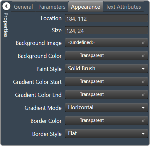

2.3.1.1.1.2.Text Label
A text label is a static text control on a Custom Panel. It is text only, cannot be linked to a device parameter, and is not interactive for the user.
Text Label controls can be managed in the Custom Panel designer and, once the Custom Panel is activated, viewed (but not changed) by the end user.
| Properties Type | Options |
|
General
|
Control Info: Shows control type.
|
Locked: Specifies if the control is locked out so that it cannot be moved or re-sized.
|
|
|
Appearance
|
Location: Control location (in pixels) of the control on the Custom Panel. Change X (horizontal) and Y (vertical) values in relation to upper left corner. You can also drag the control to a different location |
| Size: Control size (in pixels). Change width and height values. You can also re-size the control manually. | |
| Background Color: Background color of the control. | |
| Background Image: Background image of the control. | |
Paint Style: Background paint style of the control.
|
|
| Gradient Color Start: Beginning gradient color if gradient is selected in Paint Style. | |
| Gradient Color End: Ending gradient color if gradient is selected in Paint Style. | |
Gradient Mode: Type of gradient fill if gradient is selected in Paint Style.
|
|
|
Border Color: Border color of the control. Brings up the Select Color window.
|
|
Border Style: Click to select border style.
|
|
|
Text Attributes
|
Text Line: Enter the text for the Text Label.
|
Text Font: Click on “…” to select desired font. Brings up a Font Select window.
|
|
Text Color: Text color of the control.
|
|
Text Alignment: Alignment of the label text.
|

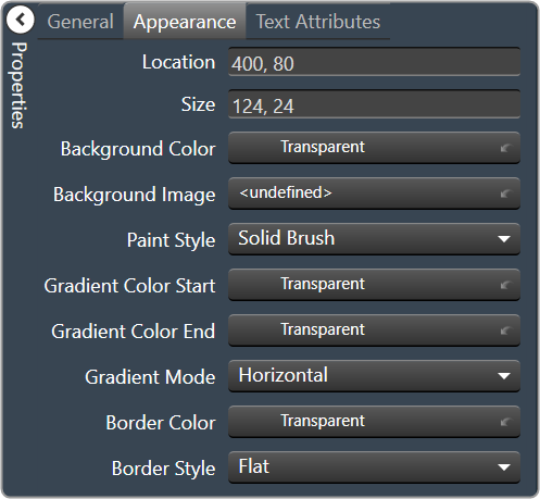
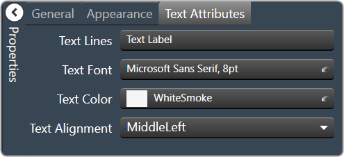
2.3.1.1.1.3.Text Box
A text box allows the user to specify the exact value of a device parameter by typing it in rather than running through a long list of values. In tablet mode, a keypad loads when a text box is selected.
Controls can be managed in the Custom Panel designer and, once the Custom Panel is activated, utilized by the end user. This control must be linked to a parameter to function properly.
| Properties Type | Options |
|
General
|
Control Info: Shows control type.
|
Locked: Specifies if the control is locked out so that it cannot be moved or re-sized.
|
|
|
Parameters
|
Address: Enables panel designer to edit addressing information with the added benefit that the values can be validated as a group before being applied to the device. This editor also allows the user to assign multiple parameters to the control.
|
Information: Shows information about the Parameter Address.
|
|
| Rest Text: Optional text to display in right click context popup | |
|
Appearance
|
Location: Control location (in pixels) of the control on the Custom Panel. Change X (horizontal) and Y (vertical) values in relation to upper left corner. You can also drag the control to a different location |
| Size: Control size (in pixels). Change width and height values. You can also re-size the control manually. | |
| Background Color: Background color of the control. | |
|
Border Color: Border color of the control. Brings up the Select Color window.
|
|
| Tool Tip Text: The text of the Tool Tip. | |
| Tab Index: If tab stop is checked, determines the position of the control in the tab order. | |
Tab Stop: Specifies whether the control appears in the tab order.
|
|
|
Text Attributes
|
Text: Enter the text for the Text Display.
|
| Maximum Length: Maximum text input length. | |
Text Alignment: Alignment of the label text.
|
|
Text Font: Click on “…” to select desired font. Brings up a Font Select window.
|
|
Text Color: Color of the text on the control.
|
|
Value Format: The number format used when displaying the value.
|
|
Text Border Style: Style of control border.
|
|
| Banner Scroll: Check this box to scroll the text. | |
| Banner Scroll Speed: The speed at which the text should scroll. Select between Slow, Medium, or Fast |

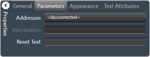

2.3.1.1.1.4.Fader Horizontal
A Fader Horizontal is an adjustable horizontally-positioned fader control that manipulates a device parameter.
Controls can be managed in the Custom Panel designer and, once the Custom Panel is activated, utilized by the end user. This control must be linked to a parameter to function properly.
| Properties Type | Options |
|
General
|
Control Info: The control type.
|
Locked: Specifies if the control is locked out so that it cannot be moved or re-sized.
|
|
|
Parameters
|
Addresses: Enables panel designer to edit addressing information with the added benefit that the values can be validated as a group before being applied to the device. This editor also allows the user to assign multiple parameters to the control. Click to select Parameter Address Editor.
|
Information: Shows information about the Parameter Address.
|
|
Maximum: Maximum parameter value.
|
|
Minimum: Minimum parameter value.
|
|
| Reset Text: Optional text to display in right click context popup. | |
|
Appearance
|
Location: Control location (in pixels) of the control on the Custom Panel. Change X (horizontal) and Y (vertical) values in relation to upper left corner. You can also drag the control to a different location |
| Size: Control size (in pixels). Change width and height values. You can also re-size the control manually | |
| Background Image: Brings up the Select Background Image window | |
| Background Color: Background color of the control | |
| Tool Tip Text: The text that appears on control mouse-over | |
| Tab Index: Determines the position of the control in the tab order | |
Tab Stop: Specifies whether the control appears in the tab order.
|
|
|
Fader Cap
|
Fader Cap Image: The image displayed for the fader cap.
|
| Fader Cap Size: How large the fader cap will be | |
| Arrow Box Width: The width of the arrow box in pixels | |
| Vertical Offset: The vertical offset of the fader cap, in pixels, from the fader channel | |
| Horizontal Offset: The horizontal offset of the fader cap, in pixels, from the fader channel | |
| Hot Spot: Sets mouse sensitivity to the fader cap or the entire length of the slider | |
|
Channel
|
Channel Color: Color of the fader channel
|
| Channel Width: Width of the fader channel in pixels | |
| Channel Start: Distance, as a percentage of length, from the bottom or left edge to where the fader channel will start | |
| Channel End: Distance, as a percentage of length, from the bottom or left edge to where the fader channel will end | |
| Channel Center: Distance, as a percentage of width, from the bottom or left edge to where the fader channel will be located | |
|
Scale
|
Display Tick Marks: Option to display the tick marks of the control. Must be set to true for custom ticks to display.
|
| Number of Major Ticks: How many major ticks are displayed | |
Custom Ticks: Option to display custom tick values by utilizing the scale editor.
|
|
| Display Tick Values: Option to display the tick values. | |
| Value Format: Allows you to format the tick values. | |
| Major Tick Color: The color of the major tick. | |
| Major Tick Length: The length of the major tick. | |
| Number of Minor Ticks: How many minor ticks are displayed. | |
| Minor Tick Color: The color of the minor tick. | |
| Minor Tick Length: The length of the minor tick. | |
| Tick Location: The location of the tick marks relative to the fader channel. | |
| Font: The font for the ticks. | |
Labels Inside: Whether labels are drawn between tick marks and fader channel or not.
|
|
Labels Vertical: Whether labels are displayed vertically or horizontally.
|
|
| Label Margin: The amount of space, as a decimal fraction of the width of the control, between the center channel and the tick marks | |
|
Nudge Button
|
Nudge Button Location: Location of the nudge buttons.
|
Nudge Type: Determines, with the increment amount, how much the control will adjust when a nudge button is pressed.
|
|
| Increment Amount: Determines with the nudge type; how much the control will adjust when a nudge button is pressed. | |
| Nudge Button Separation: Distance in pixels from the edge to the nudge button | |
|
Up Image: The static image for the “up” nudge button. Click the button to select a new image. |
|
|
Up Pushed Image: Image that displays when the “up” nudge button is pushed. Click the button to select a new image. |
|
|
Down Image: The static image for the “down” nudge button. Click the button to select a new image. |
|
|
Down Pushed Image: The image that displays when the “down” nudge button is pushed. Click the button to select a new image. |
|
|
Popup Value
|
Popup Value Position – Fraction: The location of the popup value as a decimal fraction of the width (X) and height (Y) of the control |
Display Popup Value: Displays the value of the control in a popup, if set to true.
|


2.3.1.1.1.5.Fader Vertical
A vertical fader is an adjustable vertically-positioned control that manipulates a device parameter.
Controls can be managed in the Custom Panel designer and, once the Custom Panel is activated, utilized by the end user. This control must be linked to a parameter to function properly.
| Properties Type | Options |
|
General
|
Control Info: The control type
|
Locked: Specifies if the control is locked out so that it cannot be moved or re-sized.
|
|
|
Parameters
|
Addresses: Enables panel designer to edit addressing information with the added benefit that the values can be validated as a group before being applied to the device. This editor also allows the user to assign multiple parameters to the control. Click to select Parameter Address Editor.
|
Information: Shows information about the Parameter Address.
|
|
Maximum: Maximum parameter value.
|
|
Minimum: Minimum parameter value
|
|
| Reset Text: Optional text to display in context popup | |
|
Appearance
|
Location: Control location (in pixels) of the control on the Custom Panel. Change X (horizontal) and Y (vertical) values in relation to upper left corner. You can also drag the control to a different location |
| Size: Control size (in pixels). Change width and height values. You can also re-size the control manually | |
| Background Image: Brings up the Select Background Image window | |
| Background Color: Background color of the control | |
| Tool Tip Text: The text that appears on control mouse-over | |
| Tab Index: Determines the position of the control in the tab order | |
Tab Stop: Specifies whether the control appears in the tab order.
|
|
|
Fader Cap
|
Fader Cap Image: The image displayed for the fader cap.
|
| Fader Cap Size: The size of the fader cap. | |
| Fader Cap Offset: The vertical offset of the fader cap, in pixels, from the fader channel | |
| Hot Spot: Sets mouse sensitivity of the fader cap or the entire length of the slider. | |
|
Channel
|
Channel Color: Color of the fader channel.
|
| Channel Width: Width of the fader channel in pixels | |
| Channel Start: Distance, as a percentage of length, from the bottom or left edge to where the fader channel will start | |
| Channel End: Distance, as a percentage of length, from the bottom or left edge to where the fader channel will end | |
| Channel Center: Distance, as a percentage of width, from the bottom or left edge to where the fader channel will be located | |
|
Scale
|
Display Tick Marks: Option to display the tick marks of the control. Must be set to true for custom ticks to display.
|
| Number of Major Ticks: How many major ticks are displayed | |
Custom Ticks: Whether to use custom tick values by utilizing the scale editor.
|
|
| Display Tick Values: The value of the ticks to be displayed | |
| Value Format: The format of the tick values | |
| Major Tick Color: The color of the major tick | |
| Major Tick Length: The length of the major tick | |
| Number of Minor Ticks: How many minor ticks are displayed | |
| Minor Tick Color: The color of the minor tick | |
| Minor Tick Length: The length of the minor tick | |
| Tick Location: The location of the tick marks relative to the fader channel | |
| Font: The font for the ticks | |
|
Labels Inside: Whether labels are drawn between tick marks and fader channel. Whether labels are drawn between tick marks and fader channel or not.
|
|
Labels Vertical: Whether labels are displayed vertically or horizontally.
|
|
| Label Margin: The amount of space, as a decimal fraction of the width of the control, between the center channel and the tick marks. | |
|
Nudge Button
|
Nudge Button Location: Location of the nudge buttons.
|
Nudge Type: Determines, with the increment amount, how much the control will adjust when a nudge button is pressed.
|
|
| Increment Amount: Determines, with the nudge type, how much the control will adjust when a nudge button is pressed. | |
| Nudge Button Separation: Distance, in pixels, from the edge to the nudge button | |
|
Up Image: The static image for the “up” nudge button. Click the button to select a new image. |
|
|
Up Pushed Image: The image that displays when the “up” nudge button is pushed. Click the button to select a new image. |
|
|
Down Image: The static image for the “down” nudge button. Click the button to select a new image. |
|
|
Down Pushed Image: The image that displays when the “down” nudge button is pushed. Click the button to select a new image. |
|
|
Popup Value
|
Popup Value Position – Fraction: The location of the popup value as a decimal fraction of the width (X) and height (Y) of the control |
Display Popup Value: Displays the value of the control in a popup, if set to true.
|


2.3.1.1.1.6.Fader Multi Parameter
A multiparameter fader manipulates multiple device parameters.
Controls can be managed in the Custom Panel designer and, once the Custom Panel is activated, utilized by the end user. This control must be linked to a parameter to function properly.
On an activated Custom Panel, levels on a multiparameter fader can be adjusted together or individually
| Properties Type | Options |
|
General
|
Control Info: The control type
|
Locked: Specifies if the control is locked out so that it cannot be moved or re-sized.
|
|
|
Parameters
|
Addresses: Enables panel designer to edit addressing information with the added benefit that the values can be validated as a group before being applied to the device. This editor also allows the user to assign multiple parameters to the control. Click to select the Multi-Parameter Address Editor.
|
Information: Shows information about the Parameter Address.
|
|
Maximum: Maximum parameter value.
|
|
Minimum: Minimum parameter value.
|
|
| Reset Text: Optional text to display in right click context popup | |
|
Appearance
|
Location: Control location (in pixels) of the control on the Custom Panel. Change X (horizontal) and Y (vertical) values in relation to upper left corner. You can also drag the control to a different location |
| Size: Control size (in pixels). Change width and height values. You can also re-size the control manually | |
| Background Image: Brings up the Select Background Image window | |
| Background Color: Background color of the control | |
| Tool Tip Text: The text that appears on control mouse-over. | |
| Tab Index: Determines the position of the control in the tab order | |
Tab Stop: Specifies whether the control appears in the tab order.
|
|
|
Arrow
|
Maximum Arrows: The maximum number of arrows to display. |
Arrow Direction: The direction the arrows should point.
|
|
|
Fader Cap
|
Fader Cap Image: The image displayed for the fader cap.
|
| Fader Cap Size: How large the fader cap will be | |
| Arrow Box Width: The width of the arrow box in pixels | |
| Vertical Offset: The vertical offset of the fader cap, in pixels, from the fader channel | |
| Horizontal Offset: The horizontal offset of the fader cap, in pixels, from the fader channel | |
| Hot Spot: Sets mouse sensitivity to the fader cap or the entire length of the slider | |
| Highlight Color: The channel highlight color | |
| Arrow Box Separation: The distance between the arrow box and the fader channel in pixels. | |
| Label Margin: The amount of space, as a decimal fraction of the width of the control, between the center channel and the tick marks | |
|
Channel
|
Channel Color: Color of the fader channel
|
| Channel Width: Width of the fader channel in pixels | |
| Channel Start: Distance, as a percentage of length, from the bottom or left edge to where the fader channel will start | |
| Channel End: Distance, as a percentage of length, from the bottom or left edge to where the fader channel will end | |
| Channel Center: Distance, as a percentage of width, from the bottom or left edge to where the fader channel will be located | |
|
Scale
|
Display Tick Marks: Option to display the tick marks of the control. Must be set to true for custom ticks to display.
|
| Number of Major Ticks: How many major ticks are displayed | |
| Tick Location: The location of the tick marks relative to the fader channel. | |
Custom Ticks: Whether to use custom tick values by utilizing the scale editor or not.
|
|
| Display Tick Values: The value of the ticks to be displayed | |
| Value Format: The format of the tick values | |
| Labels Inside: | |
| Major Tick Color: The color of the major tick | |
| Major Tick Length: The length of the major tick | |
| Number of Minor Ticks: How many minor ticks are displayed | |
| Minor Tick Color: The color of the minor tick | |
| Minor Tick Length: The length of the minor tick | |
| Font: The font for the ticks | |
|
|
Nudge Button Location: Location of the nudge buttons.
|
Nudge Type: Determines, with the increment amount, how much the control will adjust when a nudge button is pressed.
|
|
| Increment Amount: Determines, with the nudge type, how much the control will adjust when a nudge button is pressed. | |
| Nudge Button Separation: Distance, in pixels, from the edge to the nudge button | |
|
Up Image: The static image for the “up” nudge button. Click the button to select a new image. |
|
|
Up Pushed Image: The image that displays when the “up” nudge button is pushed. Click the button to select a new image. |
|
|
Down Image: The static image for the “down” nudge button. Click the button to select a new image. |
|
|
Down Pushed Image: The image that displays when the “down” nudge button is pushed. Click the button to select a new image. |
|
|
Popup Value
|
Popup Value Position – Fraction: The location of the popup value as a decimal fraction of the width (X) and height (Y) of the control |
Display Popup Value: Displays the value of the control in a popup, if set to true
|

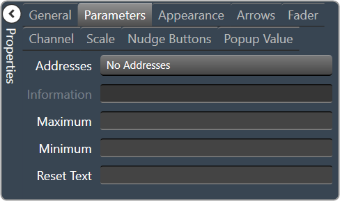


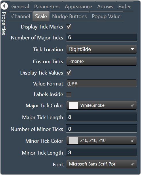
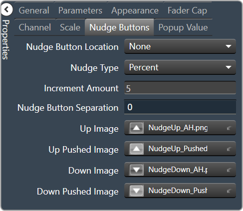

2.3.1.1.1.7.Rotary
| Property Type | Options |
|
General
|
Control Info: The control type.
|
Locked: Specifies if the control is locked out so that it cannot be moved or re-sized.
|
|
|
Parameters
|
Addresses: Enables panel designer to edit addressing information with the added benefit that the values can be validated as a group before being applied to the device. This editor also allows the user to assign multiple parameters to the control. Click to select Parameter Address Editor.
|
Information: Shows information about the Parameter Address.
|
|
Maximum: Maximum value a control can be set.
|
|
Minimum: Minimum value a control can be set.
|
|
| Reset Text: Optional text to display in right click context popup | |
|
Appearance
|
Location: Control location (in pixels) of the control on the Custom Panel. Change X (horizontal) and Y (vertical) values in relation to upper left corner. You can also drag the control to a different location |
|
Size: Control size (in pixels). Change width and height values. You can also re-size the control manually |
|
| Background Image: Click to select background image. | |
| Background Color: Background color of the control. | |
| Foreground Color: Foreground color of the control | |
Anti-Aliasing: Whether to draw with anti-aliasing or not.
|
|
| Tool Tip Text: The text that appears on control mouse-over | |
| Tab Index: If tab stop is set to true, determines the position of the control in the tab order | |
Tab Stop: Specifies whether the control appears in the tab order.
|
|
|
Knob
|
Base Image: The image displayed for the inside of the knob |
| Ring Image: The image displayed for the outside of the knob. | |
| Shading Image: The image used to simulate lighting/shading effects of the knob. | |
|
Knob Size: The size of the knob. Set to 0,0 to reset to the actual image size. |
|
| Start Position: The angular starting point from vertical. | |
| End Position: The angular ending point from vertical. | |
| Orientation: The movement of the knob from min to max. | |
|
Scale
|
Display Tick Mark: Display mark on the control, when set to “true”. |
| Number of Major Ticks: The number of major tick marks displayed on the control. | |
Custom Ticks: Option to use custom tick values by utilizing the scale editor.
|
|
| Display Tick Values: Displays the value of a tick mark next to major tick marks when set to “True”. | |
| Value Format: The format of the value displayed next to major tick marks. This is an advanced feature. | |
| Major Tick Color: The color of major tick marks. | |
| Major Tick Length: The length, in pixels, of major tick marks. | |
| Number of Minor Ticks: The number of minor tick marks display between major tick marks | |
| Minor Tick Color: The color of minor tick marks. | |
| Minor Tick Length: The length, in pixels, of minor tick marks | |
| Font: The font for the ticks | |
| Inner Distance: The distance between the center of the knob and the inside end of the tick marks. | |
| Label Separation: The distance between the outer end of the major tick marks and the edge of the labels in pixels. | |
|
Nudge Button
|
Nudge Button Location: Location of the nudge buttons. None, Left, Right, Above or Below |
Nudge Type: Determines, with the increment amount, how much the control will adjust when a nudge button is pressed.
|
|
| Increment Amount: Determines, with the nudge type, how much the control will adjust when a nudge button is pressed. | |
| Nudge Button Separation: Distance, in pixels, from the edge to the nudge button | |
|
Up Image: The static image for the “up” nudge button. Click the button to select a new image. |
|
|
Up Pushed Image: The image that displays when the “up” nudge button is pushed. Click the button to select a new image. |
|
|
Down Image: The static image for the “down” nudge button. Click the button to select a new image. |
|
|
Down Pushed Image: The image that displays when the “down” nudge button is pushed. Click the button to select a new image. |
|
|
Popup Value
|
Popup Value Position – Fraction: The location of the popup value as a decimal fraction of the width (X) and height (Y) of the control |
Display Popup Value: Displays the value of the control in a popup, if set to true
|


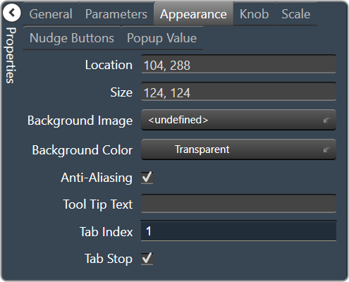

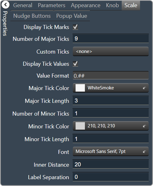
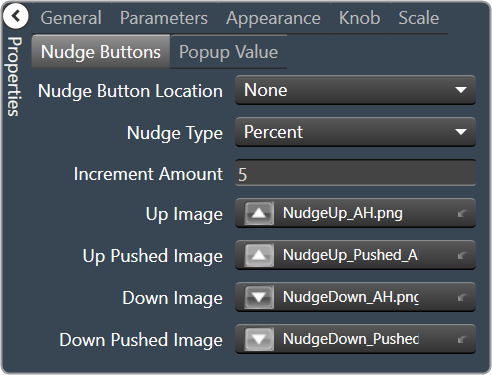

2.3.1.1.1.8.Rotary Encoder
A rotary encoder is an adjustable rotary control that manipulates a device parameter and displays values of a device parameter.
When a Custom Panel is activated, the rotary control (inner ring) changes the linked parameter values as the end user clicks and slides it around it to the desired value position (like twisting a nob). The rotary encoder is controlled by right-clicking with the mouse and moving to the top or right to increase the value and moving to the bottom or left to decrease the value.
The LED meter (outer ring) reflects the selected parameter values, which are usually the same as those linked to and adjusted by the rotary control.
Controls can be managed in the Custom Panel designer and, once the Custom Panel is activated, utilized by the end user. This control must be linked to a parameter to function properly.
| Property Type | Options |
|
General
|
Control Info: The control type.
|
Locked: Specifies if the control is locked out so that it cannot be moved or re-sized.
|
|
|
Parameters
|
Addresses: Enables panel designer to edit addressing information with the added benefit that the values can be validated as a group before being applied to the device. This editor also allows the user to assign multiple parameters to the control. Click to select Parameter Address Editor.
|
Information: Shows information about the Parameter Address.
|
|
Rotary Maximum: Maximum parameter value.
|
|
Rotary Minimum: Minimum parameter value
|
|
Meter Maximum: Maximum meter value
|
|
Meter Minimum: Minimum meter value
|
|
| Reset Text: Optional text to display in right click context popup | |
|
Appearance
|
Location: Control location (in pixels) of the control on the Custom Panel. Change X (horizontal) and Y (vertical) values in relation to upper left corner. You can also drag the control to a different location |
|
Size: Control size (in pixels). Change width and height values. You can also re-size the control manually |
|
| Background Image: Click to select background image. | |
| Background Color: Background color of the control. | |
| Foreground Color: Foreground color of the control | |
Font: Font style for the text on the control. Click on “…” to select desired font.
|
|
| Mode String: User-definable description of mode | |
Anti-Aliasing: Whether to draw with anti-aliasing or not.
|
|
| Tool Tip Text: The text that appears on control mouse-over | |
| Tab Index: If tab stop is set to true, determines the position of the control in the tab order | |
Tab Stop: Specifies whether the control appears in the tab order.
|
|
|
Backing Circle
|
Radius: Radius for the backing circle as fraction of control size |
Color: Color of the backing circle
|
|
| Border Width: Width of the backing circle border | |
| Border Color: Color of the backing circle border | |
|
Rotary
|
Encoder Multiplier: The amount that the turn of the rotary is multiplied to tune sensitivity |
|
Base Image: The image displayed for the inside of the knob. Brings up the Select Image File window. |
|
|
Ring Image: The image displayed for the outside of the knob. Brings up the Select Image File window. |
|
Knob Radius: The radius of the rotary knob as percent of control size.
|
|
| Nudge Amount: Determines, with the nudge type, how much the control will adjust when up and down arrow keys are pressed | |
Nudge Type: Determines, with the nudge amount, how much the control will adjust when up and down arrow keys are pressed.
|
|
|
Meter
|
Encoder Mode: The display mode for the LED elements.
|
Outer Radius: The outside edge of the display meter as a percentage of the entire circle.
|
|
Inner Radius: The inside edge of the display meter as a percentage of the entire circle.
|
|
Starting Angle: Where the meter display starts
|
|
Ending Angle: Where the meter display ends
|
|
| Separation Angle: The angle, in degrees, separating each segment | |
| Segment Count (1..360): The number of segments in the display | |
| Off Color: The “off” color of the control | |
| On Color: The “on” color of the control | |
| Segment Border Color: The color of the segment border |


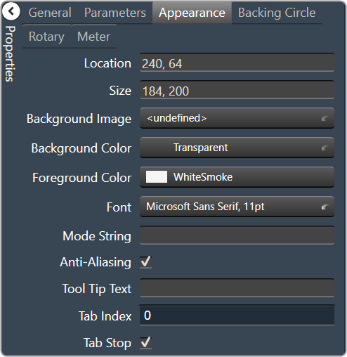


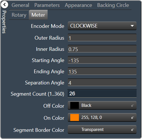
2.3.1.1.1.9.Button
A standard button sends a single value each time that it is pressed. While a button can be linked to a device parameter, it is more typically linked to a system function.
Controls can be managed in the Custom Panel designer and, once the Custom Panel is activated, utilized by the end user. This control must be linked to a parameter to function properly.
On the following example, if “Preset 1” button is pushed, the 1st preset is selected for DriveRack #1. If “Preset 2” button is pushed, the 2nd preset is selected. Each button push overrides the value of the previous button push.
| Property Type | Options |
|
General
|
Control Info: Shows control type.
|
Locked: Specifies if the control is locked out so that it cannot be moved or re-sized.
|
|
|
Parameters
|
Addresses: Enables panel designer to edit addressing information with the added benefit that the values can be validated as a group before being applied to the device. This editor also allows the user to assign multiple parameters to the control. Click to select Parameter Address Editor.
|
Information: Shows information about the Parameter Address.
|
|
| Press Value: Value sent when button is pressed | |
| System Functions: Brings up the System Function editor. | |
| Reset Text: Optional text to display in right click context popup | |
|
System Functions
|
System Functions: Assign specific system operations to be performed when the button is pressed. Brings up the System Function editor. |
|
Appearance
|
Location: Control location (in pixels) of the control on the Custom Panel. Change X (horizontal) and Y (vertical) values in relation to upper left corner. You can also drag the control to a different location. |
|
Size: Control size (in pixels). Change width and height values. You can also re-size the control manually |
|
|
Background Image: Background graphic of control Brings up the Select Image File window. |
|
| Tool Tip Text: Text that appears when mouse pointer hovers over control. | |
| Tab Index: Indicates the sequence of an element within the tabbing order of all focusable elements in the document. | |
Tab Stop: Whether the control appears in the tab order.
|
|
|
Button
|
Text: Text appearing on the control. Select and type desired label.
|
Font: Font style for the text on the control. Click on “…” to select desired font.
|
|
| Text Color: Color of the text on the control | |
| Fill Color: Changes the Fill Color of the control, will not be visible if you have an image selected. | |
| Border Color: The color of the Button border |


2.3.1.1.1.10.Button On/Off
An on/off button alternately turns on or off a device parameter value when pressed.
Controls can be managed in the Custom Panel designer and, once the Custom Panel is activated, utilized by the end user. This control must be linked to a parameter to function properly.
| Property Type | Options |
|
General
|
Control Info: Shows control type.
|
Locked: Specifies if the control is locked out so that it cannot be moved or re-sized.
|
|
|
Parameters
|
Addresses: Enables panel designer to edit addressing information with the added benefit that the values can be validated as a group before being applied to the device. This editor also allows the user to assign multiple parameters to the control. Click to select Parameter Address Editor.
|
Information: Shows information about the Parameter Address.
|
|
| On Value: Value sent when button is pressed | |
| Off Value: Value sent when button is released | |
| Reset Text: Optional text to display in right click context popup | |
|
Appearance
|
Location: Control location (in pixels) of the control on the Custom Panel. Change X (horizontal) and Y (vertical) values in relation to upper left corner. You can also drag the control to a different location. |
|
Size: Control size (in pixels). Change width and height values. You can also re-size the control manually |
|
| Center Text: Centers the tool tip text on the control | |
| Tool Tip Text: Text that appears when mouse pointer hovers over control. | |
| Tab Index: Indicates the sequence of an element within the tabbing order of all focusable elements in the document. | |
Tab Stop: Whether the control appears in the tab order.
|
|
|
Button
|
Button Action: When an event occurs when the button is clicked. |
Font: Font style for the text on the control. Click on “…” to select desired font.
|
|
| On Indication: Sets the button label, label color, background color, and background image for the “on” state. | |
|
Off Indication: Sets the button label, label color, background color, and background image for the “off” state. Brings up the State Indication Setup window. |
|
| Enable Flashing: Enables button to flash. | |
| Flash Frequency: If flashing is enabled, sets the flashing frequency. | |
| Flash In Phase: If flashing is enabled, determines if button will flash in or out of phase with other buttons | |
|
Flash On Indication: Sets the button label, label color, background color, and background image for the “flash on” state. Brings up the State Indication Setup window. |
|
|
Flash Off Indication: Sets the button label, label color, background color, and background image for the “flash off” state. Brings up the State Indication Setup window. |
|
| Timed(ms): How long button will remain active when pressed in milliseconds |
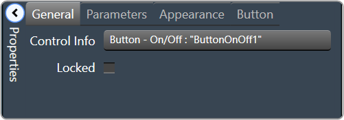
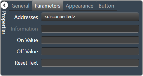

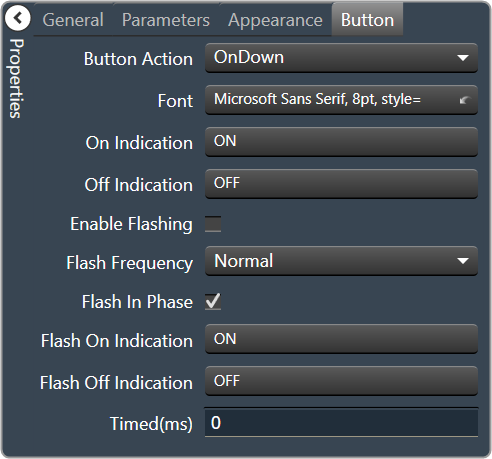
2.3.1.1.1.11.Button Momentary
A momentary button turns on a device parameter value while it is being pressed and turns the value off when released.
Controls can be managed in the Custom Panel designer and, once the Custom Panel is activated, utilized by the end user. This control must be linked to a parameter to function properly.
| Property Type | Options |
|
General
|
Control Info: Shows control type.
|
Locked: Specifies if the control is locked out so that it cannot be moved or re-sized.
|
|
|
Parameters
|
Addresses: Enables panel designer to edit addressing information with the added benefit that the values can be validated as a group before being applied to the device. This editor also allows the user to assign multiple parameters to the control. Click to select Parameter Address Editor.
|
Information: Shows information about the Parameter Address.
|
|
| On Value: Value sent when button is pressed | |
| Off Value: Value sent when button is released | |
| Reset Text: Optional text to display in right click context popup | |
|
Appearance
|
Location: Control location (in pixels) of the control on the Custom Panel. Change X (horizontal) and Y (vertical) values in relation to upper left corner. You can also drag the control to a different location. |
|
Size: Control size (in pixels). Change width and height values. You can also re-size the control manually |
|
| Center Text: Centers the tool tip text on the control | |
| Tool Tip Text: Text that appears when mouse pointer hovers over control. | |
| Tab Index: Indicates the sequence of an element within the tabbing order of all focusable elements in the document. | |
Tab Stop: Whether the control appears in the tab order.
|
|
|
Button
|
Primary Font: Font style for the text on the control. Click on “…” to select desired font.
|
| On Primary Indication: Sets the button label, label color, background color, and background image for the “on” state. | |
|
Off Primary Indication: Sets the button label, label color, background color, and background image for the “off” state. Brings up the State Indication Setup window. |
|
| Enable Flashing: Enables button to flash. | |
| Flash Frequency: If flashing is enabled, sets the flashing frequency. | |
| Flash In Phase: If flashing is enabled, determines if button will flash in or out of phase with other buttons | |
|
Flash On Indication: Sets the button label, label color, background color, and background image for the “flash on” state. Brings up the State Indication Setup window. |
|
|
Flash Off Indication: Sets the button label, label color, background color, and background image for the “flash off” state. Brings up the State Indication Setup window. |
|
Multi-line: When checked, changes the button for multi-line operation. A secondary set of certain properties are added to the button: Secondary Font, Secondary On Indication and Secondary Off Indication.
|
|
| Bump up: When checked, bumps up the assigned parameter by the Bump % amount. | |
| Bump %: Sets the percentage amount for the Bump function. | |
| Bump Down: When checked, bumps down the assigned parameter by the Bump % amount. |


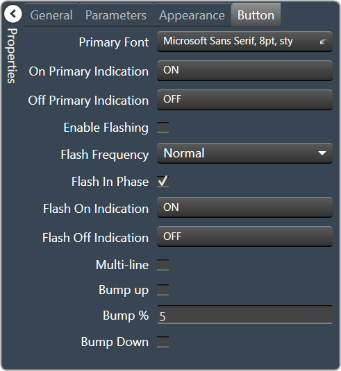
2.3.1.1.1.12.Button Latching
A latching button alternately turns on or off a device parameter value when pressed.
Controls can be managed in the Custom Panel designer and, once the Custom Panel is activated, utilized by the end user. This control must be linked to a parameter to function properly.
| Property Type | Options |
|
General
|
Control Info: Shows control type.
|
Locked: Specifies if the control is locked out so that it cannot be moved or re-sized.
|
|
|
Parameters
|
Addresses: Enables panel designer to edit addressing information with the added benefit that the values can be validated as a group before being applied to the device. This editor also allows the user to assign multiple parameters to the control. Click to select Parameter Address Editor.
|
Information: Shows information about the Parameter Address.
|
|
| On Value: Value sent when button is pressed | |
| Off Value: Value sent when button is released | |
| Reset Text: Optional text to display in right click context popup | |
|
Appearance
|
Location: Control location (in pixels) of the control on the Custom Panel. Change X (horizontal) and Y (vertical) values in relation to upper left corner. You can also drag the control to a different location. |
|
Size: Control size (in pixels). Change width and height values. You can also re-size the control manually |
|
| Center Text: Centers the tool tip text on the control | |
| Tool Tip Text: Text that appears when mouse pointer hovers over control. | |
| Tab Index: Indicates the sequence of an element within the tabbing order of all focusable elements in the document. | |
Tab Stop: Whether the control appears in the tab order.
|
|
|
Button
|
Button Action: When an event occurs when the button is clicked. |
Font: Font style for the text on the control. Click on “…” to select desired font.
|
|
| On Indication: Sets the button label, label color, background color, and background image for the “on” state. | |
|
Off Indication: Sets the button label, label color, background color, and background image for the “off” state. Brings up the State Indication Setup window. |
|
| Enable Flashing: Enables button to flash. | |
| Flash Frequency: If flashing is enabled, sets the flashing frequency. | |
| Flash In Phase: If flashing is enabled, determines if button will flash in or out of phase with other buttons | |
|
Flash On Indication: Sets the button label, label color, background color, and background image for the “flash on” state. Brings up the State Indication Setup window. |
|
|
Flash Off Indication: Sets the button label, label color, background color, and background image for the “flash off” state. Brings up the State Indication Setup window. |


2.3.1.1.1.13.Button MultiState
A multi-state button both sets and displays a defined value of a device parameter. While the multi-state button is somewhat complex to set-up, its function can be very powerful. To set up an MS button, first you add (and link) the button, then change its properties. You must also define the button action. You can also change its other properties.
Controls can be managed in the Custom Panel designer and, once the Custom Panel is activated, utilized by the end user. This control must be linked to a parameter to function properly.
A multi-state button can be powerful but very complex, save your venue before adding or editing a multi-state button.
- Sets Value: Once the multi-state button is linked and defined, the parameter on the Custom Panel changes the parameter(s) on the device control panel(s):
- Multiple Device Parameters – If the multi-state button is linked to more than one device parameter, when the multi-state button on the Custom Panel is pushed, all the attached device parameters will be set to the specified value.
- Displays Value: Once the multi-state button is linked and defined, the parameter on the device control changes the parameter on the Custom Panel as defined in the properties section:
- Multiple Device Parameters – If the multi-state button is linked to more than one device parameter, the multi-state button on the Custom Panel will update the device parameters with the new value.
- Add Multi-State Button: Add a multi-state button the same way you add other controls and link it to one or more device parameters
- Change button properties – In order for the linked multi-state button to work properly, you must define how the property works. This is accomplished in Properties in the “Value Indication Matrix” window. You must also set the button action.
| Property Type | Options |
|
General
|
Control Info: Shows control type.
|
Locked: Specifies if the control is locked out so that it cannot be moved or re-sized.
|
|
|
Parameters
|
Addresses: Enables panel designer to edit addressing information with the added benefit that the values can be validated as a group before being applied to the device. This editor also allows the user to assign multiple parameters to the control. Click to select Parameter Address Editor.
|
Information: Shows information about the Parameter Address.
|
|
| Value Matrix: Allows changes to the button states, and images associated with each state | |
| Reset Text: Optional text to display in right click context popup | |
|
Appearance
|
Location: Control location (in pixels) of the control on the Custom Panel. Change X (horizontal) and Y (vertical) values in relation to upper left corner. You can also drag the control to a different location. |
|
Size: Control size (in pixels). Change width and height values. You can also re-size the control manually |
|
|
Background Image: Background graphic of control Brings up the Select Image File window. |
|
|
Background Color: Background color of control Brings up the Select Color window. |
|
|
Font: Font style for the text on the control. Click on “…” to select desired font. Selects from Windows fonts |
|
| Center Text: Centers the tool tip text on the control | |
| Tool Tip Text: Text that appears when mouse pointer hovers over control. | |
| Tab Index: Indicates the sequence of an element within the tabbing order of all focusable elements in the document. | |
Tab Stop: Whether the control appears in the tab order.
|
|
|
Button
|
Button Action: When an event occurs when the button is clicked.
|


2.3.1.1.1.14.Button Radio
A radio button allows the user to select the value of a device parameter from a list.
Controls can be managed in the Custom Panel designer and, once the Custom Panel is activated, utilized by the end user. This control must be linked to a parameter to function properly.
| Property Type | Options |
|
General
|
Control Info: Shows control type.
|
Locked: Specifies if the control is locked out so that it cannot be moved or re-sized.
|
|
|
Parameters
|
Addresses: Enables panel designer to edit addressing information with the added benefit that the values can be validated as a group before being applied to the device. This editor also allows the user to assign multiple parameters to the control. Click to select Parameter Address Editor.
|
Information: Shows information about the Parameter Address.
|
|
|
Value List: Allows editing of the value range of the control. Brings up the Discrete Values Editor. |
|
| Reset Text: Optional text to display in right click context popup | |
|
Appearance
|
Location: Control location (in pixels) of the control on the Custom Panel. Change X (horizontal) and Y (vertical) values in relation to upper left corner. You can also drag the control to a different location. |
|
Size: Control size (in pixels). Change width and height values. You can also re-size the control manually |
|
|
Text Color: Text color of the item text. Brings up the Select Color window. |
|
| Background Color: Text that appears when mouse pointer hovers over control. | |
|
Font: Font style for the text on the control. Click on “…” to select desired font. Selects from Windows fonts |
|
| Tool Tip Text: Text that appears on control mouse-over. | |
| Tab Index: Indicates the sequence of an element within the tabbing order of all focusable elements in the document. | |
Tab Stop: Whether the control appears in the tab order.
|
|
|
Button
|
Alignment: Alignment of the button nubs.
|
| Diameter: Diameter of the radio button nubs | |
|
Style: The style (color) of the nubs. Select from the pull-down list. |
|
|
Border Style: The style of the control border. Select from the pull-down list |
|
| Top Margin: Distance of the values, in pixels, from the top border of the control. | |
| Bottom Margin: Distance of the values, in pixels, from the bottom border of the control. | |
| Left Margin: Distance of the values, in pixels, from the left border of the control. | |
| Right Margin: Distance of the values, in pixels, from the right border of the control. |


2.3.1.1.1.15.Button Region
This button sends a single value each time that it is pressed. While a button can be linked to a device parameter, it is more typically linked to a system function.
Controls can be managed in the Custom Panel designer and, once the Custom Panel is activated, utilized by the end user. This control must be linked to a parameter or system function to function properly. You can also easily add a pre-defined label.
On the following example, if “Preset 1” button is pushed, the 1st preset is selected for DriveRack #1. If “Preset 2” button is pushed, the 2nd preset is selected. Each button push overrides the value of the previous button push.
| Property Type | Options |
|
General
|
Control Info: Shows control typey.
|
Locked: Specifies if the control is locked out so that it cannot be moved or re-sized.
|
|
|
Parameters
|
Addresses: Enables panel designer to edit addressing information with the added benefit that the values can be validated as a group before being applied to the device. This editor also allows the user to assign multiple parameters to the control. Click to select Parameter Address Editor.
|
Information: Shows information about the Parameter Address.
|
|
| On Value: Value sent when button is pressed | |
| Off Value: Value sent when button is released | |
|
Color 0 to Color 63: Background color of control Brings up the Select Color window. |
|
| Indication same as Button: The value sent when the button is pressed. | |
|
System Indication
|
On State Logic: Link device state to the On state of the Region Button. Brings up the Indication Configuration editor. |
|
On Color: The color of the region when in the On state. Brings up the Select Color window. |
|
|
Partial State Logic: Link device state to the partial state of the region button. Brings up the Indication Configuration editor. |
|
|
Partial Color: The color of the region when in the Partial state. Brings up the Select Color window. |
|
|
Off Color: The color of the region when in the Off state. Brings up the Select Color window. |
|
|
System Functions
|
System Functions: Assign specific system operations to be performed when the button is pressed. Brings up the System Function editor. |
|
Appearance
|
Location: Control location (in pixels) of the control on the Custom Panel. Change X (horizontal) and Y (vertical) values in relation to upper left corner. You can also drag the control to a different location. |
|
Size: Control size (in pixels). Change width and height values. You can also re-size the control manually |
|
|
Transparency: Percent transparent, between 0 (opaque) and 90 (very transparent) Brings up the Select Image File window. |
|
| Hover Transparency: Percent transparent when the mouse pointer is over the region | |
|
Border Color: The color of the border. Brings up the Select Color window. |
|
| Border Width: The width of the border (in pixels) |

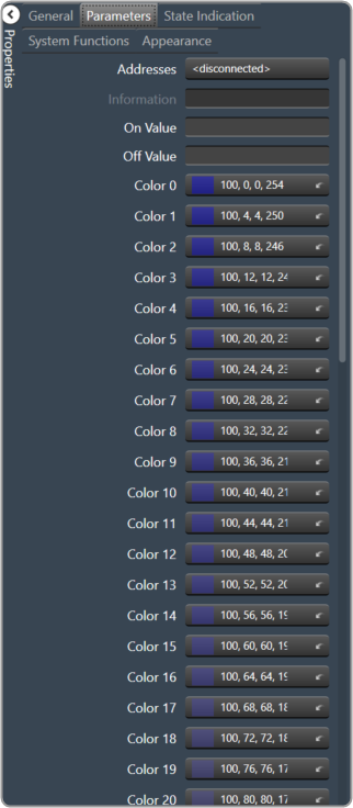
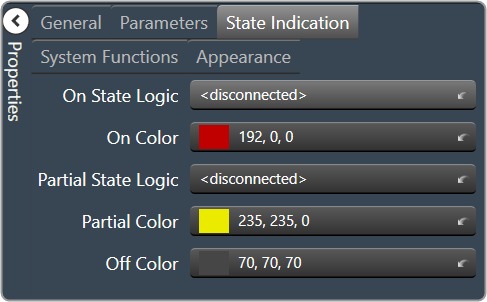


2.3.1.1.1.16.Button System Functions
A System Functions button sends a single value each time that it is pressed. This button is specifically linked to a system function.
Controls can be managed in the Custom Panel designer and, once the Custom Panel is activated, utilized by the end user. This control must be linked to a parameter to function properly.
| Property Type | Options |
|
General
|
Control Info: Shows control type.
|
Locked: Specifies if the control is locked out so that it cannot be moved or re-sized.
|
|
|
System Functions
|
System Functions: Assign specific system operations to be performed when the button is pressed. Brings up the System Function editor. |
|
Appearance
|
Location: Control location (in pixels) of the control on the Custom Panel. Change X (horizontal) and Y (vertical) values in relation to upper left corner. You can also drag the control to a different location. |
|
Size: Control size (in pixels). Change width and height values. You can also re-size the control manually |
|
| Tool Tip Text: Text that appears on control mouse-over. | |
| Tab Index: Indicates the sequence of an element within the tabbing order of all focusable elements in the document. | |
Tab Stop: Whether the control appears in the tab order.
|
|
|
Button
|
Button Action: Determines which event occurs when the button is clicked. OnClick is recommended.
|
|
Font: Font style for the text on the control. Click on “…” to select desired font.
|
|
|
Text Color: Color of the text on the control Brings up the Select Color window. |
|
|
Button Image: The image displayed as the button. Brings up the Select Image File window. |
|
|
On Color: The color of the button in the On state Brings up the Select Color window. |
|
|
Off Color: The color of the button in the Off state Brings up the Select Color window. |
|
| On Text: The text displayed on the button in the On state | |
| Off Text: The text displayed on the button in the Off state | |
| Mixed Text: The text displayed on the button when in a mixed state |


2.3.1.1.1.17.Combo Box
A Combo Box allows the user to select the value of a device parameter from a drop-down list.
Controls can be managed in the Custom Panel designer and, once the Custom Panel is activated, utilized by the end user. This control must be linked to a parameter to function properly.
| Property Type | Options |
|
General
|
Control Info: Shows control type.
|
Locked: Specifies if the control is locked out so that it cannot be moved or re-sized.
|
|
|
Parameters
|
Addresses: Enables panel designer to edit addressing information with the added benefit that the values can be validated as a group before being applied to the device. This editor also allows the user to assign multiple parameters to the control. Click to select Parameter Address Editor.
|
Information: Shows information about the Parameter Address.
|
|
|
Value List: Allows editing of the value range of the control. Brings up the Discrete Values Editor. |
|
| Reset Text: Optional text to display in right click context popup | |
|
Appearance
|
Location: Control location (in pixels) of the control on the Custom Panel. Change X (horizontal) and Y (vertical) values in relation to upper left corner. You can also drag the control to a different location. |
|
Size: Control size (in pixels). Change width and height values. You can also re-size the control manually |
|
| Tool Tip Text: Text that appears on control mouse-over. | |
| Tab Index: Indicates the sequence of an element within the tabbing order of all focusable elements in the document. | |
Tab Stop: Whether the control appears in the tab order.
|
|
|
Combo Box
|
Background Color: The background color of the Combo Box Brings up the Select Color window |
|
Text Color: The color of the Combo Box text Brings up the Select Color window. |
|
Font: Font style for the text in the box. Click on “…” to select desired font.
|
|
Style: Sets the appearance and functionality of the Combo Box.
|
|
|
Selected Item Color: The color of the selected item. Brings up the Select Color window. |


2.3.1.1.1.18.List Box
A List Box allows the user to select the value of a device parameter from a list.
Controls can be managed in the Custom Panel designer and, once the Custom Panel is activated, utilized by the end user. This control must be linked to a parameter to function properly.
| Property Type | Options |
|
General
|
Control Info: Shows control type.
|
Locked: Specifies if the control is locked out so that it cannot be moved or re-sized.
|
|
|
Parameters
|
Addresses: Enables panel designer to edit addressing information with the added benefit that the values can be validated as a group before being applied to the device. This editor also allows the user to assign multiple parameters to the control. Click to select Parameter Address Editor.
|
Information: Shows information about the Parameter Address.
|
|
|
Value List: Allows editing of the value range of the control. Brings up the Discrete Values Editor. |
|
| Reset Text: Optional text to display in right click context popup | |
|
Appearance
|
Location: Control location (in pixels) of the control on the Custom Panel. Change X (horizontal) and Y (vertical) values in relation to upper left corner. You can also drag the control to a different location. |
|
Size: Control size (in pixels). Change width and height values. You can also re-size the control manually |
|
| Tool Tip Text: Text that appears on control mouse-over. | |
| Tab Index: Indicates the sequence of an element within the tabbing order of all focusable elements in the document. | |
Tab Stop: Whether the control appears in the tab order.
|
|
|
List Box
|
Background Color: The background color of the Combo Box Brings up the Select Color window. |
|
Text Color: The color of the Combo Box text Brings up the Select Color window. |
|
|
Font: Font style for the text in the box. Click on “…” to select desired font. Selects from Windows fonts. |
|
Border Style: Sets the style of the List Box border.
|
|
|
Selected Item Color: The color of the selected item. Brings up the Select Color window. |


2.3.1.1.1.19.Check Box
A Checkbox turns on or off a device parameter value when pressed.
Controls can be managed in the Custom Panel designer and, once the Custom Panel is activated, utilized by the end user. This control must be linked to a parameter to function properly.
| Property Type | Options |
|
General
|
Control Info: Shows control type.
|
Locked: Specifies if the control is locked out so that it cannot be moved or re-sized.
|
|
|
Parameters
|
Addresses: Enables panel designer to edit addressing information with the added benefit that the values can be validated as a group before being applied to the device. This editor also allows the user to assign multiple parameters to the control. Click to select Parameter Address Editor.
|
Information: Shows information about the Parameter Address.
|
|
|
Value List: Allows editing of the value range of the control. Brings up the Discrete Values Editor. |
|
| Reset Text: Optional text to display in right click context popup | |
|
Appearance
|
Location: Control location (in pixels) of the control on the Custom Panel. Change X (horizontal) and Y (vertical) values in relation to upper left corner. You can also drag the control to a different location. |
|
Size: Control size (in pixels). Change width and height values. You can also re-size the control manually |
|
|
Background Image: Background image of the control Brings up the Select Image File window. |
|
|
Text Color: Text color of the item text. Brings up the Select Color window. |
|
| Background Color: Text that appears when mouse pointer hovers over control. | |
Font: Font style for the text on the control. Click on “…” to select desired font.
|
|
| Tool Tip Text: Text that appears on control mouse-over. | |
| Tab Index: Indicates the sequence of an element within the tabbing order of all focusable elements in the document. | |
Tab Stop: Whether the control appears in the tab order.
|
|
| Top Margin: The amount of space, in pixels at the top of the control where a label may be placed | |
| Bottom Margin: The amount of space, in pixels at the bottom of the control where a label may be placed | |
| Left Margin: The amount of space, in pixels to the left of the control where a label may be placed | |
| Right Margin: The amount of space, in pixels to the right of the control where a label may be placed | |
|
Combo Box
|
Check Box Text: The text shown in the Checkbox. |
| Checkbox Size: The size of the Checkbox in pixels. | |
|
Checkbox Style: The Checkbox style. Normal, flat, and various colors |
|
| Label Separation: The space, in pixels between the checkbox and the checkbox text |


2.3.1.1.1.20.Spinner
A Spinner allows the user to change the value of a device parameter by adjusting it up or down; the increment can be specified by the Custom Panel designer.
Controls can be managed in the Custom Panel designer and, once the Custom Panel is activated, utilized by the end user. This control must be linked to a parameter to function properly.
| Property Type | Options |
|
General
|
Control Info: Shows control type.
|
Locked: Specifies if the control is locked out so that it cannot be moved or re-sized.
|
|
|
Parameters
|
Addresses: Enables panel designer to edit addressing information with the added benefit that the values can be validated as a group before being applied to the device. This editor also allows the user to assign multiple parameters to the control. Click to select Parameter Address Editor.
|
Information: Shows information about the Parameter Address.
|
|
| Maximum: The maximum value that a control may be set to | |
| Minimum: The minimum value that a control may be set to | |
| Disable Mixed-sate Editor: When checked, disables the mixed-state context menu and editor | |
| Reset Text: Optional text to display in right click context popup. | |
|
Appearance
|
Location: Control location (in pixels) of the control on the Custom Panel. Change X (horizontal) and Y (vertical) values in relation to upper left corner. You can also drag the control to a different location. |
|
Size: Control size (in pixels). Change width and height values. You can also re-size the control manually |
|
|
Border Style: The style of the Spinner border. Choose from drop down menu. |
|
|
Border Color: The color of the Spinner border Brings up the Select Color window. |
|
| Top Margin: The amount of space, in pixels at the top of the control where a label may be placed | |
| Bottom Margin: The amount of space, in pixels at the bottom of the control where a label may be placed | |
| Left Margin: The amount of space, in pixels to the left of the control where a label may be placed | |
| Right Margin: The amount of space, in pixels to the right of the control where a label may be placed | |
| Tool Tip Text: Text that appears on control mouse-over. | |
| Tab Index: Indicates the sequence of an element within the tabbing order of all focusable elements in the document. | |
Tab Stop: Whether the control appears in the tab order.
|
|
|
Text Attributes
|
Text Font: The font of the Spinner text. Choose from Windows fonts. |
|
Text Color: The color of the Spinner text Brings up the Select Color window. |
|
|
Background Color: The background color of the text area Brings up the Select Color window. |
|
| Value Format: The format used when displaying the value. This is an advanced feature and must follow English conventions. | |
|
Text Alignment: The horizontal alignment of the text. Left, center or right |
|
|
Text Border Style: The border style of the text area. Choose from drop down menu |
|
|
Nudge Buttons
|
Nudge Type: Together with the Increment Amount, determines the amount that the control will increment/decrement when a Nudge Button is pressed.
|
| Increment: Together with the Nudge Type, determines the amount that the control will increment/decrement when a Nudge Button is pressed. | |
|
Spinner Attributes
|
Spinner Position: Specifies where the up/down arrows are to be located.
|
| Spinner Width: Sets the size of the up/down arrow buttons, in percent of width or height. | |
|
Spinner Button Color: The color of the up/down arrow buttons. Brings up the Select Color window. |
|
|
Spinner Arrow Color: The color of the up/down arrows. Brings up the Select Color window. |
|
| Arrow Width: The width of the base as a percentage of the spinner button width. |


2.3.1.1.1.21.Spinner Advanced
| Property Type | Options |
|
General
|
Control Info: Shows control type.
|
Locked: Specifies if the control is locked out so that it cannot be moved or re-sized.
|
|
|
Parameters
|
Addresses: Enables panel designer to edit addressing information with the added benefit that the values can be validated as a group before being applied to the device. This editor also allows the user to assign multiple parameters to the control. Click to select Parameter Address Editor.
|
Information: Shows information about the Parameter Address.
|
|
| Maximum: The maximum value that a control may be set to | |
| Minimum: The minimum value that a control may be set to | |
| Disable Mixed-sate Editor: When checked, disables the mixed-state context menu and editor | |
| Reset Text: Optional text to display in right click context popup. | |
|
Appearance
|
Location: Control location (in pixels) of the control on the Custom Panel. Change X (horizontal) and Y (vertical) values in relation to upper left corner. You can also drag the control to a different location. |
|
Size: Control size (in pixels). Change width and height values. You can also re-size the control manually |
|
|
Border Style: The style of the Spinner border. Choose from drop down menu. |
|
|
Border Color: The color of the Spinner border Brings up the Select Color window. |
|
| Top Margin: The amount of space, in pixels at the top of the control where a label may be placed. | |
| Bottom Margin: The amount of space, in pixels at the bottom of the control where a label may be placed | |
| Left Margin: The amount of space, in pixels to the left of the control where a label may be placed | |
| Right Margin: The amount of space, in pixels to the right of the control where a label may be placed | |
| Tool Tip Text: Text that appears on control mouse-over. | |
| Tab Index: Indicates the sequence of an element within the tabbing order of all focusable elements in the document. | |
Tab Stop: Whether the control appears in the tab order.
|
|
|
Text Attributes
|
Text Font: The font of the Spinner text. Choose from Windows fonts. |
|
Text Color: The color of the Spinner text Brings up the Select Color window. |
|
|
Background Color: The background color of the text area Brings up the Select Color window. |
|
| Value Format: The format used when displaying the value. This is an advanced feature and must follow English conventions. | |
|
Text Alignment: The horizontal alignment of the text. Left, center or right |
|
|
Text Border Style: The border style of the text area. Choose from drop down menu |
|
|
Nudge Buttons
|
Nudge Type: Together with the Increment Amount, determines the amount that the control will increment/decrement when a Nudge Button is pressed.
|
| Increment: Together with the Nudge Type, determines the amount that the control will increment/decrement when a Nudge Button is pressed. | |
|
Spinner Attributes
|
Spinner Position: Specifies where the up/down arrows are to be located.
|
| Spinner Width: Sets the size of the up/down arrow buttons, in percent of width or height. | |
|
Spinner Button Color: The color of the up/down arrow buttons. Brings up the Select Color window. |
|
|
Spinner Arrow Color: The color of the up/down arrows. Brings up the Select Color window. |
|
| Arrow Width: The width of the base as a percentage of the spinner button width. |


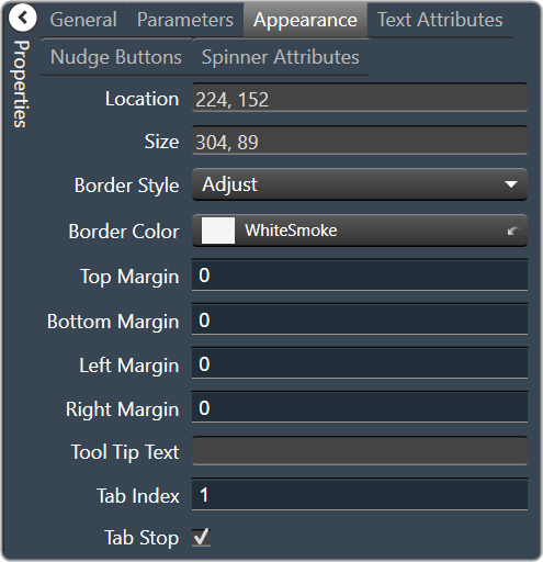
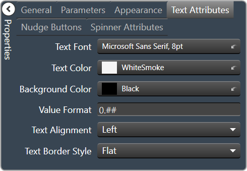
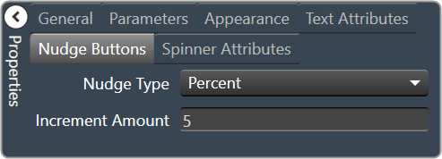
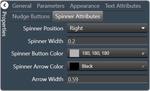
2.3.1.1.1.22.Led Image
An LED is a display-only control that shows the state of a device parameter. The LED control helps the designer to graphically show a certain condition, as defined by the designer, such as a warning. The “LED Image” control allows you to change the entire image of the LED where the “LED Color” control is a simplified control where you only need to change the color of the LED.
Controls can be managed in the Custom Panel designer and, once the Custom Panel is activated, utilized by the end user. This control must be linked to a parameter or system function to function properly. You can also easily add a pre-defined label.
For example, the designer wants to show when the pink noise levels on each of the four inputs of a DriveRack 4800 are more than 10dB. First, he adds an LED and links it to the pink noise on Channel 1.
The designer then goes into the Properties field to the Parameters Value and defines the value with the LED Values Editor.
| Property Type | Options |
|
General
|
Control Info: Shows control type.
|
Locked: Specifies if the control is locked out so that it cannot be moved or re-sized.
|
|
|
Parameters
|
Addresses: Enables panel designer to edit addressing information with the added benefit that the values can be validated as a group before being applied to the device. This editor also allows the user to assign multiple parameters to the control. Click to select Parameter Address Editor.
|
Information: Shows information about the Parameter Address.
|
|
|
Image Values: Allows editing of the value range of the control. Brings up the LED Values Editor. |
|
Value Equation: When specified, this equation combines the attached parameter’s values and returns the value that the control will display.
|
|
|
Appearance
|
Location: Control location (in pixels) of the control on the Custom Panel. Change X (horizontal) and Y (vertical) values in relation to upper left corner. You can also drag the control to a different location. |
|
Size: Control size (in pixels). Change width and height values. You can also re-size the control manually |
|
|
Background Color: The background color of the text area. Brings up the Select Color window. |
|
| Tool Tip Text: Text that appears on control mouse-over. | |
|
Border Color: The color of the Spinner border. Brings up the Select Color window. |

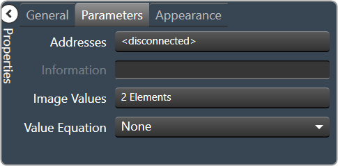
2.3.1.1.1.23.Led Color
An LED is a display-only control that shows the state of a device parameter. The LED control helps the designer to graphically show a certain condition, as defined by the designer, such as a warning.
Controls can be managed in the Custom Panel designer and, once the Custom Panel is activated, utilized by the end user. This control must be linked to a parameter or system function to function properly. You can also easily add a pre-defined label.
For example, the designer wants to display when pink noise levels on each of the four inputs of a DriveRack 4800 are more than 10dB. First, he adds an LED and links it to the pink noise on Channel 1.
The designer then goes into the Properties field to the Parameters Value and defines the value with the LED Values Editor.
| Property Type | Options |
|
General
|
Control Info: Shows control type.
|
Locked: Specifies if the control is locked out so that it cannot be moved or re-sized.
|
|
|
Parameters
|
Addresses: Enables panel designer to edit addressing information with the added benefit that the values can be validated as a group before being applied to the device. This editor also allows the user to assign multiple parameters to the control. Click to select Parameter Address Editor.
|
Information: Shows information about the Parameter Address.
|
|
|
Color Values: Allows editing of the value range of the control. Brings up the LED Values Editor. |
|
Value Equation: When specified, this equation combines the attached parameter’s values and returns the value that the control will display.
|
|
|
Appearance
|
Location: Control location (in pixels) of the control on the Custom Panel. Change X (horizontal) and Y (vertical) values in relation to upper left corner. You can also drag the control to a different location. |
|
Size: Control size (in pixels). Change width and height values. You can also re-size the control manually |
|
|
Background Color: The background color of the text area Brings up the Select Color window. |
|
| Tool Tip Text: Text that appears on control mouse-over. | |
|
Border Color: The color of the Spinner border Brings up the Select Color window. |

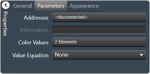

2.3.1.1.1.24.Led Preset Trigger
A preset trigger is a control on a Custom Panel that causes an activation event to execute when a specific condition occurs. The Custom Panel must be activated for the action to be performed. You can, however, set up a venue-wide rule with Logic Rules.
To Set Up a Preset Trigger
Add the preset trigger control to the Custom Panel then do one of the following:
- Right click the control and select edit parameter assignment.
or - In the properties section of the graph, select the “…” at the right of parameter addresses.
To Reset a Preset Trigger
If the condition for the activation event is set to manual reset, the user must reset the control. Right-click the control on the activated panel and select “Reset Trigger.”
| Property Type | Options |
|
General
|
Control Info: Shows control type.
|
Locked: Specifies if the control is locked out so that it cannot be moved or re-sized.
|
|
|
Parameters
|
Addresses: Enables panel designer to edit addressing information with the added benefit that the values can be validated as a group before being applied to the device. This editor also allows the user to assign multiple parameters to the control. Click to select Parameter Address Editor.
|
Information: Shows information about the Parameter Address.
|
|
|
Trigger
|
Event: Control location (in pixels) of the control on the Custom Panel. Change X (horizontal) and Y (vertical) values in relation to upper left corner. You can also drag the control to a different location. |
|
Appearance
|
Location: Control location (in pixels) of the control on the Custom Panel. Change X (horizontal) and Y (vertical) values in relation to upper left corner. You can also drag the control to a different location. |
|
Size: Control size (in pixels). Change width and height values. You can also re-size the control manually |
|
| Center Text: Centers the tool tip text on the control | |
| Tool Tip Text: Text that appears on control mouse-over. | |
| Tab Index: Indicates the sequence of an element within the tabbing order of all focusable elements in the document. | |
Tab Stop: Whether the control appears in the tab order.
|
|
|
Indication
|
Active: Sets the Control Label, label color, background color and background image for the Active state. Brings up the State Indication Setup window. |
|
Inactive: Sets the Control Label, label color, background color and background image for the Inactive state. Brings up the State Indication Setup window. |
|
| Enable: When checked, the trigger is enabled |

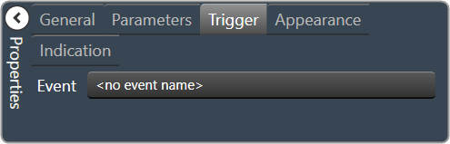
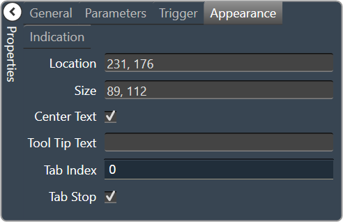
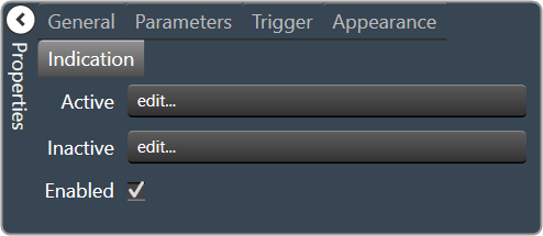
2.3.1.1.1.25.Led Region
The LED Region control sends a single value each time that it is pressed. While a button can be linked to a device parameter, it is more typically linked to a system function.
Controls can be managed in the Custom Panel designer and, once the Custom Panel is activated, utilized by the end user. This control must be linked to a parameter or system function to function properly. You can also easily add a pre-defined label.
| Property Type | Options |
|
General
|
Control Info: Shows control type.
|
Locked: Specifies if the control is locked out so that it cannot be moved or re-sized.
|
|
|
Parameters
|
Addresses: Enables panel designer to edit addressing information with the added benefit that the values can be validated as a group before being applied to the device. This editor also allows the user to assign multiple parameters to the control. Click to select Parameter Address Editor.
|
Information: Shows information about the Parameter Address.
|
|
|
Color Values: Allows editing of the value range of the control. Brings up the LED Values Editor. |
|
|
Value Equation: When specified, this equation combines the attached parameter’s values and returns the value that the control will display. Select from a drop-down list. |
|
|
Appearance
|
Location: Control location (in pixels) of the control on the Custom Panel. Change X (horizontal) and Y (vertical) values in relation to upper left corner. You can also drag the control to a different location. |
|
Size: Control size (in pixels). Change width and height values. You can also re-size the control manually |
|
|
Background Color: Sets the background color for the note. Brings up the Select Color window. |
|
| Transparency: Percent transparent, between 0 (opaque) and 90 (very transparent) | |
|
Border Color: The color of the border. Brings up the Select Color window. |
|
| Border Width: The width of the border (in pixels) | |
| Tool Tip Text: Text that appears on control mouse-over. |

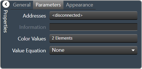
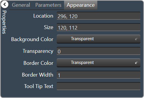
2.3.1.1.1.26.Led System Indicator
The system indicator is an LED-style control that allows you to define and show the state of specified devices.
For example, on an activated panel, a system indicator will turn red and beep when a device is offline, then return to green when the connection is restored. A right mouse click on the system indicator on an activated panel also shows what state attached devices are in.
Controls can be managed in the Custom Panel designer and, once the Custom Panel is activated, utilized by the end user. This control must be linked to a parameter or system function to function properly. You can also easily add a pre-defined label.
| Property Type | Options |
|
General
|
Control Info: Shows control type.
|
Locked: Specifies if the control is locked out so that it cannot be moved or re-sized.
|
|
|
State Indication
|
Addresses: Enables panel designer to edit addressing information with the added benefit that the values can be validated as a group before being applied to the device. This editor also allows the user to assign multiple parameters to the control. Click to select Parameter Address Editor.
|
Information: Shows information about the Parameter Address.
|
|
|
Image Values: Allows editing of the value range of the control. Brings up the LED Values Editor. |
|
Value Equation: When specified, this equation combines the attached parameter’s values and returns the value that the control will display.
|
|
|
Appearance
|
Location: Control location (in pixels) of the control on the Custom Panel. Change X (horizontal) and Y (vertical) values in relation to upper left corner. You can also drag the control to a different location. |
|
On Color: The color of the LED in the On state Brings up the Select Color window. |
|
|
Off Color: The color of the LED in the Off state Brings up the Select Color window. |
|
|
Show Label: Determines if the label will be drawn with the indicator. Checked = show the label |


2.3.1.1.1.27.Meter Fast
A Fast Meter is an output meter that shows the state of a device parameter.
Controls can be managed in the Custom Panel designer and, once the Custom Panel is activated, utilized by the end user. This control must be linked to a parameter to function properly.
| Property Type | Options |
|
General
|
Control Info: Shows control type.
|
Locked: Specifies if the control is locked out so that it cannot be moved or re-sized.
|
|
|
Parameters
|
Addresses: Enables panel designer to edit addressing information with the added benefit that the values can be validated as a group before being applied to the device. This editor also allows the user to assign multiple parameters to the control. Click to select Parameter Address Editor.
|
Information: Shows information about the Parameter Address.
|
|
| Maximum: The maximum value that a control may be set to | |
| Minimum: The minimum value that a control may be set to | |
|
Appearance
|
Location: Control location (in pixels) of the control on the Custom Panel. Change X (horizontal) and Y (vertical) values in relation to upper left corner. You can also drag the control to a different location. |
|
Size: Control size (in pixels). Change width and height values. You can also re-size the control manually |
|
|
Background Color: The background color of the text area Brings up the Select Color window. |
|
| Tool Tip Text: Text that appears on control mouse-over. | |
|
Meter
|
High Color: The color of the upper section of the meter Brings up the Select Color window. |
|
Mid Color: The color of the mid-section of the meter. Brings up the Select Color window. |
|
|
Low Color: The color of the lower section of the meter. Brings up the Select Color window. |


2.3.1.1.1.28.Meter Gradient
A gradient meter is an output meter that shows the state of a device parameter in specifically designed gradients.
Controls can be managed in the Custom Panel designer and, once the Custom Panel is activated, utilized by the end user. This control must be linked to a parameter to function properly.
| Property Type | Options |
|
General
|
Control Info: Shows control type.
|
Locked: Specifies if the control is locked out so that it cannot be moved or re-sized.
|
|
|
Parameters
|
Peak Equation: When specified, this equation combines the attached parameter’s values and returns the peak that the control will display.
|
|
Addresses: Enables panel designer to edit addressing information with the added benefit that the values can be validated as a group before being applied to the device. This editor also allows the user to assign multiple parameters to the control. Click to select Parameter Address Editor.
|
|
Information: Shows information about the Parameter Address.
|
|
| Maximum: The maximum value that a control may be set to. | |
| Minimum: The minimum value that a control may be set to. | |
| Value Equation: When specified, this equation combines the attached parameter’s values and returns the value that the control will display. | |
| Gain Reduction: Check if this meter is to be a Gain Reduction style. The negative dB gains are reported (shown) as increasing positive gains. | |
|
Appearance
|
Optimized for Speed: Enables the meter to draw faster. Note: This decreases the aesthetic properties of the meter. |
|
Location: Control location (in pixels) of the control on the Custom Panel. Change X (horizontal) and Y (vertical) values in relation to upper left corner. You can also drag the control to a different location. |
|
|
Size: Control size (in pixels). Change width and height values. You can also re-size the control manually |
|
| Tool Tip Text: Text that appears on control mouse-over. | |
| Tab Index: Indicates the sequence of an element within the tabbing order of all focusable elements in the document. | |
Tab Stop: Whether the control appears in the tab order.
|
|
|
Meter
|
Orientation: The orientation of the meter; Vertical or Horizontal.
|
|
High Color: The color of the upper section of the meter Brings up the Select Color window. |
|
|
Mid Color: The color of the mid-section of the meter. Brings up the Select Color window. |
|
|
Low Color: The color of the lower section of the meter. Brings up the Select Color window. |
|
| High Threshold: The value at which the upper section ends, and the mid-section begins. | |
| Mid Threshold: The value at which the mid-section ends, and the lower section begins. | |
|
Peak Color: The color of the peak line. Brings up the Select Color window. |
|
| Gradient Fraction: Determines which portion of a meter section is gradient filled. | |
| Draw Peak: If checked, the peak line will be displayed | |
| Peak Thickness: The thickness, in pixels of the Peak Line | |
| Peak Decay Rate: Percent of the meter that the Peak Line will drop per second | |
Border Style: The border style drawn around the meter.
|
|
|
Background Color 1: First background color used in the gradient behind the meter itself. Brings up the Select Color window. |
|
|
Background Color 2: Second background color used in the gradient behind the meter itself. Brings up the Select Color window. |
|
|
Scale
|
Display Scale: When checked, the scale is enabled. |
Font: Click on “…” to select desired font. Brings up a Font Select window.
|
|
|
Background Color: The background color of the text area Brings up the Select Color window. |
|
|
Fore Color: The foreground color for the scale. Brings up the Select Color window. |
|
Scale Location: Placement for the scale (the scale must be enabled first)
|
|
| Custom Ticks: Customized ticks for the control. Parameters must be set first. | |
| Scale Count: The number of scale entries to display. | |
| Scale Space: Space to allocate for the scale. |


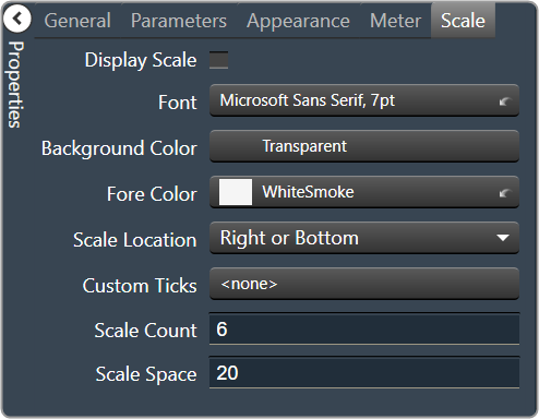
2.3.1.1.1.29.Meter Segmented
A segmented meter is an output meter that shows the state of a device parameter.
Controls can be managed in the Custom Panel designer and, once the Custom Panel is activated, utilized by the end user. This control must be linked to a parameter to function properly.
| Property Type | Options |
|
General
|
Control Info: Shows control type.
|
Locked: Specifies if the control is locked out so that it cannot be moved or re-sized.
|
|
|
Parameters
|
Addresses: Enables panel designer to edit addressing information with the added benefit that the values can be validated as a group before being applied to the device. This editor also allows the user to assign multiple parameters to the control. Click to select Parameter Address Editor.
|
Information: Shows information about the Parameter Address.
|
|
| Maximum: The maximum value that a control may be set to. | |
| Minimum: The minimum value that a control may be set to. | |
| Value Equation: When specified, this equation combines the attached parameter’s values and returns the value that the control will display. | |
| Gain Reduction: Check if this meter is to be a Gain Reduction style. The negative dB gains are reported (shown) as increasing positive gains. | |
|
Appearance
|
Location: Control location (in pixels) of the control on the Custom Panel. Change X (horizontal) and Y (vertical) values in relation to upper left corner. You can also drag the control to a different location. |
|
Size: Control size (in pixels). Change width and height values. You can also re-size the control manually |
|
|
Background Color: The background color of the text area Brings up the Select Color window. |
|
| Tool Tip Text: Text that appears on control mouse-over. | |
Tab Stop: Whether the control appears in the tab order.
|
|
|
Meter
|
Orientation: The orientation of the meter; Vertical or Horizontal.
|
|
High Color: The color of the upper section of the meter Brings up the Select Color window. |
|
|
Mid Color: The color of the mid-section of the meter. Brings up the Select Color window. |
|
|
Low Color: The color of the lower section of the meter. Brings up the Select Color window. |
|
| High Threshold: The value at which the upper section ends, and the mid-section begins. | |
| Mid Threshold: The value at which the mid-section ends, and the lower section begins. | |
|
Off Color: The color of the Off segments. Brings up the Select Color window. |
|
|
Segment Border: The border color for each segment. Brings up the Select Color window. |
|
| Segment Count: The number of meter segments. | |
| Segment Height: The height of individual LEDs in the meter. | |
| Segment Width: The width of individual LEDs in the meter. | |
| Top Border: Distance, in pixels, between the top edge of the control and the top of the meter. | |
| Bottom Border: Distance, in pixels, between the bottom edge of the control and the bottom of the meter. | |
| Left Border: Distance, in pixels, between the left edge of the control and the left side of the meter. | |
| Right Border: Distance, in pixels, between the right edge of the control and the right side of the meter. | |
| Segment Spacing: The distance, in pixels between segments. | |
|
Scale
|
Display Scale: When checked, the scale is enabled. |
Font: Click on “…” to select desired font. Brings up a Font Select window.
|
|
|
Background Color: The background color of the text area Brings up the Select Color window. |
|
|
Fore Color: The foreground color for the scale. Brings up the Select Color window. |
|
Scale Location: Placement for the scale (the scale must be enabled first)
|
|
| Custom Ticks: Customized ticks for the control. Parameters must be set first. | |
| Scale Count: The number of scale entries to display. | |
| Scale Space: Space to allocate for the scale. |


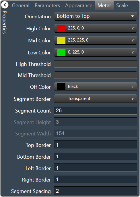

2.3.1.1.1.30.Meter Segmented Advanced
A segmented advanced meter is an output meter that shows the state of a device parameter.
Controls can be managed in the Custom Panel designer and, once the Custom Panel is activated, utilized by the end user. This control must be linked to a parameter to function properly.
| Property Type | Options |
|
General
|
Control Info: Shows control type.
|
Locked: Specifies if the control is locked out so that it cannot be moved or re-sized.
|
|
|
Parameters
|
Addresses: Enables panel designer to edit addressing information with the added benefit that the values can be validated as a group before being applied to the device. This editor also allows the user to assign multiple parameters to the control. Click to select Parameter Address Editor.
|
Information: Shows information about the Parameter Address.
|
|
| Maximum: The maximum value that a control may be set to. | |
| Minimum: The minimum value that a control may be set to. | |
| Value Equation: When specified, this equation combines the attached parameter’s values and returns the value that the control will display. | |
| Gain Reduction: Check if this meter is to be a Gain Reduction style. The negative dB gains are reported (shown) as increasing positive gains. | |
|
Appearance
|
Location: Control location (in pixels) of the control on the Custom Panel. Change X (horizontal) and Y (vertical) values in relation to upper left corner. You can also drag the control to a different location. |
|
Size: Control size (in pixels). Change width and height values. You can also re-size the control manually |
|
|
Fore Color: Sets the foreground color for the meter. Brings up the Select Color window. |
|
|
Background Color 1: First background color used in the gradient behind the meter itself. Brings up the Select Color window. |
|
|
Background Color 2: Second background color used in the gradient behind the meter itself. Brings up the Select Color window. |
|
| Border: The margin, in pixels around the outside of the LEDs. | |
| Tool Tip Text: Text that appears on control mouse-over. | |
Tab Stop: Whether the control appears in the tab order.
|
|
|
Meter
|
Orientation: The orientation of the meter; Vertical or Horizontal.
|
| Draw Peak: If checked, the peak line will be displayed. | |
| Peak Decay Rate: Percent of the meter that the Peak Line will drop per second. | |
| Peak Hold Time: Time taken, in seconds to hold the peak at the top value before decay. | |
| Meter Decay Rate: For meter filtering – Percent of the meter that the meter itself will drop per second. Must be greater than the Peak Decay Rate. | |
|
High Color: The color of the upper section of the meter Brings up the Select Color window. |
|
|
Mid Color: The color of the mid-section of the meter. Brings up the Select Color window. |
|
|
Low Color: The color of the lower section of the meter. Brings up the Select Color window. |
|
| High Threshold: The value at which the upper section ends, and the mid-section begins. | |
| Mid Threshold: The value at which the mid-section ends, and the lower section begins. | |
|
Peak Color: The color of the Peak Line. Brings up the Select Color window. |
|
|
Scale
|
Display Scale: When checked, the scale is enabled. |
Font: Click on “…” to select desired font. Brings up a Font Select window.
|
|
|
Background Color: The background color of the text area Brings up the Select Color window. |
|
|
Fore Color: The foreground color for the scale. Brings up the Select Color window. |
|
Scale Location: Placement for the scale (the scale must be enabled first)
|
|
| Custom Ticks: Customized ticks for the control. Parameters must be set first. | |
| Scale Count: The number of scale entries to display. | |
| Scale Space: Space to allocate for the scale. |

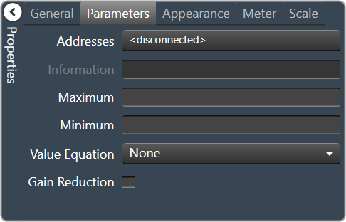
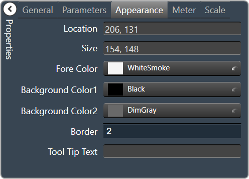
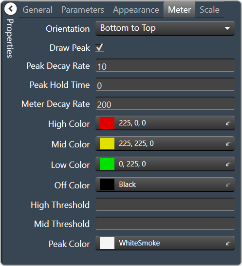

2.3.1.1.1.31.Meter Segmented Dial
A segmented dial meter is an output meter that shows the state of a device parameter.
Controls can be managed in the Custom Panel designer and, once the Custom Panel is activated, utilized by the end user. This control must be linked to a parameter to function properly.
| Property Type | Options |
|
General
|
Control Info: Shows control type.
|
Locked: Specifies if the control is locked out so that it cannot be moved or re-sized.
|
|
|
Parameters
|
Addresses: Enables panel designer to edit addressing information with the added benefit that the values can be validated as a group before being applied to the device. This editor also allows the user to assign multiple parameters to the control. Click to select Parameter Address Editor.
|
Information: Shows information about the Parameter Address.
|
|
| Maximum: The maximum value that a control may be set to. | |
| Minimum: The minimum value that a control may be set to. | |
| Value Equation: When specified, this equation combines the attached parameter’s values and returns the value that the control will display. | |
| Gain Reduction: Check if this meter is to be a Gain Reduction style. The negative dB gains are reported (shown) as increasing positive gains. | |
|
Appearance
|
Location: Control location (in pixels) of the control on the Custom Panel. Change X (horizontal) and Y (vertical) values in relation to upper left corner. You can also drag the control to a different location. |
|
Size: Control size (in pixels). Change width and height values. You can also re-size the control manually |
|
|
Background Color: The background color of the text area Brings up the Select Color window. |
|
| Anti-Aliasing: When checked, the meter will draw with anti-aliasing. | |
| Tool Tip Text: Text that appears on control mouse-over. | |
|
Meter
|
Outer Radius: The fractional position of the outermost portion of the segments. |
| Inner Radius: The fractional position of the innermost portion of the segments. | |
| Starting Angle: The clockwise angle, in degrees where 0 is straight up | |
| Ending Angle: The clockwise angle, in degrees where 0 is straight up. | |
| Separation Angle: The angle, in degrees separating each segment | |
| Segment Count: The total number of segments in the display. | |
|
Off Color: The color of the Off segments. Brings up the Select Color window. |
|
|
High Color: The color of the upper section of the meter Brings up the Select Color window. |
|
|
Mid Color: The color of the mid-section of the meter. Brings up the Select Color window. |
|
|
Low Color: The color of the lower section of the meter. Brings up the Select Color window. |
|
| Segment Border Color: The total number of segments in the display. | |
| High Threshold: The value at which the upper section ends, and the mid-section begins. | |
| Mid Threshold: The value at which the mid-section ends, and the lower section begins. |


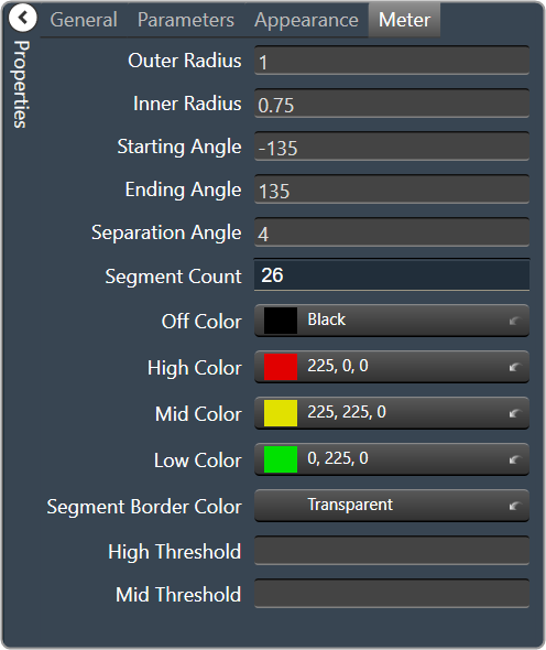
2.3.1.1.1.32.Tick Marker
A tick marker is an unlinked control that can be customized to show user-specified values. It can be used with faders and meters to specify particular measurements with unique positions, orientations, colors, etc.
Controls can be managed in the Custom Panel designer and, once the Custom Panel is activated, utilized by the end user. This control must be linked to a parameter to function properly.
| Property Type | Options |
|
General
|
Control Info: Shows control type.
|
Locked: Specifies if the control is locked out so that it cannot be moved or re-sized.
|
|
|
Appearance
|
Location: Control location (in pixels) of the control on the Custom Panel. Change X (horizontal) and Y (vertical) values in relation to upper left corner. You can also drag the control to a different location. |
|
Size: Control size (in pixels). Change width and height values. You can also re-size the control manually |
|
|
Background Color: The background color of the text area Brings up the Select Color window. |
|
|
Ticks
|
Vertical Justification: Vertical justification of the ticks |
Display Ticks: Whether to display the tick marks of the control or not
|
|
|
Major Tick Color: Color of the major ticks Brings up the Select Color window.
|
|
|
Major Tick Count: How many major ticks are displayed. The major tick count must be the same as or larger than the number of major tick labels in order to display all labels. |
|
| Major Tick Length: The length (in pixels) of the major ticks | |
| Orientation: Displayed Horizontal or Vertical | |
| Minor Split: Whether or not to split minor ticks on the centered tick marker. | |
|
Minor Tick Color: Color of the minor ticks. Brings up the Select Color window.
|
|
| Minor Tick Count: How many minor ticks are displayed between major ticks | |
| Minor Tick Length: The length (in pixels) of the major tick | |
| Tick Thickness: Thickness (in pixels) of the tick marks. | |
|
Tick Labels
|
Display Labels: Whether or not to display labels on the control. |
Label Font: Click on “…” to select desired font.
|
|
|
Label Color: Color of the control text. Brings up the Select Color window.
|
|
| Tick Label Offset: Spacing (in pixels) between tick marks and their labels. | |
|
Major Tick Labels: The labels for the major ticks The major tick count must be the same as or larger than the number of major tick labels to display all labels. |
|
|
Margins
|
High Margin: Spacing (in pixels) between label and top border, limited by size of bounding box |
| Left Margin: Spacing (in pixels) between label and left border, limited by size of bounding box | |
| Low Margin: Spacing (in pixels) between label and bottom border, limited by size of bounding box | |
| Right Margin: Spacing (in pixels) between label and right border, limited by size of bounding box |

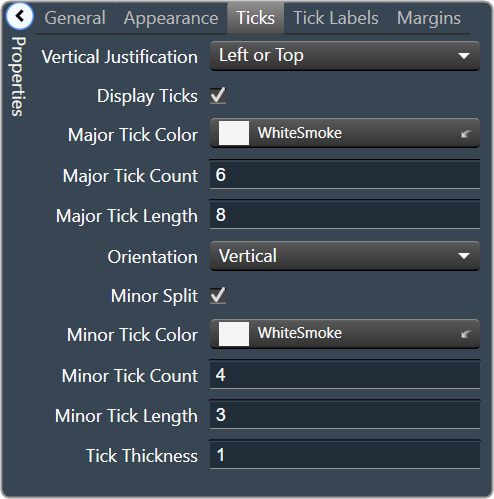

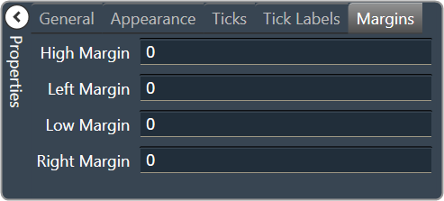
2.3.1.1.1.33.Note
A note adds an icon to a Custom Panel with popup text. A note cannot be linked to a parameter.
Controls can be managed in the Custom Panel designer and, once the Custom Panel is activated, viewed (but not changed) by the end user.
| Property Type | Options |
|
General
|
Control Info: Shows control type.
|
Locked: Specifies if the control is locked out so that it cannot be moved or re-sized.
|
|
|
Appearance
|
Location: Control location (in pixels) of the control on the Custom Panel. Change X (horizontal) and Y (vertical) values in relation to upper left corner. You can also drag the control to a different location. |
|
Background Color: The background color of the text area Brings up the Select Color window. |
|
| Tool Tip Text: Text that appears on control mouse-over. | |
|
Note
|
Note Text: Click to enter desired text for note content. Brings up a Control Text editor. |
|
Text Color: Text color of the control. Brings up the Select Color window.
|
|
|
Popup Background Color: Background color for the popup. Brings up the Select Color window. |
|
| Popup Width: The width of the popup in pixels | |
| Popup Height: The height of the popup in pixels | |
|
Display Direction: The direction in which the popup will appear when the note is clicked. “Auto” will position the popup depending on where the user clicks.
|


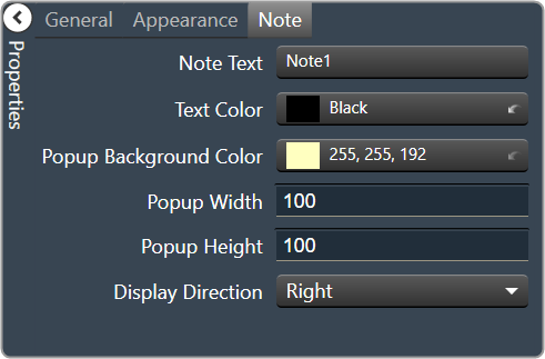
2.3.1.1.1.34.Panel Link
A panel link is a control on a Custom Panel that links to another Custom Panel. Define the link in the panel link section of the properties tab.
Controls can be managed in the Custom Panel designer and, once the Custom Panel is activated, utilized by the end user. This control must be linked to another Custom Panel to function properly.
| Property Type | Options |
|
Appearance
|
Background Color: The background color of the text area Brings up the Select Color window. |
|
Background Image: Background image of the control. Brings up the Select Color window. |
|
Background Image Layout: Background layout of the image.
|
|
Font: Click on “…” to select desired font.
|
|
|
Foreground Color: The foreground color for the panel. Brings up the Select Color window. |
|
|
Design
|
Panel Name: Enter the name of the panel.
|
|
Layout
|
Size: Control size (in pixels). Change width and height values. You can also re-size the control manually. |
Start Behavior: Behavior of the panel.
|
|
|
Start Location: Control location (in pixels) of the control on the Custom Panel. Change X (horizontal) and Y (vertical) values in relation to upper left corner. You can also drag the control to a different location |
|
|
Window Style
|
Show Control Box: Whether to display control box or not. |
Form Border Style: Click to select form border style.
|
|
| Hide Cursor: Whether or not to display cursor. | |
| Icon: Click on “…” to select desired icon. | |
| Show Maximize Box: Whether to display maximize box or not. | |
| Show Minimize Box: Whether to display minimize box or not. | |
| Show Icon: Whether to display icon or not. | |
| Show in Taskbar: Whether to display taskbar or not. | |
Size Grip Style: Click to select size grip style.
|
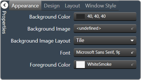


2.3.1.1.1.35.Panel Preset Bar
The panel preset bar manages panel presets. This control is added to the Custom Panel as an unlinked control because it is not linked to a parameter; it creates values as you change parameter settings.
On an activated Custom Panel, you can store, recall, rename, and delete panel presets. On the Custom Panel designer, you can edit it or change its properties.
A panel preset saves the current values and control parameters on a Custom Panel; when additional parameters are added or values are changed, the panel preset must be saved again to include them.
- Store panel preset: On the activated Custom Panel, change parameter settings as desired then click “Store” on panel preset bar.
On Store Panel Preset dialog, type preset name, and click “OK.”
The panel preset is added to the preset list.
If one of the values on a panel preset is changed, the button will turn green to alert you that you need to re-save the panel preset to include the changed value. Simply click the ‘Store’ button.
- Recall panel preset: Recall panel presets on the activated Custom Panel, either from the title bar or the panel preset bar.
- TITLE BAR: Right click title bar, select “Recall Preset,” then select the desired preset from the list.
- PANEL PRESET BAR: Select “Recall.” Select the panel preset from the list and click “OK.”
The panel preset settings are recalled.
- Rename panel preset: On the activated Custom Panel, select “Store” on panel preset bar. Select the item from the list that you wish to rename.
Type the new name next to “Preset Name” and click “OK.”
- Delete panel preset: On the activated Custom Panel, select “Delete.” Select the panel preset from the list and click “OK.”
| Property Type | Options |
|
General
|
Control Info: Shows control type. Read only |
Locked: Specifies if the control is locked out so that it cannot be moved or re-sized.
|
|
|
Appearance
|
Location: Control location (in pixels) of the control on the Custom Panel. Change X (horizontal) and Y (vertical) values in relation to upper left corner. You can also drag the control to a different location |
| Size: Control size (in pixels). Change width and height values. You can also re-size the control manually. | |
|
Background Color: Background color of the control. Brings up the Select Color window. |
|
|
Text Color: Text color of the control Brings up the Select Color window. |
|
Font: Click on “…” to select desired font
|
|
|
Label Text Color: The color of the Label Text Brings up the Select Color window. |
|
| Tab Index: Indicates the sequence of an element within the tabbing order of all focusable elements in the document. | |
Tab Stop: Whether the control appears in the tab order.
|


2.3.1.1.2.Images
The second toolset contains image design tools. This toolset includes the following tools.
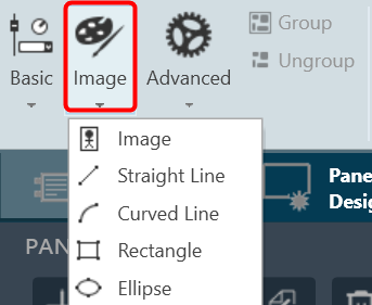
2.3.1.1.2.1.Image
The Image control is a basic Custom Panel control used for custom images such as a company logo or icon.
| Property Type | Options |
|
General
|
Control Info: Shows control type. Read only |
Locked: Specifies if the control is locked out so that it cannot be moved or re-sized.
|
|
|
Appearance
|
Location: Control location (in pixels) of the control on the Custom Panel. Change X (horizontal) and Y (vertical) values in relation to upper left corner. You can also drag the control to a different location |
| Size: Control size (in pixels). Change width and height values. You can also re-size the control manually. | |
| Image: Brings up the Select Image file window. | |
Image Layout: The image layout used by the control.
|
|
|
Background Color: Background color of the image control. Brings up the Select Color window. |
|
Border Style: Select the border type of bitmap control.
|
|
Border Color: Color of the image border.
|

2.3.1.1.2.2.Straight Line
Allows to add a straight line in the custom panel.
| Property Type | Options |
|
General
|
Control Info: Shows control type. Read only |
Locked: Specifies if the control is locked out so that it cannot be moved or re-sized.
|
|
|
Appearance
|
Location: Control location (in pixels) of the control on the Custom Panel. Change X (horizontal) and Y (vertical) values in relation to upper left corner. You can also drag the control to a different location |
| Size: Control size (in pixels). Change width and height values. You can also re-size the control manually. | |
|
Fore Color: The color of the line. Brings up the Select Color window. |
|
|
Line Properties
|
Anti-alias: When checked, turns on the anti-aliasing filter. |
| Start Point: The location on the panel of the line starting point. | |
| End Point: The location on the panel of the line ending point. | |
| Thickness: The thickness, in pixels of the line. | |
Line Template: The orientation of the line.
|


2.3.1.1.2.3.Curved Line
Allows to add a curved line in the custom panel.
| Property Type | Options |
|
General
|
Control Info: Shows control type. Read only |
Locked: Specifies if the control is locked out so that it cannot be moved or re-sized.
|
|
|
Appearance
|
Location: Control location (in pixels) of the control on the Custom Panel. Change X (horizontal) and Y (vertical) values in relation to upper left corner. You can also drag the control to a different location |
| Size: Control size (in pixels). Change width and height values. You can also re-size the control manually. | |
|
Fore Color: The color of the line. Brings up the Select Color window. |
|
|
Line Properties
|
Curve Type: The quadrant that the curved line occupies.
|
| Anti-alias: When checked, turns on the anti-aliasing filter. | |
| Thickness: The thickness, in pixels of the line. |


2.3.1.1.2.4.Rectangle
Allows to add a rectangle in the custom panel.
| Property Type | Options |
|
General
|
Control Info: Shows control type. Read only |
Locked: Specifies if the control is locked out so that it cannot be moved or re-sized.
|
|
|
Appearance
|
Location: Control location (in pixels) of the control on the Custom Panel. Change X (horizontal) and Y (vertical) values in relation to upper left corner. You can also drag the control to a different location |
| Size: Control size (in pixels). Change width and height values. You can also re-size the control manually. | |
|
Fore Color: The color of the line. Brings up the Select Color window. |
|
|
Gradient Color Start: The starting color of a gradient fill or the color of a solid fill. Brings up the Select Color window. |
|
|
Gradient Color End: The ending color of a gradient fill. Not used for a solid fill. Brings up the Select Color window. |
|
Gradient Mode: The direction that a color gradient fill will flow.
|
|
Paint Style: The type of background fill.
|
|
| Rounded Corners: When checked the corners of the box will be rounded by the Corner Radius amount. | |
| Corner Radius: The radius of the corners. | |
|
Line Properties
|
Anti-alias: When checked, turns on the anti-aliasing filter. |
| Thickness: The thickness, in pixels of the line. |


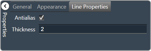
2.3.1.1.2.5.Ellipse
Allows to add ellipse in the custom panel.
| Property Type | Options |
|
General
|
Control Info: Shows control type. Read only |
Locked: Specifies if the control is locked out so that it cannot be moved or re-sized.
|
|
|
Appearance
|
Location: Control location (in pixels) of the control on the Custom Panel. Change X (horizontal) and Y (vertical) values in relation to upper left corner. You can also drag the control to a different location |
| Size: Control size (in pixels). Change width and height values. You can also re-size the control manually. | |
|
Fore Color: The color of the line. Brings up the Select Color window. |
|
|
Gradient Color Start: The starting color of a gradient fill or the color of a solid fill. Brings up the Select Color window. |
|
|
Gradient Color End: The ending color of a gradient fill. Not used for a solid fill. Brings up the Select Color window. |
|
Gradient Mode: The direction that a color gradient fill will flow.
|
|
Paint Style: The type of background fill.
|
|
|
Line Properties
|
Anti-alias: When checked, turns on the anti-aliasing filter. |
| Thickness: The thickness, in pixels of the line. |

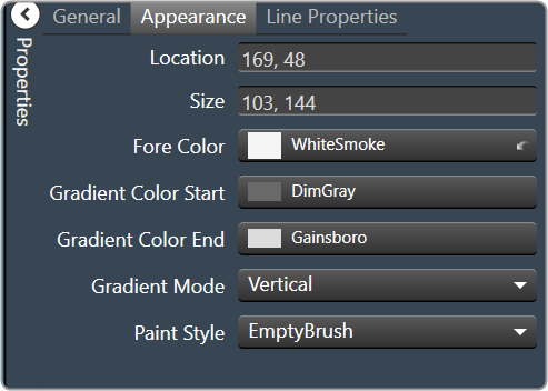

2.3.1.1.3.Advanced
The Advance toolset contains additional design tools. This toolset includes the following tools.

2.3.1.1.3.1.Panel
A panel is a box that allows you to manage the look of your Custom Panel.
| Property Type | Options |
|
General
|
Control Info: Shows control type. Read only |
|
Appearance
|
Back Color: Background color of the panel. Brings up the Select Color window. |
|
Location: Control location (in pixels) of the control on the Custom Panel. Change X (horizontal) and Y (vertical) values in relation to upper left corner. You can also drag the control to a different location |
|
| Size: Control size (in pixels). Change width and height values. You can also re-size the control manually. | |
Paint Style: The type of background fill.
|
|
Gradient Mode: The direction that a color gradient fill will flow.
|
|
|
Gradient Color Start: The starting color of a gradient fill or the color of a solid fill. Brings up the Select Color window. |
|
|
Gradient Color End: The ending color of a gradient fill. Not used for a solid fill. Brings up the Select Color window. |
|
| Background Image: Background image of the control. | |
Background Image Layout: The way the background image is drawn.
|
|
Border Style: Click to select border style.
|
|
| Draw Border: When checked, a border is drawn around the Panel. | |
| Rounded Corners: When checked the corners of the box will be rounded by the Corner Radius amount. | |
| Corner Radius: The radius of the corners. | |
| Tab Index: If tab stop is set to true, determines the position of the control in the tab order. | |
Tab Stop: Specifies whether the control appears in the tab order.
|

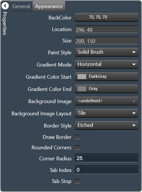
2.3.1.1.3.2.Tab Panel
A tab panel is a box with selectable tabs that allows you to manage the look of your Custom Panel as well as group controls together in a functional, attractive manner. Tab panels can be managed in the Custom Panel designers and, once the Custom Panel is activated, viewed by the end user. They can also select the desired tab.
Add a Tab Panel by dragging and dropping the Tab Panel icon, then add controls to the panel the same way you would a Custom Panel. After the tab panel has been added, add controls to the tab panel the same way you would a Custom Panel.
If the controls are not on the tab panel, select them and drag them over to the panel.
There are two levels to the panel – the entire panel and the tab portion of the panel.
| Property Type | Options |
|
Appearance
|
Border Style: Click to select border style. Default style is flat. |
|
Background Color: Background color behind the tab. Brings up the Select Color window. |
|
|
Tab Background Color: Background color of the tab area. Brings up the Select Color window. |
|
|
Tab Foreground Color: The color of the Tab’s text. Brings up the Select Color window. |
|
| Text: The header text for this tab. | |
Font: Click on “…” to select desired font. Brings up a Font Select window.
|
|
| Background Image: Background image of the control. | |
Background Image Layout: The way the background image is drawn.
|
|
| Text Padding: The amount of space around the text for this tab page. | |
|
Design
|
Draw Grid: When checked, the positioning grid will be drawn |
| Grid Size: Adjusts the size of the grid points within the panel. 8,8 is the default. Making this number smaller, such as 6,6 will add more grid points. | |
| Snap To Grid: Snaps each element in the Panel to the nearest grid point. |


2.3.1.1.3.3.Device Frame
The Device Frame looks and behaves similar to a standard Panel. Like a standard Panel, Parameter controls are added into it. Unlike a standard Panel, it has the power to change which Parameters its controls are attached to at run time (as opposed to design time).
At the top of the Design Frame is a combo box which lists devices of the same type. When the Device Frame is running, you can change which device is currently selected. All the controls in the Device Frame should then switch Parameters moving to corresponding State Variables on the newly selected device. In this way, you can create one small control panel which potentially controls or monitors any number of devices.
| Property Type | Options |
|
General
|
Control Info: Shows control type. Read only |
|
Appearance
|
Back Color: Background color of the panel. Brings up the Select Color window. |
|
Location: Control location (in pixels) of the control on the Custom Panel. Change X (horizontal) and Y (vertical) values in relation to upper left corner. You can also drag the control to a different location |
|
| Size: Control size (in pixels). Change width and height values. You can also re-size the control manually. | |
Paint Style: The type of background fill.
|
|
Gradient Mode: The direction that a color gradient fill will flow.
|
|
|
Gradient Color Start: The starting color of a gradient fill or the color of a solid fill. Brings up the Select Color window. |
|
|
Gradient Color End: The ending color of a gradient fill. Not used for a solid fill. Brings up the Select Color window. |
|
| Background Image: Background image of the control. | |
Background Image Layout: The way the background image is drawn.
|
|
Border Style: Click to select border style.
|
|
| Draw Border: When checked, a border is drawn around the Panel. | |
| Rounded Corners: When checked the corners of the box will be rounded by the Corner Radius amount. | |
| Corner Radius: The radius of the corners. | |
| Tab Index: If tab stop is set to true, determines the position of the control in the tab order. | |
Tab Stop: Specifies whether the control appears in the tab order.
|
|
|
Combo Box
|
Horizontal Alignment: The alignment of the Combo Box within the Device Frame.
|
| Devices: Brings up a Devices select window where you will select the available devices to assign to the Device Frame. |

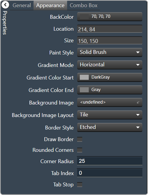

2.3.1.1.3.4.Graph Frequency/Gain
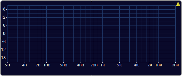
| Property Type | Options |
|
General
|
Control Info: Shows control type. Read only |
|
Graph Name: The name of the graph. Required to link to a Selector Panel or Widget Panel. |
|
| Band Selector Name: The name of the band selector panel associated with this graph. | |
| Channel Selector Name: The name of the Selector Panel to which the graph is linked. | |
| Widget Panel Name. The name of the Widget Panel to which the graph is linked. | |
| Widget Panel-B Name: The name of a secondary Widget Panel associated with this graph. | |
Locked: Specifies if the control is locked out so that it cannot be moved or re-sized.
|
|
|
Parameters
|
Addresses: The addresses for the parameters attached to the graph hierarchy. Opens the Graph Parameters window. |
Override attached alert: Whether to display the warning for disconnected controls.
|
|
|
Appearance
|
Location: Control location (in pixels) of the control on the Custom Panel. Change X (horizontal) and Y (vertical) values in relation to upper left corner. You can also drag the control to a different location |
|
Size: Control size (in pixels). Change width and height values. You can also re-size the control manually |
|
Show Grid: Whether or not to display the grid lines.
|
|
|
Fore Color The foreground color for this graph. Brings up the Select Color window. |
|
|
Background Color: Background color of the graph. Brings up the Select Color window. |
|
|
Font: Font for tick labels. Click on “…” to select desired font.
|
|
Value Format: The format of the values next to the major tick marks.
|
|
| Margin Width: The width of the margin from the sides to the graph (in pixels). | |
| Margin Height: The height of the margin from the sides to the graph (in pixels). | |
|
Grid Color: Grid line color. Brings up the Select Color window. |
|
|
Tick Color: Color of the tick marks. Brings up the Select Color window. |
|
|
Centerline Color: Color of the graph center line. Brings up the Select Color window. |
|
Color Scheme: The manner in which the Channel Colors are to be used.
|
|
| Min Frequency: Lower bound frequency for the graph. | |
| Max Frequency: Upper bound frequency for the graph. | |
| Min Gain: Lower bound gain for the graph. | |
| Max Gain: Upper bound gain for the graph. | |
| Vert Grids per pow: The number of grid lines to display for each power of 10 in frequency. | |
| Vert Ticks per pow: The number of ticks to display for each power of 10 in frequency. | |
| Horiz Grid dB: The number of dB between each horizontal grid line. | |
| Horiz Tick dB: The number of dB between each horizontal tick mark. | |
| Tool Tip Text: The text that appears on control mouse over. | |
| Tab Index: If tab stop is set to true, determines the position of the control in the tab order. | |
Tab Stop: Specifies whether the control appears in the tab order.
|
|
|
Graph
|
Channel Count: The number of channels currently in the graph. |
Channel Visibility: How many channels should be visible.
|
|
| Crossover/Channel Count: The number of Crossover/Bandpass curves currently in each channel. | |
| DeEsser/Channel Count: The number of DeEsser curves currently in each channel. | |
| FIR/Channel Count: The number of FIR filter curves currently in each channel. | |
| Parametric/Channel Count: The number of Parametric curves currently in each channel. | |
| Bandpass in Selector: If checked, the bandpass curves will be in the selector panels. | |
| Selected Channel Number: The number of the currently selected channel. | |
| Sample Rate: The interval at which the curve is sampled. | |
|
Curves
|
PEQ Curve Fill Style: The fill style for Parametric EQ curves.
|
| Label PEQ Curves: When checked, the Parametric EQ curves will be labeled. | |
| Label Bandpass Curves: When checked, the Bandpass curves will be labeled. | |
Label Font: The font for curve labels.
|
|
|
Control Blocks
|
Show Control Blocks: Enable the display of the filter control blocks. |
| Block Width: The width of the filter control blocks. | |
| Block Height: The height of the filter control blocks. | |
Block Font: The font for the filter control blocks.
|
|
|
Nubbins
|
Diameter: Drawing diameter for control point nubs. |
| Diameter Extended: Interaction diameter for control point nubs. | |
Bandpass Nub Draw When: Selects when the Bandpass nubs should be drawn.
|
|
DeEsser Nub Draw When: Selects when the DeEsser nubs should be drawn.
|
|
PEQ Nub Draw When: Selects when the Parametric EQ nubs should be drawn.
|
|
Bandpass Nub Draw Which: Selects which bandpass nubs should be drawn.
|
|
PEQ Nub Draw Which: Selects which Parametric EQ nubs should be drawn.
|
|
PEQ Primary Nub Style: Selects the style of the parametric EQ primary nubs.
|
|
PEQ Secondary Nub Style: Selects the style of the parametric EQ secondary nubs.
|
|
Bandpass Primary Nub Style: Selects the style of the Bandpass primary nubs.
|
|
Bandpass Secondary Nub Style: Selects the style of the Bandpass secondary nubs.
|
|
DeEsser Primary Nub Style: Selects the style of the DeEsser primary nubs.
|
|
|
Sum Curve
|
Show Composite Curve: When checked, the overall composite curve will be displayed. |
| Show Sum Curves: When checked, the channel’s sum curve will be displayed. | |
|
Sum Curve Color: The color of the channel sum curve. Brings up the Select Color window. |
|
|
Composite Curve Color: The color of the composite curve. Brings up the Select Color window. |
|
| Composite Curve Thickness: The thickness, in pixels of the Composite Curve. | |
| Sum Curve Thickness: The thickness, in pixels of the Sum Curve. |


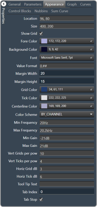


2.3.1.1.3.5.Graph Dynamics

| Property Type | Options |
|
General
|
Control Info: Shows control type. Read only |
|
Graph Name: The name of the graph. Required to link to a Selector Panel or Widget Panel. |
|
| Channel Selector Name: The name of the Selector Panel to which the graph is linked. | |
Locked: Specifies if the control is locked out so that it cannot be moved or re-sized.
Unchecked = Unlocked |
|
| Widget Panel Name. The name of the Widget Panel to which the graph is linked. | |
|
Parameters
|
Addresses: The addresses for the parameters attached to the graph hierarchy. Opens the Graph Parameters window. |
Override attached alert: Whether to display the warning for disconnected controls.
|
|
|
Appearance
|
Location: Control location (in pixels) of the control on the Custom Panel. Change X (horizontal) and Y (vertical) values in relation to upper left corner. You can also drag the control to a different location |
|
Size: Control size (in pixels). Change width and height values. You can also re-size the control manually |
|
Show Grid: Whether or not to display the grid lines.
|
|
|
Axis Color The color of the grid axis. Brings up the Select Color window. |
|
|
Axis Label Color: The color of the grid axis label. Brings up the Select Color window. |
|
|
Font: Font for tick labels. Click on “…” to select desired font.
|
|
Axis Font: The font for Input (dB) and Output (dB) labels.
|
|
Value Format: The format of the values next to the major tick marks.
|
|
| Margin Width: The width of the margin from the sides to the graph (in pixels). | |
| Margin Height: The height of the margin from the sides to the graph (in pixels). | |
|
Background Color: Background color behind the tab. Brings up the Select Color window. |
|
Enable Graph Label: Whether to display the graph label.
|
|
Enable Labels: Whether to display the graph axis labels.
|
|
|
Grid Color: Grid line color. Brings up the Select Color window. |
|
|
Tick Color: Color of the tick marks. Brings up the Select Color window |
|
|
Control Point Color: Color of the control point. Brings up the Select Color window. |
|
| Input Grid Spacing: Spacing (in dB) between vertical grid lines | |
| Input Tick Spacing: Spacing (in dB) between vertical tick marks | |
| Output Grid Spacing: Spacing (in dB) between horizontal grid lines | |
| Output Tick Spacing: Spacing (in dB) between horizontal tick marks | |
| Min Input: Minimum input level (in dB) shown on the graph | |
| Max Input: Maximum input level (in dB) shown on the graph | |
| Min Output: Minimum output level (in dB) shown on the graph | |
| Max Output: Maximum output level (in dB) shown on the graph | |
| Tool Tip Text: The text that appears on control mouse over. | |
| Tab Index: If tab stop is set to true, determines the position of the control in the tab order. | |
Tab Stop: Specifies whether the control appears in the tab order.
|
|
|
Graph
|
Channel Visibility: How many channels should be visible.
|
|
Channels
|
Selected Channel: Sets the selected channel |
|
Channel Color: The color of the channel line Brings up the Select Color window. |
|
Channel Guidelines: Whether to display channel guidelines or not.
|
|
|
Channel Guideline Color: The color of the channel guidelines. Brings up the Select Color window. |
|
|
Control Point
|
Diameter: Diameter for control points (nubs) on an un-selected channel. |
| Selected Diameter: Diameter for control points (nubs) on a selected channel. | |
Draw When: When control points (nubs) are drawn.
|
|
Draw Which: Which control points (nubs) should be drawn.
|
|
Primary Style: Style of the parametric primary control points (nubs).
|
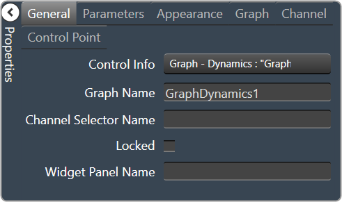

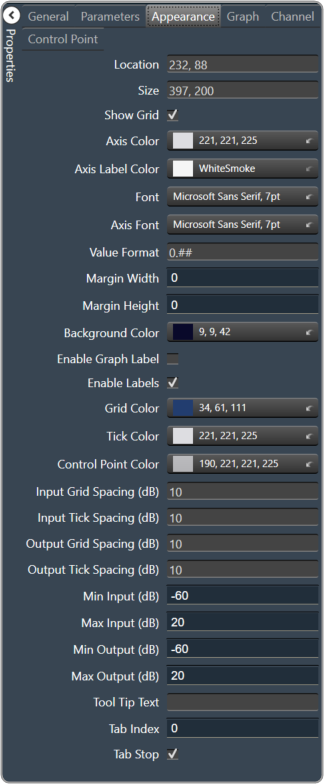

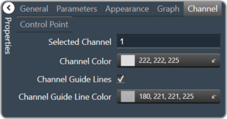

2.3.1.1.3.6.Selector Panel
A selector panel is a control that can link to a graph. It has buttons that allow the control panel user to select channels or bands on the graph.
Once the Selector Panel is tied to a graph, you can change its properties, including whether it will select bands or channels on the graph. To select the panel for editing, click anywhere between its borders and the buttons on the panel:
Individual selector buttons may be edited as well.

Overlapping controls, especially graph controls, can result in unexpected behavior and/or the appearance of controls. Use caution if you choose to overlap controls.
| Property Type | Options |
|
Appearance
|
Background Color: The background color of the text area Brings up the Select Color window. |
|
Background Image: Background image of the control. Brings up the Select Image window. |
|
Background Image Layout: Background layout of the image.
|
|
Font: Click on “…” to select desired font.
|
|
|
Foreground Color: The foreground color for the panel. Brings up the Select Color window. |
|
|
Design
|
Panel Name: Enter the name of the panel. Default text is “Panel 1”. |
|
Layout
|
Size: Control size (in pixels). Change width and height values. You can also re-size the control manually. |
|
Start Behavior: Behavior of the panel. Manual, CenterScreen, and WindowsDefaultLocation. |
|
|
Start Location: Control location (in pixels) of the control on the Custom Panel. Change X (horizontal) and Y (vertical) values in relation to upper left corner. You can also drag the control to a different location |
|
|
Window Style
|
Show Control Box: Whether to display control box or not. |
Form Border Style: Click to select form border style.
|
|
| Hide Cursor: Whether to display cursor or not. | |
| Icon: Click on “…” to select desired icon. | |
| Show Maximize Box: Whether to display maximize box or not. | |
| Show Minimize Box: Whether to display minimize box or not. | |
| Show Icon: Whether to display icon or not. | |
| Show in Taskbar: Whether to display taskbar or not. | |
Size Grip Style: Click to select size grip style.
|


2.3.1.1.3.7.Widget Panel
A widget panel is a control on a Custom Panel that links all controls inside its borders to one or more curves of a graph.
The entire widget panel is linked to the graph, so individual controls do not (and cannot) link to individual parameters; individual control assignments are made in the “assignments” property of the widget panel.
Controls on a widget panel are similar to other Custom Panel controls except that they are tied to elements of a graph. The widget panel controls the band or channel that is specified on the selector panel of an activated panel.
The entire widget panel is linked to the graph, so individual controls do not (and cannot) link to individual parameters; individual control assignments are made in the “Assignments” property of the widget panel.
For example, a fader can control one parameter of one band on one channel.
Even if multiple parameters are added to the fader, all of the parameters change to the same value:
If, however, a fader is added to a widget panel that is linked to a graph (and a selector panel), the fader can control ALL bands individually with one control of the graph:
Once a new band is selected on the selector panel, the fader controls the same parameter on that band as well.
To set up a widget panel
- Add a widget panel to the Custom Panel.
- Link the widget panel to the desired graph using graph collaboration.
- Add controls to the widget panel.
- Assign those graph parameters to the controls.
Graphs can be managed in the Custom Panel designer and, once the Custom Panel is activated, utilized by the end user.
Overlapping controls, especially graphs, can result in unexpected behavior and/or appearance of controls. Use caution if you choose to overlap controls.
| Property Type | Options |
|
General
|
Control Info: Shows control type. Read only |
| Graph Name: Allows graph to be named. | |
| Type: Select which type of EQ to be used for collaboration. | |
Widget Panel Name: The name of the widget panel.
|
|
| Assignments: Allows editing of assignments on Widget Panel. | |
|
Appearance
|
Back Color: Background color of the panel. Brings up the Select Color window. |
|
Location: Control location (in pixels) of the control on the Custom Panel. Change X (horizontal) and Y (vertical) values in relation to upper left corner. You can also drag the control to a different location |
|
| Size: Control size (in pixels). Change width and height values. You can also re-size the control manually. | |
Paint Style: The type of background fill.
|
|
Gradient Mode: The direction that a color gradient fill will flow.
|
|
|
Gradient Color Start: The starting color of a gradient fill or the color of a solid fill. Brings up the Select Color window. |
|
|
Gradient Color End: The ending color of a gradient fill. Not used for a solid fill. Brings up the Select Color window. |
|
| Background Image: Background image of the control. | |
Background Image Layout: The way the background image is drawn.
|
|
Border Style: Click to select border style.
|
|
| Draw Border: When checked, a border is drawn around the Panel. | |
| Rounded Corners: When checked the corners of the box will be rounded by the Corner Radius amount. | |
| Corner Radius: The radius of the corners. | |
| Tab Index: If tab stop is set to true, determines the position of the control in the tab order. | |
Tab Stop: Specifies whether the control appears in the tab order.
|
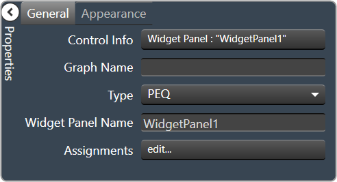

2.3.1.1.4.Group and Ungroup
Group
The group tool helps you to group the multiple items in the designer panel workspace. Grouping helps you to organize design components and keeps your workspace panel uncluttered.
Ungroup
The ungroup tool helps you to ungroup the group items in the designer panel workspace.
2.3.1.2.Clipboard
The Clipboard group is a set of copy and paste menus. This includes Duplicate, Cut, Copy, Paste, Copy Visual, and Paste Visual.

Duplicate
- Duplicate: Duplicates the selected control.
- Duplicate Special: Brings up the following window.
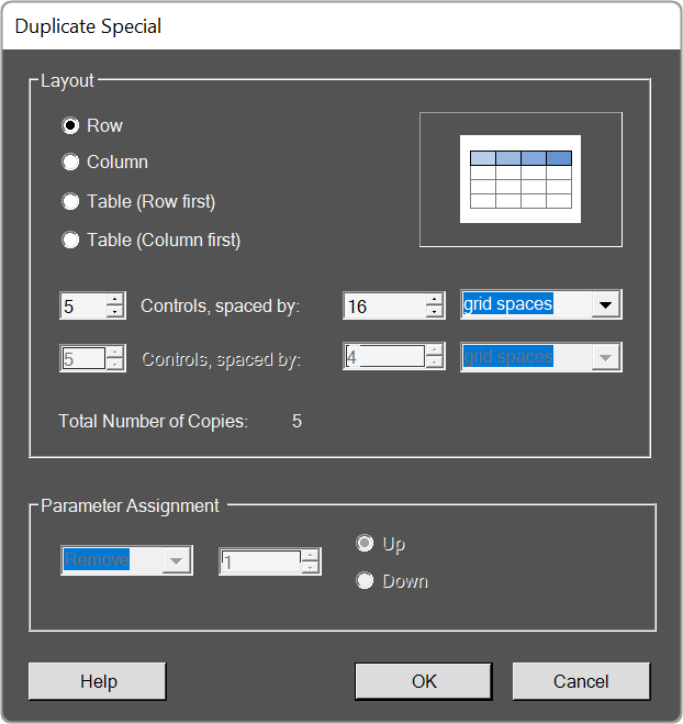
Cut / Copy / Paste
Acts as standard Windows function in that you may Cut/ Copy/ Paste the selected control.
Copy Visual / Paste Visual
This brings up the Select Control Properties window.
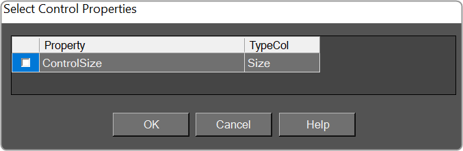
The visual properties of a single control are copied and pasted with the appropriate menu entry in the right-click context menu for a selection of controls, and with the appropriate button in the Clipboard control group within the Custom Panel Designer pop-up Ribbon.
2.3.1.3.Editing
The Editing group is a set of edit menus. This includes Delete, Select All, Undo, and Redo.
- Delete: You may delete a selected device or multiple selections of devices from the Venue using the Delete button or with the Delete keyboard key.
- Select All: Use this to select all devices within the current view, or with the standard CTRL-A Windows keyboard shortcut.
- Undo / Redo: Use these buttons to Undo or Redo all operations, or with the standard CTRL-Z (Undo), and CTRY-Y (Redo) Windows keyboard shortcuts.
2.3.1.4.Panels

- Launch Current: This option allows you to open the current active Custom Panel.
- Duplicate: This option allows you to create a copy of the current active Custom Panel.
- Create Link: This option allows you to create a link on a custom panel.
2.3.1.5.Layout
The Layout group is a set of tools that allow you to arrange your design items just the way you want them. This includes Align tools, Size tools, Spacing tools, and Order tools.
Align
A drop-down menu for aligning the current selection(s) within the Panel.

Size
Drop-down menu with options for sizing the current selection(s) as Size to Grid, Make the Same Width, Make the Same Height, or make all selected controls the Same Size.

Spacing
Drop-down menu with options for spacing the controls within the Panel.

Order
Bring-to-Front or Send-to-Back options for selected controls.

2.3.1.6.Parameters
The tools in the Parameter group allow you to Edit, Remove, and Search the parameters.

- New Link:
- Add To Link:
- Edit: Click to select Parameter Address Editor.
- Remove: Removes the selected parameters.
- Search: Brings up the Advanced Parameter Search window.
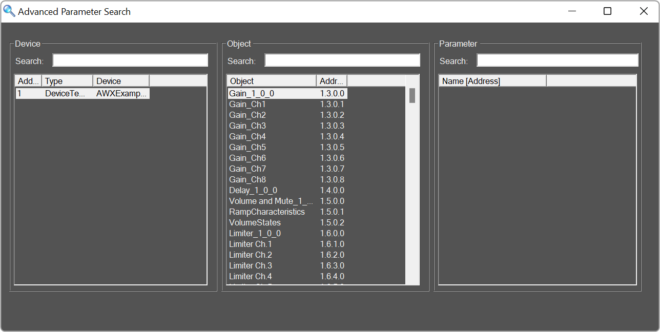
- Readdress:
2.3.2.Panels View
The Panels view in Panel Designer lists all custom panels. You can use the Panel view to create a new panel, export a panel, import a panel, and delete the panel. You can access additional options like Application, Parameter Sets, and Venue in the panel menu.
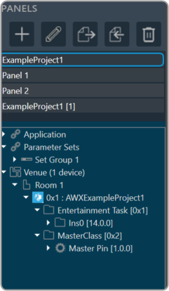
| Icon | Description |
 |
Add Panel: Click on this option to add new panel. |
 |
Rename Panel: Allows you to rename the existing panel. |
 |
Import Panel: Click on this option to import a panel. |
 |
Export Panel: Click on this option to export a panel. |
 |
Remove Devices: Click on this option to delete the panel. |
2.3.3.Custom Panel Properties View
The Property View displays the properties of each of the components that are used to design the panel and also allows you to customize the panel. The Properties view is displayed on the right side of the screen.
The custom panel workspace has the following properties.
- Appearance: Allows you to edit the background color and, background image, image layout, font style, and foreground color.
-
- Background Color: Opens the Select Color editor, and sets the background color of the Panel.
- Background Image: Opens a separate window where an image file is located and selected. Note: it is highly recommended that the background image fit the panel size for the best look. See Layout > Size for these dimensions.
- Background Image Layout: Sets the layout of the Background Image – whether it be None, Tile, Center, Stretch, or Zoom.
- Font: Select the text font used by the form.
- Foreground Color: The foreground color of the component, which is used to display text.
-
- Design: Allows you to rename the panel.
-
- Panel Name: Sets the name of the panel.
-
- Layout: Allows you to edit the panel layout size, behavior, and location.
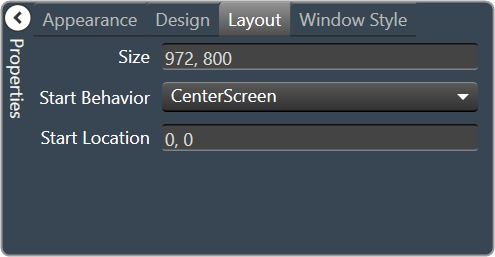
-
- Size: Sets the pixel size of the panel.
- Start Behavior: Determines the location of the form when it is launched. Selections are Windows Default Location, Center Screen, or Manual.
- Start Location: The point on the screen, in pixels, that the form will appear when the Start Behavior is set to Manual.
-
- Window Style: Allows you to edit the panel styling properties.
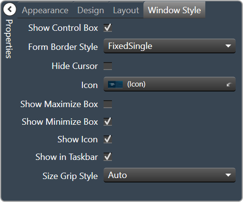
-
- Show Control Box: Determines whether or not the Minimize, Maximize, and Close buttons will be shown.
- Form Border Style: Determines the Border Style for this Custom Panel. Selections are Sizable, None, Fixed Single, Fixed 3D, Fixed Dialog, Fixed Tool Window, and Sizable Tool Window.
- Hide Cursor: When selected will hide the mouse cursor when it is over the panel. This may be useful when using touchscreen monitors to display Custom Panels.
- Icon: Select the icon for the form. This icon is displayed in the form’s system menu box and when the form is minimized. When clicked, a widow opens for you to locate and select the icon file (*.ico).
- Show Maximize Box: Determines whether or not this Custom Panel can be maximized.
- Show Minimize Box: Determines whether or not this Custom Panel can be minimized.
- Show Icon: Sets whether or not to show an icon for this Custom Panel.
- Show in Taskbar: Determines whether or not to show this Custom Panel in the taskbar when active.
- Size Grip Style: Sets the size grip style for this Custom Panel – selections are Auto, Show or Hide.
-
- Parameters : Allows to configure control with specific audio object state variable. This is helpful in tuning the audio object.
Different user control has different set to properties which can be configured.
Below are the examples of different user control.Rotary Encoder user control

On/Off Button user control


Horizontal Fader user control

Below are some common properties and values which can be set.
-
- Address: This establishes a link between a UI control (like a button or slider) and a state variable, allowing the control to modify the variable’s value.
- Minimum: This UI control allows setting a minimum value for the state variable. The minimum value should be within the state variable predefined minimum range.
- Maximum: This UI control allows setting a maximum value for the state variable. The maximum value should be within the state variable predefined maximum range.
- Reset Text: This is to control right-click context menu option (Rest Param) for resetting state variable to its predefined default value. The Rest Param option in the context menu is associated with default value setting in State Variable.
Below example shows default SV value is 1kHZ. Clicking on “Reset Param” option would reset the SV variable to its default value.

You can override the default value and add custom message to the Reset Text. The Text box UI control associated with EQ.
Open the Parameters properties and enter the required test in the “Reset Text” field.
In the below example, for the Frequency state variable the “Reset Text” is set to text “Set to default value”.

The update text for “Reset Param” would appear as per below image.
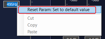
IMPORTANT
You can disable the “Reset Param” option on the right-click context menu. Open the Parameters properties and set the “Reset Text” field to <null>.
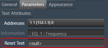
This will disable the “Reset Param” option from the context menu without impacting the other options.
2.3.4.Designer Workspace
In the Designer workspace, you can create a custom panel using various tools available on the Tool panel. Below is an example of the custom panel.
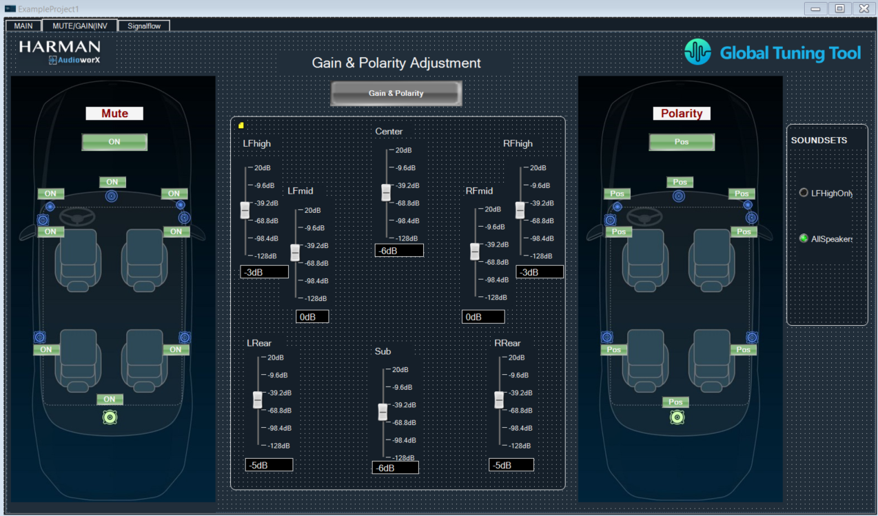
2.3.5.Editor Windows
In the Properties view there are various type of editor available, which allows you to customize the Panel. All the following editour windows are mapped with respective properties.
2.3.5.1.Parameter Address Editor
The Parameter Address Editor allows you to add or remove parameters linked to a control. It is accessed in the Custom Panel Designer Tab from Properties, Parameters, Address or with a right click on the control and selecting Edit parameters.
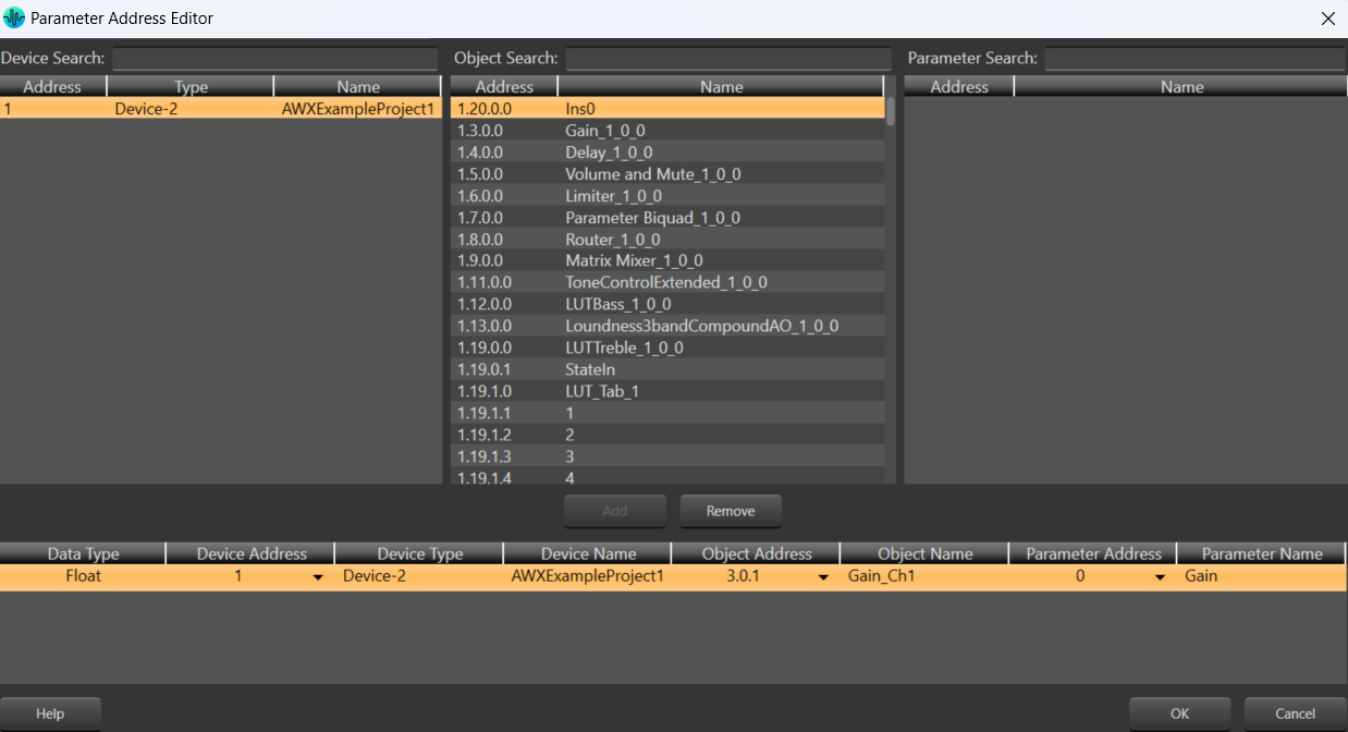
The top section of the parameter address editor shows all available parameter assignments Device, Object and Parameter.
- Device, Object, and Parameter Search
Since there are often a large number of items in the Device, Object and Parameter lists, the Search window allows you to narrow down the number of items in that list. For example, if you want to narrow the search to all Crown, Output Faders you would enter these into the Search windows.
The bottom half of the Parameter Address Editor shows assignments made to the control.
- Add Assignment
On the top section, select the parameters to be added to the control. Only devices that have been added to the venue will display in the “device” column.
Click the Add button or drag and drop the selection to the lower section. The parameters are assigned to the control.
- Remove Assignment
Select the parameters to be removed from the control then click the Remove button.
- Data Type: Shows the Address data type.
- Device Address: A drop-down list showing current available device addresses.
- Device Type: Shows type of device.
- Device Name: Shows the name of the device given in the venue.
- Object Address: A drop-down list showing current available object addresses.
- Object Name: Shows the name of the object where the parameter resides.
- Parameter Address: A drop-down list showing current addresses available for the selected parameter.
- Parameter Name: The name of the selected parameter
2.3.5.2.Multi-Parameter Address Editor
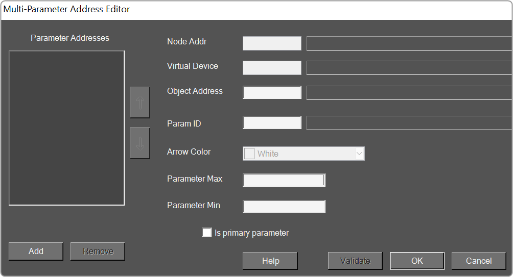
- Parameter Addresses:
- Add:
- Remove:
- Node Addr:
- Virtual Device:
- Object Address:
- Param ID:
- Arrow Color:
- Parameter Max:
- Parameter Min:
2.3.5.3.System Function Editor
The System Function Editor is a separate window that allows you to assign a certain System Function or functions upon an action such as pressing a button or receiving an external control signal.
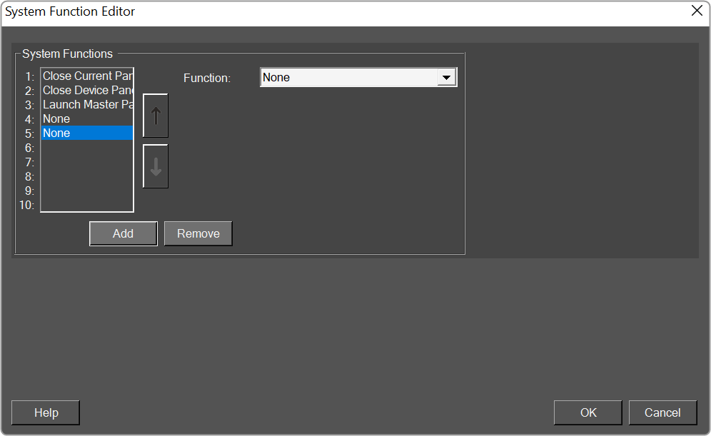
Function: Here you can select which function is to be assigned. Depending on which function you choose, other options below this will open offering supporting parameters or functions.
Below is the list of the functions that can be assigned.
- None
- Close Current Panel: Closes the current Panel
- Close Custom Panel: Closes a selected Custom Panel
- Close Device Panel: Closes a selected Device Panel
- Close Master Panel: Closes a selected Master Panel
- Launch Custom Panel: Launches a selected Custom Panel
- Launch Device Panel: Launches a selected Device Panel
- Launch Master Panel: Launches a selected Master Panel
- Locate: Select a device in the venue and determine whether you want it’s Locate feature on or off
- Mute Device: Mutes a selected Device
- Unmute Device: Unmutes a selected Device
- Mute Channel: Select a device in the venue and select a channel within that device to mute
- Unmute Channel: Select a device in the venue and select a channel within that device to unmute
- Solo Channel: Select a device in the venue and select a channel within that device to solo
- Recall Device Preset: Select a device in the venue and recall a preset within that device
- Recall Panel Preset: Select a custom Panel and recall a preset within that panel
- Recall Venue Preset: Brings up the Venue Presets window.
- Save File: Saves the current project file.
- Logout: Logout the current user from GTT.
- Switch User: Brings up a window to login a different GTT user.
- Close Application: Shuts down GTT.
- Shutdown Computer: Shuts down the computer GTT is running on.
- Play Sound File: Brings up a window to select a sound file. Selections include MP3, MIDI, Windows Audio or Windows Media files
- Launch Scheduler: Activates the Scheduler
- Launch Event Log: Activates the Event Log
2.3.5.4.State Indication Setup Window
The State Indication Setup window allows you to customize the look of a control such as a button.
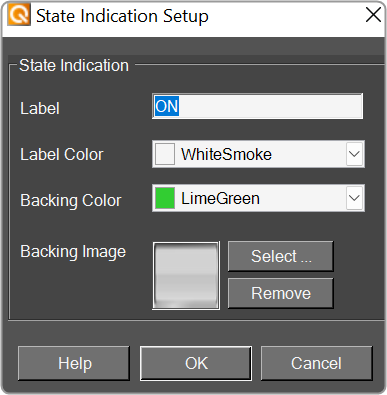
- Label: Enter the name of the label for the current state.
- Label Color: The color of the label. Select the color from the Select Color window.
- Backing Color: The color of the label background (such as the color of a button). Select the color from the Select Color window.
- Backing Image: An image for the label. Select the image from the Select Image File window.
2.3.5.5.Select Color Window
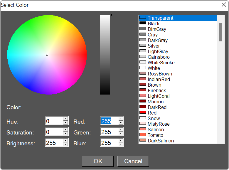
This window allows you to select the color of the current function such as line colors, background colors etc.
Select the desired color then click the OK button to set the color.
2.3.5.6.Discrete Values Editor
The discrete values editor lists the possible values of some controls such as the Radio Button.
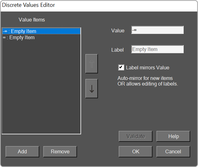
- Value Items: Displays a list of possible values of the parameter.
- Add: Adds additional values.
- Remove: Removes selected value.
- Value: Value of the item in the list.
- Label: Enter the label for the value of the item in the list; the default value is the same as the value (to edit, uncheck “Label mirrors Value”)
- Label mirrors Value: Checked – the Value text will be the same as the Label text. Unchecked – the Label text may be different than the Value text.
- Validate Authenticates values.
2.3.5.7.Indication Configuration Editor
The Indication Configuration form allows you to make specifications for a system indicator or region control on a Custom Panel.
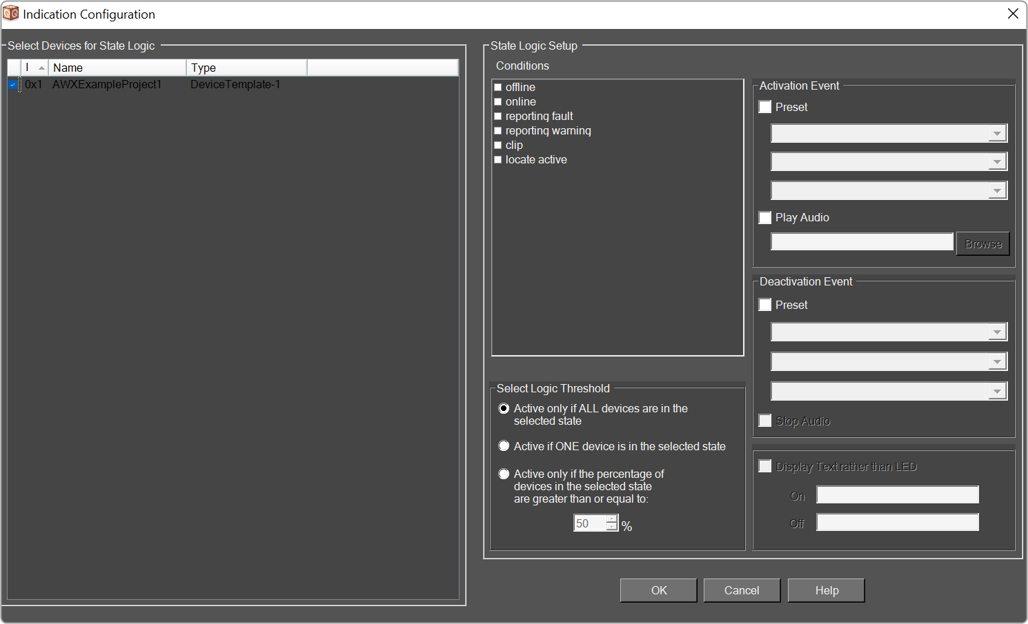
- Select Devices for State Logic: The devices that will be included in this configuration.
- Conditions: The condition of the device that will facilitate the activation or deactivation events.

- Select Logic Threshold: What will cause the logic action to occur:

– if the condition occurs on all devices. 
– if the condition occurs on at least one device. 
– if the condition occurs on a specified percentage of devices. The logic represented by the Conditions combined with the Threshold corresponds to AND/OR/Mixed logic.
- Activation Event: The action that takes place each time the specified device state occurs including launch preset and/or play audio file.
- Preset: The panel preset, device preset, or venue preset to be launched each time the device state occurs.

- Play Audio: The audio file that will play each time the specified device state occurs. It will continue to play to the end of the file unless the deactivation event includes stop audio.Browse and select the name of the file to play. Windows sounds are located in the “Windows\media” directory.
- Deactivation Event: The action that takes place when the event stops occurring, including launch preset and/or stop playing the audio file.
- Preset: The panel preset, device preset, or venue recall to be launched when the device state stops occurring.

- Stop Audio: Shuts down the audio file when the device state stops occurring.
- Display Text rather than LED (System Indicator Only): Instead of an LED , a text button can display alternating states. Check the box to the left and enter the text to show the ON and OFF states.
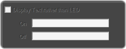
2.3.5.8.LED Values Editor
The LED Values Editor allows you to define the display for specified values for an LED or LED Image.
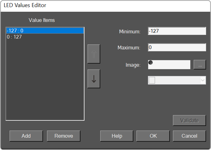
- Value Items: Displays a list of possible values of the parameter.
- Minimum: Sets the minimum allowable value.
- Maximum: Sets the maximum allowable value.
- Image: Brings up the Image Select window.
- Color: Select a color for the LED.
- Add: Add new Value Items.
- Remove: Remove selected Value Item.
- Validate: Authenticates the values.
2.3.5.9.Graph Parameters Window
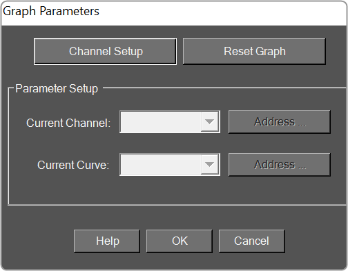
- Channel Setup: Brings up the Channel Setup window.
- Reset Graph: Resets the graph back to its default state.
- Parameter Setup
- Current Channel: Select the current channel to edit.
- Current Curve: Select the process for the channel that was selected above.
- Addresses: Brings up the Parameter Address Editor window.
Channel Setup Window

- Number of Channels: Click the up/down arrows to select the number of channels.
- PEQ per channel: Click the up/down arrows to select the number of parametric equalizers per channel
- Xover/Bandpass per channel: Click the up/down arrows to select the number of crossover / bandpass filters per channel.
- DeEsser per channel: Click the up/down arrows to select the number of DeEsser filters per channel.
- FIR per channel: When available, Click the up/down arrows to select the number of FIR filters per channel.
- Bandpass in Selector: When checked, displays the Bandpass in the graph.
- Color Scheme: Choose the color scheme for the graph. Select from Channel Number, Band Number or Curve Index
2.3.5.10.Scale Editor
The Scale Editor provides a way to customize ticks on a fader or rotary control.
- Type: Select between Real Values (default), Arbitrary or <none>.
- Real Values: Shows the actual values on the control. The Values may be edited.
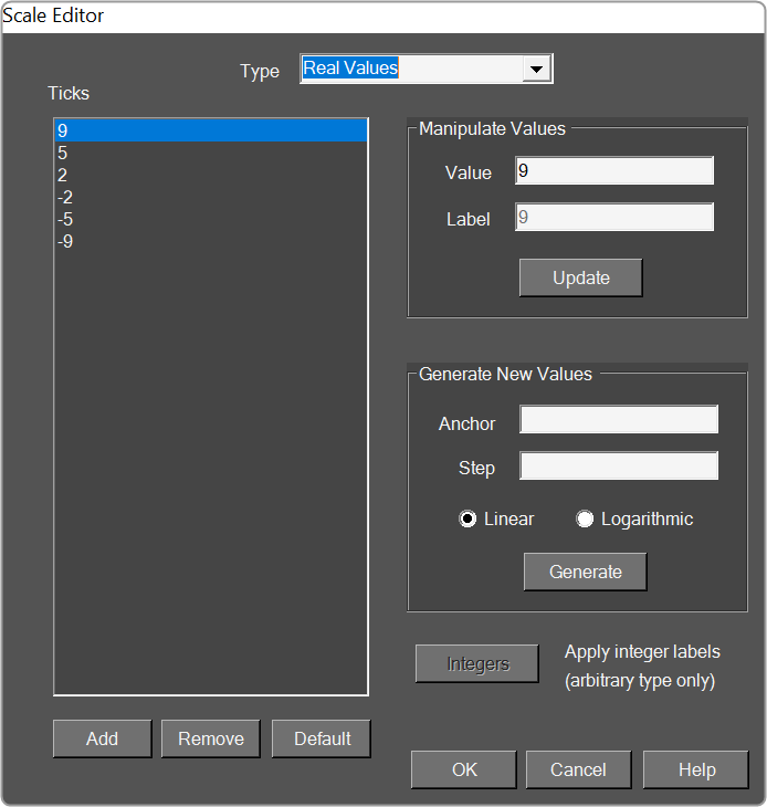
- Arbitrary: This shows the values of the table in two columns. The left column lists the actual values and the right column lists their corresponding labels.
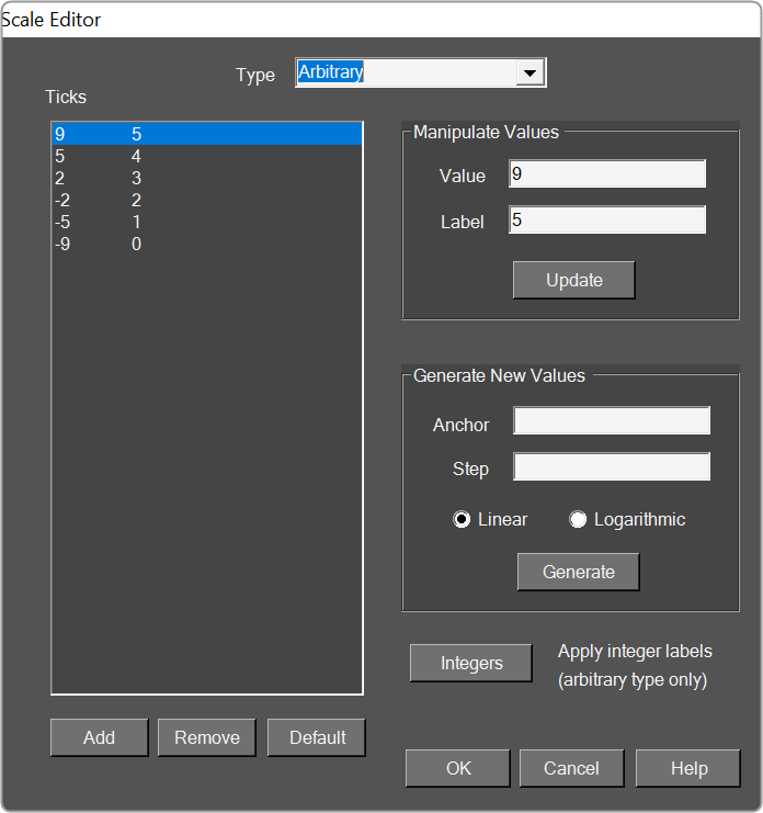
- <none>: Default settings or the display settings from the device panel.
- Ticks: List of the ticks shown on the control.
- Add: Adds a new tick.
- Remove: Removes the selected tick.
- Default: Resets the ticks back to the default setting.
- Manipulate Values: Edits the selected tick.
- Value: Changes the actual value of the control.
- Label: Sets what the tick will display as the control in the panel.
- Generate New Values: Automatically Generate Ticks using the following properties.
- Anchor: Reference point where the automatically generated ticks will cross.
- Step: Sets the initial spacing between the anchor and the next tick.
- Linear: Sets the spacing between each automatically created tick to the Step value.
- Logarithmic: Spaces the automatically created ticks logarithmically with respect to the anchor.
- Integers: Automatically changes the labels to integers starting with the lowest tick value at 0.
2.4.Parameter Set Overview
GTT allows you to tune the audio object memory by setting values using Parameters Set and measuring the audio experience.
The Parameter Sets show the tuning data of all the set of objects used in the signal flow design. These sets can be easily maintained, exported, and shared with others. Additionally, the Parameter Sets allow you to save the progress of the tuning of the audio objects at every milestone point. As a result, you can return to any level and start fine-tuning the device.
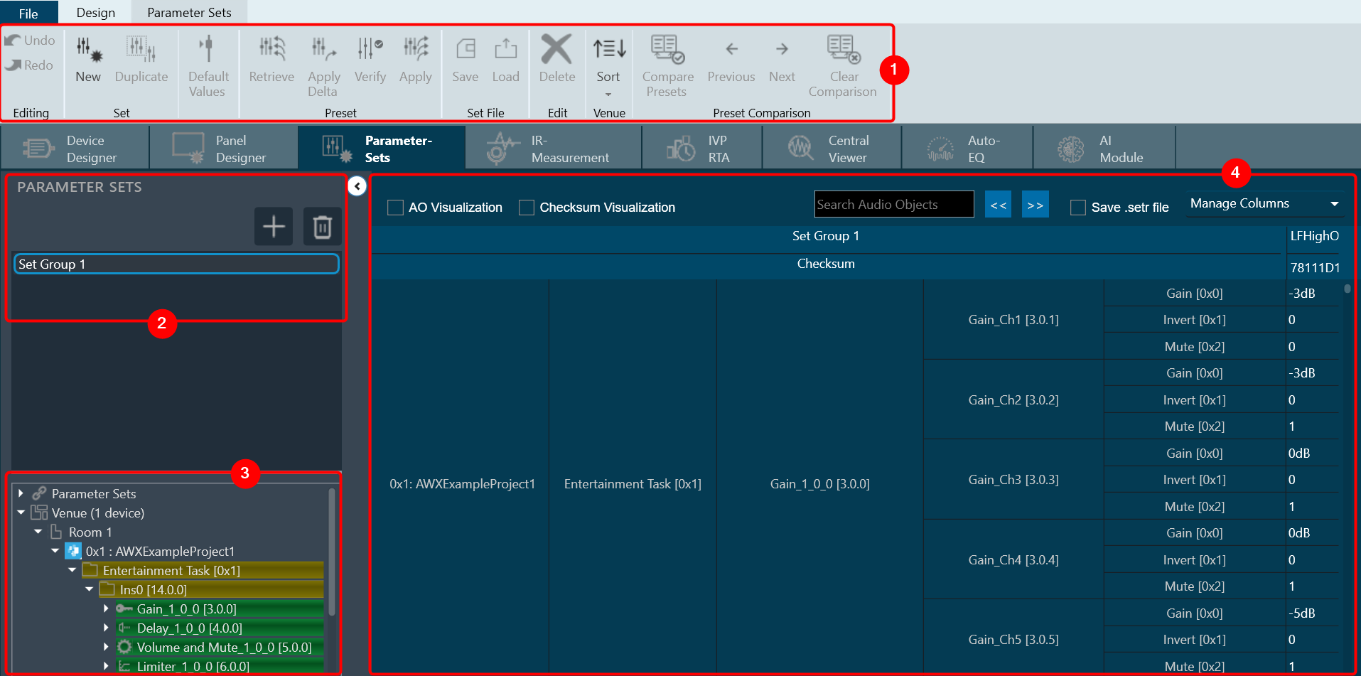
When you launch a project in GTT, the Device Designer screen appears, which includes the following elements:
- Parameter Set Ribbon: The ribbon is composed of six groups, each of which represents a subset of program functionality. In addition to these programs there are also additional contextual programs that automatically appear depending on what is currently selected.
- Parameter Sets view: This section displays the list of projects. In addition, you can add and delete a parameter set group.
- Venu Explorer: This section displays core objects. Core objects that are part of the Audio Core (virtual core) and operate at a higher level than audio objects.
- Tuning Panel: The workspace is used to add audio object/ xAF instance and program the device core.
Parameter Set Ribbon
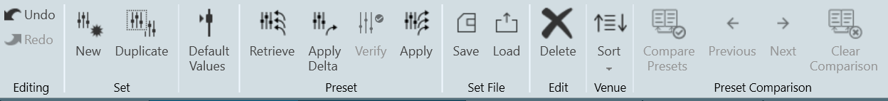
| Set |
|
| Default Values | Use the “Default Values” option to reset all the parameters of the selected set to their default values. |
| Preset |
|
| Set File |
|
| Edit |
|
| Venue |
By default, parameter sets explorer show data in HiQNetId order. |
| Preset Controller | The Preset Controller is basically a group of parameter sets in a single view, with all of the functionalities such as creating .set files, storing sets, and recalling sets of parameter sets available. A “Slot” is a group of parameters set one level above. You can create multiple such slots and do any actions like create set files, store , recall etc. In addition to GTT functionalities, it is also possible to send Xtp commands to device. There are XTP commands to send slot map and Load the slot on to device. You need to export all .set files and manually flash on to the amp. For more details, refer Preset Controller. |
| Preset Comparison |
By default, Presets Comparison ribbon buttons will be disabled. For more details about Presets Comparison, refer to Preset Comparison. |
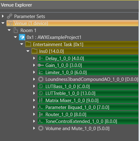
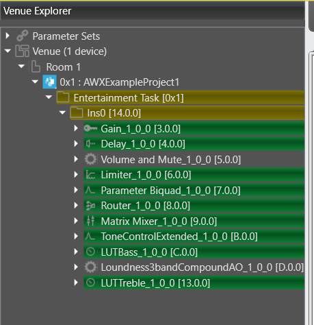
Parameter Sets View
The Parameter Sets section allows you to perform the following actions:
- Add a new parameter set group.
- Provides options to remove the set group.
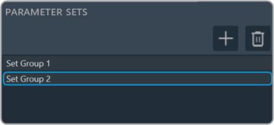
Venue Explorer
In venue explorer allows you to navigate and explore various parameter set groups and audio objects. Drag and drop the desired objects you wish to have presets configured in onto the workspace.
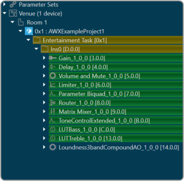
Tuning Panel
The tuning panel shows the tuning data of the audio objects used in the SFD. You can perform the following actions on the tuning panel.
- Modify the tuning data of the audio objects.
- Manage or filter the columns and set groups.
- Search the audio objects.
- Stores the tuning data in set files. These files are in Intel Hex format.
Save the modification or progress of tuning of audio objects.
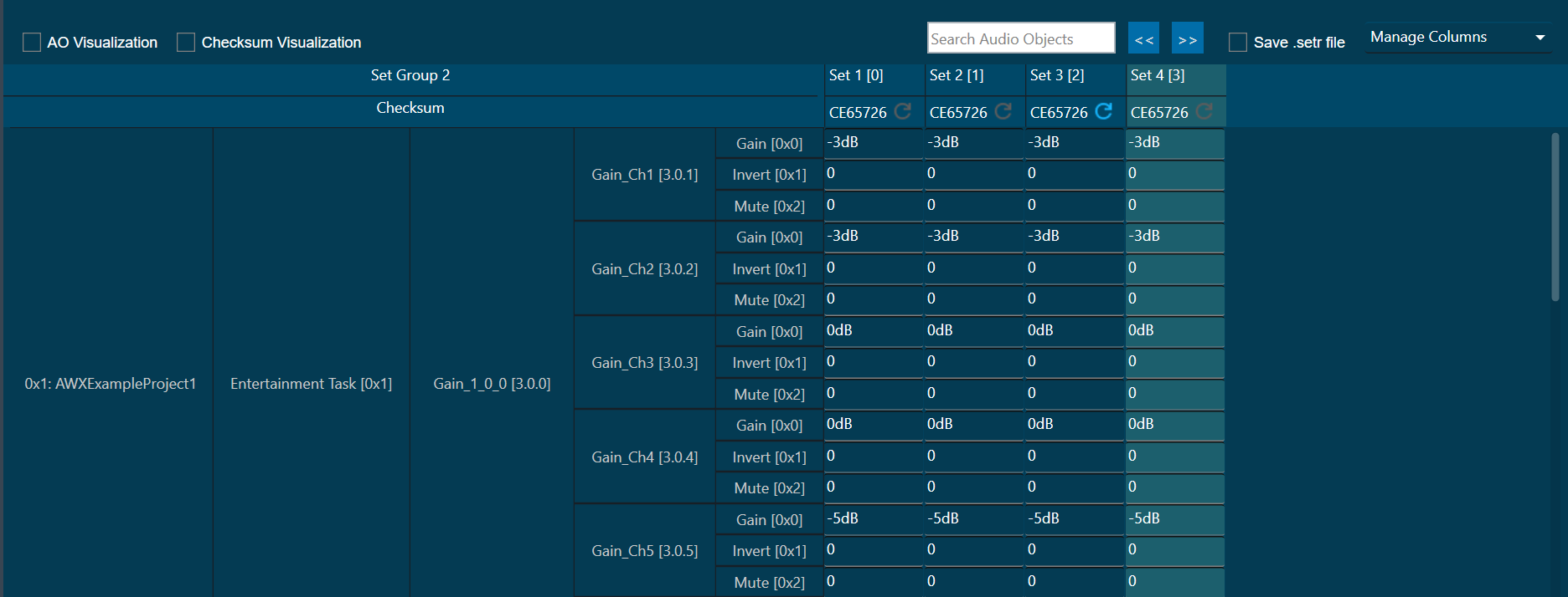
AO Visualization: To view audio objects added in parameter sets, the “AO Visualization” view can be used.
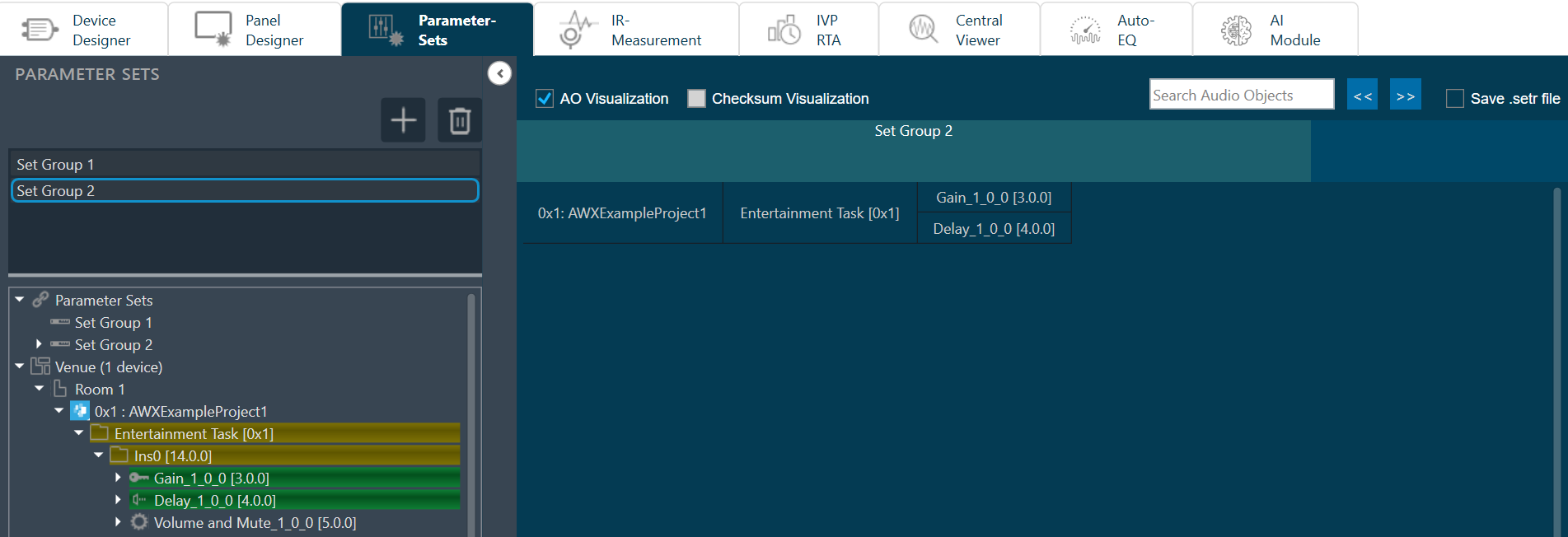
You can view the compact view of the device, cores, and audio objects by checking “AO Visualization” checkbox in the header. On unchecking this checkbox, the default view of parameter sets will be shown. This compact view is specific to each set group, so you can enable this for one set group and view the default view for another.
Operations such as adding new parameters by drag & drop, deleting parameters, and creating new sets are allowed in the AO Visualization view, but the view will be reset back to default.
AO Visualization view supports the search feature and you can search audio objects by name. The matching cells will be highlighted in yellow color.
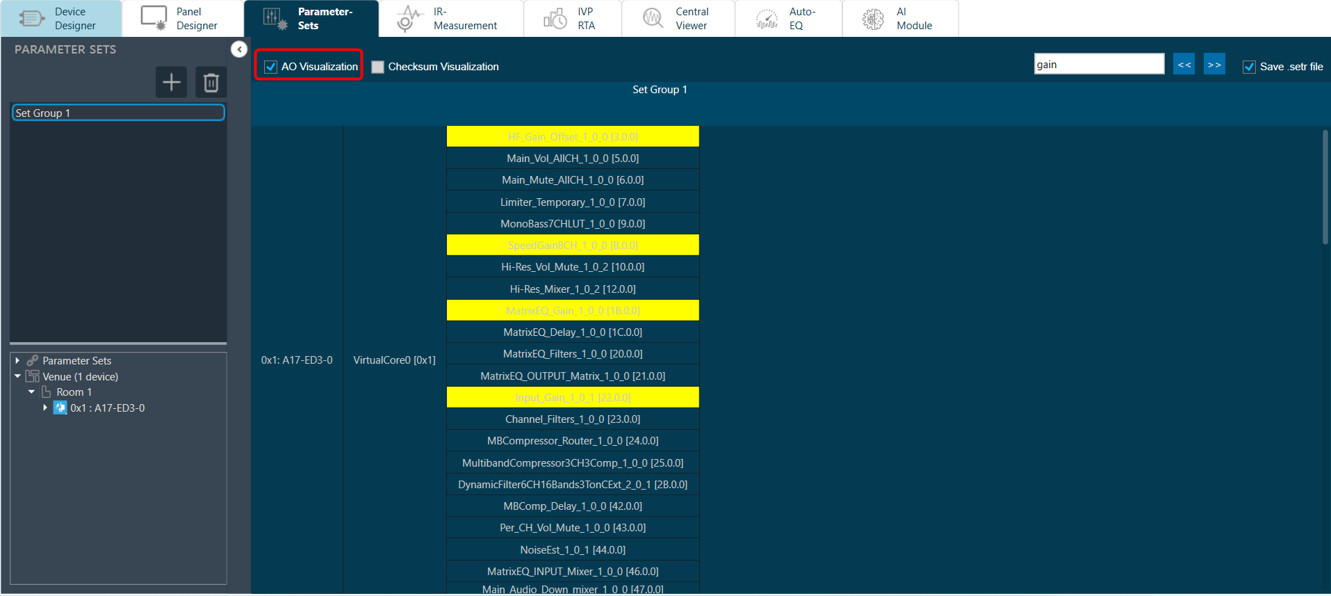
Checksum Visualization: Checksum visualization allows you to view more sets data by hiding left side columns.
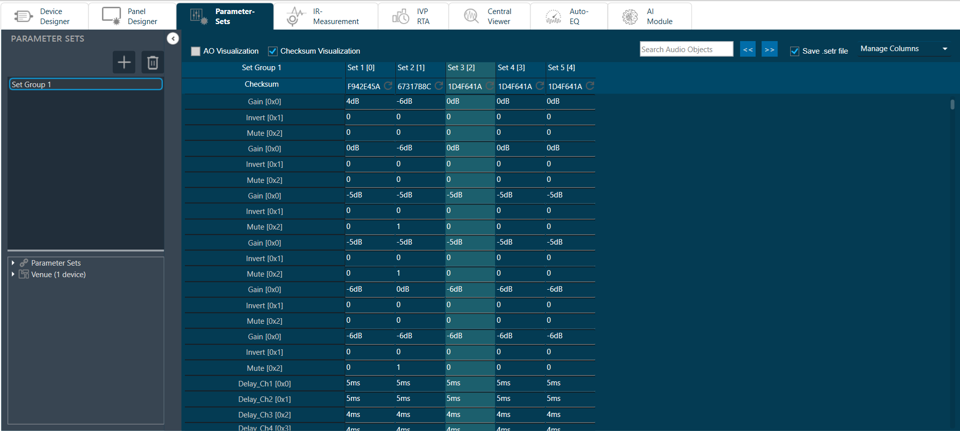
Parameter Sets Checksum: A checksum is an alphanumeric string that serves as a fingerprint for data. Later this data can be used for comparisons to detect errors in the data. checksum is significant because it helps to validate the data. This feature allows you to view the checksum of each set and export the checksum along with the set files.
You can use this set checksum to verify exported set files to validate whether set files data and parameter sets set data is same or not.
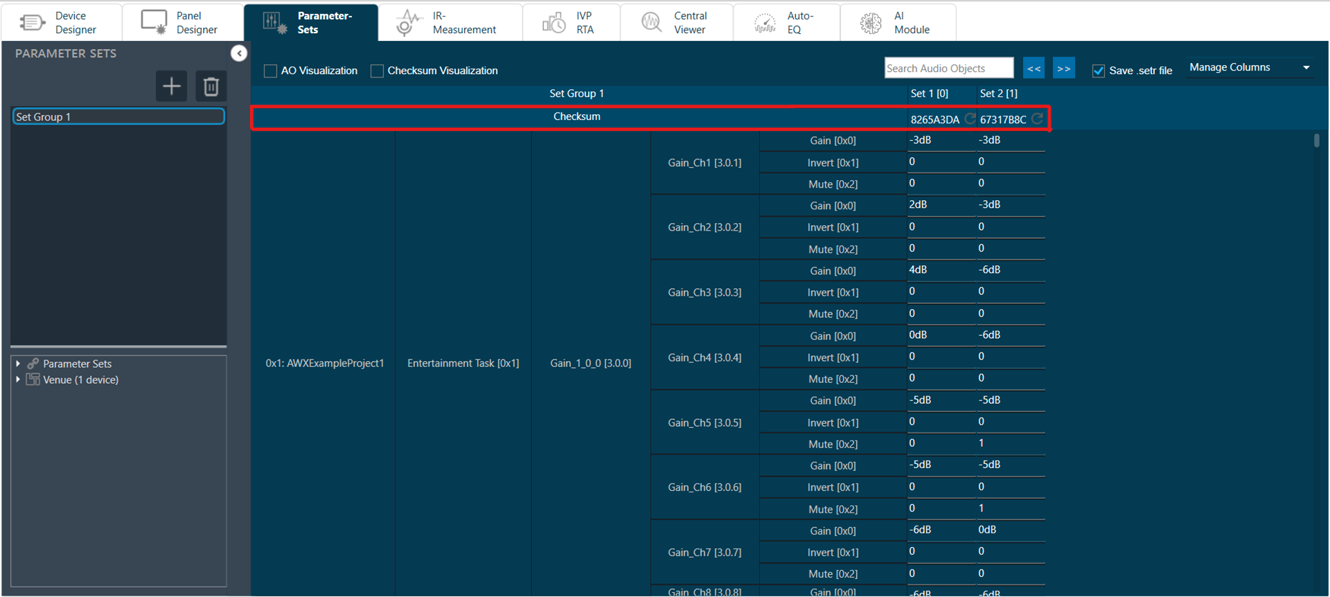
Refresh Checksum: Refresh checksum option get enabled when any changes are made in set data and user data. You can click on refresh icon to calculate latest checksum.
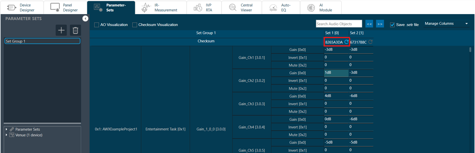
Export Checksum in Set file: GTT allows you to export set checksum in set and setr files.
Checksum will not be saved in .set and .setr files in below cases:
– While saving .set and .setr files in State Variable explorer.
– While exporting .set and .setr files from Export Tuning Data.
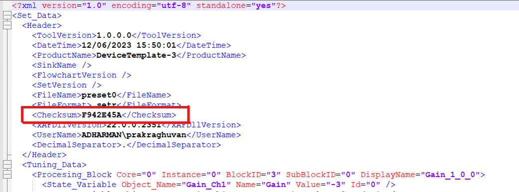
3.Working with GTT Project
This section contains step-by-step instructions on how to use Global Tuning Tool. Some of the things you’ll learn and do in this guide are:
- Create and configure the project
- Build a template for the project
- Create a signal flow design
- Tune a signal flow design
- Building a panel
- Adding and configuring parameter sets
Use Case
- Offline Tuning: Set tuning parameters for audio objects without connecting to device.

- Real-Time Tuning of a Target Device: Live tuning connected to target device.

- Real Time Tuning of a IVP/VST: Live tuning connected to virtual device (IVP/Audio Mulch).

- Socket: A socket is an interface type, that can send or receive data within a PC (from one application to another) or over a computer network from one PC to another.
In this case a socket connection is used to send data from GTT to AmpSrv2 and vice versa.
- VST: Virtual Studio Technology is a software interface definition for audio plugins into music software by Steinberg company. Usually, these plugins are shipped as windows Dlls that can be used inside of a VST-Host (e.g. AudioMulch).
In this use case, AudioworX provides the file (xAFVirtualAmp.dll) that simulates the audio behavior of an amplifier or head unit.
3.1.Create a New Project
Follow the below steps to create a new project:
- On the GTT home screen, select the Project tab, and click Create Project (+ icon). This opens Create Project dialog box.
- Select the Empty Template option, enter the Project Name and Description, and the click Create.
A new project is created, and you will be redirected to the Device Designer window.

Create a Device Template
On the Device Designer tab, click on the (+) icon to open the Add Device window.
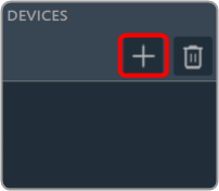
On the Add Device window. You can use any of the following options to create a device template.
- Discover Device: Click on the Discover Device option, if you have the pre-configured device template available.
In case of discovered device, we can make a connection (routing) adhering to defined rules. For more details refers to Device Routing. - Create Light Device: Click on the Create Light Device option, if you want to create a new template.
- Create Device File: Click on the Device file option, if you want to create a device file.
Add Device Template to the Project
There are two types of templates available in the Add Device window: the new ones and the existing ones. Use any of the templates you wish to deploy as per your requirements.
Follow the below steps to add a device template to the project:
- On the Add Device window, select the template from the device template list and click OK.
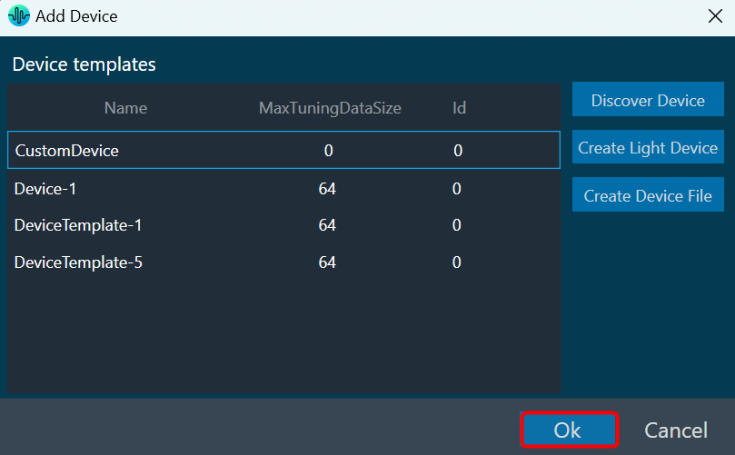
You can see the physical core of the template. The below figure shows a multi-core template and single-core template.
Multi-core template
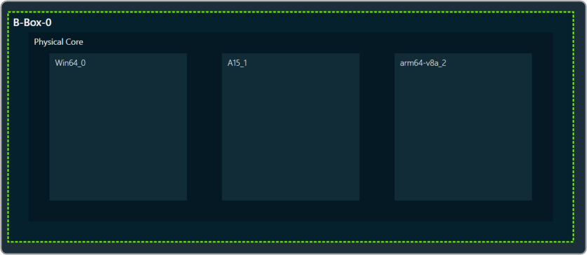
Single core template
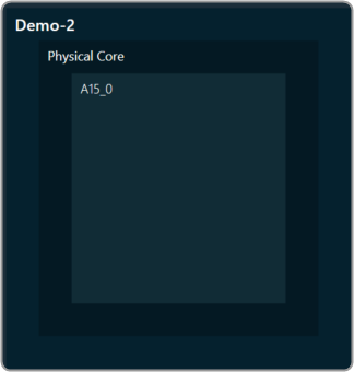
- Drag and drop the Xaf Instance from the Core objects to the physical core window.

This action opens the Configure I/O Channels message box with Ok button preselected. - Enter the Input channel and Output channel number and click OK.

The audio objects inside the signal flow designer are filtered based on the Data Format of the core. For more information related to the Data format of the core, please check the below Create Device Template documentation.If there is a tuning version mismatch between audio objects of signal flow and audio objects in the toolbox, then a warning message pops up showing tuning version differences, and those audio objects are shown in blue color.
Each core object has different properties. For more details refer to the Devices. Once all the properties of the core are verified, click Save to save the changes.
One of the most common uses of GTT is to design the signal flow and tune the signal as desired. The Signal Flow Designer makes it easier to create dynamic signal flow as well as allows you to send audio signals to the amplifier.
In addition, it supports the creation of dynamic state variables for audio blocks present in a flow, as well as the launching of tuning panels (both native and custom).
3.1.1.Create Signal Flow
The AudioworX Signal Flow Designer (SFD) allows you to deploy features across DSPs, SoCs, and ECUs. Harman and third-party technologies are available for drag-and-drop audio flow construction using a library of standard audio building blocks.
This audio processing can be simulated on a PC or target hardware while computing and memory measurements for each block are collected.
Follow the below steps to create a signal flow design:
- Double click on xAF instance in Device View to open Signal Flow designer.

- Go to the Toolbox section, expand Interface, and drag AudioIO audio object to the Signal Flow view. Similarly add another AudioIO audio object to the Signal Flow view.
When adding an xAF instance to a discovered device, this AudioIO can be added. Thus, this step is only necessary if these two AudioIO objects are absent.
- Select one of the AudioIO audio object and set the Object Mode parameter to Audio In. Similarly, select another AudioIO audio object and set the Object Mode parameter to Audio Out.
- Expand Basic and drag Gain audio object to the Signal Flow view. You can use any of the audio object, for example Gain audio object is used.
Try to keep Gain audio object in between two AudioIO audio object or else you cannot connect the input or output pin with Gain audio object.

Now, you can modify the audio object properties as per requirement.

- Select the Gain audio object and set # of channels parameter to 2. The number of channels determines how many connectors the AO will be allotted. You can assign as many channels as you want to your device in GTT.
- Hold the CTRL key, select all the audio object from the Signal Flow view, and click Connect Blocks to connect all the audio object.Or you can drag a connection from output pin of an AO and drop to input pin of another AO

Now you have an input and output object, as well as an object to tune gain, invert, and mute parameters for each channel of signal flow designer. - Click Save to save the signal flow design and click Go Back.
- Launch IVP and click on Send Signal Flow in device view.
A message “Signal flow successfully submitted” will be displayed. The Signal Flow sent to the virtual amplifier.
Messages While Saving Signal Flow Design
- If there is a version mismatch between the current audio library version and the version data on the device, a warning message appears asking whether to continue or stop saving.
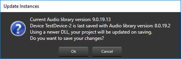
- If there is a tuning version mismatch between audio objects in the signal flow and audio objects in the toolbox, a warning message will be displayed, showing the tuning version differences, and those audio objects are highlighted in blue. Right click on the particular AO and click on Upgrade Audio Object to resolve these errors or warnings.


- If the Sample Rate/Block Length does not match, a message will be displayed asking if you want to continue or stop saving.

For more details about Signal Flow Design, refer to the Signal Flow Design user guide.
3.1.2.Connecting a Device
Steps to connect a Device.
- Navigate to the IVP RTA tab and select Advanced from the ribbon bar. This opens the RTA Settings dialogue box.
- On the RTA Settings dialogue box, select the Plugins tab, and click on the folder icon to browse the xAF library path.
- Set the port number under the Port box.
- Enable the Bypass option (optional), if you prefer the input to be passed directly to the next plugin or output without undergoing any processing.
- Click on Apply. The number of inputs, number of outputs, and plugin type will be automatically updated based on the provided signal flow. Similarly, you can set remaining plugins.
Click on Reset (optional), to set back all the values in a specific row to their default values. Now you can configure the analyzer settings like the plugging host, Sound Card Settings, Generator Settings. For more information, refer to RTA Settings. - Switch to Device Designer tab and click on Connect Device to connect to device.

- On successful connection with device the Device synchronization dialogue box will appear.
3.1.3.Device Synchronization
On the Device Synchronization dialogue box, you will get the below option.
- Send: Sends tuning data or control data from GTT to target device.
- Receive: Receives tuning data or control data from target device to GTT.
- Not_Sync: No exchange of tuning data between target device and GTT.

The Device Synchronization dialogue box also includes two check boxes.
- Include state data while receive.
- If this option is checked and “Receive” operation is selected – The state data will be received from target device along with tuning data to GTT.
- If this option is not checked and receive operation is selected – Only tuning data will be received from target device to GTT.
- Checkbox value will be persist per device in GTT.
- Include control data while send and receive.
- If this option is checked and “Receive” operation is selected – The control data will be received from target device along with tuning data to GTT.
- If this option is not checked and “Receive” operation is selected – Only tuning data will be received from target device to GTT.
- If this option is checked and “Send” operation is selected – Control data will be sent from GTT along with tuning data to target device.
- If this option is not checked and “Send” operation is selected – Only tuning data will be sent from GTT to target device.
- Checkbox value will be persist per device in GTT.
The selected data is stored and can be transferred using a .gttd file format for export and import purposes.
Switching off “Include state data while receive” during receive operation might impact synchronization of some audio object panels.
Sending or receiving data is indicated by a progress window along with a percentage of completion of sending or receiving data. The progress bar will close automatically once the send / receive process is completed.

The progress bar window title will be either “Sending data” or “Receiving data” depending on the functionality you have selected.
You can also perform “Send” and “Receive” operation from ribbon bar. To achieve this, the device should already be in a connected state. Following are the options provided as part of context menu.
- Send Tuning Data: Send tuning data will only send tuning data from GTT to target device.
- Receive Tuning Data: Receive tuning data will only receive tuning data from target device to GTT.
- Receive State Data: Receive state data will only receive state data from target device to GTT.
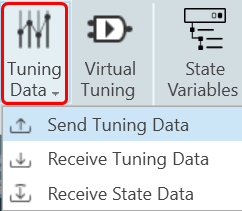
If EOC object is present in the signal flow, Progress window will not show the real progress.
In case there is issue with data transfer between device and GTT. a warning message appears asking you to abort or ignore the operation. You can check the device setup and retry the operation.
While sending the data from GTT to connected device, if there is a data transfer issue between the device and the GTT. A warning will appear asking whether to abort the operation or ignore the error and continue.
You can troubleshoot the issue by verifying your device configuration and then retry the operation.

While sending the data from GTT to connected device, if there is a version mismatch between GTT and the connected device. A warning message will appears asking whether to continue or abort the operation.

Removing Device Instance
- Select device and click on Delete. A warning message will be displayed.
- Click OK to remove the device instance from the project.
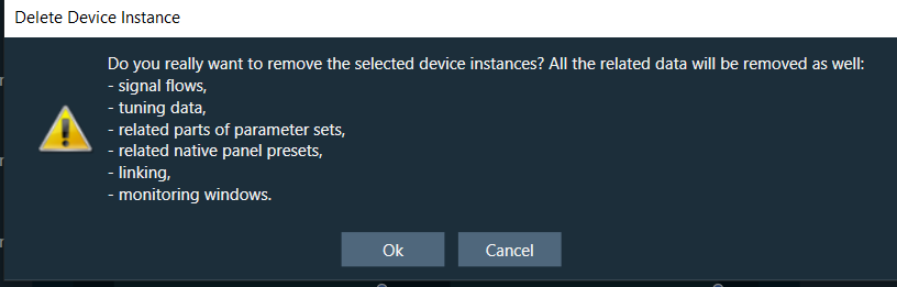
Removing a device instance carries significant consequences, including the deletion of all associated data such as tuning and signal flows.
3.1.4.Launching Multiple Signal Flows
In GTT you can open multiple signal flow design simultaneously and tune the audio objects associated with different xAF Instances from either the same or different devices.
To open multiple signal flow design:
- Right-click on any of the Xaf Instance, and click Open signal Flow for Tuning.
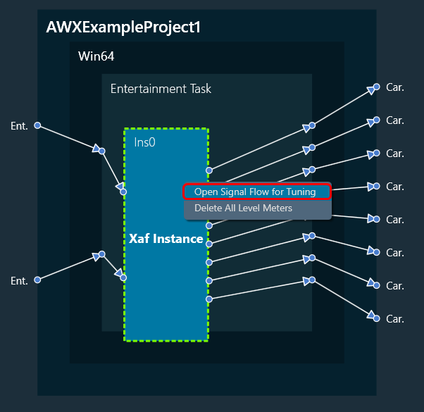
This opens the signal flow designer in a separate floating window. Similarly, you can open multiple signal flow designer in a separate floating window and perform tuning operations.
The signal flow designer window can be identified by its title bar, which displays the name of the respective device associated with that window.
Device name -> Virtual core name -> xAF Instance name.
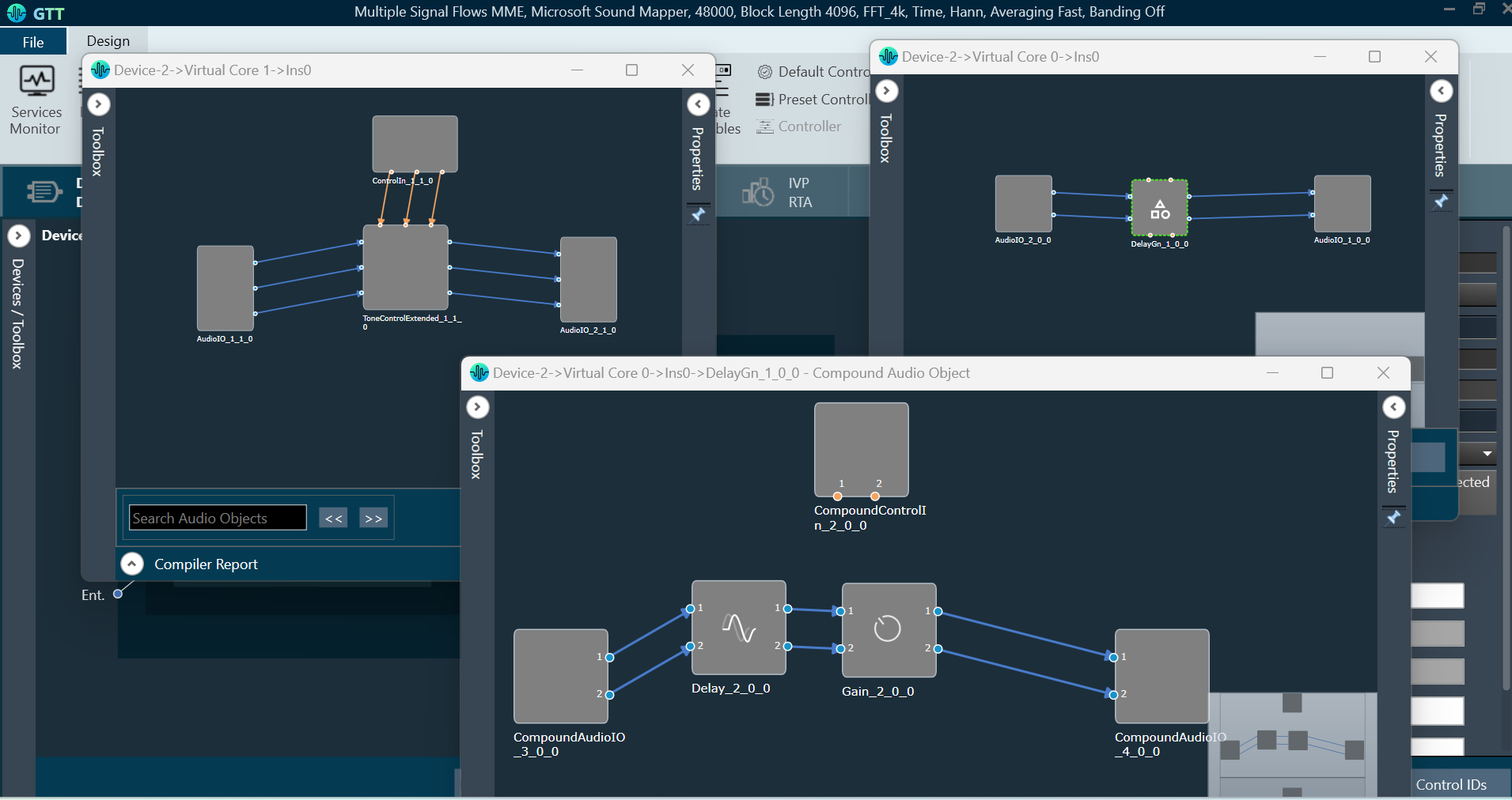
The Signal flow designer floating windows will be in read-only mode. In the read-only mode, you can search and select audio objects. Although you cannot make any modifications to the signal flow itself, you can navigate through the audio objects and tune them.
On the read-only signal flow designer floating window, double-click on the audio object to view their properties and launch corresponding panels. This functionality enables you to perform tuning operations on multiple signal flows simultaneously.
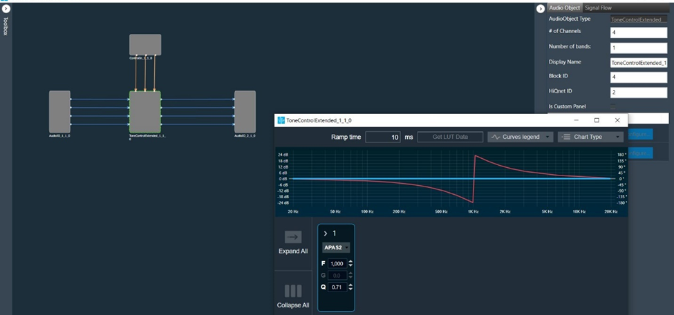
You can either copy partially or complete signal flow from read-only mode and then paste it into editable signal flows.

Tuning Compound Audio Object in Multiple Signal Flow Design
If the signal flow contains instances of compound audio object (CAO), you can open the signal flow of the compound audio object by selecting it from the context menu. This allows you to perform tuning on the inner audio objects of the CAO as well as apply tuning data specific to the preset type of the compound audio object.

When device is connected, then processing state can be set from all opened signal flows.

When probe-points are enabled for the core, you also have the option to add, remove, enable, or disable probe points.
To modify the properties of the device core or core object, it is necessary to close any open signal flows associated with them. A confirmation message will appear and selecting “Ok” will close all signal flow windows related to the chosen device. If “Cancel” is clicked, the property change will be aborted.
3.1.5.Tune a Signal Flow
The native panel is one of the most important part of the Signal Flow Designer. The native panel has interactive widgets that help to tune complex audio objects easily.
Launch Native Panel
- On the Signal Flow Designer window, double-click on any audio object to open a Native Panel.

Use the interactive widgets on the Native panel to make the desired changes to audio object properties.When Native Panels is open, if there is any modification to Signal Flow Designer, a popup message will appear asking to save the changes.
When Native Panels is open, you cannot make any changes to the Signal Flow Designer tab. But you can open other native panel from the Signal Flow Designer tab.
- If preset bar is present in the panel, select the free preset slot numbers, enter the name of the slot, and click Store preset. This saves and stores the current tuning data to the selected slot.

If you do not enter a name of the slot, then it will take the default named “New Preset”.
You can switch between presets and apply their values to the native panel by simply clicking on them. You can also change the values in the native panel and/or the preset name after you’ve clicked it to override the preset.
Click Reset Selected to clear the preset that is currently selected. Click Reset All to clear every preset in the corresponding native panel.
Visualize a Signal Flow
You can check the tuning effects of the designed audio signal flow on the virtual device in IVP.
For more information, refer to Analyzer and Generator.
Perform Tuning
The Audio objects that do not have their own native panel can create a custom panel and link the panel with the respective audio object.
If an audio object doesn’t have its own native panel, you can create a custom panel and link it to the appropriate audio object under the “Available Custom Panels” option.
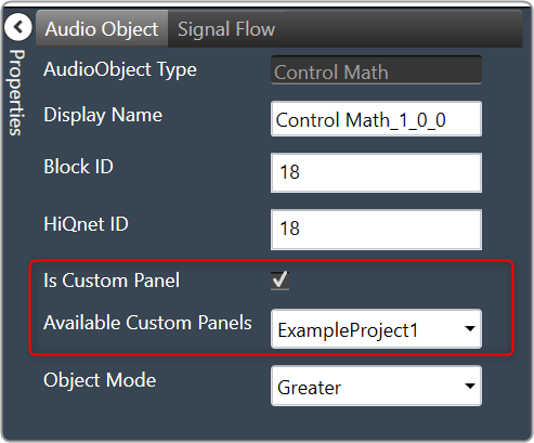
Follow the below steps to view the signal flow performance:
- Go to the RTA tab, start Generator, Analyzer, and PluginHost.

- Go to the Device Designer tab, click on Send Signal Flow to send tuning data.

- Open the native panel and go back to the IVP tab. On the native panel, tune the signals. The signal flow in the IVP tab will change accordingly.
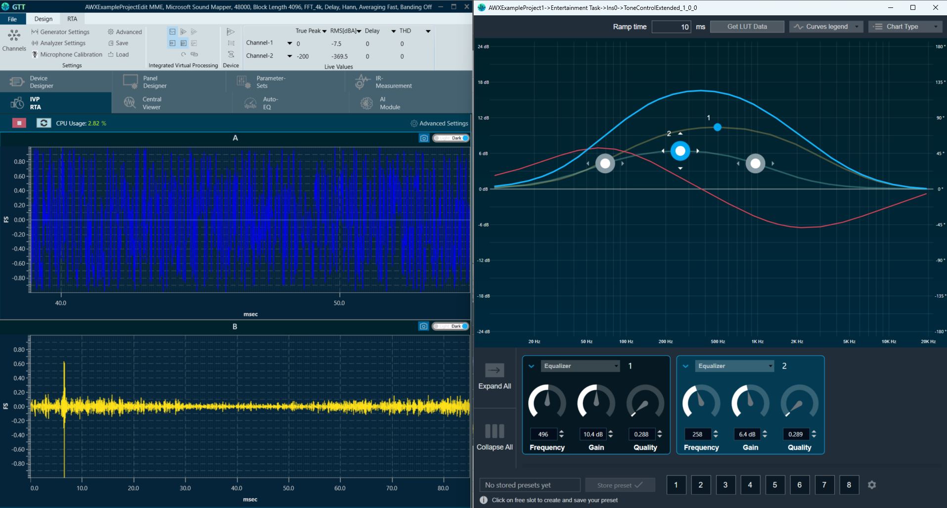
3.2.Create a Custom Panel in GTT
Follow the below steps to create a new panel.
- Navigate to the Panel Designer tab.
- Go to Panels view and click on the (+) icon.

- Enter the name of the panel and click OK. The newly created panel add to the panel list.In the Panel view, select the new panel. The designer workspace of the new panel opens.
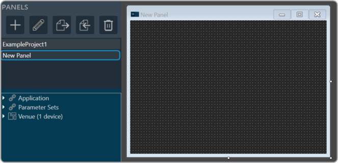
Add State Variables to Panel
Before adding StateVariables, make sure you have added a device to GTT. For information on how to add a device, refer to Signal Flow Designer.
There are two ways to add StateVariables to a custom control panel.
- Option 1: Drag a StateVariable and choose a control.
- Option 2: Add a control and assign a StateVariable.
Option 1: Drag StateVariable and choose control:
- Go to Panels view, expand the cores of your device, and drag-drop a StateVariable to a free space in the custom designer panel. A dialog box opens showing all the basic control tools.
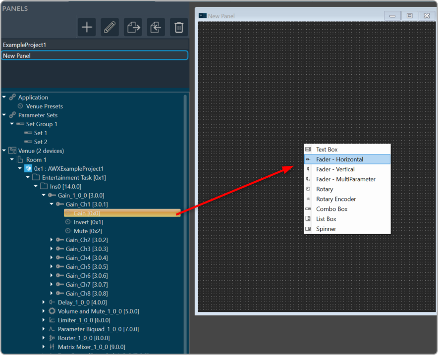
- Select the desired control tool from the list to adjust the value. The choice of controls depends on the StateVariable type.
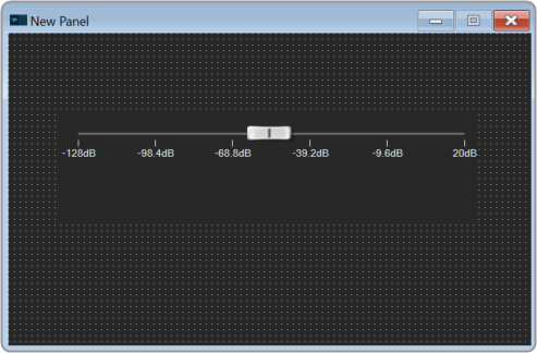
Option 2: Add control and assign StateVariable:
- Right-click on the designer workspace Insert > Basic > select the desired control tool from the list to adjust the value.
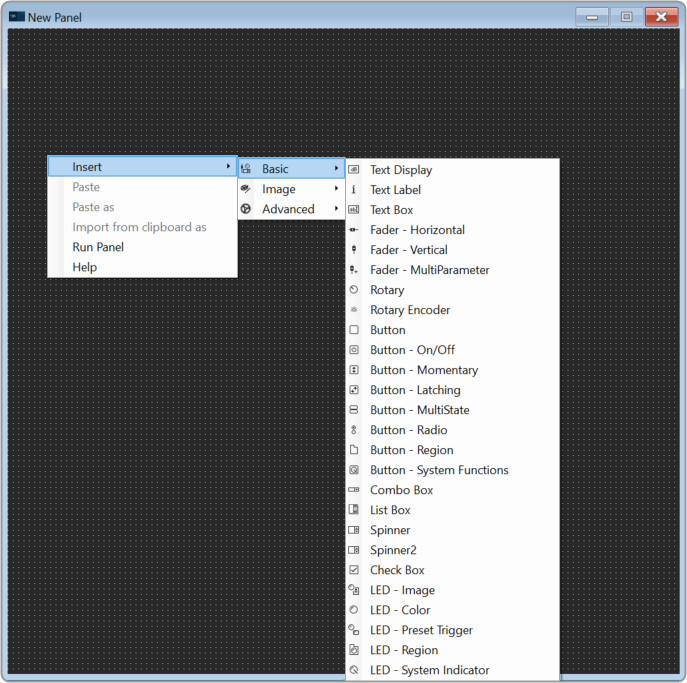
The control added to the designer workspace. The warning symbol indicates that no StateVariable is assigned to the control.

- Expand the cores of your device and drag-drop a StateVariable on a control. The control value is updated as per StateVariable.
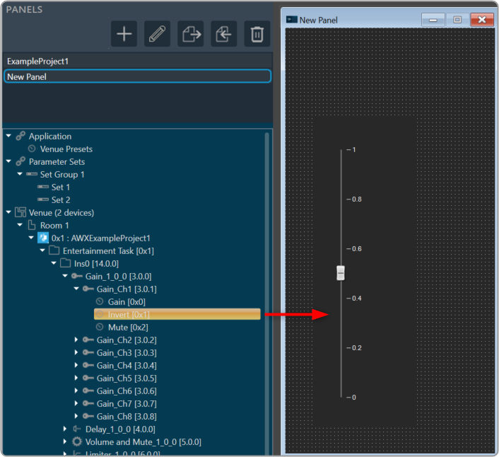
Launch Panel
In order to verify the controls in the panel, you have to launch the control panel.
- Select the panel from the Panels view.
- Go to Tool panel, and click on Launch Current.
Or Press F5.
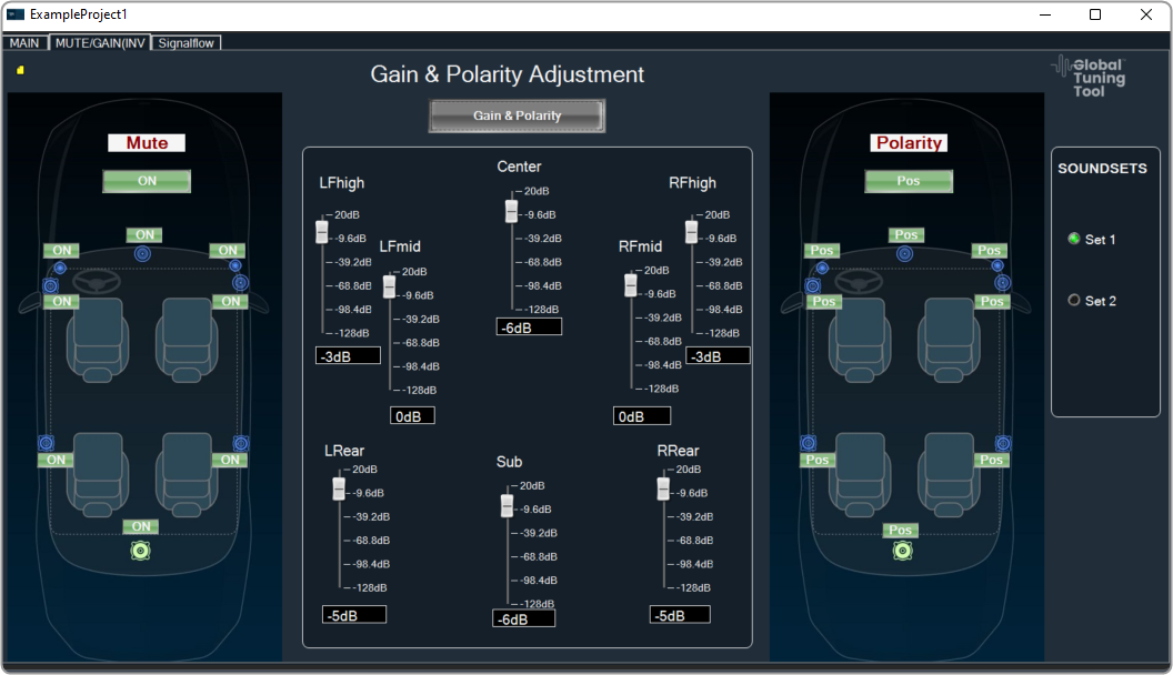
Link Custom Panel with Audio Object
Once a custom panel has been created, it can be linked to any audio object.
- Go to device designer tab and open the SFD view of the project.
- Select the desired audio object and enable the Is Custom Panel option from the Properites view.
- Set the required custom panel from the Available Custom Panels list.

- Double-click on the audio object once it has been linked to the custom panel. This will open the custom panel that is assigned to an audio object.
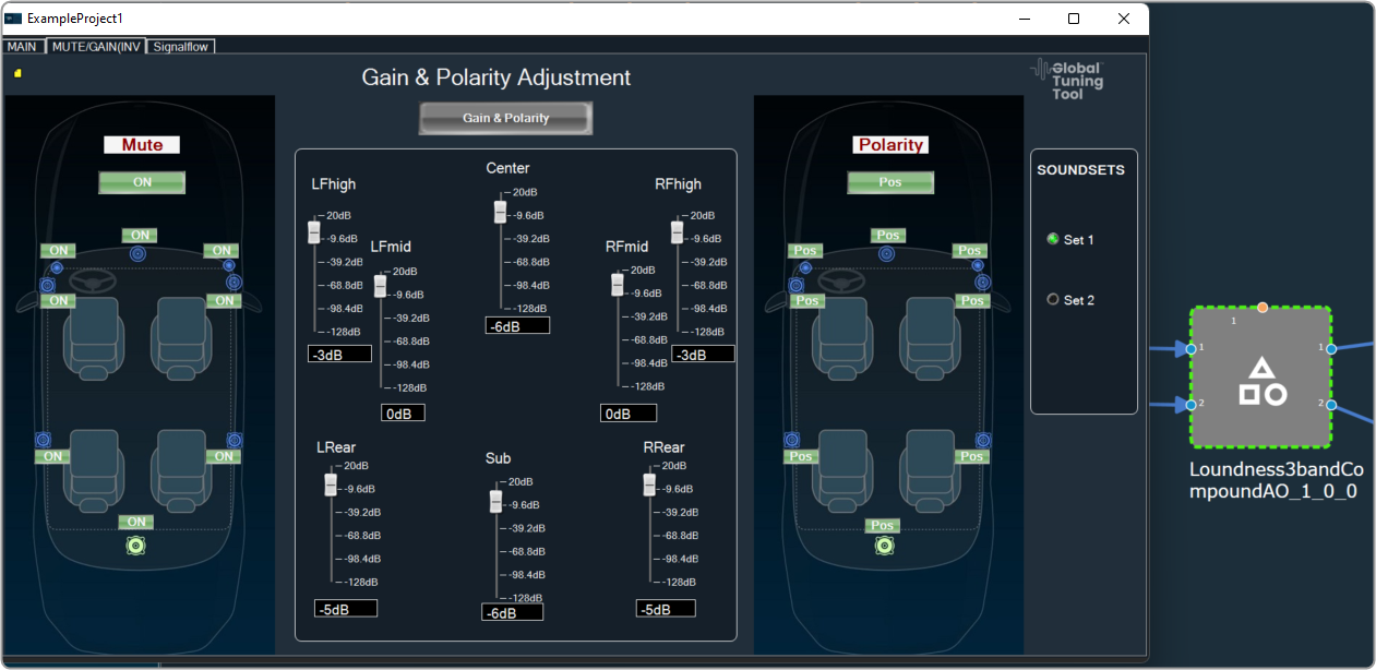
Change Processing State of Audio Object
This feature allows the user to configure a button to any processing state for a specific object in the custom panel.
- Create a new panel and add a Button from the Basic controls tools.
- Select the Button, open the Properties view, and select the System Function tab.
- Click on System Functions. This opens System Function Editor window.

- Click on System Function and select Function as Processing state. On the System Function Editor window, select the Function as Processing State from the drop-down list, and Sate as Mute. This opens a Configuration panel.
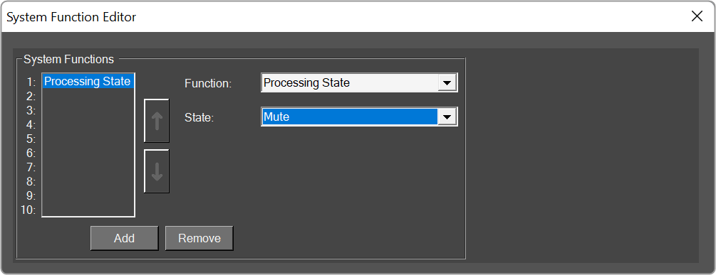
- Select the device/project and audio object from the drop-down list which you want to link, and click OK. Depending on the selection of device/project the list of the audio objects is displayed in the drop-down list.
You can edit the device name and audio object name in the configuration panel. - Click Ok. If you want you can customize the Button appearance.
- Go to the Properties view, select the Button tab, and change the button name, font style, text color, fill color, and border color.
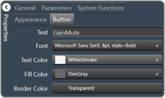
- Click on Launch Current and click on the button to set the processing state
This feature helps you to set the processing state when you don’t have the license to SFD.
3.3.Create a Parameter Set in GTT
Follow the below steps to create parameter sets.
- Open the Parameter Sets tab.
- Go to the Parameter Sets view and click on the (+) icon. This adds a new parameter group in the Parameter Sets view.
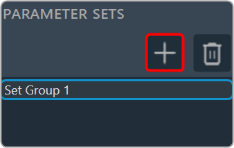
- Drag and drop the required AOs from the Explorer tree to the set group workspace.
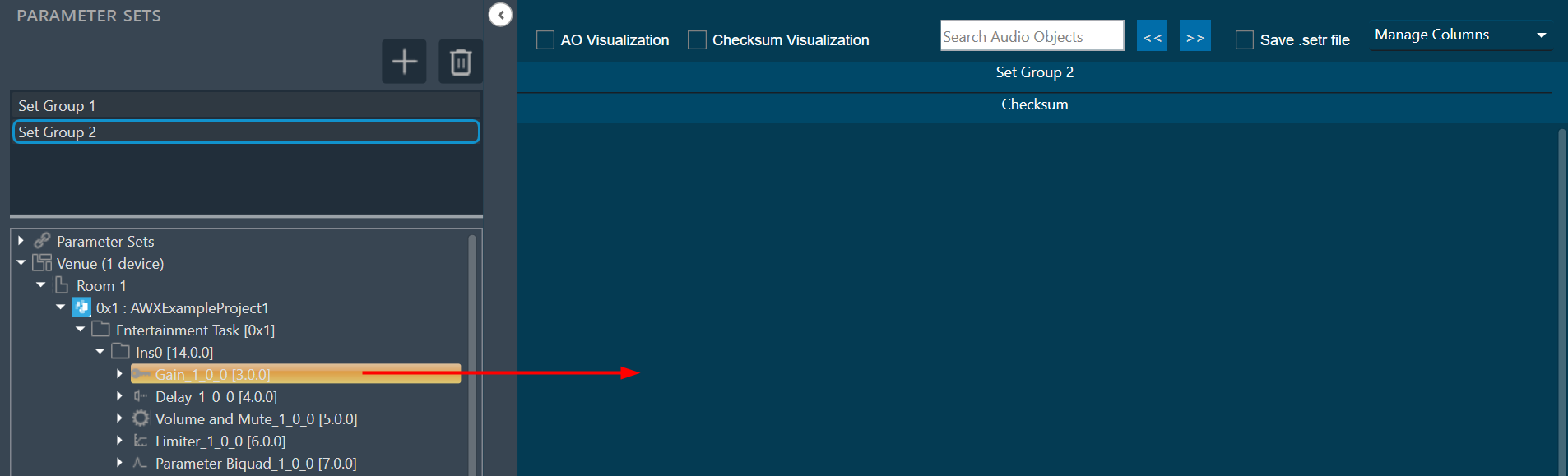
The AO will be displayed in a table form.
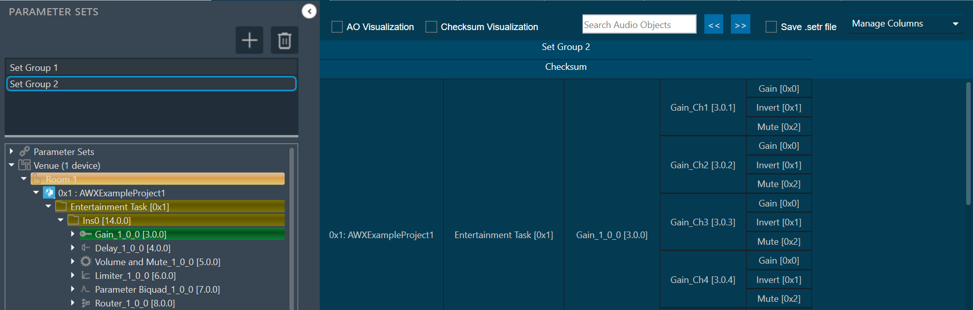
- Click New to add a new set to this set group. This adds a new set in the Set Group.
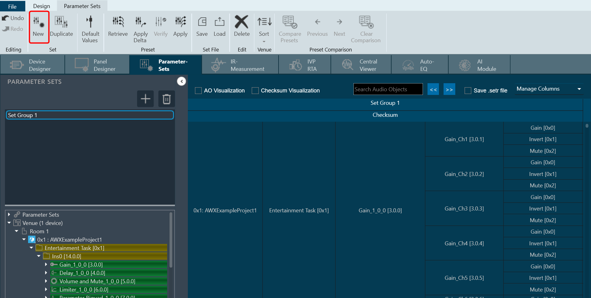
You can create multiple set groups and multiple sets for one set group.
3.3.1.Apply Delta in Parameter Sets
You can send the tuning values to the device using “Apply Delta” or “Apply” function.
- Apply Delta function: Only sends the tuning values which updated in the selected set.
- Apply function: Sends all the tuning values of the selected set.
To Apply Delta in Parameter Sets:
- Open the Signal Flow Designer and create a signal flow.
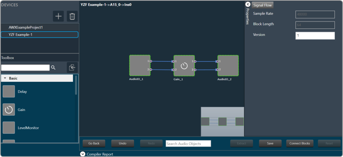
- Double-click on the Gain audio object to open the native panel. The native panel displays gain values. Now keep the Parameter Sets window and Gain window side-by-side.
Make sure to drag and drop the Gain AO from the Explorer tree to the Parameter set group workspace before you start comparing. You will see the gain values as set in Parameter Sets with respect to the Gain native panel.
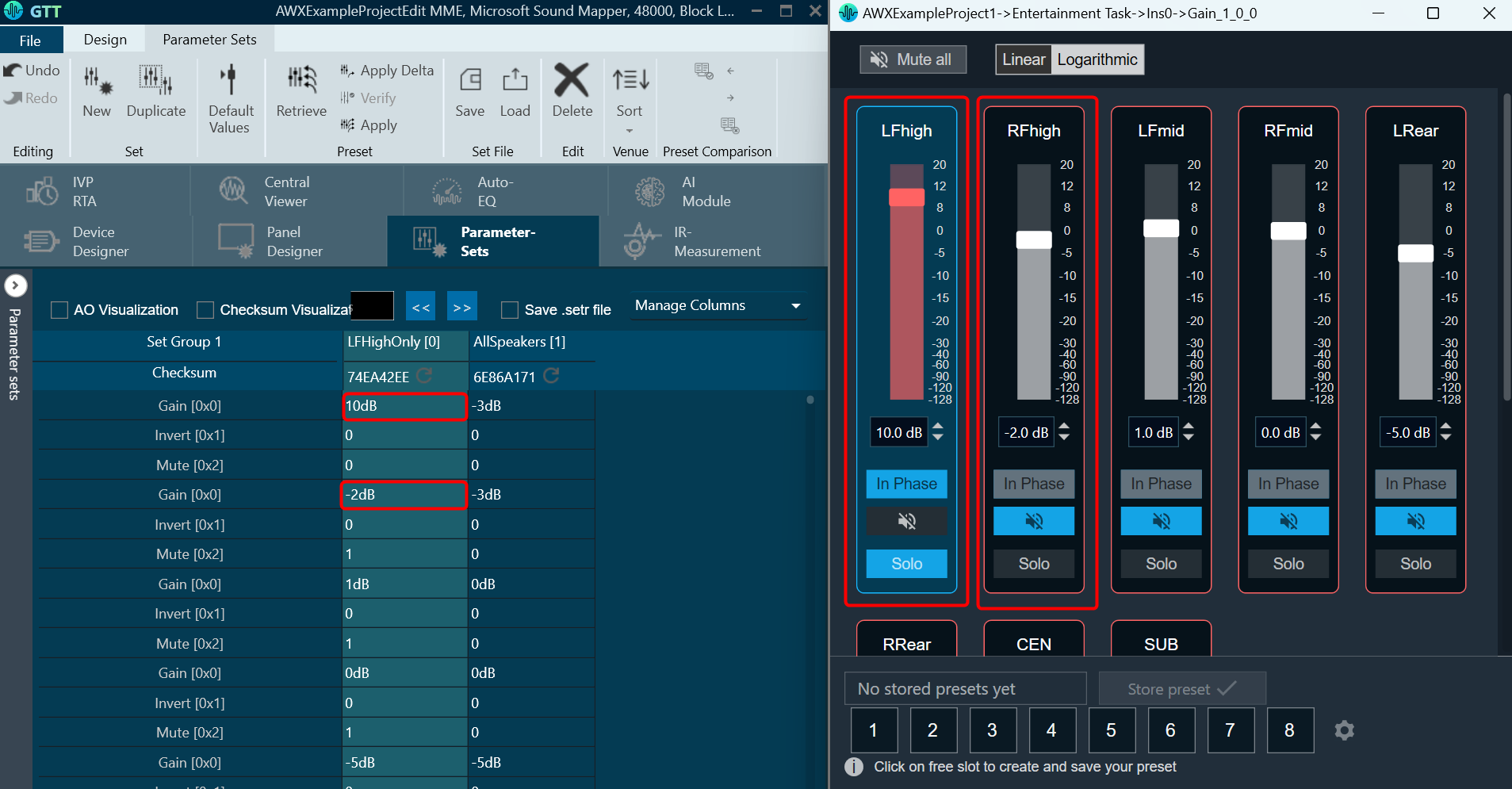
- On the Parameter set group workspace, change the values in the parameter set and click Apply Delta. You will see the native panel updated with respect to the parameter set value.
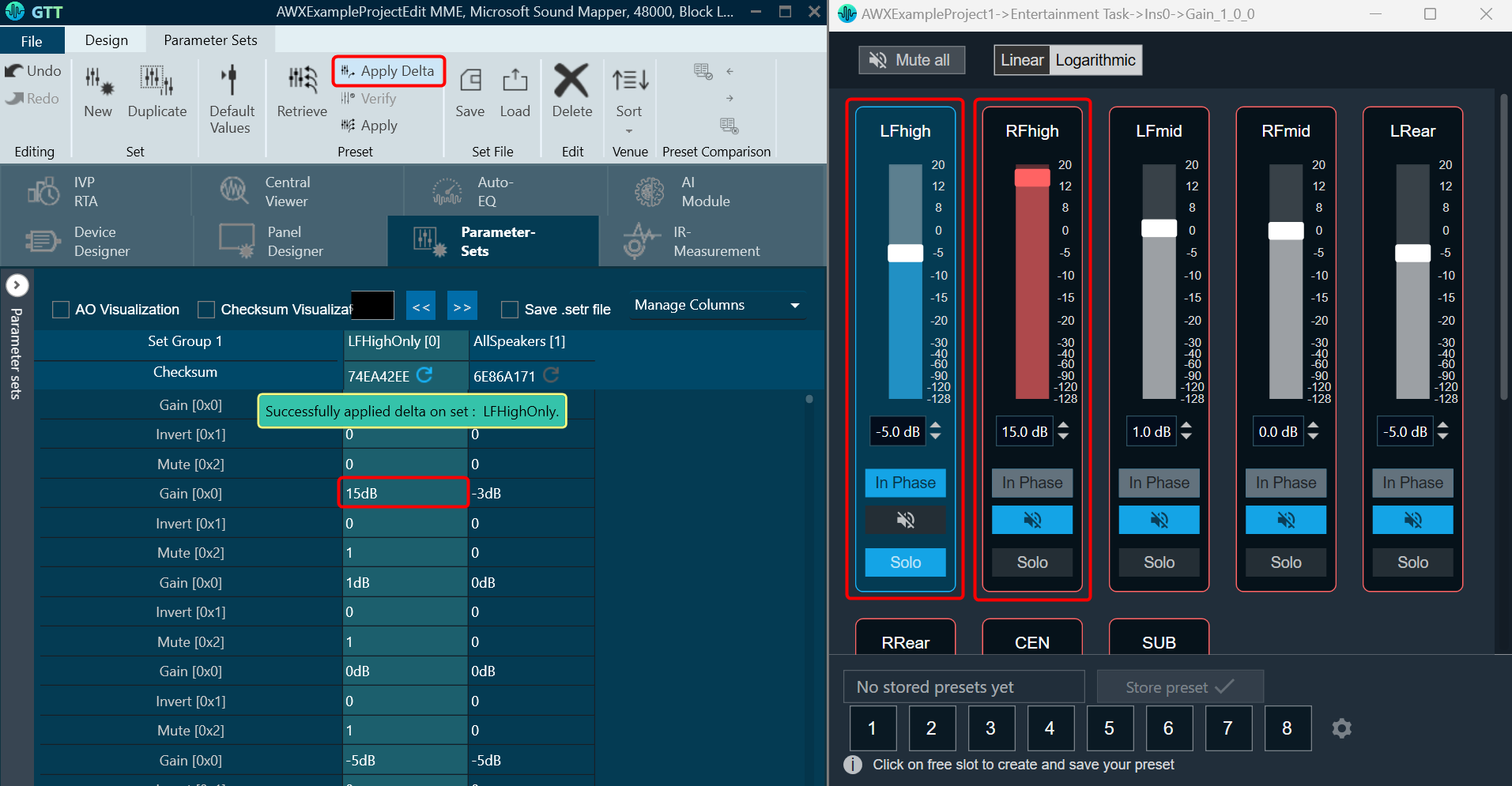
Similarly, if you click on Apply, all the tuning values of the selected set will be send.
3.3.2.Retrieve Parameter Sets
The Retrieve function updates the parameter set values, with respect to changes made in the state variable.
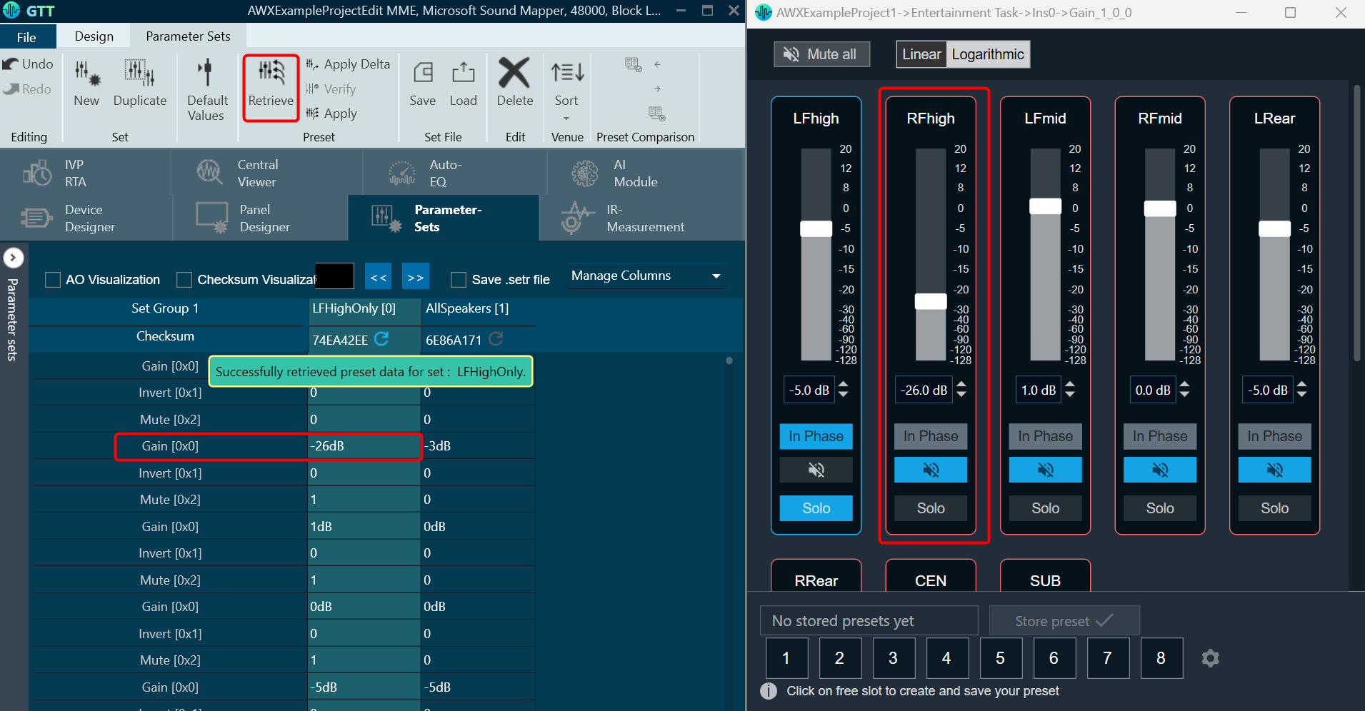
Retrieve will change the values in the state variable and transfer the changes to the parameter set
- Open the native panel and move the slider to change the values.
- On the Parameter set group workspace and click Retrieve.
- Click Yes to confirm to complete the operation.
You will see the parameter set value will be updated with respect to the state variable, which are mapped in to the respective native panel.
3.3.3.Verify Parameter sets
This functionality is designed to compare the presets loaded on a device with those available in the GTT in order to ensure their accuracy.
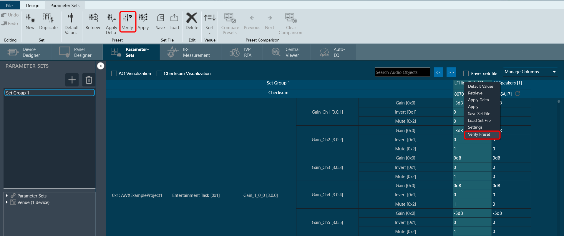
This feature is available only in online mode. i.e. only when the device is connected.
To verify preset values, select a preset and then click the ‘Verify’ button. A read command is sent to the device for each state variable within the preset. Once the value has been read, it will be compared with the corresponding value in the preset. If all values match, the verification process is considered successful.
However, if any values do not match, an error message will be displayed, and an error report will be generated.
Sample error report is as attached here Set 1[2].
Verify functionality is available at the Master Preset Controller level as well. You can verify all the presets under a slot in online mode.
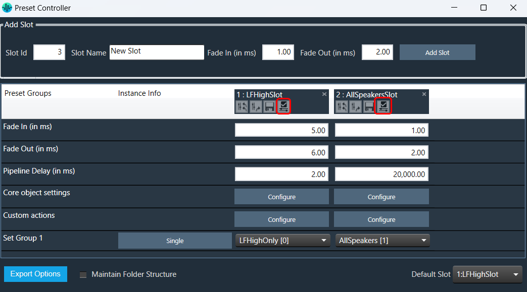
3.3.4.Saving Parameter Sets
When a device is removed or GTT is closed, parameter sets are automatically saved.
There is currently a limitation on saving parameter sets to databases.
The parameter set is not immediately saved to the database. It is saved in the moment when the device is removed from the device list. Therefore, if the signal flow is modified (for which there is an associated parameter set) when the device is not in device list, the old parameter sets are retrieved from the database when the device is dragged to device list next time.
3.3.5.Configuring Parameter Set Data
To configure parameter set data:
- Select any parameter set column, right-click and select Settings. This displays the settings dialog box.

- Except tuning tool version all the other fields are editable.
- By default, the product name will be the name of the device.
- There is no limitation on the number of characters entered.
- The user data values are persistent.
- You can either enter string values or hex values.
- The copy set data function performs a data merge operation. This means that the user data is combined with the meta data into a single output.
- User data will be stored and loaded in hex format.

Create Set File
To create set file:
- Select any parameter set column, right-click and select Save Set File. This opens the windows directory.
Store the parameter data in the directory with file extension *.set.

Load Set File
To load set file:
- Select any parameter set column, right-click and select Load Set File. This opens the windows directory.
Locate the set file and open the file. Tuning data will be loaded onto the chosen set after selecting the .set file. When you click Undo, the load action is reversed, and the screen displays the previous preset values.
Only matching (CoreId, InstanceId, BlockId, and SublockId) objects tuning data will be loaded.

Following are the notifications you will get during the load:
- If there are additional objects in the .set file than the set group, a notification message will be displayed.
- If there are additional objects in the set group, then in the .set file a notification message will be displayed.
- If there is a mismatch in the size of the AO a notification message will be displayed.
- If there are mismatching objects in both .set file and set group, a notification message will be displayed.
All the mismatched object details will be displayed in the event log.
Tuning data will be loaded only to the set in the parameter set column. Not on to the state variables.
Similarly, you can also load a human-readable set file (.setr file).
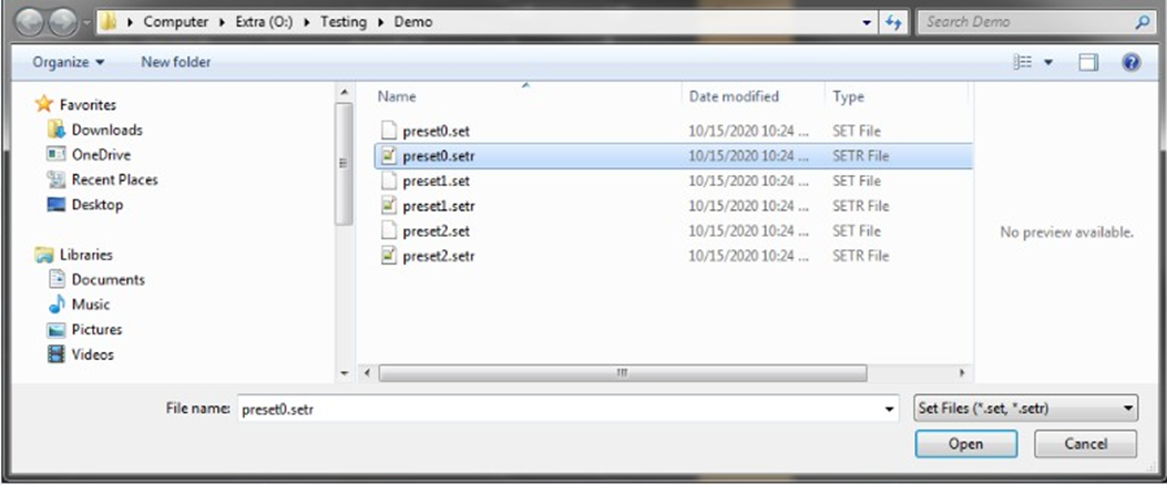
Tuning data is loaded onto the chosen set upon selection of the .setr file. When you click Undo, the load action is reversed, and the screen displays the previous preset values.
Only tuning data for objects with matching (CoreId, InstanceId, BlockId, and SublockId) identifiers will be loaded. The following message appears following the loading of the tuning data from Setr.
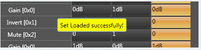
The following notifications are displayed in the cases mentioned below:
- If there are additional objects in .setr file than set group a notification message will be displayed.
- If there are additional objects in the set group, then in.setr file a notification message will be displayed.

- If there is a mismatch in the size of the AO a notification message will be displayed.
- If there are mismatching objects in both .setr file and set group, a notification message will be displayed.
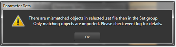
All the mismatched object details will be displayed in the event log.

3.3.6.Load .set file
In the context menu of any set Click on “Load Set file”. This opens a dialog to select the .set file to be loaded. On selecting the .set file, tuning data will be loaded on to the selected set. On clicking Undo, load action will be undone and old preset values will be displayed in the screen.
Only matching (CoreId, InstanceId, BlockId, and SublockId) object’s tuning data will be loaded.
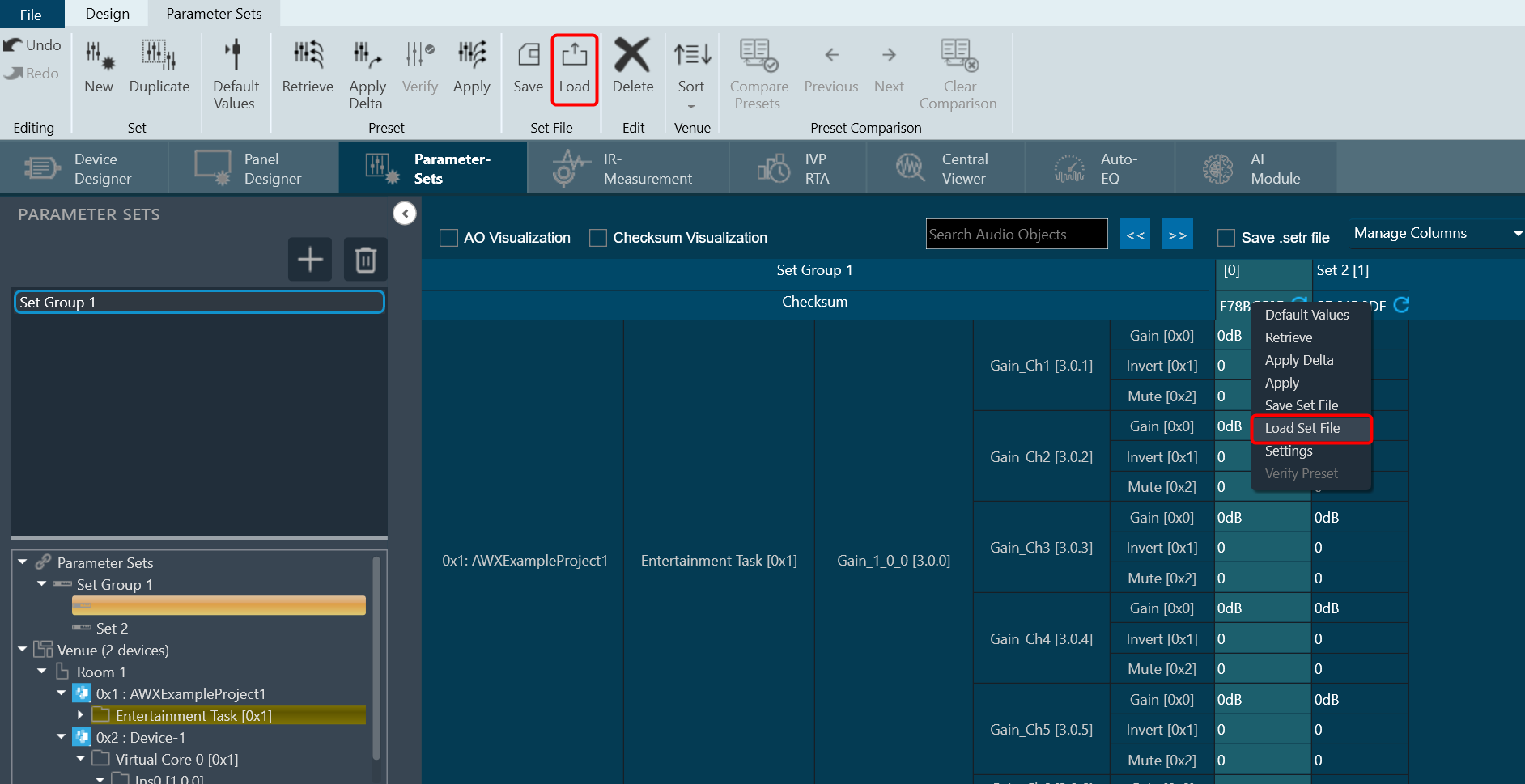
Notifications to the user during load:
- If there are additional objects in .set file than set group a notification message will be displayed.
- If there are additional objects in set group than in .set file a notification message will be displayed.
- If there is a mismatch in the size of the AO a notification message will be displayed.
- If there are mismatching objects in both .set file and set group, a notification message will be displayed.
All the mismatched object details will be displayed in event log.
Tuning data will be loaded only on to the set in the parameter set column. Not on to the state variables.
3.3.7.Different Methods of Saving Set File
Saving Set File from Device
- Navigate to the Device Designer tab and choose the desired device for storing the set file.
- Click on Export > Tuning Data.
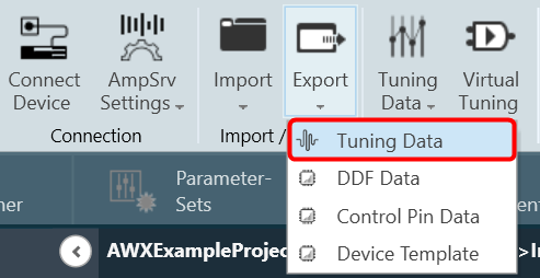
- A dialog box will be displayed, select the folder where the files (.set/.setr) will be stored, type a file name, and click on Save.
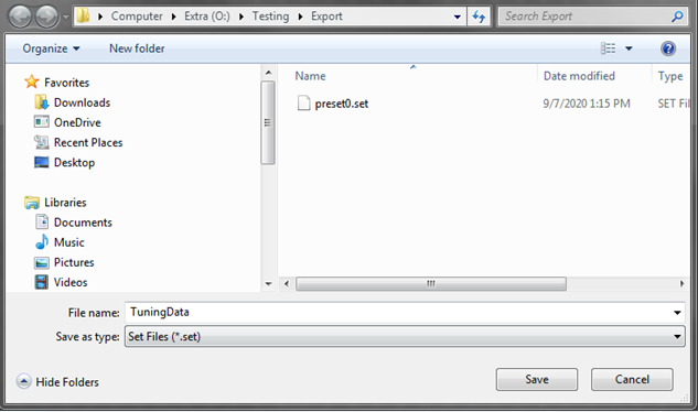
Saving Set File from Presets
- Navigate to the Parameter Sets tab and choose the desired Set column.
- Right-click on the chosen Set column to open the context menu and select Save Set File.
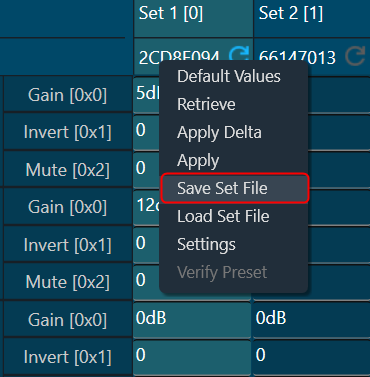
A dialog box will appear, where you can choose the folder to store the files (.set/.setr). Enter a file name and click on the Save button.
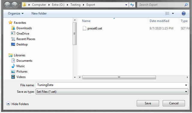
Saving Set File from Preset Controller
- Navigate to the Device Designer tab and click on Preset Controller. This opens Preset Controller window will be opened.
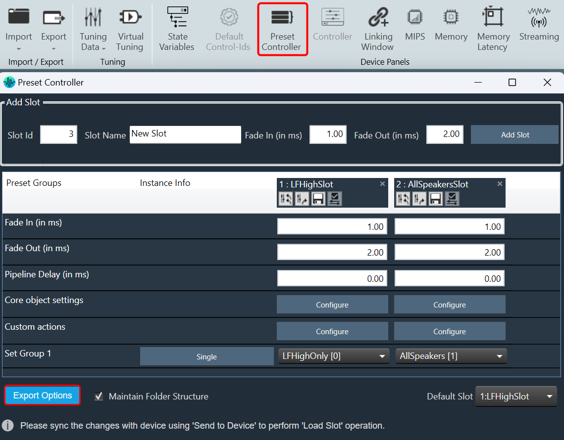
- In the Preset Controller window, right-click on Export Options and click on Export Set Files.
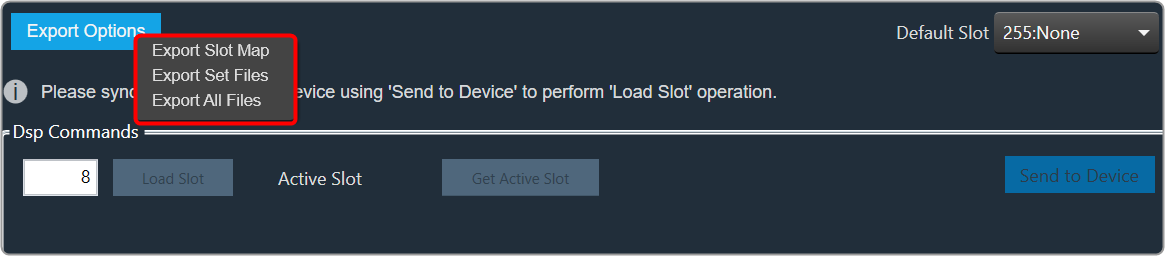
A dialog box will appear, where you can choose the folder to store the files (.set/.setr). Enter a file name and click on the Save button.

Saving Set File from State Variables Explorer
- Navigate to the Device Designer tab and select the device from which you would like to select and store the set file.
- Click on State Variables. This opens the State Variables window.
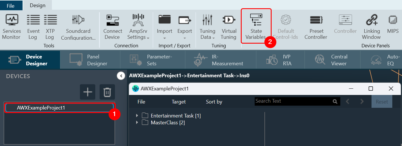
- On the State Variable window, select from File and click Save Set As.
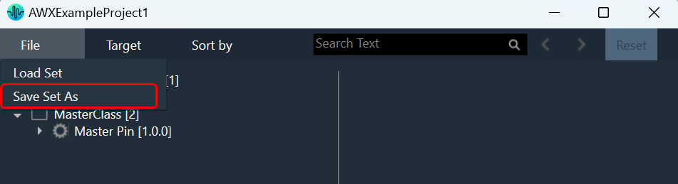
A dialog box will appear, where you can choose the folder to store the files (.set/.setr). Enter a file name and click on the Save button.
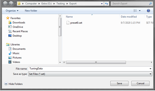
Once you have saved the set file, both the .set and .setr files will be accessible in the folder you selected.

If the set file is generated using a different panel, such as the IESS panel, the .setr file will not be generated by default. However, you can utilize any of the methods mentioned earlier to generate the .setr file if needed.
3.3.8.Preset Comparison
Using the Compare Presets feature to compare preset values between two columns.
By default, the Compare Presets feature is inactive. When you select two preset columns, it becomes active.
Steps to compare preset values:
- On the Parameter Sets tab, select first preset column, then press “Ctrl” and select the another preset column.
This will make the Compare Presets feature active and other features such as the New, Duplicate, Default Values, Retrieve, Apply Delta, Apply, Verify, Save, Load, Delete, and Presets column Context menu will become inactive.
Additionally, when two preset columns are selected, the Next, Previous, and Clear Comparison option will also be inactive; they will only become active if there is a mismatch values available in the selected preset columns.
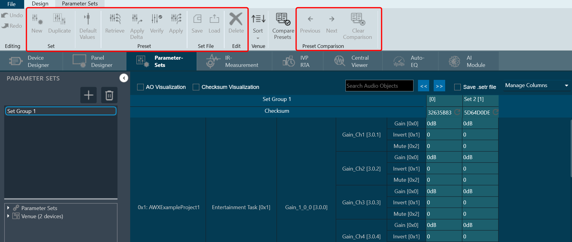
- Click on Compare Presets to compare the values in the selected preset columns. All the mismatched cell will be highlighted in the selected preset columns and the Previous, Next, Clear Comparison options will be in active state.
Use Previous and Next option check the mismatch value for the particular row.
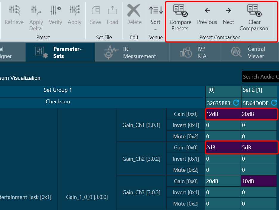
On comparing both the selected preset columns, if no mismatch found, GTT will display “Both Presets are identical” message.
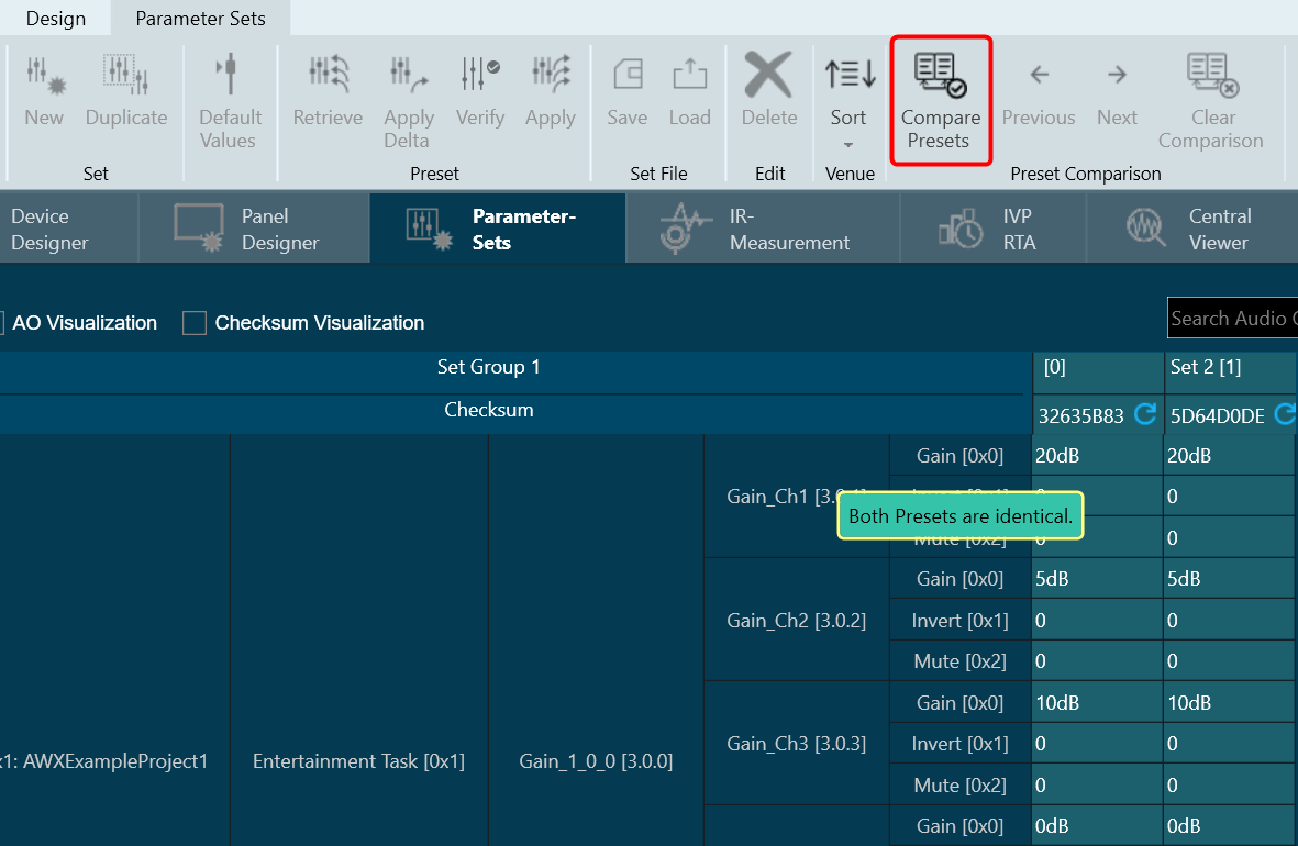
Presets Comparison will not be persisted when switching to the ‘AO Visualization’ view, but it will be persisted in the ‘Checksum Visualization’ view.
If you attempt to select the third preset column, GTT will prompt a message that “2 presets have been selected already.”
Next: Use this option to navigate to the next mismatch value. When you click on Next, GTT will take you to next mismatch row. If you reach to the last mismatch row and the you click Next; GTT will take you to the first mismatch row.
Previous: Use this option to navigate to the previous mismatch value. If you are on the first mismatch row, and then you click Previous; GTT will take you to the last mismatch row.
Clear Comparison: Use this option to clear all the highlights from mismatch cell background.
When you unselect the presets columns, all Preset Comparison options will be in inactive state.
3.3.9.Exporting Set File
GTT stores the tuning data in set files these files are in Intel Hex format. Due to the complexity to analyze the data stored in set files a human readable set file is generated. This type of file is generated when you check the check box in the parameter sets workspace.

A confirmation message appears when you save a set file using the device context menu or the state variable explorer. This file will have the same file name that set file but with extension “.setr”. The human readable set file is in XML format, this file contains three main nodes:
Header: Generic file information
| Data in GTT | Data in human readable set file |
 |
 |
User data: User data defined in preset settings.
| Data in GTT | Data in human readable set file |
 |
 |
Tuning data: Values associated to each state variable for each audio object.
| Data in GTT | Data in human readable set file |
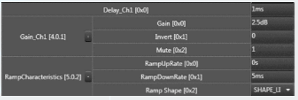 |
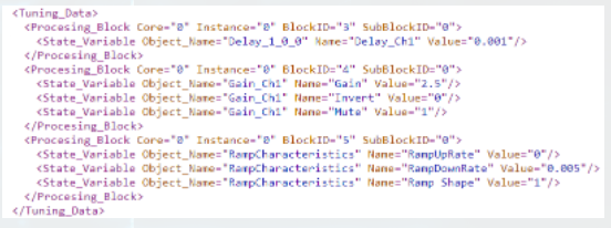 |
Each processing block corresponds to each Audio Object in current configuration.
3.3.10.Importing Set File
The GTT allows you to import a set file, these set file is in human-readable set format. There are multiple ways to import the set file.
Using Device Import
Using device import you can import a .set or .setr file.
- On the Device Designer tab, click on the Import > Tuning Data. This opens a dialog box to select the .setr file (human readable set file).
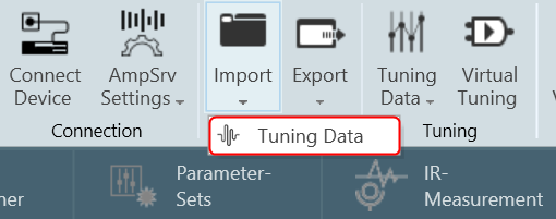
- Browse the location, select the .set or .setr file, and click Open. Once the set or .setr file selected, the device processing blocks will be updated with the tuning information extracted from the imported file.
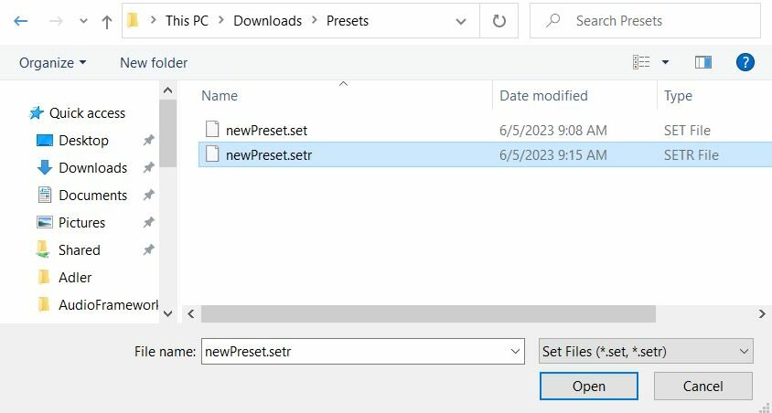
Using State Variables Explorer
- On the Device Designer tab, click on the State Variables. This opens a State Variables explorer.

- On the State Variables explorer, click on File > Load Set option.

- Browse the location of .set or .setr file and click Open. This loads the set or .setr file in State Variables explorer.
Using Parameter Sets
To load set file:
- Select any parameter set column, right-click and select Load Set File. This opens the windows directory.
- Browse the location of .set or .setr file and click Open. Tuning data will be loaded onto the chosen set after selecting the .set or .setr file.

Tuning data is loaded onto the chosen set upon selection of the .setr file. When you click “Undo”, the load action is reversed, and the screen displays the previous preset values. Only matching (CoreId, InstanceId, BlockId, and SublockId) objects tuning data will be loaded.

Tuning data will be loaded only in the parameter set column. Not on to the state variables.
The following notifications are displayed in the cases mentioned below:
- If there are additional objects in .setr file then set group a notification message will be displayed.
- If there are additional objects in the set group, then in .setr file a notification message will be displayed.

- If there is a mismatch in the size of the AO a notification message will be displayed.
- If there is mismatch in state variable names, a notification message will be displayed.

- If there are mismatching objects in both .setr file and set group, a notification message will be displayed.

- If an error occurs while loading to Device from Import > Tuning Data or State Variables > Load Set , below message will be displayed.

All the mismatched object details will be displayed in the event log.

3.3.11.Parameter Sets Explorer Color scheme
Parameter Set uses the following color scheme to represent the usage of nodes in the set group.
- Yellow: To represent partial use of the object state variables.
- Green: To represent complete use of the node.
- No color: To represent, the node is not used in the set group.

Colors are visible in Explorer only for Parameter sets. Colors are updated when something gets updated in the Set group.
You can easily determine which nodes from the Explorer are a part of Set Group and which ones are not by using the color coding. This will enable to modify the set group further.
3.3.12.Switch between Multiple Parameter Sets
To switch between multiple parameters, follow the below steps:
- Create a new panel as instructed in the chapter Create New Panel.
- Drag and drop a set group with multiple parameter sets to the panel and select Button – Radio from the upcoming menu.

- Add Multiple Parameter sets to the Panel. The parameter sets will be displayed in the panel.
- Click Launch Current. The panel and parameter sets will be launched and appear in a new window.
Launched Panel with Multiple parameter sets.

- Click on the checkboxes to switch between the sets.
The corresponding settings will be shown in the tuning panel.
3.3.13.Search in Parameter Sets
A search box is available on the top right of the window to search parameter sets by Audio-object name.
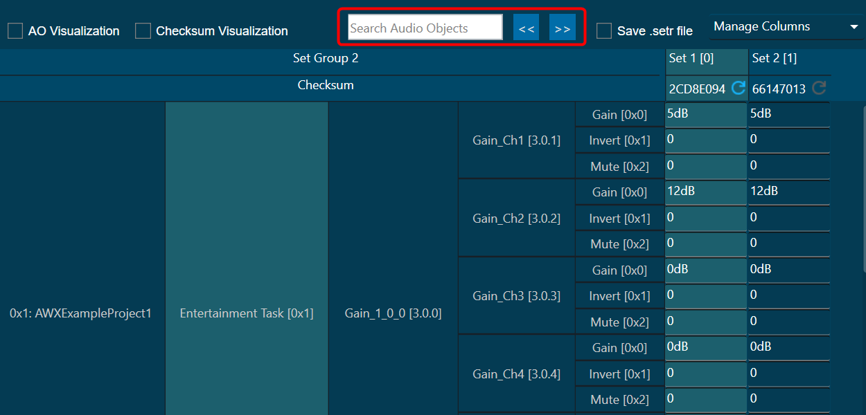
To enable the search, at least 3 characters must be entered. When an audio object’s name is searched, any matching audio objects that contain the key are highlighted in yellow, and a navigation to the first matching row is automatically carried out.
You can use “<< and >>” options to navigate between the highlighted audio objects.
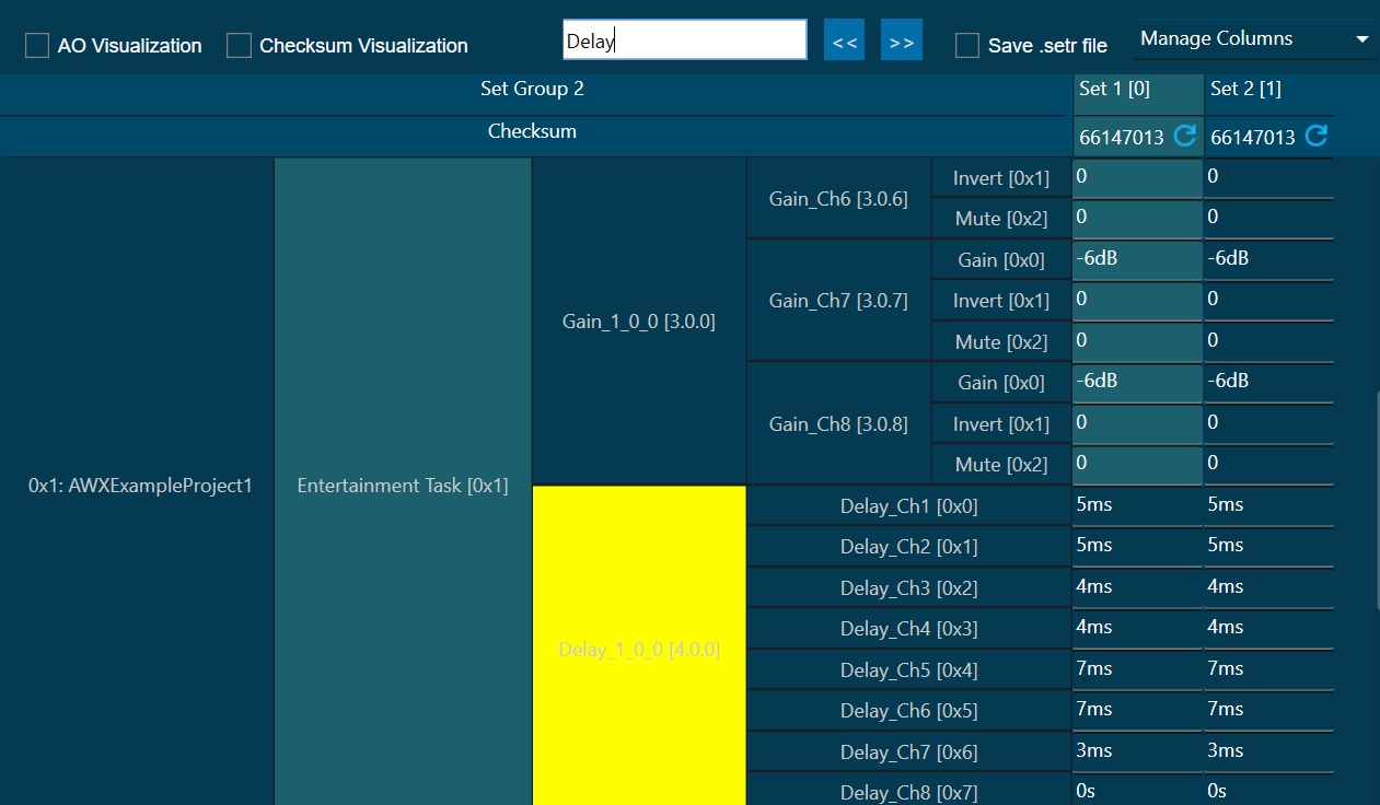
If a row is added or removed from parameter sets, and if a set group is changed, the search results will be cleared.
You can sort the explorer data using “Sort By Name” or “Sort By HiQNetld”.
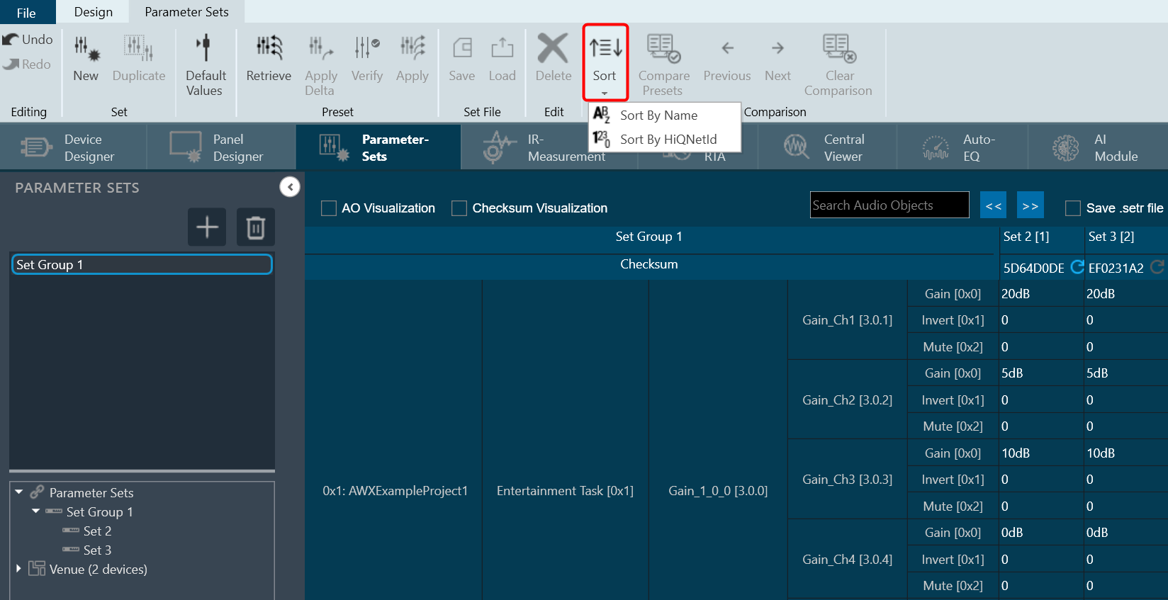
3.4.Custom Device Usage
GTT provides an option to use file-based devices. A default custom file with file extension .deviceInfo available under Devices folder (C:\Program Files\Harman\HarmanAudioworX\tools\GTT\Devices).
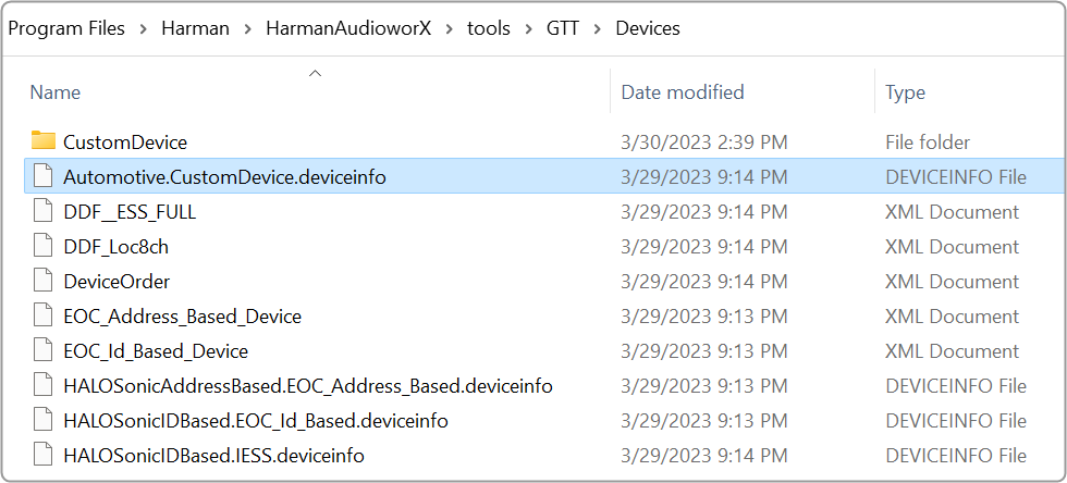
Also, you need a .ddf file, which you can keep under the Custom Device folder.
You can create a .ddf file in GTT. Once you have created a project, click on the Export option, and select DDF Data. Now browse to C:\Program Files\Harman\HarmanAudioworX\tools\GTT\Devices\CustomDevice location and save the file.
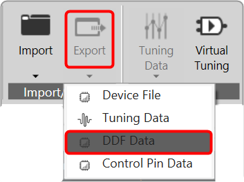
Once the above files are placed in the folder. The custom device will be shown in the Devices view tab in GTT. You can drag-drop this device into the venue explorer. This is similar to any other device created inside GTT.
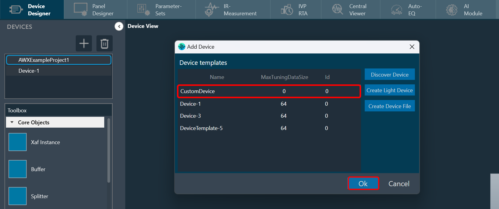
This file-based device has some limitations. In the normal device (created inside GTT), double-click will open the signal flow designer. But this is not the case with custom devices. This device is not stored in a database. So, the signal flow designer will not be opened.
It is possible to create a custom panel and use the device. However, because it is a file-based device, it is not stored in the GTT database. To reuse the project, export it as a file and then import it whenever needed.
The custom devices created will not be part of the existing project as the devices displayed in the location are retrieved from the GTT database, and custom devices are not stored in the GTT database.
Regardless of the sorting order, the Add Device Dialog always displays the Custom Device as the top option if it is available.
The Custom Device is loaded when the application is launched. Therefore, if any changes are made to the associated .DDF file after launching GTT, it is necessary to relaunch GTT and add the custom device again to ensure the modifications are reflected.
The source for the Custom Device is the .DDF file, which launches the State Variable window. This window displays the audio object definitions that are contained within the associated .DDF file and these definitions can be utilized during panel designing.
3.5.Multi-xAF Library Support
When working with multiple xAF audio library versions (DLL version) in GTT, any new device added to the project will be automatically linked with the default audio library version (DLL version).
If the linking of existing devices with their respective DLLs was done in the “O” version of GTT or if the DLLs were loaded before the project was imported to GTT, those devices will still function with their respective DLLs without any issues.
On the property view of the device instance, you can see the audio library version of the respective device.

Changing Device Audio Library
To change the audio library version of the device:
- Select the device instance in the device view. This opens the property view of the device.
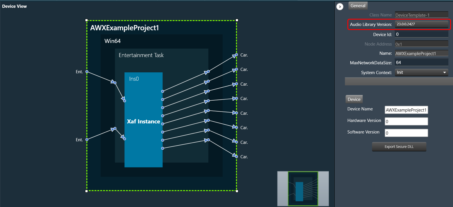
- Click on the Audio Library Version, select the desired DLL version from the drop-down, and click Save.
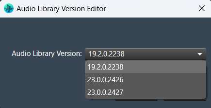
The device will start working with the updated DLL version.
If a device has a signal flow with audio objects created in a previous version, compatible audio objects are automatically upgraded.
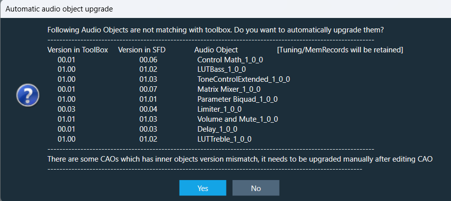
Once you update the DLL version, if any non-compatible audio objects are there, it will be highlighted in blue and the warning displayed in the compiler report.

You can fix the non-compatible audio objects in the signal flow. Right-click on the highlighted audio object and select upgraded audio object from the context menu.

Change of association DLL for one device will not impact other device instance.
xAF Audio Library Use Cases
While importing a project file in GTT, make sure the xAF audio library version is already available in GTT.
- Use Case 1: When you import a project, if the xAF DLL associated with the project is already loaded in the GTT audio library. Regardless of whether the associated DLL is the default library or not, the project will import without error or warning. Later, you can switch to the latest DLL.
- Use Case 2: While importing a project, if the xAF DLL associated with the project is not loaded in the GTT audio library, then the project will be linked to the default xAF DLL in GTT.
When you open the project after importing it, a message will appear. This displays the default audio library of project and details of previous audio library that is associated with the imported project.
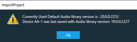
Once you open the Signal Flow Designer of the imported project, the below message will appear every time you open the Signal Flow Designer of the project.
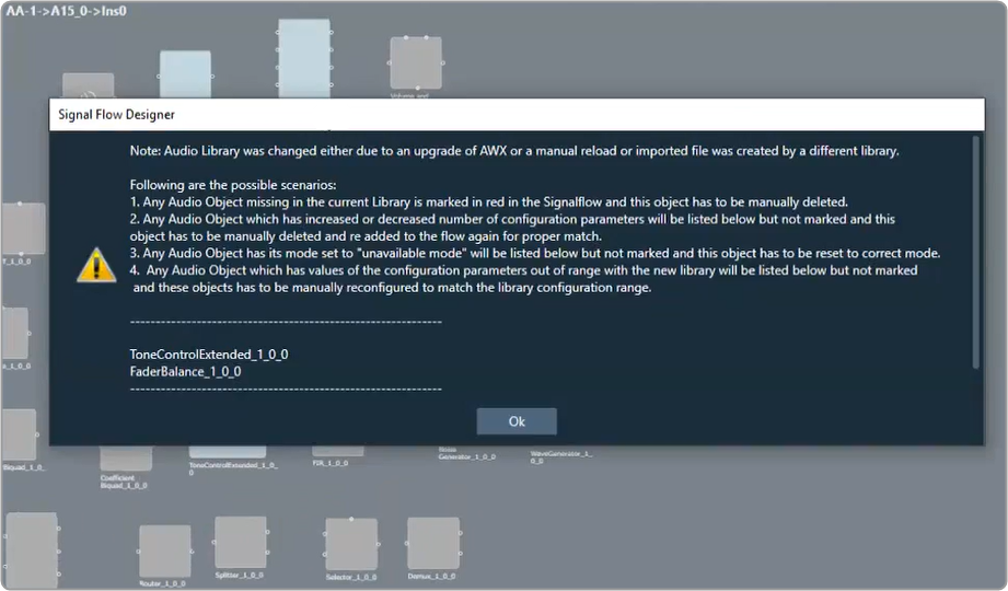
You can get rid of the message by using the methods listed below.
- Once you open the Signal Flow Designer of the project, go to the non-compatible audio objects, which are highlighted in blue. Right-click on the highlighted audio object, select upgraded audio object from the context menu, and save the changes. This will upgrade the non-compatible audio objects in the project.
- The message will not appear if you import the previous DLL (which is associated with the imported project) into the GTT audio library manager.
Use Case 3: While importing a project, if the xAF DLL associated with the project is not loaded in GTT audio library and the default xAF DLL is not compatible. An error message will be displayed, and project import will be cancelled.
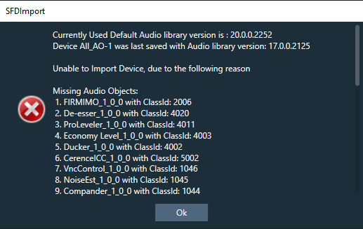
Use Case 4: After importing a project and switching to a different audio library, you may encounter missing audio objects in the Signal Flow Designer. These missing objects will be highlighted in red, and an error message with a list of the missing audio objects will be displayed. The same error message will also be included in the compiler report.
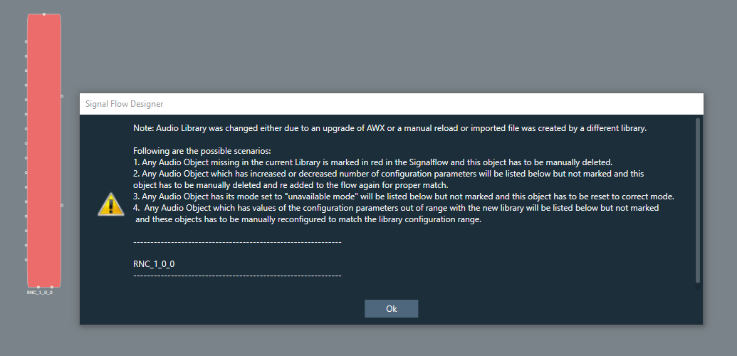
In order to resolve the error, it is necessary to delete the missing audio object from the Signal Flow Designer. Once the missing audio object is removed, the error will be cleared.
3.6.Configuring Preset Controller
This section provides a basic overview of setting up and using the Preset Controller functionality.
- Configuring Controller Slot
- Core Object Settings
- Custom Actions Settings
- Exporting Preset Configurations
- Maintain Folder Structure
- Loading Slots on the Device
- Handling Dual Responses from Device
- Send Preset Data Online
Limitations in Preset Controller
- After the set map is configured, if parameter sets are deleted, a generic sets window should be reopened to see the changes.
- Generic sets window can be opened only one at a time. If a new window has to be opened for a new device, the currently opened window will be automatically closed (changes made will be retained).
- Parameter sets are project specific. Generic sets are device-specific.
- Only basic validations are done. Illegal values are yet to be handled. Ex: Entering a string value for fade in –out is considered illegal and will not be handled.
- Signal flow and presets saved on the device should be in sync.
- The slot map and set files export is offline. The user shall make sure that these files are in sync with GTT for better visualization.
- All the presets configuration, slot map, and preset data are sent together in “Send To Device”. There is no option to send these data individually.
- For any changes in presets or maps, the user is expected to send all data (config, map, and presets).
Virtual device naming conventions. The set files should always follow the “preset [preset id]” naming convention. Example preset0, preset1, etc. when checkbox “Maintain Folder Structure” is unchecked.
When exporting the slot map file for Virtual Device usage, the name should always be sect262144.flash.
If set groups overlap for a given audio object, the one loaded last will override the first. The order is not guaranteed so it is not recommended to do this.
3.6.1.Configuring Controller Slot
Steps to configure preset controller slot:
- Go to the Standard toolbar and open Preset Controller.

On the Preset Controller window you can see the following details:- In the Slot Id, the serial number starting from 1 (or the next available slot) will be displayed.
- The Slot Name, Fade In, and Fade Out will be filled in with default values.
- All the Set groups created in parameter sets screen containing the parameters of the device are displayed as rows in set map table.
- Enter the values in Slot Id, Slot Name, Fade In, and Fade Out, and click Add Slot.

A new slot column added with entered details and default value (None) for set groups available in the table. - Enter the Pipeline Delay in the text box. The pipeline delay is used as a delay after applying the preset to the Load Slot operation and before starting to ramp up. The pipeline delay is the time required for the history buffers (which have already been cleared) to be filled with valid data before the start of the ramp-up. The value can be set from 0 to 65535 ms.
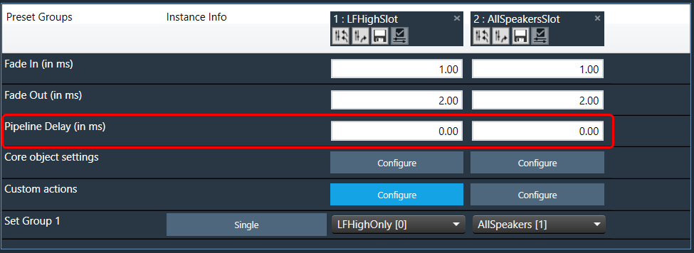
- In the Core object Setting row, click Configure. This opens the Core state configuration window.

- On the Core object configuration window, Enable or Disable ramping for individual core objects using the toggle button.
Instances which have active set groups in this slot will automatically be added to this window and cannot be removed.
For more details about Core object configuration, refer to Core Object Settings

- (Optional) If you want to add custom actions, in the Custom actions row, click Configure. This opens the Custom action configuration window.
On this window you define custom actions. For more details about Core object configuration, refer to Custom Actions Settings
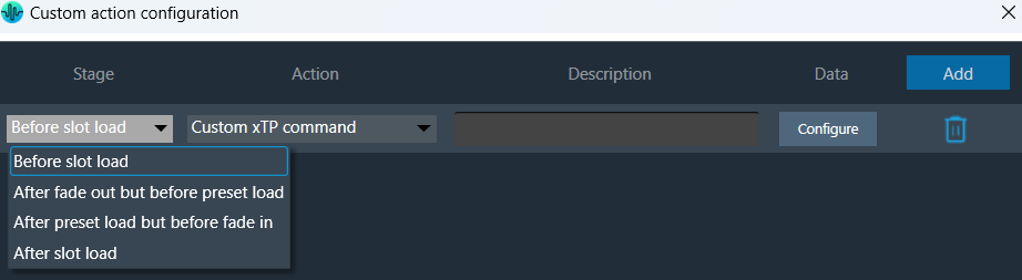
- In the Set Group row, click on the drop-down to set a group created in the parameter sets screen.
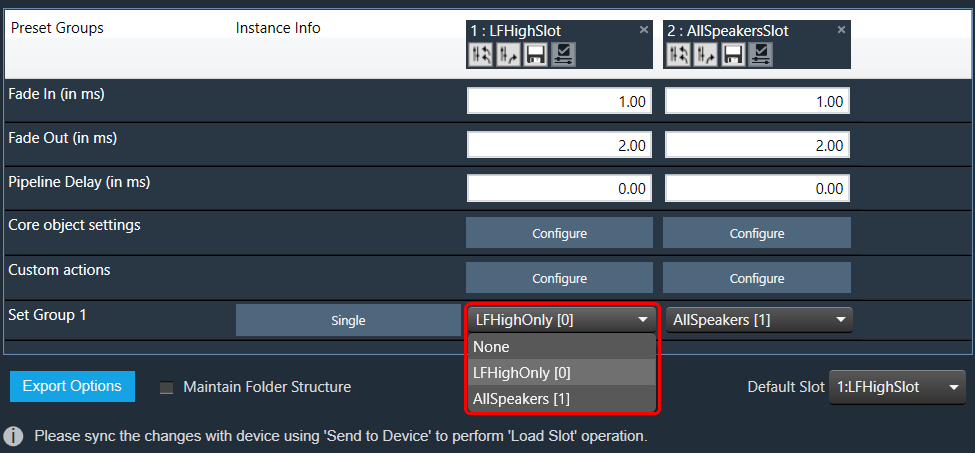
If the “None” value is selected for any set group no parameter set from that group is loaded for this slot. - Click on the Single to see the core and instance.
The instances associated with the set group are shown next to the set group. If the group contains parameters of only one instance, the instance info is “Single”, otherwise it will display “Multiple”.

- Double-click on the table column header to edit the slot name.

Ramp Settings configuration is supported from S+2 device library version.
- Click on the “X” icon available on any column to delete the slot.

Slot Options
Retrieve Slot: The Retrieve Slot option in the generic sets window reads the state variable values of all the sets in a slot and updates them in the in the corresponding sets of Parameter Sets. Retrieve Slot button is available in the header of each slot.

Apply Delta Slot: The Apply Delta Slot feature only sends tuning values of the parameter which is updated in the slot. The tuning values of the presets are send to the device via XTP Tuning write messages. Apply Delta Slot option is available in the header of each slot.
Export Slot: Once you have created a Set Map, click on the “Export Slot” option, and browse the desired path.

Flash file created in binary format. For virtual devices, use the file name as “sect262144.flash”.
Generic sets are persisted in the database, just like any other data in GTT.
Generic sets are also persisted in the .gttd file when the project is exported, and the same is available after importing. The selection of the default slots is dynamic and will not be persisted.
Verify Slot: This functionality is designed to compare the presets loaded on a device with those available in the GTT in order to ensure their accuracy.

This feature is available only in online mode. i.e. only when the device is connected.
To verify preset values, select a slot and then click the ‘Verify slot’ option. A read command is sent to the device for each state variable within of all presets under a slot. Once the value has been read, it will be compared with the corresponding value in the preset. If all values match, the verification process is considered successful. However, if any values do not match, an error message will be displayed, and an error report will be generated.
Sample error report is as attached here Set 1[2].
3.6.2.Core Object Settings
The “Core Object Settings” window is used to control core object transitions and target states. Any core object can be added here optionally, but instances with active set groups for the slot are automatically added.
You can specify which processing state the core object should transition to during the slot load, and if that transition should involve ramping or an instant change.
Core Object Settings includes following processing states:
- Normal Processing state
- Bypass without processing
- Mute with processing
- Mute without processing
By default, ramping is enabled for all instances if not configured. Ramping can be disabled per instances in a core using toggle button.
When Ramping is disabled:
– There is no rampdown to mute phase before applying preset data (but calc is momentarily disabled during the actual load to protect data).
– There is no ramping between processing state changes.
Things to know about this window and how objects transitions will function.
- The ramp time used is configured in the slot, it overrides default core object ramp times.
- Automatically added core objects (instances with active set groups) cannot be deleted from the list.

- You can also manually add and remove other core instances and objects.
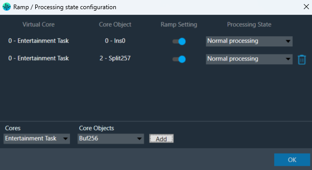
If performing control set custom actions or other non preset object tuning – you may end up with multiple ramps (once from core object and once from AO tuning) multiplying against each other.
– When loading a preset though – the tuning method is called with ramping disabled so the object should not ramp.
- Ramp Setting for instances, which load presets function differently than ramp settings for core object switches or instances which do not load presets.
- With Ramping on:
- Core objects and Instances which do not load will use only one ramp if possible.
- example: going from normal to mute we do not need to ramp back up after the mute.
- example: going from normal to bypass we have to ramp down to mute and then up to bypass.
- Instances that load presets will always go to mute for loading the preset and then transition to whatever proper state after.
- Core objects and Instances which do not load will use only one ramp if possible.
- With Ramping off:
- During the ‘muted’ phase which occurs after any rampdowns are finished (if there are indeed rampdowns in the slot) all non-ramping core objects (whether loading presets or not) will instantly switch state to the target state.
- With Ramping on:
Instances which load presets are disabled during the load even if they are unmuted.
3.6.3.Custom Actions Settings
The Preset Controller allows you to configure a “Custom Action” option. Choosing this option opens a dedicated configuration window where you can define custom actions, as shown in the below image.

In Preset controller, there is an option to configure what actions have to be performed when a slot is loaded. Currently this feature supports the following actions.
- Custom xTP command
- Custom xTP command (External)
- Set master control pin
- Set Audio object processing state
These custom actions can be configured at different stages of slot load. There are 4 stage that can be configured as listed below.
- Before slot load
- After fade out but before preset load
- After preset load but before fade in
- After slot load
Steps to configure custom actions:
- On the Custom action configuration window, click Add to add an action that you can then configure.
- Once the action is added, select the “Stage” from the drop-down options.
- Similarly, select the “Action” from the drop-down actions.
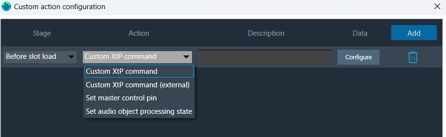
- Click on Configure to configure the Action.
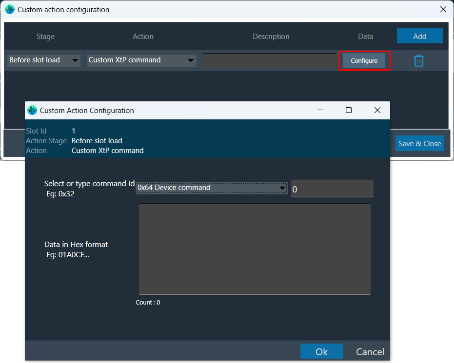
The data configuration option depend on the type of “Action” you choose from the drop-down. Below are the configurations for each supported action type.
| Custom xTP command |  |
This action sends an xTP message of your choice into the device (as if it received it from GTT).
The commands which go to the core may send a response to the network after processing. These responses may not cause a GTT update depending on the command. The same limitation applies to read commands, for example reading a control value won’t cause GTT to update the value in the explorer. You can select a xTP command from the drop-down. If the command is not available (perhaps in that case you are using a custom command), you can enter command Id in the text box. Then you can enter the command data in the box provided. This window lets you enter data in hexadecimal format. As you enter the data, the count at the bottom keeps track of the characters, helping you ensure the correct length. The system automatically generates a clear description to help you understand the configured custom action. |
| Custom xTP command (External) | 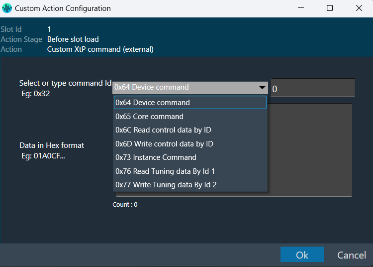 |
This sends a command from the system to the extrenal device or any connected tool from the context of the xTP Interpreter. You can select a xTP command from the drop-down. If the command is not available, you can enter command Id in the text box. Then you can enter the command data in the box provided. This window lets you enter data in hexadecimal format. As you enter the data, the count at the bottom keeps track of the characters, helping you ensure the correct length. The system automatically generates a clear description to help you understand the configured custom action. |
| Set master control pin |  |
This is equivalent to sending the control and value from GTT or from any other xTP source. This window appears when you choose “Set master control pin” as the action in the main custom action configuration window. |
| Set Audio object processing state (beta) | 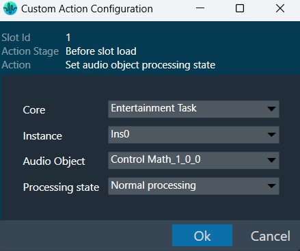 |
Sets the selected audio object to the chosen state. This window appears when you choose “Set audio object processing state” as the action in the main custom action configuration window. This window will show where you can configure the processing state of the audio object. Once the values are selected, Click “Ok” to save the processing state information. |
Once all the slots are configured with set of actions, the custom action window will appear as per below image. You can override the default descriptions yourself after you configure the action.

The custom action data configured will be saved only when “Save and close” button is clicked in main custom action window.
3.6.4.Exporting Preset Configurations
You can export Preset Configuration using following methods:
- Export Slot Map: To save the flash files of the slot map in the selected path.
- Export Set Files: To save all the set files of the map in the selected path.
- Export All Files: To save all the set files of the map along with the flash file in the selected path.
Right-click or click on “Export Options” to select the type of export.

To export a slot map set files all files should contain at least one valid slot, otherwise the options Export Slot Map, Export Set Files, Export All Files, and Export Slot will be disabled.

Exporting human readable flash file: The exported flash file is useful in the event any slot got accidentally deleted. You can reconfigured Preset Controller values using the slot map table details mentioned the exported flash file.
Once you have configured all parameters of the Preset Controllers , it is recommended that you export the flash file.
Steps to export human readable flash file:
- Open Preset Controller, add and configure the slots.
- Click on the Configure and enable or disable “Ramp Setting”.
- Click on Export Slot Map or Export All Files, browse the desire location, enter the file name, and click Save.

This action creates two files, one human-readable CSV file and another flash file at the specified path.
The name of the CSV file is determined by the name of the flash file, which is the original file.
Example: The flash file name in the example below is Map.flash, so the readable CSV created file name is Map.flashr.

- Open the CSV file to see the slot details.
In the below image, the Ramp Setting details for “1: Core 0” column is “0:0 Disabled 1:0 Enabled 1:1 Enabled”, which is “Core Id : Instance ID : State” .
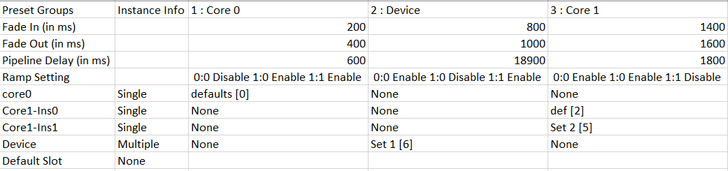
The below image explains the “Ramp Setting” configuration for “0:0 Enabled 0:1 Enabled 0:1 Disabled” in the GTT.
Similarly, all ramp settings detail will be exported in this format.
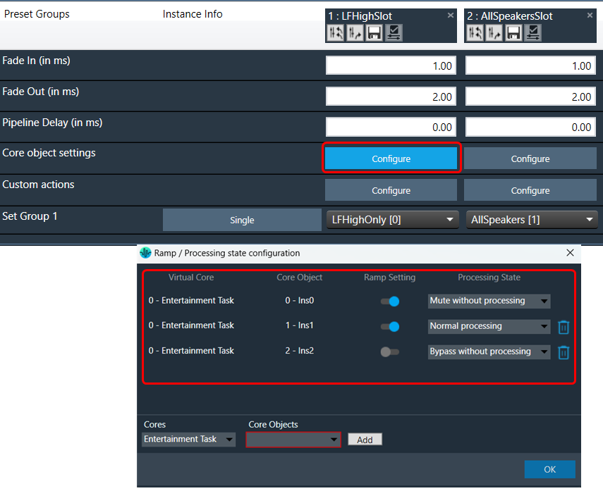
3.6.5.Maintain Folder Structure
When the “Maintain Folder Structure” option is checked, then all the set files will be generated within a folder named after the Presets Group name, using the format “Presets Group name_SetNamePresetIds”. This applies when performing operations such as Export Set Files, Export All Files, and Export Slot. On the other hand, if this option is unchecked, all the set files will be stored in the chosen path directly.
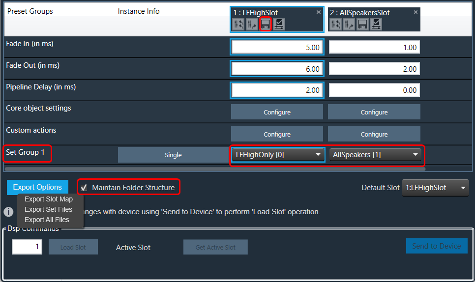
So for above Preset Group (Set Group 1) and sets (Set 1[0], Set2[1]) below folders and file will be created under selected path.

Maintain Folder Structure flag will be persisted while exporting/importing projects and reopening the preset controller window.
3.6.6.Loading Slots on the Device
If a set of files and slot map files are already available on the device.
- Click on the column header of the slot and select the slot, which has to be loaded to the device. Selected Slot Id is displayed in a text box under the DSP commands section.
- Click on the Load Slot button.
By default, the first valid slot in the table is loaded. If the device is offline, it will be automatically connected to it.

The GTT sends a slot load request to the device and waits for a response. If the device is successfully loaded into the slot, a success message is displayed on the screen.
An error message will be displayed on the screen if the device has failed to load into the slot.
If a slot does not exist in the table but is present on the device, it is also possible to load it. In this case, the user can manually enter the slot ID and click on the “Load slot” button.
3.6.7.Handling Dual Responses from Device
When the “Load Slot” command is sent to the device, the device can respond with the following options.
Option 1
- Slot loading in progress > Slot can be loaded > Loading in progress
- Slot loaded successfully.
Two responses one after the other.
Option 2
- Slot loading in progress > Slot can be loaded > Loading in progress >
- Slot loading failed.
Single Error response – Slot loading failed.
In the first two cases, between the first response and the second response, you will be blocked from taking any action in GTT.
The following progress dialogue box will be displayed.

If the second reply is not received within 15 seconds, GTT will unblock itself and report an error.
3.6.8.Send Preset Data Online
Steps to send preset data online:
- Connect to the device.
- Click on Send To Device under the DSP Commands section. The Preset Configuration, Slot Map, and Presets are sent in sequence.

The default slot is the slot number loaded at boot. By default, it is set to “255:None”. You can specify the default loaded slot.
When loading the standard slot, the framework does not apply ramps
Once a preset has been flashed, it will not be flashed again, i.e. each preset configured in the slot map will only be sent once.
If any of these commands fail to be sent, the next command will not be sent, and an error message will be displayed.
When the preset data has been successfully sent, a completion message is displayed to indicate that the transmission was successful. If an error occurs, an error message is displayed.
4.Streaming and Polling
The streaming and polling are used to monitor the signal flow of different parameters in a Signal Flow Designer.
Streaming can be beneficial when you need to constantly monitor a signal for a specific channel. If any changes are made to the signal flow design, the updated values will automatically be displayed through streaming. However, for non-streamable parameters, GTT will transmit a single command and receive the corresponding value from the device in response.
To access this feature, you will need a license for unlocking. Kindly contact the license administrator to obtain the necessary license.
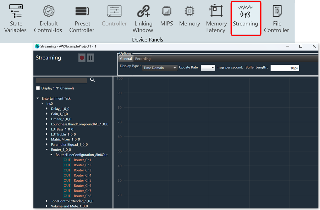
The object tree displays filtered state variables that support streaming and polling.
Streaming state variables are highlighted in white, while polling state variables are highlighted in orange.
The default display of state variables in the object tree is set to show “after calculation” data for streaming out. However, if you want to display “before calculation” state variables, select the “Display IN Channels” option. The IN state variables indicated with a blue color and OUT state variables indicated with a red color, with keywords denoting their specified type.
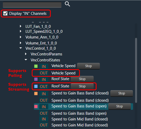
Below table describes the audio objects that support streaming.
| Audio Object | Parameter Name | State Variable | Streamable |
| Level Monitor | Level_Value | Yes | True |
| Compressor | Attenuation | Yes | True |
| VNC Control | VNCControlStates | Yes | True |
| NoiseESt | StreamingParam | Yes | True |
| AlaControl | AlaControlStates | Yes | True |
| FFTCalc | FFTCalcState | Yes | True |
| Ducker | State params | Yes | True |
| dbXLimiter | States | Yes | True |
| AudioToControl | AudioToControlState | Yes | True |
| Limiter | Attenuation | Yes | True |
4.1.Start Live Streaming
Ensure that the following requirements are met before beginning the streaming process.
- Make sure the device is connected to GTT.
- If you want to stream streamable state variable, then you can enable Streaming option, for more details refer Streaming.
- While performing streaming make sure the parameter supports streaming. You can verify this by opening the state variable explorer and confirming that the “Category” is set to “state” and “Streamable” is set to “true” for the parameter.

To start live streaming, follow the below steps:
- Open GTT project, click on the Streaming option from the Device Designer tab. This opens the streaming window.

- On the General option, set the Display Type, Update Rate, and Buffer Length.
The Update Rate will be applied to all live streams, and Buffer length (the maximum streaming data that can be stored) can be changed any time during the live streaming.

- Expand the state variable you want to stream and drag-drop the variable from the object tree to graph. This starts live streaming of the variable.
Active streams can be matched with the curve on graph by the colors of the curve and the rectangular block next to the state variable.

The graph can be zoomed on both the x and y axes by scrolling. - Click on the Stop option, if you want to stop streaming of the variable.
You can open multiple streaming windows for a device and stream on multiple devices. However state variable can be streamed in only one window at a time and not in multiple window.
If the “Streaming” feature is disabled for any core, streamable state variables (push mode) will be excluded from the available state variable list for that core.
4.2.Viewing Streaming Data in Custom Panel
You can view live streaming data in a custom panel. Map the streaming state variable address to any control on the custom panel and start the live streaming from the streaming window. Then, launch the custom control panel.
The live streaming of the state variable will be displayed on a custom panel.
Only the current value of the state variable will be displayed on the custom panel.

4.3.Search Variable
You can search for a specific variable from the object tree in the Streaming window and then drag and drop it onto the chart.
To find a variable in the Streaming window, enter at least two keywords of the variable in the search bar. The GTT will use these keywords to search and display the filter results in the object tree.
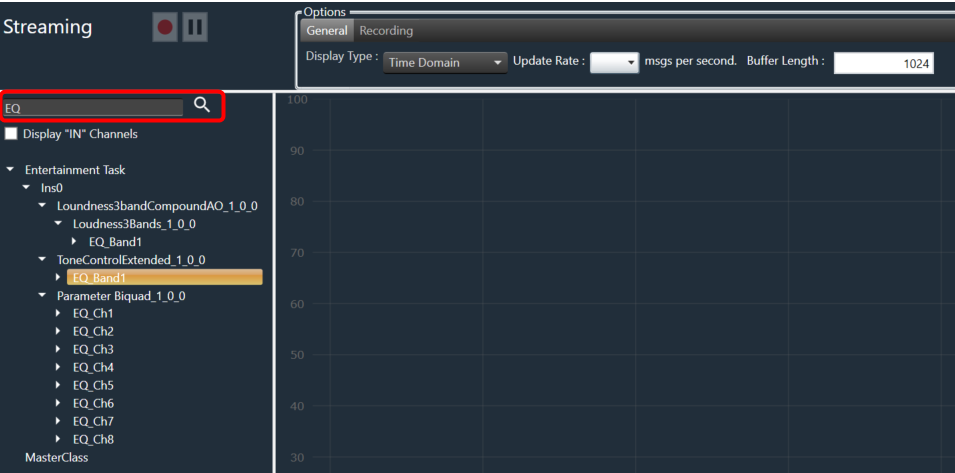
4.4.Record Streaming Data
The streaming data can be recorded and stored in a file using the record button available. There are two supported file formats.
- Csv file format (.log)
- PCM file format (.pcm)
The default recording folder is C:\Users\Username\AppData\Local\Harman\GTT\PCMStreamingLogs. To change the folder location for the recording, you need to click on “…” button.

Record Streaming Data in csv format
The csv format logs are supported by both polling and streaming state variables. Once you click on the record button, it opens file explorer to choose the location and file name for storing streaming data.
The default file format for storing streaming recordings is CSV.

The recording process is indicated by a continuously blinking button, indicating that streaming is currently being recorded. To stop the recording, simply use the same button.
During the recording process, adding or stopping streaming is not permitted.
The file stores the following information in the streaming data:
- Buffer Size and Update Rate.
- Streaming variables names with comma (,) separator.
- Streaming variable data with comma (,) separator and if any variables have an array of data it is separated by spaces.
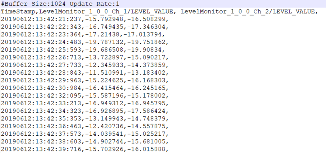
Record Streaming Data in PCM format
The PCM format recording only supported by streaming state variable. Once you click on the record button, it opens file explorer to choose the location and file name for storing streaming data.
Prior to commencing PCM format recording, you must ensure the following conditions are met:
- The State Variable used for streaming is of a streamable type.
- PCM format is selected as the file format.

The recording process is indicated by a continuously blinking button, an indication that streaming is currently being recorded. To stop the recording, simply use the same button.
During the recording process, adding or stopping streaming is not permitted.
Each state variable’s streaming data is stored in a separate file containing raw data, which can be imported into tools such as Audacity for further analysis or processing.
A date-time stamped folder is automatically created for each recording under the root folder. Inside this folder, a separate file is generated for each state variable being streamed.
File Name Format: {state variable Name} {Channel Name} {Audio Object Name} {sample rate} {duration in seconds}. pcm
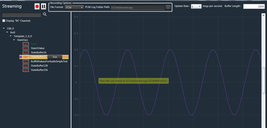
Example of sample recorded file.
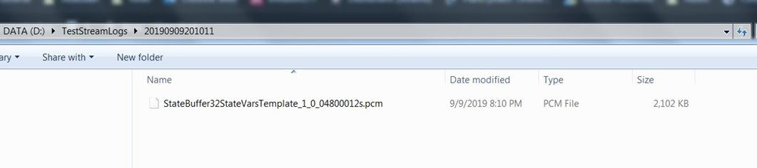
4.5.Pause/Play Streaming
The streaming data can be paused by using the pause button. When the stream is paused, it indicates that GTT Tool stops receiving data from the device internally, and no bandwidth is utilized during this pause period.

To resume streaming, the same button can be used, and it will convert to a play button once data is paused.
It is not permitted to add new state variables or change the update rate while the streaming is paused. However, stopping an active state variable is allowed.
4.6.FFT for Streaming
FFT Analysis capabilities are also available in the streaming window, wherein the FFT analysis of incoming audio signals is undertaken in real-time, depending upon the block size, additional calculations, etc).
The “Display Type” selection under the General tab provides the option to switch between Time and Frequency domain display.
When the Display Type is set to “Frequency Domain”, the Spectrum functionality of Streaming can be viewed.
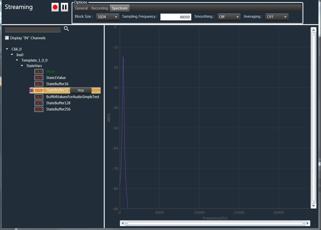
In Spectrum view the X-axis ranges from “0 to Sampling Frequency / 2”, and Y-Axis ranges from “0 to -90 dbFS”.
Providing the correct sampling frequency is the responsibility of the audio engineer, and it should match the sampling frequency of the streaming state variable.
The Spectrum properties such as Block size, Sampling Frequency, Smoothing, and Averaging can be configured according to your requirements.

The variable “MaxWinSize” determines the maximum window size for smoothing in the Spectrum functionality. It has three options: Low (20), Medium (40), and High (1000). Choosing a larger number will result in a smoother curve.
For instance, if you set the limit to 500 Hz, all bins in the upper frequency range will be smoothed by averaging a window width of 500 Hz.
Example: Smoothing set to Off.
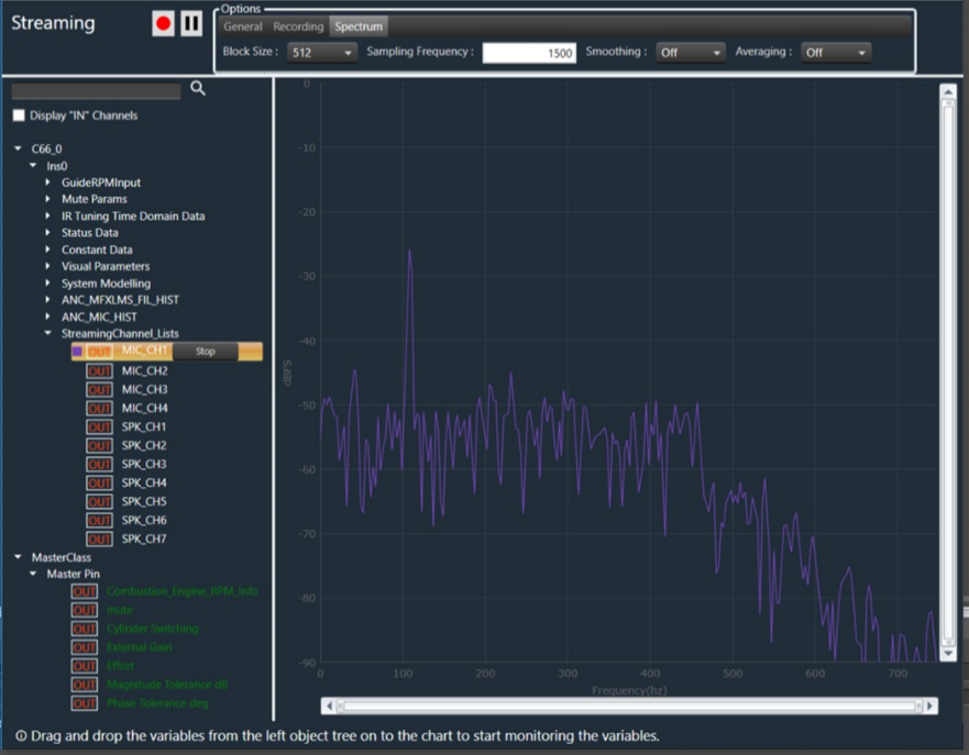
Example: Smoothing set to Low.

Example: Smoothing set to Medium.
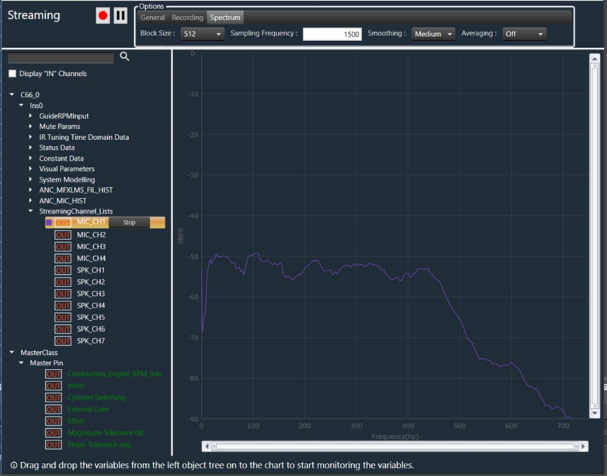
Example: Smoothing set to High.

4.7.Limitations in Streaming
Below are the limitations associated with streaming.
- Last selected update rate will be applied to all active streams.
- The update rate is not configurable, you need to select one of the predefined values from the drop-down menu. It is not possible to enter a custom update rate.
- Maximum buffer length allowed is 65536.
- Streaming state variables are read only.
- Zooming the graph with more than 8 active streams in parallel may cause performance issues.
Opening multiple streaming windows may result in increased CPU load, potentially leading to performance issues. To avoid such concerns, you can configure the option to receive notifications and restrict streaming when CPU load exceeds a certain threshold.
By default, the maximum allowed CPU load is set to 100%. However, you can configure restrictions at specific load levels by modifying the “MaxAllowedCpuLoadForMonitoring” value in the configuration file.