Allows to add a rectangle in the custom panel.
| Property Type | Options |
|
General
|
Control Info: Shows control type. Read only |
Locked: Specifies if the control is locked out so that it cannot be moved or re-sized.
|
|
|
Appearance
|
Location: Control location (in pixels) of the control on the Custom Panel. Change X (horizontal) and Y (vertical) values in relation to upper left corner. You can also drag the control to a different location |
| Size: Control size (in pixels). Change width and height values. You can also re-size the control manually. | |
|
Fore Color: The color of the line. Brings up the Select Color window. |
|
|
Gradient Color Start: The starting color of a gradient fill or the color of a solid fill. Brings up the Select Color window. |
|
|
Gradient Color End: The ending color of a gradient fill. Not used for a solid fill. Brings up the Select Color window. |
|
Gradient Mode: The direction that a color gradient fill will flow.
|
|
Paint Style: The type of background fill.
|
|
| Rounded Corners: When checked the corners of the box will be rounded by the Corner Radius amount. | |
| Corner Radius: The radius of the corners. | |
|
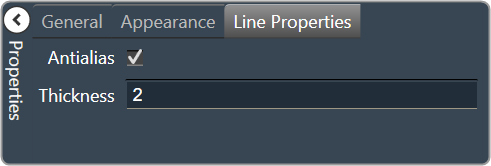
Line Properties
|
Anti-alias: When checked, turns on the anti-aliasing filter. |
| Thickness: The thickness, in pixels of the line. |