| Property Type | Options |
|
General
|
Control Info: Shows control type. Read only |
|
Graph Name: The name of the graph. Required to link to a Selector Panel or Widget Panel. |
|
| Band Selector Name: The name of the band selector panel associated with this graph. | |
| Channel Selector Name: The name of the Selector Panel to which the graph is linked. | |
| Widget Panel Name. The name of the Widget Panel to which the graph is linked. | |
| Widget Panel-B Name: The name of a secondary Widget Panel associated with this graph. | |
Locked: Specifies if the control is locked out so that it cannot be moved or re-sized.
|
|
|
Parameters
|
Addresses: The addresses for the parameters attached to the graph hierarchy. Opens the Graph Parameters window. |
Override attached alert: Whether to display the warning for disconnected controls.
|
|
|
Appearance
|
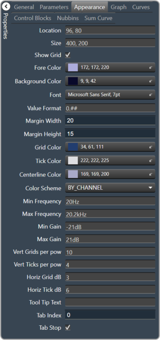
Location: Control location (in pixels) of the control on the Custom Panel. Change X (horizontal) and Y (vertical) values in relation to upper left corner. You can also drag the control to a different location |
|
Size: Control size (in pixels). Change width and height values. You can also re-size the control manually |
|
Show Grid: Whether or not to display the grid lines.
|
|
|
Fore Color The foreground color for this graph. Brings up the Select Color window. |
|
|
Background Color: Background color of the graph. Brings up the Select Color window. |
|
|
Font: Font for tick labels. Click on “…” to select desired font.
|
|
Value Format: The format of the values next to the major tick marks.
|
|
| Margin Width: The width of the margin from the sides to the graph (in pixels). | |
| Margin Height: The height of the margin from the sides to the graph (in pixels). | |
|
Grid Color: Grid line color. Brings up the Select Color window. |
|
|
Tick Color: Color of the tick marks. Brings up the Select Color window. |
|
|
Centerline Color: Color of the graph center line. Brings up the Select Color window. |
|
Color Scheme: The manner in which the Channel Colors are to be used.
|
|
| Min Frequency: Lower bound frequency for the graph. | |
| Max Frequency: Upper bound frequency for the graph. | |
| Min Gain: Lower bound gain for the graph. | |
| Max Gain: Upper bound gain for the graph. | |
| Vert Grids per pow: The number of grid lines to display for each power of 10 in frequency. | |
| Vert Ticks per pow: The number of ticks to display for each power of 10 in frequency. | |
| Horiz Grid dB: The number of dB between each horizontal grid line. | |
| Horiz Tick dB: The number of dB between each horizontal tick mark. | |
| Tool Tip Text: The text that appears on control mouse over. | |
| Tab Index: If tab stop is set to true, determines the position of the control in the tab order. | |
Tab Stop: Specifies whether the control appears in the tab order.
|
|
|
Graph
|
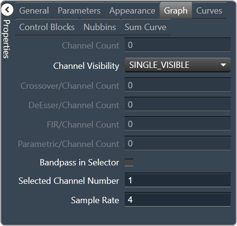
Channel Count: The number of channels currently in the graph. |
Channel Visibility: How many channels should be visible.
|
|
| Crossover/Channel Count: The number of Crossover/Bandpass curves currently in each channel. | |
| DeEsser/Channel Count: The number of DeEsser curves currently in each channel. | |
| FIR/Channel Count: The number of FIR filter curves currently in each channel. | |
| Parametric/Channel Count: The number of Parametric curves currently in each channel. | |
| Bandpass in Selector: If checked, the bandpass curves will be in the selector panels. | |
| Selected Channel Number: The number of the currently selected channel. | |
| Sample Rate: The interval at which the curve is sampled. | |
|
Curves
|
PEQ Curve Fill Style: The fill style for Parametric EQ curves.
|
| Label PEQ Curves: When checked, the Parametric EQ curves will be labeled. | |
| Label Bandpass Curves: When checked, the Bandpass curves will be labeled. | |
Label Font: The font for curve labels.
|
|
|
Control Blocks
|
Show Control Blocks: Enable the display of the filter control blocks. |
| Block Width: The width of the filter control blocks. | |
| Block Height: The height of the filter control blocks. | |
Block Font: The font for the filter control blocks.
|
|
|
Nubbins
|
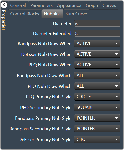
Diameter: Drawing diameter for control point nubs. |
| Diameter Extended: Interaction diameter for control point nubs. | |
Bandpass Nub Draw When: Selects when the Bandpass nubs should be drawn.
|
|
DeEsser Nub Draw When: Selects when the DeEsser nubs should be drawn.
|
|
PEQ Nub Draw When: Selects when the Parametric EQ nubs should be drawn.
|
|
Bandpass Nub Draw Which: Selects which bandpass nubs should be drawn.
|
|
PEQ Nub Draw Which: Selects which Parametric EQ nubs should be drawn.
|
|
PEQ Primary Nub Style: Selects the style of the parametric EQ primary nubs.
|
|
PEQ Secondary Nub Style: Selects the style of the parametric EQ secondary nubs.
|
|
Bandpass Primary Nub Style: Selects the style of the Bandpass primary nubs.
|
|
Bandpass Secondary Nub Style: Selects the style of the Bandpass secondary nubs.
|
|
DeEsser Primary Nub Style: Selects the style of the DeEsser primary nubs.
|
|
|
Sum Curve
|
Show Composite Curve: When checked, the overall composite curve will be displayed. |
| Show Sum Curves: When checked, the channel’s sum curve will be displayed. | |
|
Sum Curve Color: The color of the channel sum curve. Brings up the Select Color window. |
|
|
Composite Curve Color: The color of the composite curve. Brings up the Select Color window. |
|
| Composite Curve Thickness: The thickness, in pixels of the Composite Curve. | |
| Sum Curve Thickness: The thickness, in pixels of the Sum Curve. |