A panel is a box that allows you to manage the look of your Custom Panel.
| Property Type | Options |
|
General
|
Control Info: Shows control type. Read only |
|
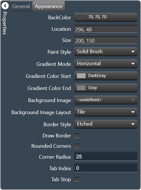
Appearance
|
Back Color: Background color of the panel. Brings up the Select Color window. |
|
Location: Control location (in pixels) of the control on the Custom Panel. Change X (horizontal) and Y (vertical) values in relation to upper left corner. You can also drag the control to a different location |
|
| Size: Control size (in pixels). Change width and height values. You can also re-size the control manually. | |
Paint Style: The type of background fill.
|
|
Gradient Mode: The direction that a color gradient fill will flow.
|
|
|
Gradient Color Start: The starting color of a gradient fill or the color of a solid fill. Brings up the Select Color window. |
|
|
Gradient Color End: The ending color of a gradient fill. Not used for a solid fill. Brings up the Select Color window. |
|
| Background Image: Background image of the control. | |
Background Image Layout: The way the background image is drawn.
|
|
Border Style: Click to select border style.
|
|
| Draw Border: When checked, a border is drawn around the Panel. | |
| Rounded Corners: When checked the corners of the box will be rounded by the Corner Radius amount. | |
| Corner Radius: The radius of the corners. | |
| Tab Index: If tab stop is set to true, determines the position of the control in the tab order. | |
Tab Stop: Specifies whether the control appears in the tab order.
|