| Property Type | Options |
|
General
|
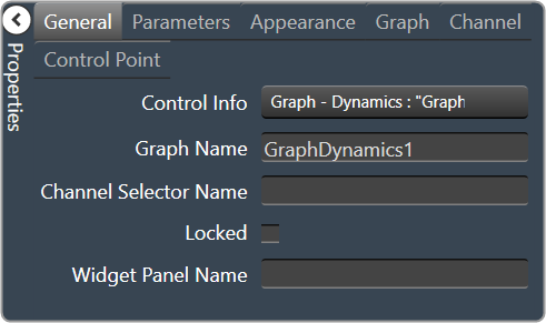
Control Info: Shows control type. Read only |
|
Graph Name: The name of the graph. Required to link to a Selector Panel or Widget Panel. |
|
| Channel Selector Name: The name of the Selector Panel to which the graph is linked. | |
Locked: Specifies if the control is locked out so that it cannot be moved or re-sized.
Unchecked = Unlocked |
|
| Widget Panel Name. The name of the Widget Panel to which the graph is linked. | |
|
Parameters
|
Addresses: The addresses for the parameters attached to the graph hierarchy. Opens the Graph Parameters window. |
Override attached alert: Whether to display the warning for disconnected controls.
|
|
|
Appearance
|
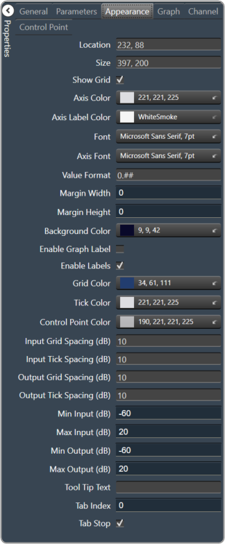
Location: Control location (in pixels) of the control on the Custom Panel. Change X (horizontal) and Y (vertical) values in relation to upper left corner. You can also drag the control to a different location |
|
Size: Control size (in pixels). Change width and height values. You can also re-size the control manually |
|
Show Grid: Whether or not to display the grid lines.
|
|
|
Axis Color The color of the grid axis. Brings up the Select Color window. |
|
|
Axis Label Color: The color of the grid axis label. Brings up the Select Color window. |
|
|
Font: Font for tick labels. Click on “…” to select desired font.
|
|
Axis Font: The font for Input (dB) and Output (dB) labels.
|
|
Value Format: The format of the values next to the major tick marks.
|
|
| Margin Width: The width of the margin from the sides to the graph (in pixels). | |
| Margin Height: The height of the margin from the sides to the graph (in pixels). | |
|
Background Color: Background color behind the tab. Brings up the Select Color window. |
|
Enable Graph Label: Whether to display the graph label.
|
|
Enable Labels: Whether to display the graph axis labels.
|
|
|
Grid Color: Grid line color. Brings up the Select Color window. |
|
|
Tick Color: Color of the tick marks. Brings up the Select Color window |
|
|
Control Point Color: Color of the control point. Brings up the Select Color window. |
|
| Input Grid Spacing: Spacing (in dB) between vertical grid lines | |
| Input Tick Spacing: Spacing (in dB) between vertical tick marks | |
| Output Grid Spacing: Spacing (in dB) between horizontal grid lines | |
| Output Tick Spacing: Spacing (in dB) between horizontal tick marks | |
| Min Input: Minimum input level (in dB) shown on the graph | |
| Max Input: Maximum input level (in dB) shown on the graph | |
| Min Output: Minimum output level (in dB) shown on the graph | |
| Max Output: Maximum output level (in dB) shown on the graph | |
| Tool Tip Text: The text that appears on control mouse over. | |
| Tab Index: If tab stop is set to true, determines the position of the control in the tab order. | |
Tab Stop: Specifies whether the control appears in the tab order.
|
|
|
Graph
|
Channel Visibility: How many channels should be visible.
|
|
Channels
|
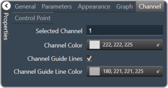
Selected Channel: Sets the selected channel |
|
Channel Color: The color of the channel line Brings up the Select Color window. |
|
Channel Guidelines: Whether to display channel guidelines or not.
|
|
|
Channel Guideline Color: The color of the channel guidelines. Brings up the Select Color window. |
|
|
Control Point
|
Diameter: Diameter for control points (nubs) on an un-selected channel. |
| Selected Diameter: Diameter for control points (nubs) on a selected channel. | |
Draw When: When control points (nubs) are drawn.
|
|
Draw Which: Which control points (nubs) should be drawn.
|
|
Primary Style: Style of the parametric primary control points (nubs).
|