
1.Overview
The Central Viewer allows the inspection and post-processing of measurements done with the Measurement Module.
The Central Viewer offers the following features:
- Measurement data browsing by intuitive on-scene element selection.
- Measurement data display in time domain, as magnitude or as phase.
- Magnitude data display as raw data, smoothed or in octave bands.
- Math operations.
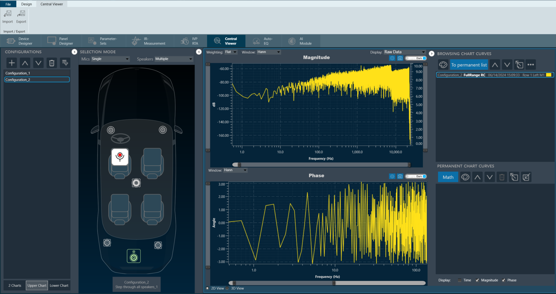
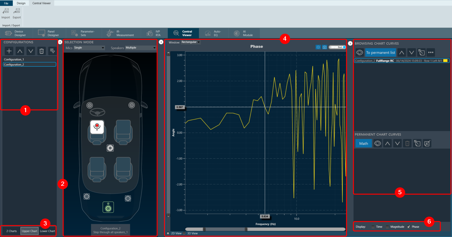
2.Central Viewer Window
The Central Viewer window is comprised of the following elements:
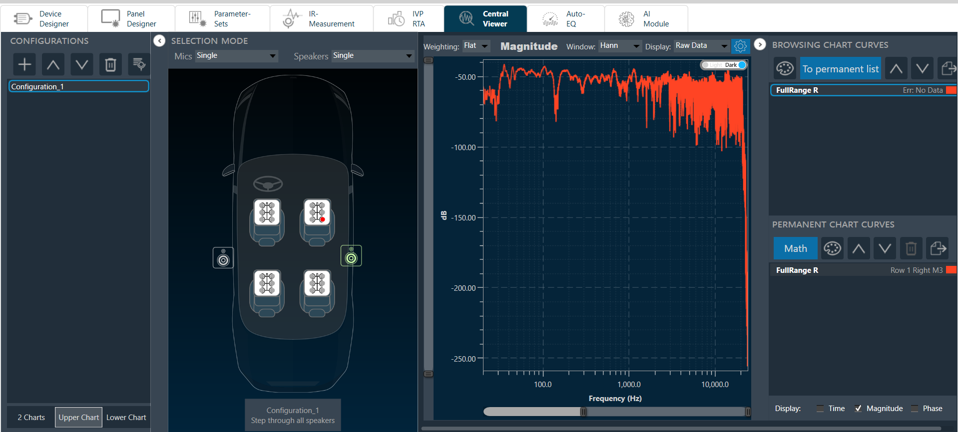
- Configurations: In the Configuration section, you can add new configuration, rearrange the configurations, delete configurations, and utilize session management. For more details refer Configurations.
- Scene Mode: In the Scene Mode area, you can see the configuration of microphone and a loudspeaker.
The Central Viewer takes your data exploration a step further with an interactive scene view. Click on elements directly in the scene to select them. This acts like a filter, focusing the graph area on the relationship between your chosen elements.
For instance, clicking on a microphone and then a loudspeaker will instantly display the measurement results specifically between those two elements in the graph. This lets you easily analyze connections within your data visualization. For more details refer Scene Mode. - Chart Selector: This section allows you to choose the type of chart you want to use to represent your data. For more details refer Chart Selector.
- Graph Area: This is where the chosen chart is displayed based on the selected data and configuration. For more details refer Graph Area.
- Curve Lists: To manage the curves displayed in the graph, use the “Browsing Chart Curves” or the “Permanent Chart Curves”. Every curve has a corresponding entry in one of these lists. For more details refer Curve Lists.
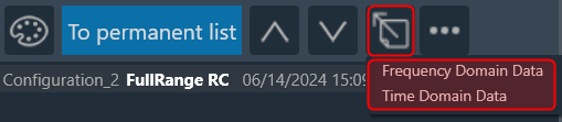
- Domain Selector: Data in your charts can be visualized in two ways: time domain (ms) or frequency domain (Hz). This gives you the flexibility to choose the most suitable representation for your analysis. For more details refer Domain Selector.
2.1.Configurations
The Configurations section is containers for one instance of a measurement sequence of a session done with the GTT Measurement Module. The container principle enables the user to load the same measurement session several times, enabling the comparison of different source-receiver combinations and processing options.
The Configurations comprises of following options:
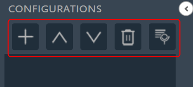
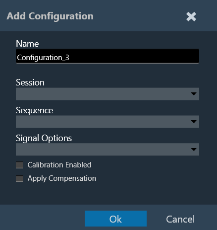
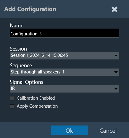
- Add Configuration: To add the loaded configuration list. The (+) button of the configuration toolbar opens the “Add Configuration” dialog.
On Add configuration dialog box, you can select the session and a measurement sequence within this session. The configuration can also be named individually in this dialog. Also, there is the option to select the proper signal options (IR / Recorded) and calibration enabled checkbox as per the selected measurement session. For more details refer to “Configuration Settings”.
When you double-click a configuration, the Add Configuration dialogue appears again, allowing you to rename and reassign it. - Move Up: To move the configuration up in the configuration list.
- Move Down: To move the configuration down in the configuration list.
- Delete Configuration: To delete the configuration list.
- Session Managment: The session management window offers a simple interface for the import, export, and deletion of sessions and sequences. For more details refer Session Management.
Configurations containing incomplete data (e.g., measurement sessions that have been finalized before all steps were executed) are identified. A list of missing measurements will be displayed while hovering over the respective entry in the configuration list.
Configuration Settings
Signal Type: Central Viewer is capable of displaying IR or Recording data. While creating the configuration, the signal type can be chosen.
Calibrated Data: Central Viewer is also capable of displaying uncalibrated and calibrated data (or a mix of both). Calibration can be enabled or disabled in the Add/ Edit configuration window.
- If “Calibration Enabled” not selected, all data will be shown without applying any calibration offset (regardless of whether calibration data is available in the Session or not).
- If “Calibration Enabled” is selected, a Y axis with calibrated ranges will be available on the right side of the plot. Each series containing calibration shall be attached to the calibrated Y axis, and each series with no calibration data available, will be attached to the default Y axis (uncalibrated, on the left).
Example: Calibrated and uncalibrated data shown on same axis (calibration disabled).
Example: Calibrated data attached to axis on right, while uncalibrated data is attached to axis on left (calibration enabled).
Apply Compensation: If a compensation file is selected in the Measurement Acquisition process and based on the checked state of “Apply Compensation” in the Add Configuration view, the mic compensation data will be used for magnitude curve correction.
2.2.Scene Mode
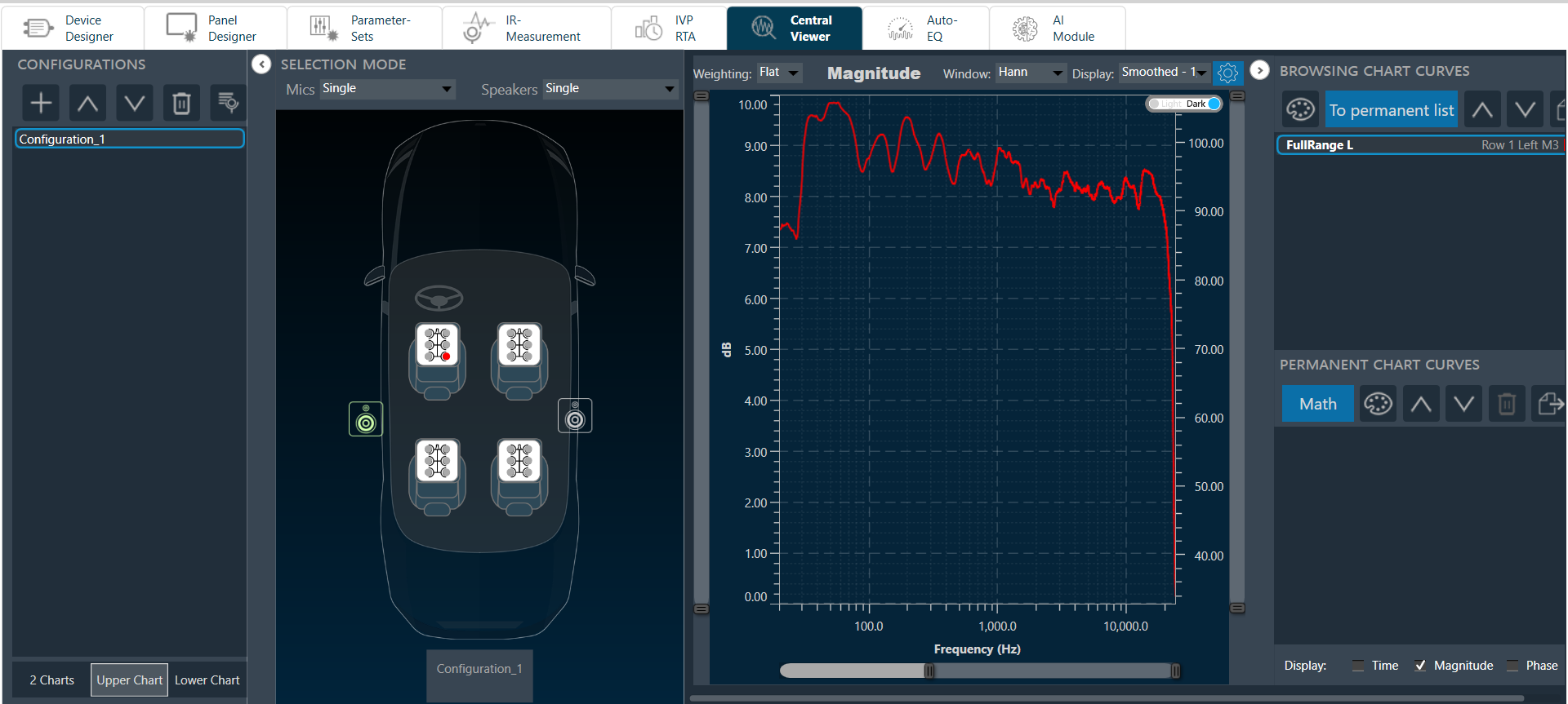
Once a configuration has been added to the list, the measurement setup used during that measurement session will be displayed in the scene view. The elements on the scene can be clicked and serve as data selectors. The combined selection of a microphone and a loudspeaker displays the respective measurement result between those two elements in the graph area.
Microphone and speaker elements are displayed as follows:

The behavior of the element selection on the scene view is controlled by the selection mode toolbar above. The following selection modes are available:
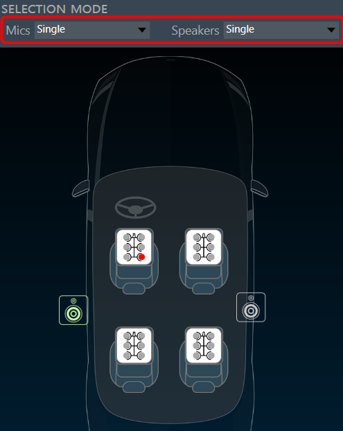
- Single: Only one element of this type of Individual microphone must be selected by clicking on the single microphone icon (red elements in the images above). Automatically unselects previously selected element(s). Assuming both are in single selection mode only one curve is displayed at any given time.
- Multiple: Several elements of one type can be selected across Individual channels of a microphone and can be selected/deselected by clicking on the single microphone icons (red in the images above). The entire array can quickly be selected/deselected by clicking on the white frame of the microphone icon. Assuming both are in multiple selection mode, [number of selected speakers] x [number of selected microphones] curves are displayed at any given time.
- Average: Only available for microphones. Selecting several individual microphones or entire arrays automatically computes the magnitude average over their measurement results. This mode results in the display of [number of selected speakers] curves at any given time.
- Locked: No selection can be changed to prevent unintentional.
2.3.Chart Selector
The displayed graph controlled by chart selector.

There are three ways you can display the graph.
- 2 Charts
- Upper Chart
- Lower Chart
2 Charts: Display the graph for all selected data sent to the selected chart
Upper Chart: Only display the data sent to the upper chart. The data displayed on the lower chart is preserved.
Lower Chart: Only display the data sent to the lower chart. The data displayed on the upper chart is preserved.
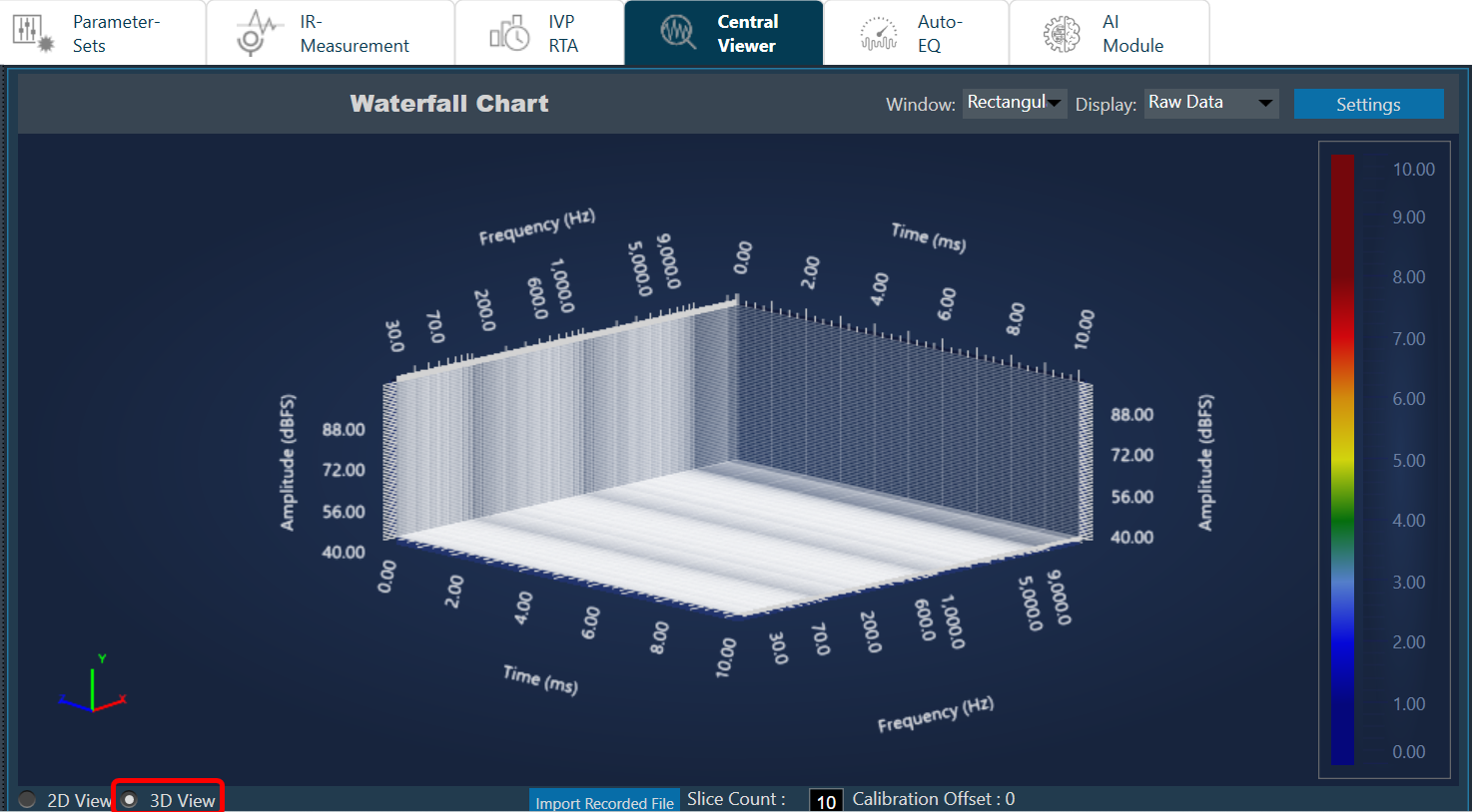
2.3.1.Waterfall
The Waterfall Graph is a visual representation used to analyze and interpret the frequency content of a WAV file or any other signal data. This graphical representation provides a comprehensive view of the signal frequency distribution over time, allowing to identify patterns, anomalies, and trends that may not be evident in a traditional time-domain or frequency-domain plot.
You can easily identify dominant frequencies, harmonics, and noise within the signal. The intensity and color of each frequency component indicate its amplitude and presence within the signal, respectively.
On the Central Viewer window, you can switch to 3D view of the plot. On the 3D view, you can see the waterfall chart.
Import Recorded File: Click “Import Recorded File” to import .wav audio files directly onto the chart.
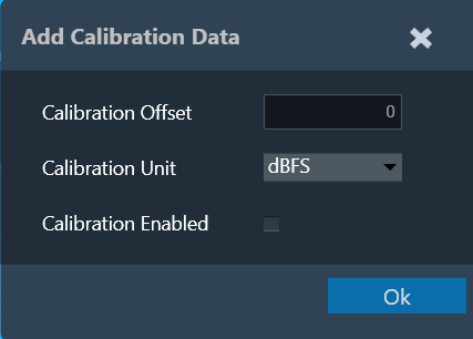
Customize Calibration Data: You can adjust the calibration offset, measurement unit, and enable/disable flags for the recorded files. On entering the calibration details, corresponding values will be applied to the chart.
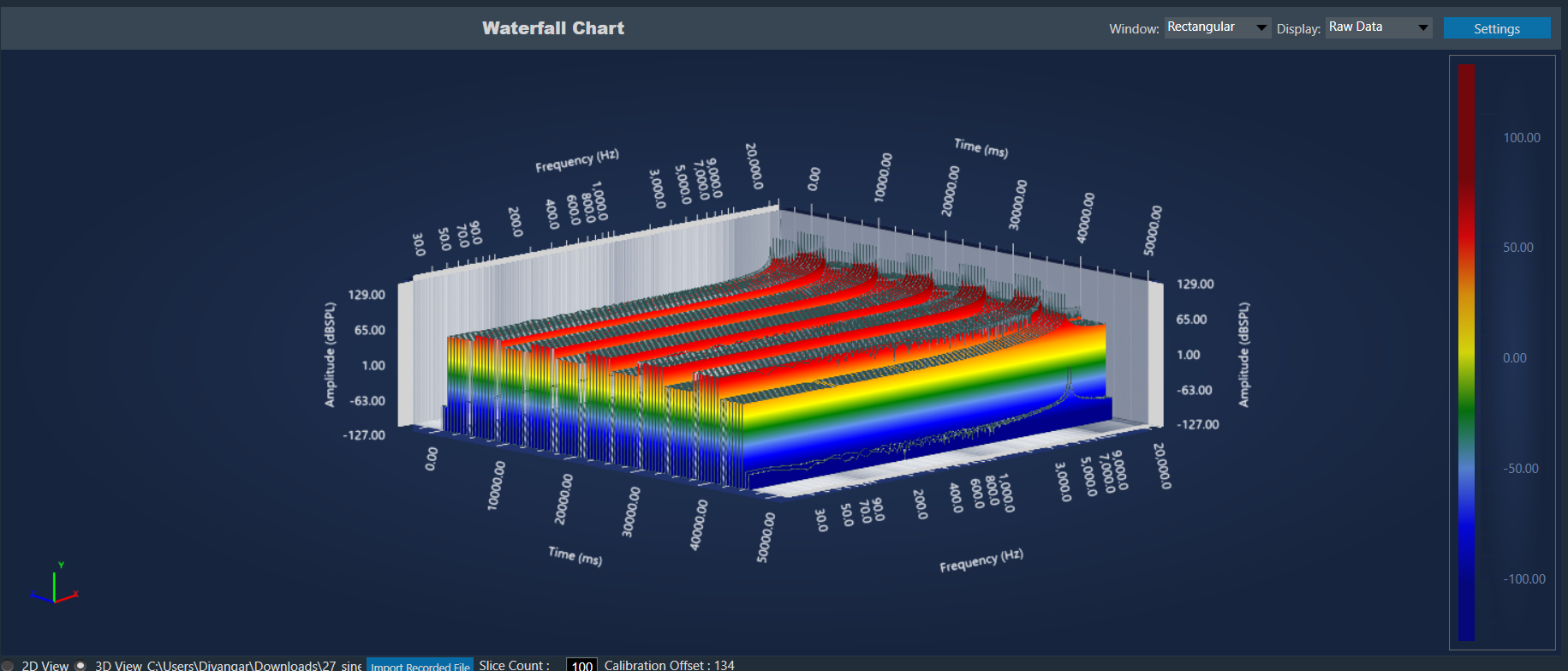
Chart Details:
- Axis Details: X axis represents the frequency, Y axis represents the amplitude, and Z axis represents time.
- Calibration offset is displayed at the bottom for reference.
- A legend represents the energy levels of the graph.
- Customization Options: Apply different Window and Display options to customize the graph appearance.
- Zoom and Rotate: Explore the data in detail with mouse scroll, pinch-to-zoom, and 360-degree rotation capabilities.
- Slice Control: Choose the number of slices (10-100) to segment the graph for analysis.
- The selected .wav file and settings are saved and retrieved within the project.
IR measurement plot:
It is possible to view IR measurement also in 3D view. Any mic and speaker selection plot will be displayed in waterfall plot.
At any point of time only one signal can be viewed. Multiple mode is not applicable for 3D plot.
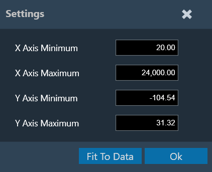
Settings:
It is possible to change the X and Y axes range of the graph. “Fit To Data” will consider the min and max values of X and Y range. However, there is a known limitation of cropping in while using the settings.
Limitations:
- It is not possible to view both IR and imported file plot at same time. Graph always shows latest selected option.
- It is not possible to delete or clear the plot. Workaround is to import new file again.
- dBFS unit is by default. Since it is not possible to add calibration with this unit, this unit will be removed in future.
Known behavior:
There are a couple of specific behaviors in the 3D view that deviate from expectations. These require a fix from the third-party.
- If scale is changed, graph is not clipped.
- Mouse hover is not exactly pointing to peak.
2.4.Graph Area
The graph area displays the graphically quantitative data corresponding to the selected configuration. The displayed graph controlled by chart selector, for more details refer to the Chart Selector.
Every chart can hold up to 2 sub-plots. Every sub-plot has its own zoom-bars for the x- and y-axis.
You can perform following actions on the chart.
Zoom and Scroll Controls
The following controls can be used to perform zoom and scroll functions on the graph.
| Alt + MW (Zoom on Y axis) | Expand the Y axis to zoom in or out of the values on the graph. |
| Ctrl + MW (Zoom on X axis) | Expand the Y axis to zoom in or out of the values on the graph. |
| Shift + MW (Scroll on X axis) | Scroll the visible graph along the X axis up to the visible or configured limits, that is, if the graph shows the maximum visible value in the configured X, the scroll will not be available. |
| MW (Scroll on X axis) | Scroll the visible graph along the Y axis up to the visible or configured limits, that is, if the graph shows the maximum visible value in the configured Y, the scroll will not be available. |
MW=Mouse Wheel
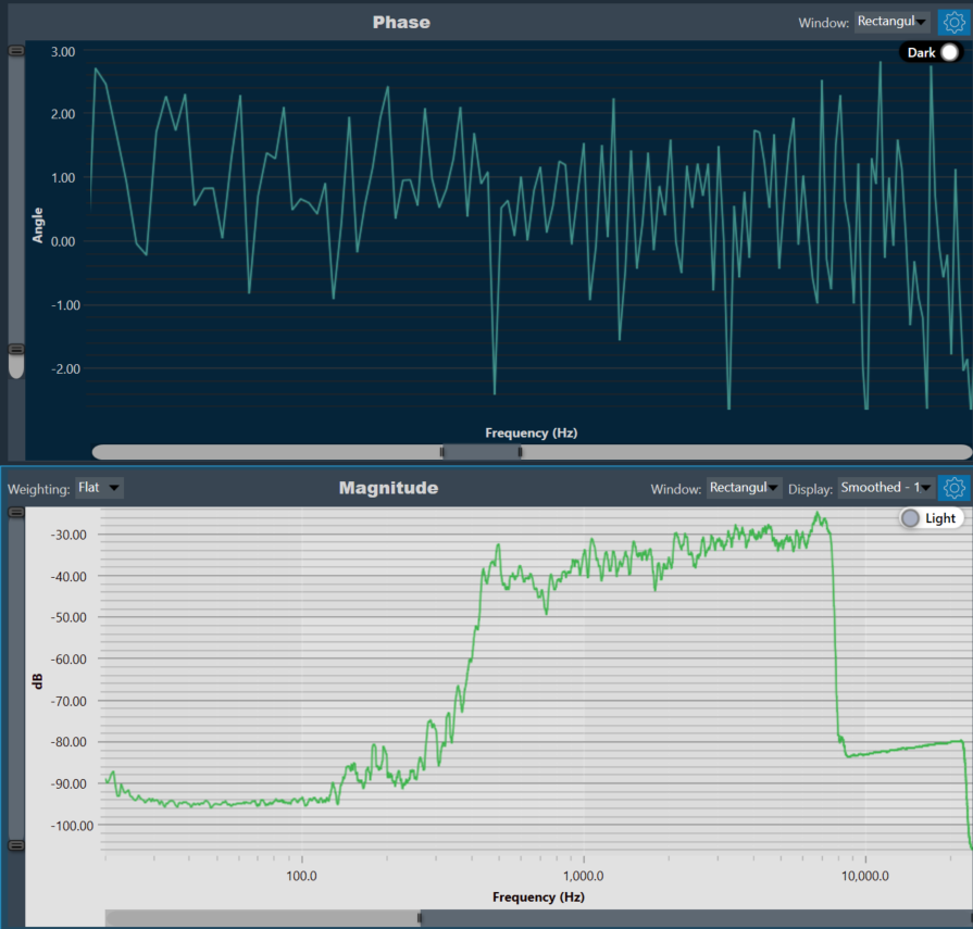
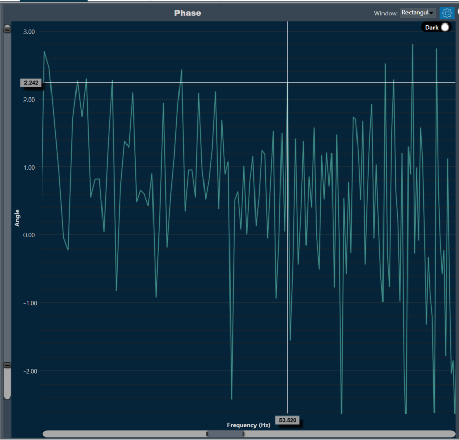
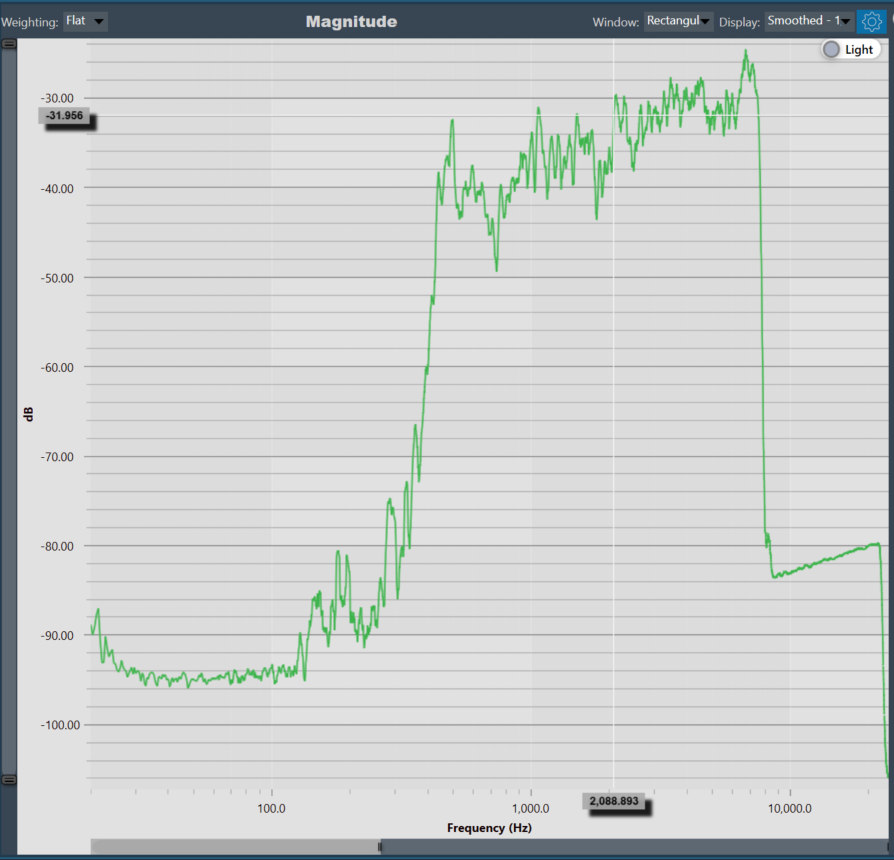
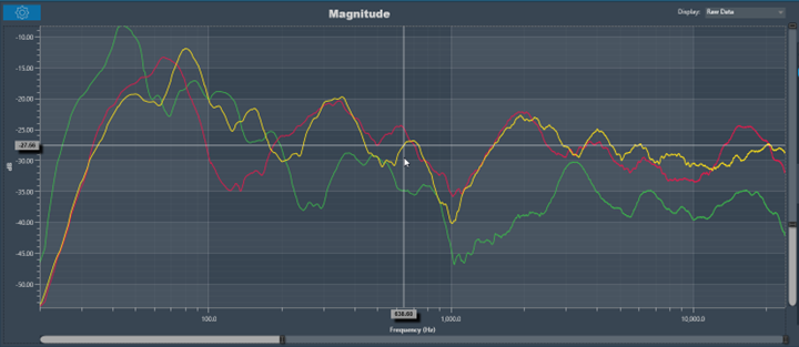
Moving the cursor over the plot will generate a crosshair that indicate values in the X and Y axes. The crosshair will always follow the line closest to the mouse cursor. On the axis, the corresponding values will be drawn.
Below is an example of a chart with a crosshair on top:
Data can either be displayed in the time (ms) domain or the frequency (Hz) domain. Using the display selector you can choose the domain for any selected chart. For more details refer to the Domain Selector.
Windowing in FFT (Fast Fourier Transform) is a technique used to reduce spectral leakage and improve the accuracy of frequency analysis. This involves multiplying the time-domain signal by a window function before applying the FFT. Common window functions include the Hamming, Hanning, and Blackman windows etc.
Windowing reduces the abrupt edges of the signal, which helps to minimize distortion in the frequency domain, especially when analyzing non-periodic signals. Keep in mind that windowing introduces a trade-off between main lobe width and sidelobe levels in the frequency domain.
A Windowing option is placed on top of every graph (Time , Magnitude, and Phase graphs). This sets the display options for the respective graph. Currently available options are:
- Hann: The Hann window can be seen as one period of a cosine “raised” so that its negative peaks just touch zero (hence the alternate name “raised cosine”).
- Rectangular: The rectangular window is the simplest window, equivalent to replacing all but N consecutive values of a data sequence by zeros, making it appear as though the waveform suddenly turns on and off.
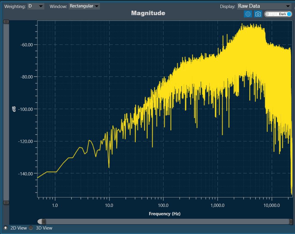
There is a Toggle button (dark / light theme) in the charts in Central Viewer. Once the Toggle button is clicked, the corresponding custom theme can be selected, and the background of the graph gets changed and vice versa.
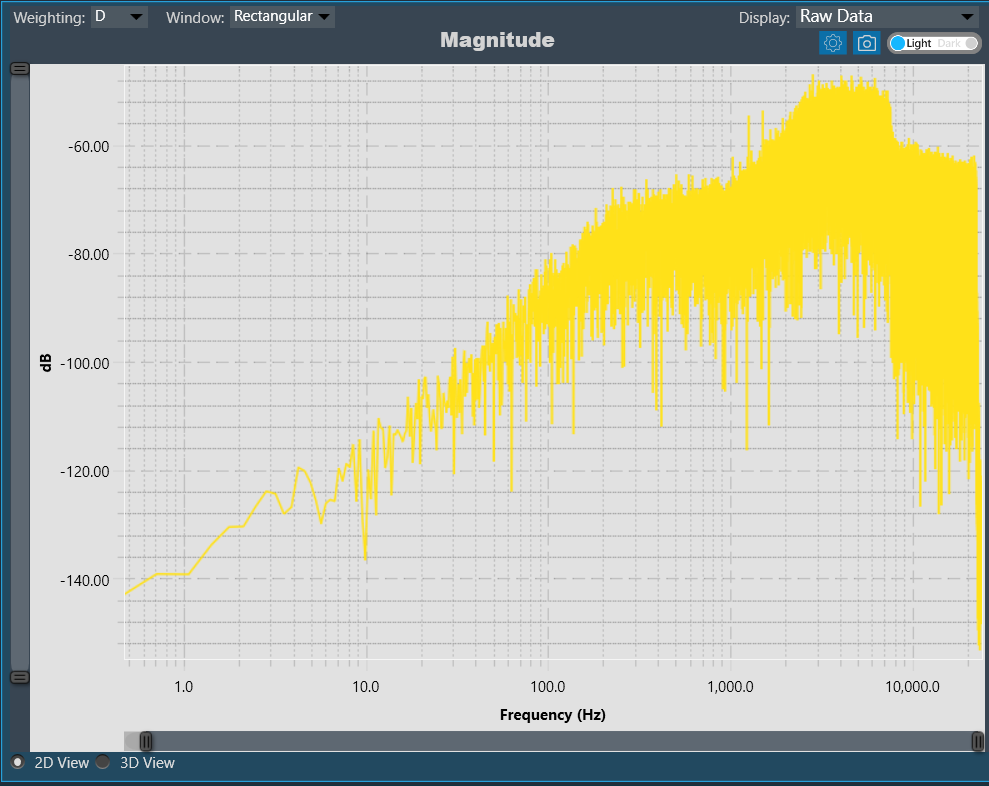
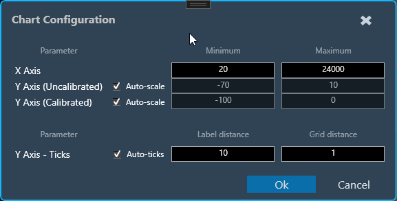
Chart Configuration
You can configure the axis on the chart configuration window. Click on the gear icon on the top left corner of the graph.
In the chart configuration window, you can set minimum and maximum range of the X and Y axis. The auto-scale option allows the chart to determine axis range based on the data. Additionally, the graph zooming out and resetting will be restricted to the axis range defined in minimum and maximum values.
On chart configuration window, you can customize the Y axis gridlines. There are two types of markings on an Y axis; a minor mark indicated just by small lines on the plot, and a major mark, where values are also added.
- Label Distance: To change the distance between the markings with values.
- Grid Distance: To change the distance between minor marks is indicated by small lines.
You can also keep these distance values blank, which will allow the chart to calculate itself based on the data and zoom level.
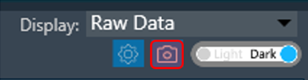
Export to Image
The Export Image feature allows you to export the graphs and certain other details based on export setting configuration. The exported image file will be available in .png or .jpeg format.
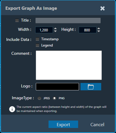
Once you click on the “Export to Image” option, export setting window for the image will open.
This export setting window includes following options:
- Title: Enter the image name.
- Image Width: Change the image width.
- Image Height: Change the image height.
- Include Data: Select the option to add Timestamp and Legend in the image.
- Comments: Enter the specific comment, that you want to be add in the image.
- Logo: Add the desired logo in the image.
Once you configured export settings, click Export button. The context menu will show you two options, export the image or copy to the clipboard.
- Save image as – option will be opened to save the image to a file.
- Copy image to clipboard – will allow you to paste the graph image somewhere else.
The exported image will have following sections based on export setting window configuration.
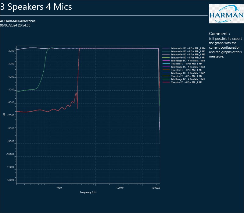
The graph always present in the exported image. Based on the export setting configuration additional sections like – Measurement information, Title, Time, User details, Logo provided, Live channel data, Generator instances details also present in the exported image.
2.5.Curve Lists
Every curve displayed in a graph is referenced by an entry in either the browsing or the permanent curve list.
A curve list entry consists of following components:
- Parent configuration of the curve
- Speaker name of the curve
- Microphone name of the curve
- Color of the curve
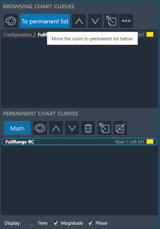
Double-click on any of the entries will open a curve property dialog, which allows to change the color of the curve and shows the associated math operation (in the case of math curves).
Browsing List
The browsing list holds entries for all curves that are directly linked to elements currently selected on the scene.
The curves will immediately disappear once the respective elements on the scene are de-selected. It still remain in the same order if GTT re-open.
The browsing list toolbar offers the following options.
| Name | Icon | Description |
| Recolor All Curves | The recolor button assigns easily distinguishable colors to all curves present on the graph. | |
| To permanent list | Sends the highlighted curve from the browsing list to the permanent list, detaching it from the scene selection | |
| Move Curve Up |  |
To move the highlighted curve up in the list. |
| Move Curve Down |  |
To move the highlighted curve down in the list. |
| Export Curve | Using the export option you can send two type of data.
Based on the selection, GTT will export the trace data (frequency-magnitude-phase or time-amplitude) into a text file. |
|
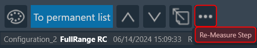
| More Options (…) |
Re-Measure Step: Once completing the initial measurements and conducting a thorough analysis of the acquired data in the Central Viewer, it may be identified that re-acquisition is necessary for certain speakers due to changes in hardware setup or tuning data. In such cases, GTT provides an option to re-acquire specific steps, allowing for the overwrite or appending of new measurements to the existing session. To utilize this feature:
The Re-Measure Step feature provides flexibility and precision in managing measurement data, enabling to adapt to changes in hardware setup or tuning data effectively. |
Permanent List
The permanent list holds curves that are manually sent from the browsing list and the results of math operations. Curves in this list are detached from the scene selection and kept in the same order, until they are manually deleted.
The permanent list toolbar offers the following options.
| Name | Icon | Description |
| Math | Opens the math operations dialog. Any math result will be stored in the permanent list | |
| Recolor All Curves | The recolor button assigns easily distinguishable colors to all curves present on the graph. | |
| Move Curve Up | |
To move the highlighted curve up in the list. |
| Move Curve Down | |
To move the highlighted curve down in the list. |
| Move Curve Down | Remove highlighted curve from the permanent list | |
| Export Curve | Using the export option you can send two type of data.
Based on the selection, GTT will export the trace data (frequency-magnitude-phase or time-amplitude) into a text file. |
|
| Import Curve |
Using the import option you can import HATS files data (frequency-magnitude-phase) and frequency files. This feature will help to compare legacy measurements conducted with HATS software to GTT measurements, and import files from RTA or exported from Central Viewer. With the imported HATS file, you can perform math operations and adjust graph settings such as smoothing and windowing. |
Math Operations
The math operation allows you to performing calculations on your curves. Clicking on the “Math” button opens a Mathematical Operation dialog box with various tabs, each offering a specific mathematical function.
The following math functions you can perform.
- Add: To add two or more signals.
- Subtract: To subtract of two signals.
- Multiply: To multiply frequency domain of two signals.
- Spectral Division: To divide frequency domain of two signals (to calculate frequency difference).
- Average: To calculate average frequency domain for magnitude and phase.
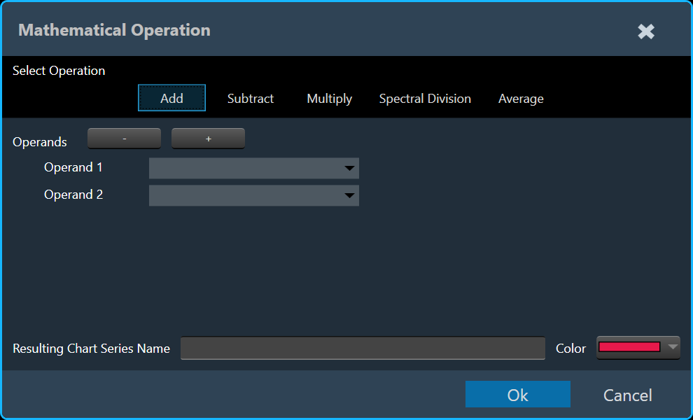
To illustrate combining curves, let’s explore the steps involved using the Add tab.
- On the Add tab, select Operand 1 and Operand 2 curve.
If required, add or delete an operand using + and – option. - Enter the Resulting Chart Series Name and select the color.
- Click Ok . The result of the curve added to the active chart.
2.6.Domain Selector
Data can either be displayed in the time (ms) domain or the frequency (Hz) domain. Using the display selector you can choose the domain for any selected chart.
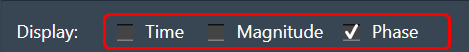
- Time
- Magnitude
- Phase
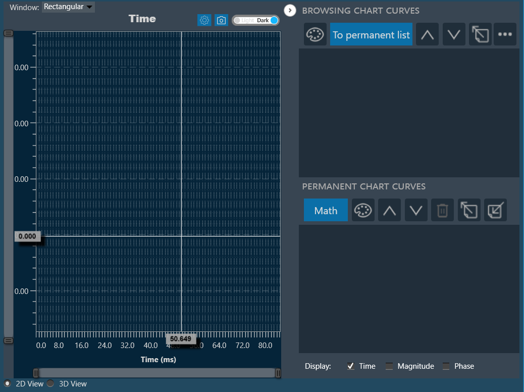
Time
Display the time domain and restricts any other sub-plots.
Magnitude
Display the magnitude of the frequency domain and can be displayed with the phase data with it in sub-plots.
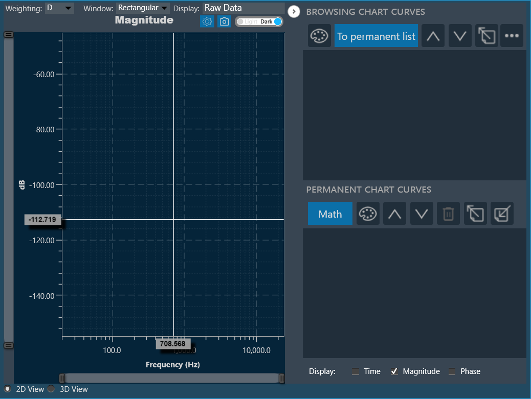
Using magnitude display option, you can sets the display options for the respective graph.
Following are the available display options for magnitude graph.
- Raw Data: Display complete raw measurement data.
- Smoothed: Display data smoothed with a moving average of width [1, 1/3, 1/6, 1/12, 1/24, 1/48] octave.
- Octave Bands: Display data averaged in fixed octave bands of width [1, 1/3, 1/6, 1/12, 1/24, 1/48] octave.
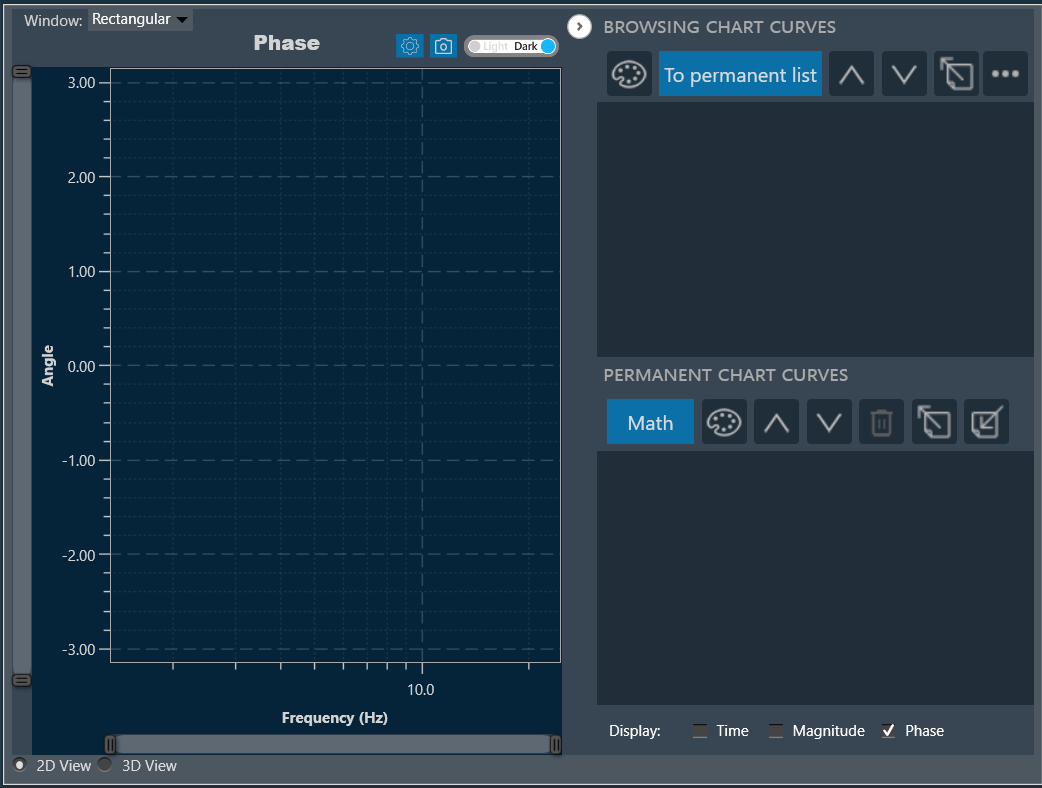
Phase
Displays the phase of the frequency domain and can be displayed with the magnitude data with it in sub-plots.
3.Legacy Measurement Sessions
Legacy measurement sessions done with GTT releases before version 18.3 can also be imported into a central viewer session. Currently, those sessions will be subject to certain restrictions.
It will not be possible to reconstruct the original measurement scene layout, so speakers and microphones will be loaded onto the scene and the user will have to place them at his convenience (as of GTT version 19.2, only the speaker position can be changed). Furthermore, microphone array not supported by the new MM IR (all types other than a single mic, 4 mic, 6mic, 4×4 mic and 16mic array) will be represented by a generic microphone icon.
4.Closing and Exporting a Central Viewer Session
A Central Viewer session can be closed by simply closing the Central Viewer window. All selected elements and curves will be stored and restored on re-opening. A Central Viewer is also exported with the associated project and after import will re-open to the same state as before the export.
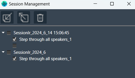
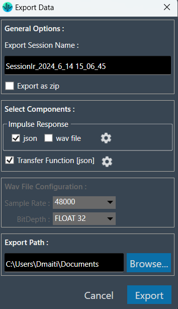
5.Session Management
The session management for Measurement Module Sessions is available through a button in the Central Viewer.
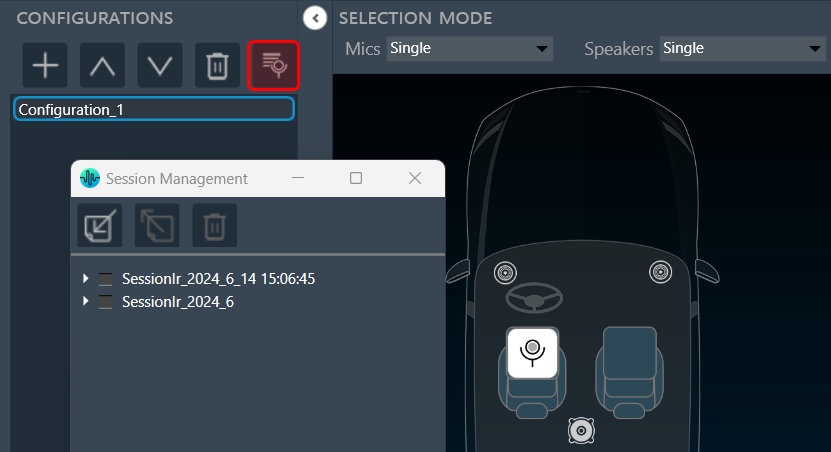
The session management window offers a simple interface for the import, export, and deletion of sessions and sequences. To edit session and sequence names, simply double click on the respective name, and the editing interface will appear. Once you have edited the names, the changes will persist and be saved.
The toolbar offers the following functions:
| Icons | Description |
| Import *.mmraw data | |
| Export a session or sequence either as *.mmraw or as JSON | |
| Delete selected session or sequence |
The JSON export functionality offers all functionality that has been available in the legacy measurement module:
6.Import Export Central viewer settings
Using the Import and Export options, you can import or export configured view settings, including selected chart (either two charts or upper or lower), chart settings, chart theme, display options etc.
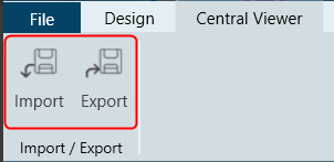
Import Central Viewer Settings
When you import the *.centralviewer file, the current project-specific central viewer settings will be overwritten by the imported settings.
- On the Centra Viewer tab, click on the Import. This opens a dialog box to select the .centralviewer file.
- Browse the location, select the .centralviewer file, and click Open.
Once the .centralviewer file is imported, the Central Viewer will be updated with the viewer settings extracted from the imported file.
Export Central Viewer Setting
The exported file will be stored with an extension *.centralviewer and its content will JSON type.
- On the Central Viewer tab, click on the Export. This opens a dialog box to save the .centralviewer file.
- Browse the location, and click Save.