A panel link is a control on a Custom Panel that links to another Custom Panel. Define the link in the panel link section of the properties tab.
Controls can be managed in the Custom Panel designer and, once the Custom Panel is activated, utilized by the end user. This control must be linked to another Custom Panel to function properly.
| Property Type | Options |
|
Appearance
|
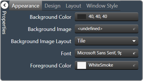
Background Color: The background color of the text area Brings up the Select Color window. |
|
Background Image: Background image of the control. Brings up the Select Color window. |
|
Background Image Layout: Background layout of the image.
|
|
Font: Click on “…” to select desired font.
|
|
|
Foreground Color: The foreground color for the panel. Brings up the Select Color window. |
|
|
Design
|
Panel Name: Enter the name of the panel.
|
|
Layout
|
Size: Control size (in pixels). Change width and height values. You can also re-size the control manually. |
Start Behavior: Behavior of the panel.
|
|
|
Start Location: Control location (in pixels) of the control on the Custom Panel. Change X (horizontal) and Y (vertical) values in relation to upper left corner. You can also drag the control to a different location |
|
|
Window Style
|
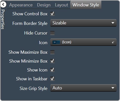
Show Control Box: Whether to display control box or not. |
Form Border Style: Click to select form border style.
|
|
| Hide Cursor: Whether or not to display cursor. | |
| Icon: Click on “…” to select desired icon. | |
| Show Maximize Box: Whether to display maximize box or not. | |
| Show Minimize Box: Whether to display minimize box or not. | |
| Show Icon: Whether to display icon or not. | |
| Show in Taskbar: Whether to display taskbar or not. | |
Size Grip Style: Click to select size grip style.
|