A note adds an icon to a Custom Panel with popup text. A note cannot be linked to a parameter.
Controls can be managed in the Custom Panel designer and, once the Custom Panel is activated, viewed (but not changed) by the end user.
| Property Type | Options |
|
General
|
Control Info: Shows control type.
|
Locked: Specifies if the control is locked out so that it cannot be moved or re-sized.
|
|
|
Appearance
|
Location: Control location (in pixels) of the control on the Custom Panel. Change X (horizontal) and Y (vertical) values in relation to upper left corner. You can also drag the control to a different location. |
|
Background Color: The background color of the text area Brings up the Select Color window. |
|
| Tool Tip Text: Text that appears on control mouse-over. | |
|
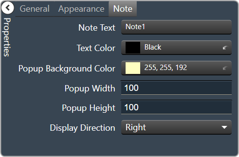
Note
|
Note Text: Click to enter desired text for note content. Brings up a Control Text editor. |
|
Text Color: Text color of the control. Brings up the Select Color window.
|
|
|
Popup Background Color: Background color for the popup. Brings up the Select Color window. |
|
| Popup Width: The width of the popup in pixels | |
| Popup Height: The height of the popup in pixels | |
|
Display Direction: The direction in which the popup will appear when the note is clicked. “Auto” will position the popup depending on where the user clicks.
|