A tick marker is an unlinked control that can be customized to show user-specified values. It can be used with faders and meters to specify particular measurements with unique positions, orientations, colors, etc.
Controls can be managed in the Custom Panel designer and, once the Custom Panel is activated, utilized by the end user. This control must be linked to a parameter to function properly.
| Property Type | Options |
|
General
|
Control Info: Shows control type.
|
Locked: Specifies if the control is locked out so that it cannot be moved or re-sized.
|
|
|
Appearance
|
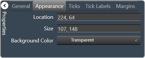
Location: Control location (in pixels) of the control on the Custom Panel. Change X (horizontal) and Y (vertical) values in relation to upper left corner. You can also drag the control to a different location. |
|
Size: Control size (in pixels). Change width and height values. You can also re-size the control manually |
|
|
Background Color: The background color of the text area Brings up the Select Color window. |
|
|
Ticks
|
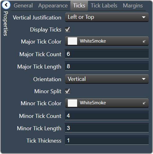
Vertical Justification: Vertical justification of the ticks |
Display Ticks: Whether to display the tick marks of the control or not
|
|
|
Major Tick Color: Color of the major ticks Brings up the Select Color window.
|
|
|
Major Tick Count: How many major ticks are displayed. The major tick count must be the same as or larger than the number of major tick labels in order to display all labels. |
|
| Major Tick Length: The length (in pixels) of the major ticks | |
| Orientation: Displayed Horizontal or Vertical | |
| Minor Split: Whether or not to split minor ticks on the centered tick marker. | |
|
Minor Tick Color: Color of the minor ticks. Brings up the Select Color window.
|
|
| Minor Tick Count: How many minor ticks are displayed between major ticks | |
| Minor Tick Length: The length (in pixels) of the major tick | |
| Tick Thickness: Thickness (in pixels) of the tick marks. | |
|
Tick Labels
|
Display Labels: Whether or not to display labels on the control. |
Label Font: Click on “…” to select desired font.
|
|
|
Label Color: Color of the control text. Brings up the Select Color window.
|
|
| Tick Label Offset: Spacing (in pixels) between tick marks and their labels. | |
|
Major Tick Labels: The labels for the major ticks The major tick count must be the same as or larger than the number of major tick labels to display all labels. |
|
|
Margins
|
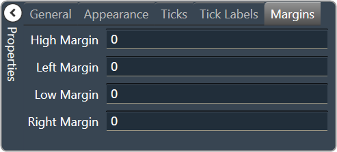
High Margin: Spacing (in pixels) between label and top border, limited by size of bounding box |
| Left Margin: Spacing (in pixels) between label and left border, limited by size of bounding box | |
| Low Margin: Spacing (in pixels) between label and bottom border, limited by size of bounding box | |
| Right Margin: Spacing (in pixels) between label and right border, limited by size of bounding box |