A segmented meter is an output meter that shows the state of a device parameter.
Controls can be managed in the Custom Panel designer and, once the Custom Panel is activated, utilized by the end user. This control must be linked to a parameter to function properly.
| Property Type | Options |
|
General
|
Control Info: Shows control type.
|
Locked: Specifies if the control is locked out so that it cannot be moved or re-sized.
|
|
|
Parameters
|
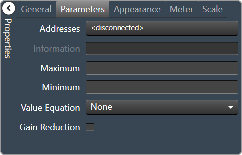
Addresses: Enables panel designer to edit addressing information with the added benefit that the values can be validated as a group before being applied to the device. This editor also allows the user to assign multiple parameters to the control. Click to select Parameter Address Editor.
|
Information: Shows information about the Parameter Address.
|
|
| Maximum: The maximum value that a control may be set to. | |
| Minimum: The minimum value that a control may be set to. | |
| Value Equation: When specified, this equation combines the attached parameter’s values and returns the value that the control will display. | |
| Gain Reduction: Check if this meter is to be a Gain Reduction style. The negative dB gains are reported (shown) as increasing positive gains. | |
|
Appearance
|
Location: Control location (in pixels) of the control on the Custom Panel. Change X (horizontal) and Y (vertical) values in relation to upper left corner. You can also drag the control to a different location. |
|
Size: Control size (in pixels). Change width and height values. You can also re-size the control manually |
|
|
Background Color: The background color of the text area Brings up the Select Color window. |
|
| Tool Tip Text: Text that appears on control mouse-over. | |
Tab Stop: Whether the control appears in the tab order.
|
|
|
Meter
|
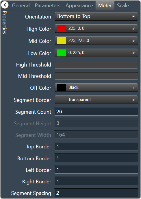
Orientation: The orientation of the meter; Vertical or Horizontal.
|
|
High Color: The color of the upper section of the meter Brings up the Select Color window. |
|
|
Mid Color: The color of the mid-section of the meter. Brings up the Select Color window. |
|
|
Low Color: The color of the lower section of the meter. Brings up the Select Color window. |
|
| High Threshold: The value at which the upper section ends, and the mid-section begins. | |
| Mid Threshold: The value at which the mid-section ends, and the lower section begins. | |
|
Off Color: The color of the Off segments. Brings up the Select Color window. |
|
|
Segment Border: The border color for each segment. Brings up the Select Color window. |
|
| Segment Count: The number of meter segments. | |
| Segment Height: The height of individual LEDs in the meter. | |
| Segment Width: The width of individual LEDs in the meter. | |
| Top Border: Distance, in pixels, between the top edge of the control and the top of the meter. | |
| Bottom Border: Distance, in pixels, between the bottom edge of the control and the bottom of the meter. | |
| Left Border: Distance, in pixels, between the left edge of the control and the left side of the meter. | |
| Right Border: Distance, in pixels, between the right edge of the control and the right side of the meter. | |
| Segment Spacing: The distance, in pixels between segments. | |
|
Scale
|
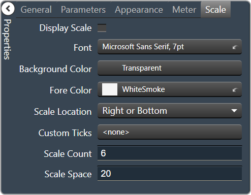
Display Scale: When checked, the scale is enabled. |
Font: Click on “…” to select desired font. Brings up a Font Select window.
|
|
|
Background Color: The background color of the text area Brings up the Select Color window. |
|
|
Fore Color: The foreground color for the scale. Brings up the Select Color window. |
|
Scale Location: Placement for the scale (the scale must be enabled first)
|
|
| Custom Ticks: Customized ticks for the control. Parameters must be set first. | |
| Scale Count: The number of scale entries to display. | |
| Scale Space: Space to allocate for the scale. |