A gradient meter is an output meter that shows the state of a device parameter in specifically designed gradients.
Controls can be managed in the Custom Panel designer and, once the Custom Panel is activated, utilized by the end user. This control must be linked to a parameter to function properly.
| Property Type | Options |
|
General
|
Control Info: Shows control type.
|
Locked: Specifies if the control is locked out so that it cannot be moved or re-sized.
|
|
|
Parameters
|
Peak Equation: When specified, this equation combines the attached parameter’s values and returns the peak that the control will display.
|
|
Addresses: Enables panel designer to edit addressing information with the added benefit that the values can be validated as a group before being applied to the device. This editor also allows the user to assign multiple parameters to the control. Click to select Parameter Address Editor.
|
|
Information: Shows information about the Parameter Address.
|
|
| Maximum: The maximum value that a control may be set to. | |
| Minimum: The minimum value that a control may be set to. | |
| Value Equation: When specified, this equation combines the attached parameter’s values and returns the value that the control will display. | |
| Gain Reduction: Check if this meter is to be a Gain Reduction style. The negative dB gains are reported (shown) as increasing positive gains. | |
|
Appearance
|
Optimized for Speed: Enables the meter to draw faster. Note: This decreases the aesthetic properties of the meter. |
|
Location: Control location (in pixels) of the control on the Custom Panel. Change X (horizontal) and Y (vertical) values in relation to upper left corner. You can also drag the control to a different location. |
|
|
Size: Control size (in pixels). Change width and height values. You can also re-size the control manually |
|
| Tool Tip Text: Text that appears on control mouse-over. | |
| Tab Index: Indicates the sequence of an element within the tabbing order of all focusable elements in the document. | |
Tab Stop: Whether the control appears in the tab order.
|
|
|
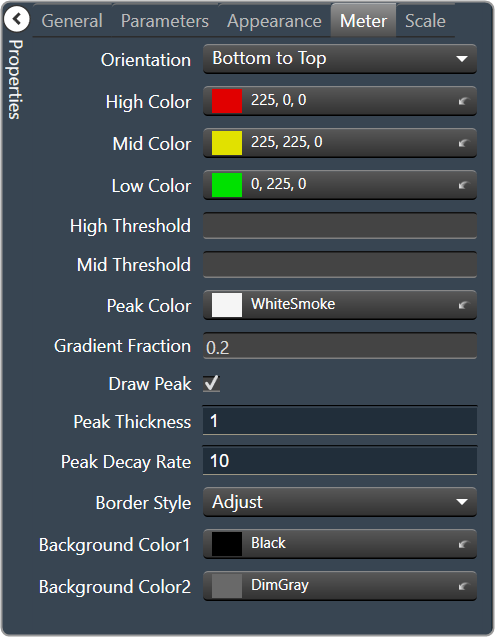
Meter
|
Orientation: The orientation of the meter; Vertical or Horizontal.
|
|
High Color: The color of the upper section of the meter Brings up the Select Color window. |
|
|
Mid Color: The color of the mid-section of the meter. Brings up the Select Color window. |
|
|
Low Color: The color of the lower section of the meter. Brings up the Select Color window. |
|
| High Threshold: The value at which the upper section ends, and the mid-section begins. | |
| Mid Threshold: The value at which the mid-section ends, and the lower section begins. | |
|
Peak Color: The color of the peak line. Brings up the Select Color window. |
|
| Gradient Fraction: Determines which portion of a meter section is gradient filled. | |
| Draw Peak: If checked, the peak line will be displayed | |
| Peak Thickness: The thickness, in pixels of the Peak Line | |
| Peak Decay Rate: Percent of the meter that the Peak Line will drop per second | |
Border Style: The border style drawn around the meter.
|
|
|
Background Color 1: First background color used in the gradient behind the meter itself. Brings up the Select Color window. |
|
|
Background Color 2: Second background color used in the gradient behind the meter itself. Brings up the Select Color window. |
|
|
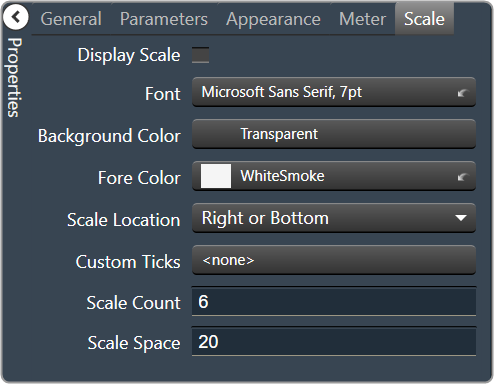
Scale
|
Display Scale: When checked, the scale is enabled. |
Font: Click on “…” to select desired font. Brings up a Font Select window.
|
|
|
Background Color: The background color of the text area Brings up the Select Color window. |
|
|
Fore Color: The foreground color for the scale. Brings up the Select Color window. |
|
Scale Location: Placement for the scale (the scale must be enabled first)
|
|
| Custom Ticks: Customized ticks for the control. Parameters must be set first. | |
| Scale Count: The number of scale entries to display. | |
| Scale Space: Space to allocate for the scale. |