The LED Region control sends a single value each time that it is pressed. While a button can be linked to a device parameter, it is more typically linked to a system function.
Controls can be managed in the Custom Panel designer and, once the Custom Panel is activated, utilized by the end user. This control must be linked to a parameter or system function to function properly. You can also easily add a pre-defined label.
| Property Type | Options |
|
General
|
Control Info: Shows control type.
|
Locked: Specifies if the control is locked out so that it cannot be moved or re-sized.
|
|
|
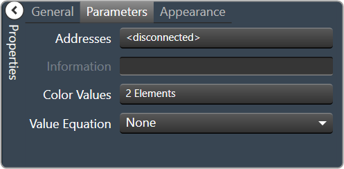
Parameters
|
Addresses: Enables panel designer to edit addressing information with the added benefit that the values can be validated as a group before being applied to the device. This editor also allows the user to assign multiple parameters to the control. Click to select Parameter Address Editor.
|
Information: Shows information about the Parameter Address.
|
|
|
Color Values: Allows editing of the value range of the control. Brings up the LED Values Editor. |
|
|
Value Equation: When specified, this equation combines the attached parameter’s values and returns the value that the control will display. Select from a drop-down list. |
|
|
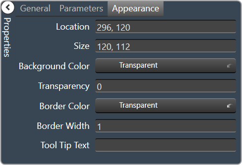
Appearance
|
Location: Control location (in pixels) of the control on the Custom Panel. Change X (horizontal) and Y (vertical) values in relation to upper left corner. You can also drag the control to a different location. |
|
Size: Control size (in pixels). Change width and height values. You can also re-size the control manually |
|
|
Background Color: Sets the background color for the note. Brings up the Select Color window. |
|
| Transparency: Percent transparent, between 0 (opaque) and 90 (very transparent) | |
|
Border Color: The color of the border. Brings up the Select Color window. |
|
| Border Width: The width of the border (in pixels) | |
| Tool Tip Text: Text that appears on control mouse-over. |