A preset trigger is a control on a Custom Panel that causes an activation event to execute when a specific condition occurs. The Custom Panel must be activated for the action to be performed. You can, however, set up a venue-wide rule with Logic Rules.
To Set Up a Preset Trigger
Add the preset trigger control to the Custom Panel then do one of the following:
- Right click the control and select edit parameter assignment.
or - In the properties section of the graph, select the “…” at the right of parameter addresses.
To Reset a Preset Trigger
If the condition for the activation event is set to manual reset, the user must reset the control. Right-click the control on the activated panel and select “Reset Trigger.”
| Property Type | Options |
|
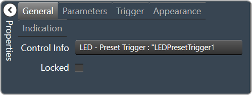
General
|
Control Info: Shows control type.
|
Locked: Specifies if the control is locked out so that it cannot be moved or re-sized.
|
|
|
Parameters
|
Addresses: Enables panel designer to edit addressing information with the added benefit that the values can be validated as a group before being applied to the device. This editor also allows the user to assign multiple parameters to the control. Click to select Parameter Address Editor.
|
Information: Shows information about the Parameter Address.
|
|
|
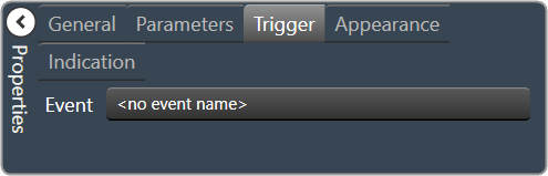
Trigger
|
Event: Control location (in pixels) of the control on the Custom Panel. Change X (horizontal) and Y (vertical) values in relation to upper left corner. You can also drag the control to a different location. |
|
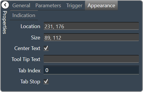
Appearance
|
Location: Control location (in pixels) of the control on the Custom Panel. Change X (horizontal) and Y (vertical) values in relation to upper left corner. You can also drag the control to a different location. |
|
Size: Control size (in pixels). Change width and height values. You can also re-size the control manually |
|
| Center Text: Centers the tool tip text on the control | |
| Tool Tip Text: Text that appears on control mouse-over. | |
| Tab Index: Indicates the sequence of an element within the tabbing order of all focusable elements in the document. | |
Tab Stop: Whether the control appears in the tab order.
|
|
|
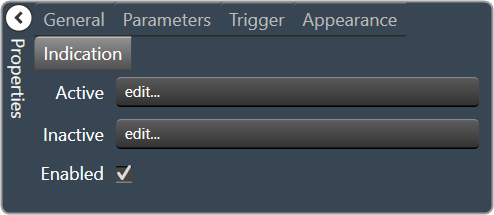
Indication
|
Active: Sets the Control Label, label color, background color and background image for the Active state. Brings up the State Indication Setup window. |
|
Inactive: Sets the Control Label, label color, background color and background image for the Inactive state. Brings up the State Indication Setup window. |
|
| Enable: When checked, the trigger is enabled |