An LED is a display-only control that shows the state of a device parameter. The LED control helps the designer to graphically show a certain condition, as defined by the designer, such as a warning. The “LED Image” control allows you to change the entire image of the LED where the “LED Color” control is a simplified control where you only need to change the color of the LED.
Controls can be managed in the Custom Panel designer and, once the Custom Panel is activated, utilized by the end user. This control must be linked to a parameter or system function to function properly. You can also easily add a pre-defined label.
For example, the designer wants to show when the pink noise levels on each of the four inputs of a DriveRack 4800 are more than 10dB. First, he adds an LED and links it to the pink noise on Channel 1.
The designer then goes into the Properties field to the Parameters Value and defines the value with the LED Values Editor.
| Property Type | Options |
|
General
|
Control Info: Shows control type.
|
Locked: Specifies if the control is locked out so that it cannot be moved or re-sized.
|
|
|
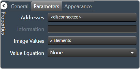
Parameters
|
Addresses: Enables panel designer to edit addressing information with the added benefit that the values can be validated as a group before being applied to the device. This editor also allows the user to assign multiple parameters to the control. Click to select Parameter Address Editor.
|
Information: Shows information about the Parameter Address.
|
|
|
Image Values: Allows editing of the value range of the control. Brings up the LED Values Editor. |
|
Value Equation: When specified, this equation combines the attached parameter’s values and returns the value that the control will display.
|
|
|
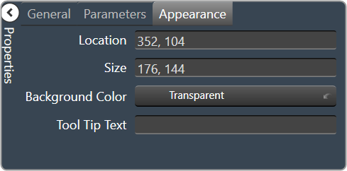
Appearance
|
Location: Control location (in pixels) of the control on the Custom Panel. Change X (horizontal) and Y (vertical) values in relation to upper left corner. You can also drag the control to a different location. |
|
Size: Control size (in pixels). Change width and height values. You can also re-size the control manually |
|
|
Background Color: The background color of the text area. Brings up the Select Color window. |
|
| Tool Tip Text: Text that appears on control mouse-over. | |
|
Border Color: The color of the Spinner border. Brings up the Select Color window. |