| Property Type | Options |
|
General
|
Control Info: Shows control type.
|
Locked: Specifies if the control is locked out so that it cannot be moved or re-sized.
|
|
|
Parameters
|
Addresses: Enables panel designer to edit addressing information with the added benefit that the values can be validated as a group before being applied to the device. This editor also allows the user to assign multiple parameters to the control. Click to select Parameter Address Editor.
|
Information: Shows information about the Parameter Address.
|
|
| Maximum: The maximum value that a control may be set to | |
| Minimum: The minimum value that a control may be set to | |
| Disable Mixed-sate Editor: When checked, disables the mixed-state context menu and editor | |
| Reset Text: Optional text to display in right click context popup. | |
|
Appearance
|
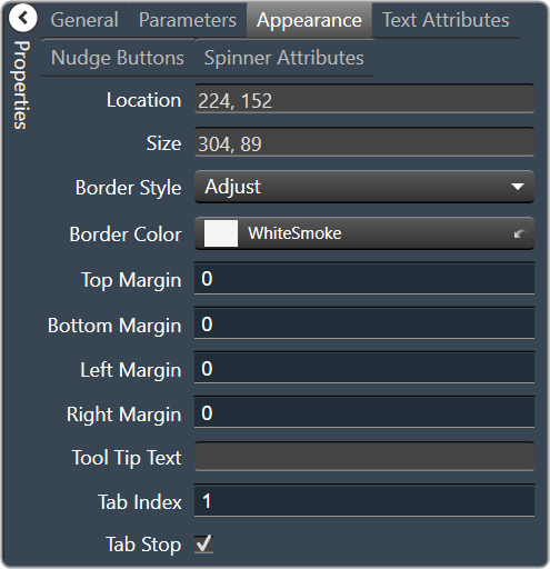
Location: Control location (in pixels) of the control on the Custom Panel. Change X (horizontal) and Y (vertical) values in relation to upper left corner. You can also drag the control to a different location. |
|
Size: Control size (in pixels). Change width and height values. You can also re-size the control manually |
|
|
Border Style: The style of the Spinner border. Choose from drop down menu. |
|
|
Border Color: The color of the Spinner border Brings up the Select Color window. |
|
| Top Margin: The amount of space, in pixels at the top of the control where a label may be placed. | |
| Bottom Margin: The amount of space, in pixels at the bottom of the control where a label may be placed | |
| Left Margin: The amount of space, in pixels to the left of the control where a label may be placed | |
| Right Margin: The amount of space, in pixels to the right of the control where a label may be placed | |
| Tool Tip Text: Text that appears on control mouse-over. | |
| Tab Index: Indicates the sequence of an element within the tabbing order of all focusable elements in the document. | |
Tab Stop: Whether the control appears in the tab order.
|
|
|
Text Attributes
|
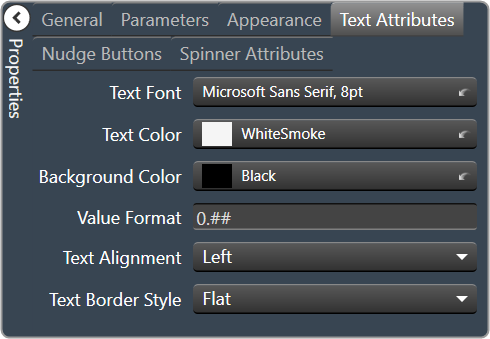
Text Font: The font of the Spinner text. Choose from Windows fonts. |
|
Text Color: The color of the Spinner text Brings up the Select Color window. |
|
|
Background Color: The background color of the text area Brings up the Select Color window. |
|
| Value Format: The format used when displaying the value. This is an advanced feature and must follow English conventions. | |
|
Text Alignment: The horizontal alignment of the text. Left, center or right |
|
|
Text Border Style: The border style of the text area. Choose from drop down menu |
|
|
Nudge Buttons
|
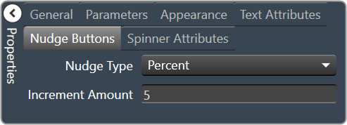
Nudge Type: Together with the Increment Amount, determines the amount that the control will increment/decrement when a Nudge Button is pressed.
|
| Increment: Together with the Nudge Type, determines the amount that the control will increment/decrement when a Nudge Button is pressed. | |
|
Spinner Attributes
|
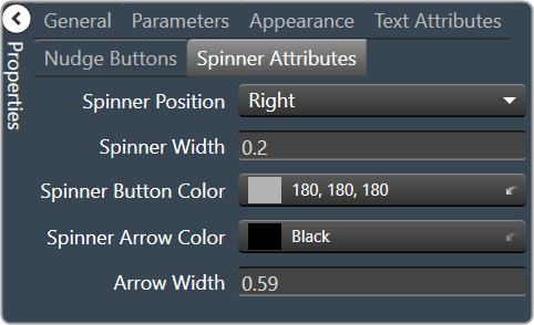
Spinner Position: Specifies where the up/down arrows are to be located.
|
| Spinner Width: Sets the size of the up/down arrow buttons, in percent of width or height. | |
|
Spinner Button Color: The color of the up/down arrow buttons. Brings up the Select Color window. |
|
|
Spinner Arrow Color: The color of the up/down arrows. Brings up the Select Color window. |
|
| Arrow Width: The width of the base as a percentage of the spinner button width. |