A Spinner allows the user to change the value of a device parameter by adjusting it up or down; the increment can be specified by the Custom Panel designer.
Controls can be managed in the Custom Panel designer and, once the Custom Panel is activated, utilized by the end user. This control must be linked to a parameter to function properly.
| Property Type | Options |
|
General
|
Control Info: Shows control type.
|
Locked: Specifies if the control is locked out so that it cannot be moved or re-sized.
|
|
|
Parameters
|
Addresses: Enables panel designer to edit addressing information with the added benefit that the values can be validated as a group before being applied to the device. This editor also allows the user to assign multiple parameters to the control. Click to select Parameter Address Editor.
|
Information: Shows information about the Parameter Address.
|
|
| Maximum: The maximum value that a control may be set to | |
| Minimum: The minimum value that a control may be set to | |
| Disable Mixed-sate Editor: When checked, disables the mixed-state context menu and editor | |
| Reset Text: Optional text to display in right click context popup. | |
|
Appearance
|
Location: Control location (in pixels) of the control on the Custom Panel. Change X (horizontal) and Y (vertical) values in relation to upper left corner. You can also drag the control to a different location. |
|
Size: Control size (in pixels). Change width and height values. You can also re-size the control manually |
|
|
Border Style: The style of the Spinner border. Choose from drop down menu. |
|
|
Border Color: The color of the Spinner border Brings up the Select Color window. |
|
| Top Margin: The amount of space, in pixels at the top of the control where a label may be placed | |
| Bottom Margin: The amount of space, in pixels at the bottom of the control where a label may be placed | |
| Left Margin: The amount of space, in pixels to the left of the control where a label may be placed | |
| Right Margin: The amount of space, in pixels to the right of the control where a label may be placed | |
| Tool Tip Text: Text that appears on control mouse-over. | |
| Tab Index: Indicates the sequence of an element within the tabbing order of all focusable elements in the document. | |
Tab Stop: Whether the control appears in the tab order.
|
|
|
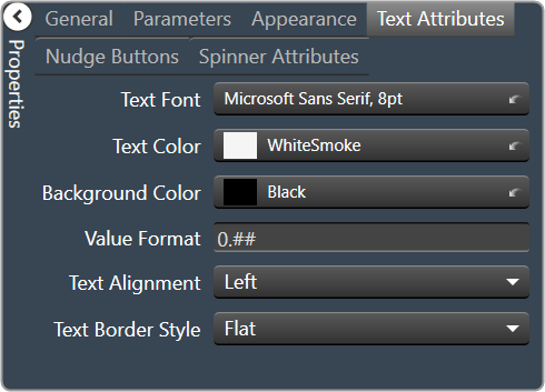
Text Attributes
|
Text Font: The font of the Spinner text. Choose from Windows fonts. |
|
Text Color: The color of the Spinner text Brings up the Select Color window. |
|
|
Background Color: The background color of the text area Brings up the Select Color window. |
|
| Value Format: The format used when displaying the value. This is an advanced feature and must follow English conventions. | |
|
Text Alignment: The horizontal alignment of the text. Left, center or right |
|
|
Text Border Style: The border style of the text area. Choose from drop down menu |
|
|
Nudge Buttons
|
Nudge Type: Together with the Increment Amount, determines the amount that the control will increment/decrement when a Nudge Button is pressed.
|
| Increment: Together with the Nudge Type, determines the amount that the control will increment/decrement when a Nudge Button is pressed. | |
|
Spinner Attributes
|
Spinner Position: Specifies where the up/down arrows are to be located.
|
| Spinner Width: Sets the size of the up/down arrow buttons, in percent of width or height. | |
|
Spinner Button Color: The color of the up/down arrow buttons. Brings up the Select Color window. |
|
|
Spinner Arrow Color: The color of the up/down arrows. Brings up the Select Color window. |
|
| Arrow Width: The width of the base as a percentage of the spinner button width. |