A Checkbox turns on or off a device parameter value when pressed.
Controls can be managed in the Custom Panel designer and, once the Custom Panel is activated, utilized by the end user. This control must be linked to a parameter to function properly.
| Property Type | Options |
|
General
|
Control Info: Shows control type.
|
Locked: Specifies if the control is locked out so that it cannot be moved or re-sized.
|
|
|
Parameters
|
Addresses: Enables panel designer to edit addressing information with the added benefit that the values can be validated as a group before being applied to the device. This editor also allows the user to assign multiple parameters to the control. Click to select Parameter Address Editor.
|
Information: Shows information about the Parameter Address.
|
|
|
Value List: Allows editing of the value range of the control. Brings up the Discrete Values Editor. |
|
| Reset Text: Optional text to display in right click context popup | |
|
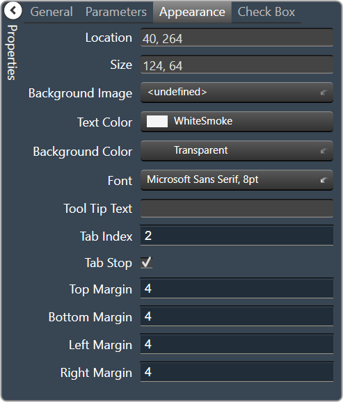
Appearance
|
Location: Control location (in pixels) of the control on the Custom Panel. Change X (horizontal) and Y (vertical) values in relation to upper left corner. You can also drag the control to a different location. |
|
Size: Control size (in pixels). Change width and height values. You can also re-size the control manually |
|
|
Background Image: Background image of the control Brings up the Select Image File window. |
|
|
Text Color: Text color of the item text. Brings up the Select Color window. |
|
| Background Color: Text that appears when mouse pointer hovers over control. | |
Font: Font style for the text on the control. Click on “…” to select desired font.
|
|
| Tool Tip Text: Text that appears on control mouse-over. | |
| Tab Index: Indicates the sequence of an element within the tabbing order of all focusable elements in the document. | |
Tab Stop: Whether the control appears in the tab order.
|
|
| Top Margin: The amount of space, in pixels at the top of the control where a label may be placed | |
| Bottom Margin: The amount of space, in pixels at the bottom of the control where a label may be placed | |
| Left Margin: The amount of space, in pixels to the left of the control where a label may be placed | |
| Right Margin: The amount of space, in pixels to the right of the control where a label may be placed | |
|
Combo Box
|
Check Box Text: The text shown in the Checkbox. |
| Checkbox Size: The size of the Checkbox in pixels. | |
|
Checkbox Style: The Checkbox style. Normal, flat, and various colors |
|
| Label Separation: The space, in pixels between the checkbox and the checkbox text |