This button sends a single value each time that it is pressed. While a button can be linked to a device parameter, it is more typically linked to a system function.
Controls can be managed in the Custom Panel designer and, once the Custom Panel is activated, utilized by the end user. This control must be linked to a parameter or system function to function properly. You can also easily add a pre-defined label.
On the following example, if “Preset 1” button is pushed, the 1st preset is selected for DriveRack #1. If “Preset 2” button is pushed, the 2nd preset is selected. Each button push overrides the value of the previous button push.
| Property Type | Options |
|
General
|
Control Info: Shows control typey.
|
Locked: Specifies if the control is locked out so that it cannot be moved or re-sized.
|
|
|
Parameters
|
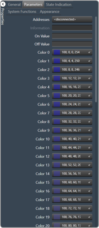
Addresses: Enables panel designer to edit addressing information with the added benefit that the values can be validated as a group before being applied to the device. This editor also allows the user to assign multiple parameters to the control. Click to select Parameter Address Editor.
|
Information: Shows information about the Parameter Address.
|
|
| On Value: Value sent when button is pressed | |
| Off Value: Value sent when button is released | |
|
Color 0 to Color 63: Background color of control Brings up the Select Color window. |
|
| Indication same as Button: The value sent when the button is pressed. | |
|
System Indication
|
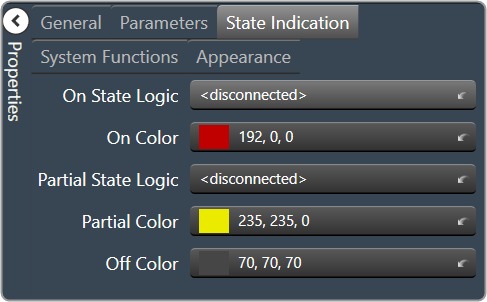
On State Logic: Link device state to the On state of the Region Button. Brings up the Indication Configuration editor. |
|
On Color: The color of the region when in the On state. Brings up the Select Color window. |
|
|
Partial State Logic: Link device state to the partial state of the region button. Brings up the Indication Configuration editor. |
|
|
Partial Color: The color of the region when in the Partial state. Brings up the Select Color window. |
|
|
Off Color: The color of the region when in the Off state. Brings up the Select Color window. |
|
|
System Functions
|
System Functions: Assign specific system operations to be performed when the button is pressed. Brings up the System Function editor. |
|
Appearance
|
Location: Control location (in pixels) of the control on the Custom Panel. Change X (horizontal) and Y (vertical) values in relation to upper left corner. You can also drag the control to a different location. |
|
Size: Control size (in pixels). Change width and height values. You can also re-size the control manually |
|
|
Transparency: Percent transparent, between 0 (opaque) and 90 (very transparent) Brings up the Select Image File window. |
|
| Hover Transparency: Percent transparent when the mouse pointer is over the region | |
|
Border Color: The color of the border. Brings up the Select Color window. |
|
| Border Width: The width of the border (in pixels) |