An on/off button alternately turns on or off a device parameter value when pressed.
Controls can be managed in the Custom Panel designer and, once the Custom Panel is activated, utilized by the end user. This control must be linked to a parameter to function properly.
| Property Type | Options |
|
General
|
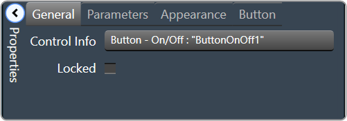
Control Info: Shows control type.
|
Locked: Specifies if the control is locked out so that it cannot be moved or re-sized.
|
|
|
Parameters
|
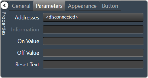
Addresses: Enables panel designer to edit addressing information with the added benefit that the values can be validated as a group before being applied to the device. This editor also allows the user to assign multiple parameters to the control. Click to select Parameter Address Editor.
|
Information: Shows information about the Parameter Address.
|
|
| On Value: Value sent when button is pressed | |
| Off Value: Value sent when button is released | |
| Reset Text: Optional text to display in right click context popup | |
|
Appearance
|
Location: Control location (in pixels) of the control on the Custom Panel. Change X (horizontal) and Y (vertical) values in relation to upper left corner. You can also drag the control to a different location. |
|
Size: Control size (in pixels). Change width and height values. You can also re-size the control manually |
|
| Center Text: Centers the tool tip text on the control | |
| Tool Tip Text: Text that appears when mouse pointer hovers over control. | |
| Tab Index: Indicates the sequence of an element within the tabbing order of all focusable elements in the document. | |
Tab Stop: Whether the control appears in the tab order.
|
|
|
Button
|
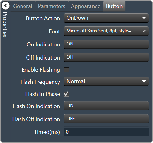
Button Action: When an event occurs when the button is clicked. |
Font: Font style for the text on the control. Click on “…” to select desired font.
|
|
| On Indication: Sets the button label, label color, background color, and background image for the “on” state. | |
|
Off Indication: Sets the button label, label color, background color, and background image for the “off” state. Brings up the State Indication Setup window. |
|
| Enable Flashing: Enables button to flash. | |
| Flash Frequency: If flashing is enabled, sets the flashing frequency. | |
| Flash In Phase: If flashing is enabled, determines if button will flash in or out of phase with other buttons | |
|
Flash On Indication: Sets the button label, label color, background color, and background image for the “flash on” state. Brings up the State Indication Setup window. |
|
|
Flash Off Indication: Sets the button label, label color, background color, and background image for the “flash off” state. Brings up the State Indication Setup window. |
|
| Timed(ms): How long button will remain active when pressed in milliseconds |