A rotary encoder is an adjustable rotary control that manipulates a device parameter and displays values of a device parameter.
When a Custom Panel is activated, the rotary control (inner ring) changes the linked parameter values as the end user clicks and slides it around it to the desired value position (like twisting a nob). The rotary encoder is controlled by right-clicking with the mouse and moving to the top or right to increase the value and moving to the bottom or left to decrease the value.
The LED meter (outer ring) reflects the selected parameter values, which are usually the same as those linked to and adjusted by the rotary control.
Controls can be managed in the Custom Panel designer and, once the Custom Panel is activated, utilized by the end user. This control must be linked to a parameter to function properly.
| Property Type | Options |
|
General
|
Control Info: The control type.
|
Locked: Specifies if the control is locked out so that it cannot be moved or re-sized.
|
|
|
Parameters
|
Addresses: Enables panel designer to edit addressing information with the added benefit that the values can be validated as a group before being applied to the device. This editor also allows the user to assign multiple parameters to the control. Click to select Parameter Address Editor.
|
Information: Shows information about the Parameter Address.
|
|
Rotary Maximum: Maximum parameter value.
|
|
Rotary Minimum: Minimum parameter value
|
|
Meter Maximum: Maximum meter value
|
|
Meter Minimum: Minimum meter value
|
|
| Reset Text: Optional text to display in right click context popup | |
|
Appearance
|
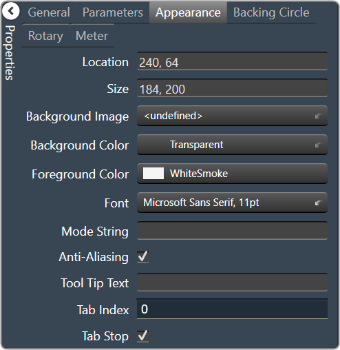
Location: Control location (in pixels) of the control on the Custom Panel. Change X (horizontal) and Y (vertical) values in relation to upper left corner. You can also drag the control to a different location |
|
Size: Control size (in pixels). Change width and height values. You can also re-size the control manually |
|
| Background Image: Click to select background image. | |
| Background Color: Background color of the control. | |
| Foreground Color: Foreground color of the control | |
Font: Font style for the text on the control. Click on “…” to select desired font.
|
|
| Mode String: User-definable description of mode | |
Anti-Aliasing: Whether to draw with anti-aliasing or not.
|
|
| Tool Tip Text: The text that appears on control mouse-over | |
| Tab Index: If tab stop is set to true, determines the position of the control in the tab order | |
Tab Stop: Specifies whether the control appears in the tab order.
|
|
|
Backing Circle
|
Radius: Radius for the backing circle as fraction of control size |
Color: Color of the backing circle
|
|
| Border Width: Width of the backing circle border | |
| Border Color: Color of the backing circle border | |
|
Rotary
|
Encoder Multiplier: The amount that the turn of the rotary is multiplied to tune sensitivity |
|
Base Image: The image displayed for the inside of the knob. Brings up the Select Image File window. |
|
|
Ring Image: The image displayed for the outside of the knob. Brings up the Select Image File window. |
|
Knob Radius: The radius of the rotary knob as percent of control size.
|
|
| Nudge Amount: Determines, with the nudge type, how much the control will adjust when up and down arrow keys are pressed | |
Nudge Type: Determines, with the nudge amount, how much the control will adjust when up and down arrow keys are pressed.
|
|
|
Meter
|
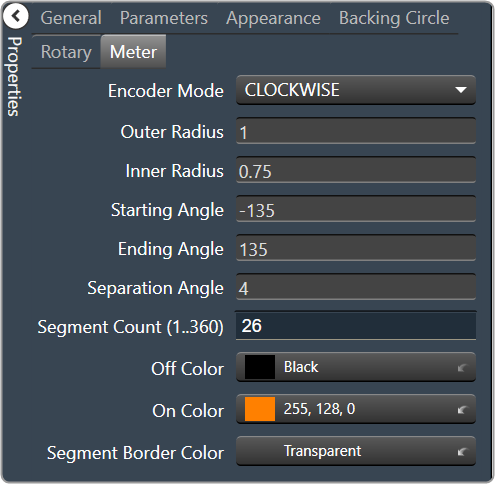
Encoder Mode: The display mode for the LED elements.
|
Outer Radius: The outside edge of the display meter as a percentage of the entire circle.
|
|
Inner Radius: The inside edge of the display meter as a percentage of the entire circle.
|
|
Starting Angle: Where the meter display starts
|
|
Ending Angle: Where the meter display ends
|
|
| Separation Angle: The angle, in degrees, separating each segment | |
| Segment Count (1..360): The number of segments in the display | |
| Off Color: The “off” color of the control | |
| On Color: The “on” color of the control | |
| Segment Border Color: The color of the segment border |