| Property Type | Options |
|
General
|
Control Info: The control type.
|
Locked: Specifies if the control is locked out so that it cannot be moved or re-sized.
|
|
|
Parameters
|
Addresses: Enables panel designer to edit addressing information with the added benefit that the values can be validated as a group before being applied to the device. This editor also allows the user to assign multiple parameters to the control. Click to select Parameter Address Editor.
|
Information: Shows information about the Parameter Address.
|
|
Maximum: Maximum value a control can be set.
|
|
Minimum: Minimum value a control can be set.
|
|
| Reset Text: Optional text to display in right click context popup | |
|
Appearance
|
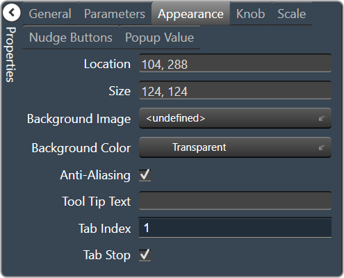
Location: Control location (in pixels) of the control on the Custom Panel. Change X (horizontal) and Y (vertical) values in relation to upper left corner. You can also drag the control to a different location |
|
Size: Control size (in pixels). Change width and height values. You can also re-size the control manually |
|
| Background Image: Click to select background image. | |
| Background Color: Background color of the control. | |
| Foreground Color: Foreground color of the control | |
Anti-Aliasing: Whether to draw with anti-aliasing or not.
|
|
| Tool Tip Text: The text that appears on control mouse-over | |
| Tab Index: If tab stop is set to true, determines the position of the control in the tab order | |
Tab Stop: Specifies whether the control appears in the tab order.
|
|
|
Knob
|
Base Image: The image displayed for the inside of the knob |
| Ring Image: The image displayed for the outside of the knob. | |
| Shading Image: The image used to simulate lighting/shading effects of the knob. | |
|
Knob Size: The size of the knob. Set to 0,0 to reset to the actual image size. |
|
| Start Position: The angular starting point from vertical. | |
| End Position: The angular ending point from vertical. | |
| Orientation: The movement of the knob from min to max. | |
|
Scale
|
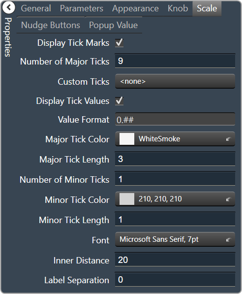
Display Tick Mark: Display mark on the control, when set to “true”. |
| Number of Major Ticks: The number of major tick marks displayed on the control. | |
Custom Ticks: Option to use custom tick values by utilizing the scale editor.
|
|
| Display Tick Values: Displays the value of a tick mark next to major tick marks when set to “True”. | |
| Value Format: The format of the value displayed next to major tick marks. This is an advanced feature. | |
| Major Tick Color: The color of major tick marks. | |
| Major Tick Length: The length, in pixels, of major tick marks. | |
| Number of Minor Ticks: The number of minor tick marks display between major tick marks | |
| Minor Tick Color: The color of minor tick marks. | |
| Minor Tick Length: The length, in pixels, of minor tick marks | |
| Font: The font for the ticks | |
| Inner Distance: The distance between the center of the knob and the inside end of the tick marks. | |
| Label Separation: The distance between the outer end of the major tick marks and the edge of the labels in pixels. | |
|
Nudge Button
|
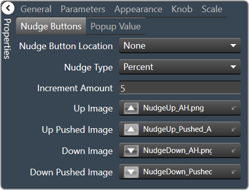
Nudge Button Location: Location of the nudge buttons. None, Left, Right, Above or Below |
Nudge Type: Determines, with the increment amount, how much the control will adjust when a nudge button is pressed.
|
|
| Increment Amount: Determines, with the nudge type, how much the control will adjust when a nudge button is pressed. | |
| Nudge Button Separation: Distance, in pixels, from the edge to the nudge button | |
|
Up Image: The static image for the “up” nudge button. Click the button to select a new image. |
|
|
Up Pushed Image: The image that displays when the “up” nudge button is pushed. Click the button to select a new image. |
|
|
Down Image: The static image for the “down” nudge button. Click the button to select a new image. |
|
|
Down Pushed Image: The image that displays when the “down” nudge button is pushed. Click the button to select a new image. |
|
|
Popup Value
|
Popup Value Position – Fraction: The location of the popup value as a decimal fraction of the width (X) and height (Y) of the control |
Display Popup Value: Displays the value of the control in a popup, if set to true
|