A vertical fader is an adjustable vertically-positioned control that manipulates a device parameter.
Controls can be managed in the Custom Panel designer and, once the Custom Panel is activated, utilized by the end user. This control must be linked to a parameter to function properly.
| Properties Type | Options |
|
General
|
Control Info: The control type
|
Locked: Specifies if the control is locked out so that it cannot be moved or re-sized.
|
|
|
Parameters
|
Addresses: Enables panel designer to edit addressing information with the added benefit that the values can be validated as a group before being applied to the device. This editor also allows the user to assign multiple parameters to the control. Click to select Parameter Address Editor.
|
Information: Shows information about the Parameter Address.
|
|
Maximum: Maximum parameter value.
|
|
Minimum: Minimum parameter value
|
|
| Reset Text: Optional text to display in context popup | |
|
Appearance
|
Location: Control location (in pixels) of the control on the Custom Panel. Change X (horizontal) and Y (vertical) values in relation to upper left corner. You can also drag the control to a different location |
| Size: Control size (in pixels). Change width and height values. You can also re-size the control manually | |
| Background Image: Brings up the Select Background Image window | |
| Background Color: Background color of the control | |
| Tool Tip Text: The text that appears on control mouse-over | |
| Tab Index: Determines the position of the control in the tab order | |
Tab Stop: Specifies whether the control appears in the tab order.
|
|
|
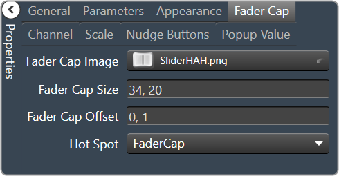
Fader Cap
|
Fader Cap Image: The image displayed for the fader cap.
|
| Fader Cap Size: The size of the fader cap. | |
| Fader Cap Offset: The vertical offset of the fader cap, in pixels, from the fader channel | |
| Hot Spot: Sets mouse sensitivity of the fader cap or the entire length of the slider. | |
|
Channel
|
Channel Color: Color of the fader channel.
|
| Channel Width: Width of the fader channel in pixels | |
| Channel Start: Distance, as a percentage of length, from the bottom or left edge to where the fader channel will start | |
| Channel End: Distance, as a percentage of length, from the bottom or left edge to where the fader channel will end | |
| Channel Center: Distance, as a percentage of width, from the bottom or left edge to where the fader channel will be located | |
|
Scale
|
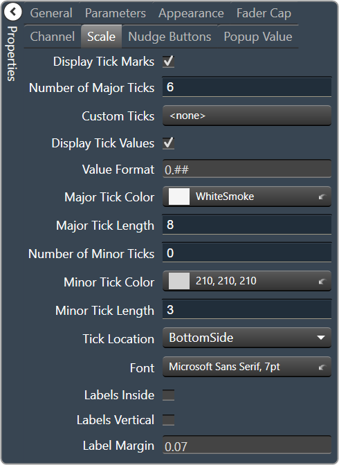
Display Tick Marks: Option to display the tick marks of the control. Must be set to true for custom ticks to display.
|
| Number of Major Ticks: How many major ticks are displayed | |
Custom Ticks: Whether to use custom tick values by utilizing the scale editor.
|
|
| Display Tick Values: The value of the ticks to be displayed | |
| Value Format: The format of the tick values | |
| Major Tick Color: The color of the major tick | |
| Major Tick Length: The length of the major tick | |
| Number of Minor Ticks: How many minor ticks are displayed | |
| Minor Tick Color: The color of the minor tick | |
| Minor Tick Length: The length of the minor tick | |
| Tick Location: The location of the tick marks relative to the fader channel | |
| Font: The font for the ticks | |
|
Labels Inside: Whether labels are drawn between tick marks and fader channel. Whether labels are drawn between tick marks and fader channel or not.
|
|
Labels Vertical: Whether labels are displayed vertically or horizontally.
|
|
| Label Margin: The amount of space, as a decimal fraction of the width of the control, between the center channel and the tick marks. | |
|
Nudge Button
|
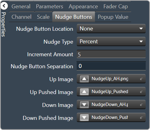
Nudge Button Location: Location of the nudge buttons.
|
Nudge Type: Determines, with the increment amount, how much the control will adjust when a nudge button is pressed.
|
|
| Increment Amount: Determines, with the nudge type, how much the control will adjust when a nudge button is pressed. | |
| Nudge Button Separation: Distance, in pixels, from the edge to the nudge button | |
|
Up Image: The static image for the “up” nudge button. Click the button to select a new image. |
|
|
Up Pushed Image: The image that displays when the “up” nudge button is pushed. Click the button to select a new image. |
|
|
Down Image: The static image for the “down” nudge button. Click the button to select a new image. |
|
|
Down Pushed Image: The image that displays when the “down” nudge button is pushed. Click the button to select a new image. |
|
|
Popup Value
|
Popup Value Position – Fraction: The location of the popup value as a decimal fraction of the width (X) and height (Y) of the control |
Display Popup Value: Displays the value of the control in a popup, if set to true.
|