A text box allows the user to specify the exact value of a device parameter by typing it in rather than running through a long list of values. In tablet mode, a keypad loads when a text box is selected.
Controls can be managed in the Custom Panel designer and, once the Custom Panel is activated, utilized by the end user. This control must be linked to a parameter to function properly.
| Properties Type | Options |
|
General
|
Control Info: Shows control type.
|
Locked: Specifies if the control is locked out so that it cannot be moved or re-sized.
|
|
|
Parameters
|
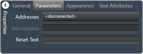
Address: Enables panel designer to edit addressing information with the added benefit that the values can be validated as a group before being applied to the device. This editor also allows the user to assign multiple parameters to the control.
|
Information: Shows information about the Parameter Address.
|
|
| Rest Text: Optional text to display in right click context popup | |
|
Appearance
|
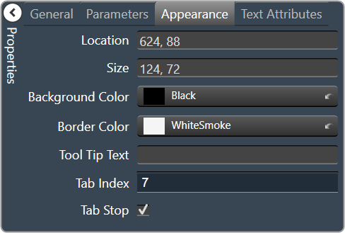
Location: Control location (in pixels) of the control on the Custom Panel. Change X (horizontal) and Y (vertical) values in relation to upper left corner. You can also drag the control to a different location |
| Size: Control size (in pixels). Change width and height values. You can also re-size the control manually. | |
| Background Color: Background color of the control. | |
|
Border Color: Border color of the control. Brings up the Select Color window.
|
|
| Tool Tip Text: The text of the Tool Tip. | |
| Tab Index: If tab stop is checked, determines the position of the control in the tab order. | |
Tab Stop: Specifies whether the control appears in the tab order.
|
|
|
Text Attributes
|
Text: Enter the text for the Text Display.
|
| Maximum Length: Maximum text input length. | |
Text Alignment: Alignment of the label text.
|
|
Text Font: Click on “…” to select desired font. Brings up a Font Select window.
|
|
Text Color: Color of the text on the control.
|
|
Value Format: The number format used when displaying the value.
|
|
Text Border Style: Style of control border.
|
|
| Banner Scroll: Check this box to scroll the text. | |
| Banner Scroll Speed: The speed at which the text should scroll. Select between Slow, Medium, or Fast |