A text label is a static text control on a Custom Panel. It is text only, cannot be linked to a device parameter, and is not interactive for the user.
Text Label controls can be managed in the Custom Panel designer and, once the Custom Panel is activated, viewed (but not changed) by the end user.
| Properties Type | Options |
|
General
|
Control Info: Shows control type.
|
Locked: Specifies if the control is locked out so that it cannot be moved or re-sized.
|
|
|
Appearance
|
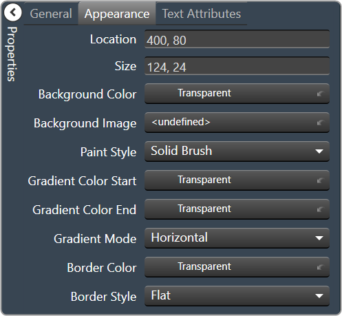
Location: Control location (in pixels) of the control on the Custom Panel. Change X (horizontal) and Y (vertical) values in relation to upper left corner. You can also drag the control to a different location |
| Size: Control size (in pixels). Change width and height values. You can also re-size the control manually. | |
| Background Color: Background color of the control. | |
| Background Image: Background image of the control. | |
Paint Style: Background paint style of the control.
|
|
| Gradient Color Start: Beginning gradient color if gradient is selected in Paint Style. | |
| Gradient Color End: Ending gradient color if gradient is selected in Paint Style. | |
Gradient Mode: Type of gradient fill if gradient is selected in Paint Style.
|
|
|
Border Color: Border color of the control. Brings up the Select Color window.
|
|
Border Style: Click to select border style.
|
|
|
Text Attributes
|
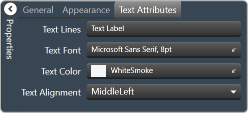
Text Line: Enter the text for the Text Label.
|
Text Font: Click on “…” to select desired font. Brings up a Font Select window.
|
|
Text Color: Text color of the control.
|
|
Text Alignment: Alignment of the label text.
|