The graph area displays the graphically quantitative data corresponding to the selected configuration. The displayed graph controlled by chart selector, for more details refer to the Chart Selector.
Every chart can hold up to 2 sub-plots. Every sub-plot has its own zoom-bars for the x- and y-axis.
You can perform following actions on the chart.
Zoom and Scroll Controls
The following controls can be used to perform zoom and scroll functions on the graph.
| Alt + MW (Zoom on Y axis) | Expand the Y axis to zoom in or out of the values on the graph. |
| Ctrl + MW (Zoom on X axis) | Expand the Y axis to zoom in or out of the values on the graph. |
| Shift + MW (Scroll on X axis) | Scroll the visible graph along the X axis up to the visible or configured limits, that is, if the graph shows the maximum visible value in the configured X, the scroll will not be available. |
| MW (Scroll on X axis) | Scroll the visible graph along the Y axis up to the visible or configured limits, that is, if the graph shows the maximum visible value in the configured Y, the scroll will not be available. |
MW=Mouse Wheel
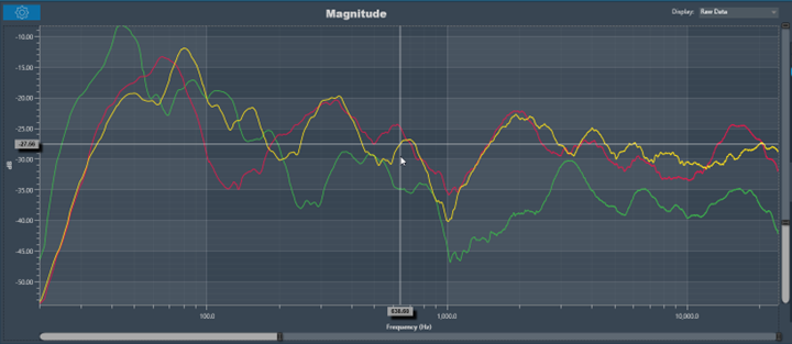
Moving the cursor over the plot will generate a crosshair that indicate values in the X and Y axes. The crosshair will always follow the line closest to the mouse cursor. On the axis, the corresponding values will be drawn.
Below is an example of a chart with a crosshair on top:
Data can either be displayed in the time (ms) domain or the frequency (Hz) domain. Using the display selector you can choose the domain for any selected chart. For more details refer to the Domain Selector.
Windowing in FFT (Fast Fourier Transform) is a technique used to reduce spectral leakage and improve the accuracy of frequency analysis. This involves multiplying the time-domain signal by a window function before applying the FFT. Common window functions include the Hamming, Hanning, and Blackman windows etc.
Windowing reduces the abrupt edges of the signal, which helps to minimize distortion in the frequency domain, especially when analyzing non-periodic signals. Keep in mind that windowing introduces a trade-off between main lobe width and sidelobe levels in the frequency domain.
A Windowing option is placed on top of every graph (Time , Magnitude, and Phase graphs). This sets the display options for the respective graph. Currently available options are:
- Hann: The Hann window can be seen as one period of a cosine “raised” so that its negative peaks just touch zero (hence the alternate name “raised cosine”).
- Rectangular: The rectangular window is the simplest window, equivalent to replacing all but N consecutive values of a data sequence by zeros, making it appear as though the waveform suddenly turns on and off.
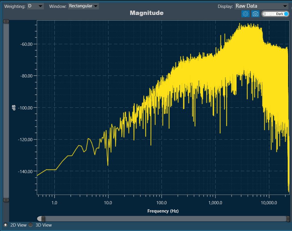
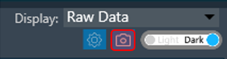
There is a Toggle button (dark / light theme) in the charts in Central Viewer. Once the Toggle button is clicked, the corresponding custom theme can be selected, and the background of the graph gets changed and vice versa.
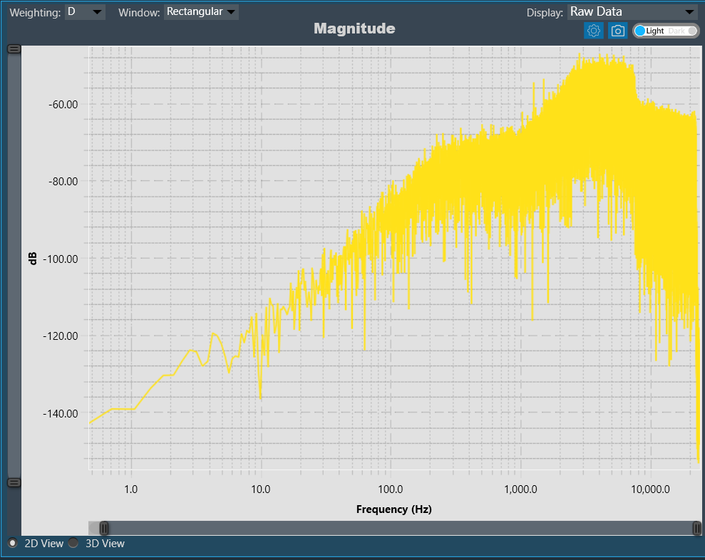
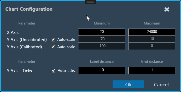
Chart Configuration
You can configure the axis on the chart configuration window. Click on the gear icon on the top left corner of the graph.
In the chart configuration window, you can set minimum and maximum range of the X and Y axis. The auto-scale option allows the chart to determine axis range based on the data. Additionally, the graph zooming out and resetting will be restricted to the axis range defined in minimum and maximum values.
On chart configuration window, you can customize the Y axis gridlines. There are two types of markings on an Y axis; a minor mark indicated just by small lines on the plot, and a major mark, where values are also added.
- Label Distance: To change the distance between the markings with values.
- Grid Distance: To change the distance between minor marks is indicated by small lines.
You can also keep these distance values blank, which will allow the chart to calculate itself based on the data and zoom level.
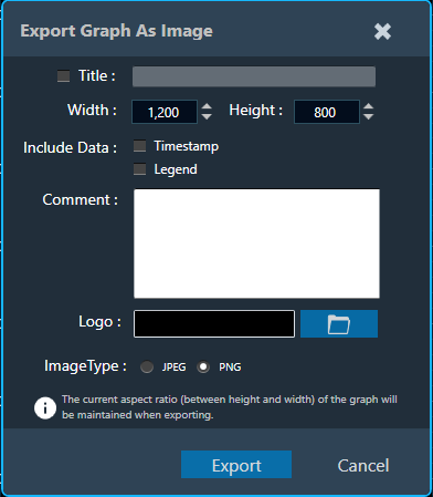
Export to Image
The Export Image feature allows you to export the graphs and certain other details based on export setting configuration. The exported image file will be available in .png or .jpeg format.
Once you click on the “Export to Image” option, export setting window for the image will open.
This export setting window includes following options:
- Title: Enter the image name.
- Image Width: Change the image width.
- Image Height: Change the image height.
- Include Data: Select the option to add Timestamp and Legend in the image.
- Comments: Enter the specific comment, that you want to be add in the image.
- Logo: Add the desired logo in the image.
Once you configured export settings, click Export button. The context menu will show you two options, export the image or copy to the clipboard.
- Save image as – option will be opened to save the image to a file.
- Copy image to clipboard – will allow you to paste the graph image somewhere else.
The exported image will have following sections based on export setting window configuration.
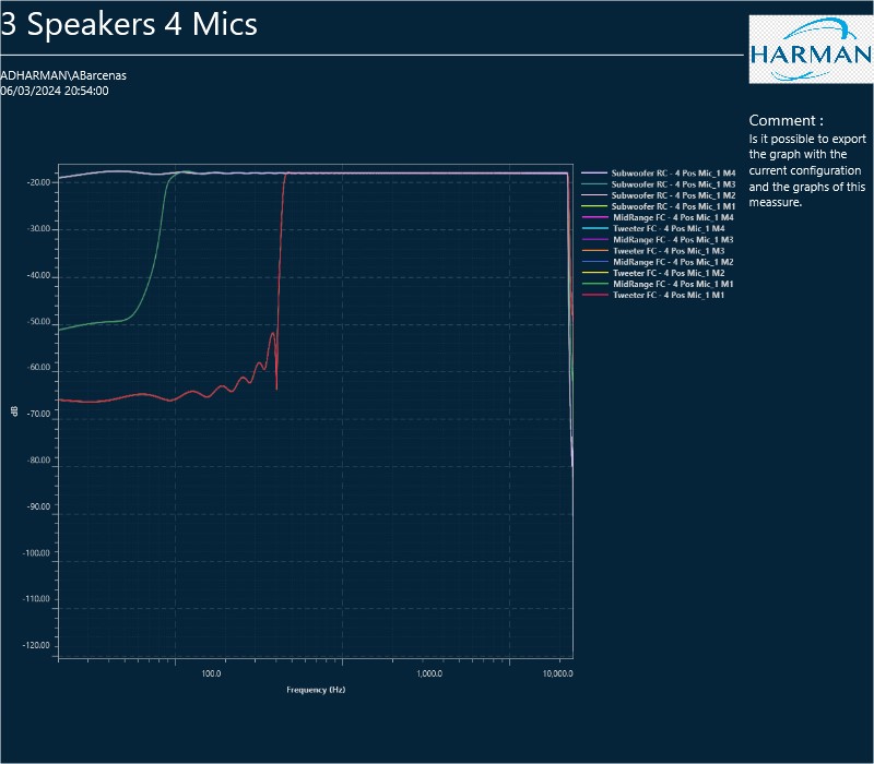
The graph always present in the exported image. Based on the export setting configuration additional sections like – Measurement information, Title, Time, User details, Logo provided, Live channel data, Generator instances details also present in the exported image.